This is a React Native Date Picker with following main features:
📱 Supporting iOS and Android
🕑 3 different modes: Time, Date, DateTime
🌍 Multiple languages
🎨 Customizable
| iOS | |
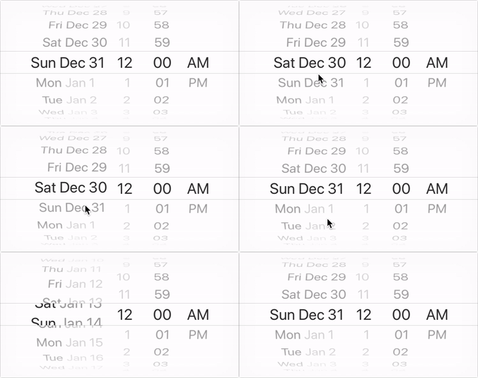
|
|
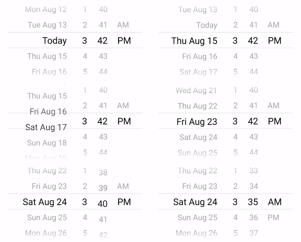
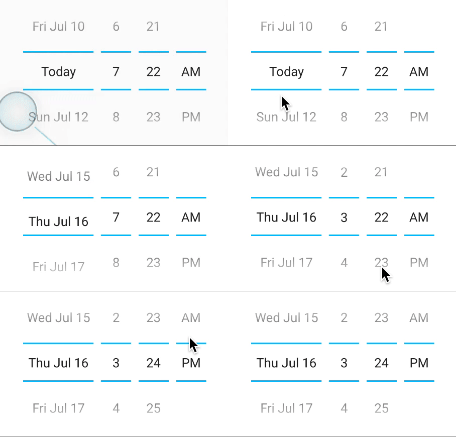
| Android Choose from 2 different variants |
|
|
|
androidVariant="iosClone" | androidVariant="nativeAndroid" |
npm install react-native-date-picker --savereact-native link react-native-date-picker(Only needed for React Native <= 0.59)(cd ios && pod install)(If you're using CocoaPods)
- Xcode >= 11.6
import React, { useState } from 'react'
import DatePicker from 'react-native-date-picker'

export default () => {

  const [date, setDate] = useState(new Date())

  return (
    <DatePicker
      date={date}
      onDateChange={setDate}
    />
  )
}| Prop | Description | Screenshots iOS | Screenshot Android |
|---|---|---|---|
| date | The currently selected date. | ||
| onDateChange | Date change handler | ||
| fadeToColor | Android picker is fading towards this background color. {color, 'none'} | ||
| maximumDate | Maximum selectable date. | ||
| minimumDate | Minimum selectable date | ||
| androidVariant | Choose from 2 android style variants. {'iosClone', 'nativeAndroid'} (default: 'iosClone') | 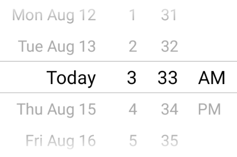 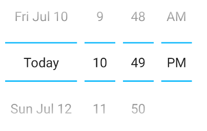 |
|
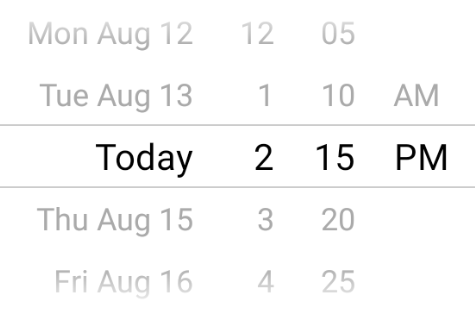
| minuteInterval | The interval at which minutes can be selected. | 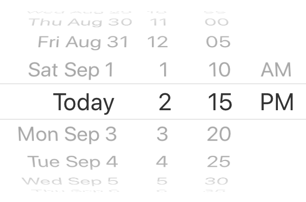 |
 |
| mode | The date picker mode. {'datetime', 'date', 'time'} | 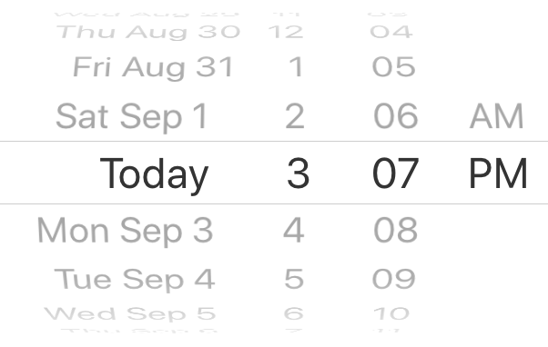 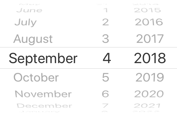 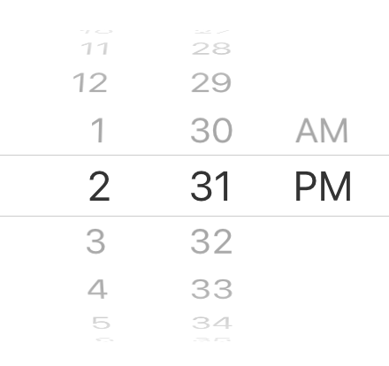 |
 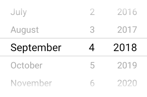 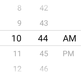 |
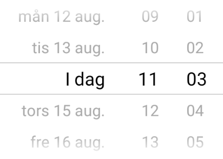
| locale | The locale for the date picker. Changes language, date order and am/pm preferences. Value needs to be a Locale ID. | 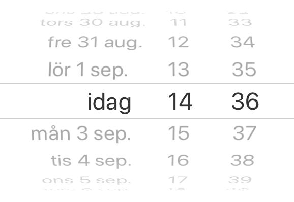 |
 |
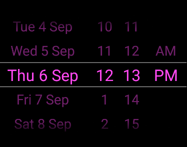
| textColor | Changes the text color. ⚠ Colors other than black (#000000) or white (#ffffff) will replace the "Today" string with a date on iOS 13 or higher. | 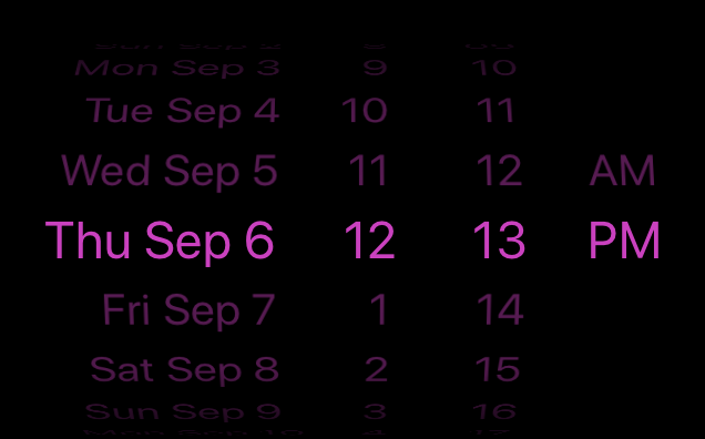 |
 |
| timeZoneOffsetInMinutes | Timezone offset in minutes (default: device's timezone) | ||
| dividerHeight | Change the divider height (only supported for iosClone) | ||
| is24hourSource | Change how the 24h mode (am/pm) should be determined, by device settings or by locale. {'locale', 'device'} (android only, default: 'device') |
📅 React Native Date Picker is a cross platform component working on both iOS and Android. It uses the slightly improved DatePickerIOS on iOS and a custom picker on Android which has similar look and feel. The datetime mode might be particulary interesting if you looking for a way to avoid two different popup pickers on android.
The color of the divider, separator (or whatever you choose to call it) can only be changed on android for the androidNative variant. To change it, add the following to your android AppTheme. The theme is often found in styles.xml.
<item name="colorControlNormal">#ff0000</item>Unfortunately, expo does not support this date picker at the moment. Upvote this feature request if you would like to have it included.
The order is determined by the locale prop. Set for instance locale='fr'to get the french preference.
On iOS the 12/24h preference is determined by the locale prop. Set for instance locale='fr'to get the french preference. On Android the 12/24h format is determined by the device setting by default. Add is24hourSource="locale" to let the locale determine the device setting on android as well. When using 12h mode the AM/PM part of the picker will be displayed. It is NOT recommended to force any specific 12/24h format, but this can be achieved by, choosing a locale which has the desired 24h preference and add is24hourSource="locale".
This is unfortunately not possible due to the limitation in DatePickerIOS. You should be able to create your own month-year picker with for instance https://github.com/TronNatthakorn/react-native-wheel-pick.
If you have enabled Proguard for Android you might need to ignore some classes to get the the picker to work propery in android production/release mode. Add these lines to you proguard file (often called proguard-rules.pro):
-keep public class net.time4j.android.ApplicationStarter
-keep public class net.time4j.PrettyTime
On Android there are two design variants to choose from:
Here are some more info about the three different picker modes that are available.
Using the datetime mode gives you a react native date time picker where both date and time can be selected at the same time. The todays date will be replays with the string "Today" translated to the desired language. This is the default mode and look like this.
| iOS | Android |

|

|
Add the optional datetime mode property to use this mode. Since datetime is default this could also be exclude.
<DatePicker
  ...
  mode="datetime"
/>The date mode displays a react native datepicker with year month and date where the year-month-date order will be adjusted to the locale. If will look similar to this:
| iOS | Android |

|

|
Just add the value date to mode property:
<DatePicker
  ...
  mode="date"
/>The time mode can be used when only the time matters. AM/PM will be added depending on locale and user setting. It can be useful to add the timeInterval to only display the time with for instance 15min intervals. The react native time picker look like this:
| iOS | Android |

|

|
Set mode property to time to show the time picker:
<DatePicker
  ...
  mode="time"
/>One of the strongest reason to use react native is its cross platform compatibility. Most of the official components are working seamlessly on both platforms but there are some with single platform support only. The react native datepicker is one example where both DatePickerIOS and DatePickerAndroid are present. The reason for this is that the default date picker is implemented in seperate ways, iOS normally have an integrated view picker wheel where android has different pickers in a dialog format.
If you want to use these pickers you can combile the official ones or a third party module that already done that for you. If you on the other hand want have a more unified design between your android and ios app, this module is for you. The datetime mode can be particularly helpful to avoid 2 separate picker dialogs on android.


