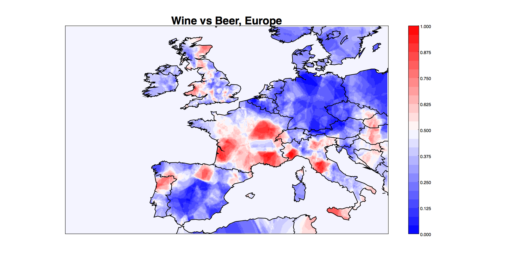
Python tool for creating density maps of events (drunk tweets, police shootings, etc). Below is a sample map created with this tool using Twitter data: color denotes the fraction of #beer or #wine tweets which are about #wine, with redder areas indicating more wine.
This code can be used in two ways. Run plotDensity.py to see examples of both. sample_data.csv contains a sample data file.
Way 1: You have a file of latitude, longitude pairs and you want to see where they cluster most densely. Eg, I want to plot the density of police shootings. Uses kernel density estimation.
Way 2: You have a file with two types of latitude, longitude pairs: points of interest, and background points. Eg, I want to plot the fraction of all tweets about alcohol which are about beer: beer tweets are the points of interest, and alcohol tweets are the background. Or I want to plot the fraction of all tweets about football which support the Patriots: Patriots tweets are the points of interest, and football tweets are the background. I think way 2 is usually the correct thing to do (otherwise, your map is heavily correlated with population density), but it does require you to have two types of events. Uses k-nearest neighbors estimation.
This code requires pylab, sklearn, numpy, and pandas to run.
Please contact Emma Pierson (emmap1 "at" cs "dot" stanford "dot" edu) with questions, comments, requests, or bugs, or see blog post or Quartz articles for full details.
