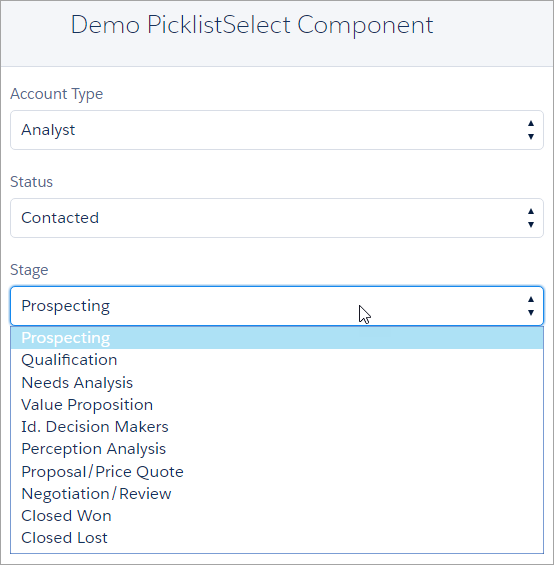
Lightning Component that renders lightning:select with options from an sobject picklist field. Ideally, this component shouldn't be needed but as of Winter '16 release the force:inputField component has a bug that when used with picklist fields it renders disabled. Disabled form fields are not conducive to users entering data.

The simplest way is to use the component and specify objectName and fieldName required attributes:
<c:PicklistSelect objectName="Account" fieldName="Type"/>
Since the standard lightning:select component is used by this component, most of the standard attributes are available to you as well:
| Attribute | Description | Required? |
|---|---|---|
| objectName | API name of object | yes |
| fieldName | API name of picklist field | yes |
| label | Text that describes the desired select input. Default is the field's label. | no |
| value | The value of the select, also used as the default value to select the right option during init. If no value is provided, the first option will be selected. | no |
| class | A CSS class that will be applied to the outer element. This style is in addition to base classes associated with the component. | no |
| onblur | The action triggered when the element releases focus. | no |
| onfocus | The action triggered when the element receives focus. | no |
| onchange | The action triggered when a value attribute changes. | no |
