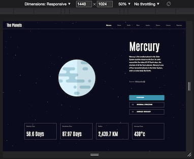
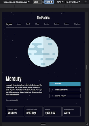
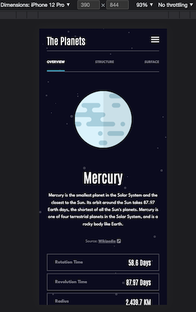
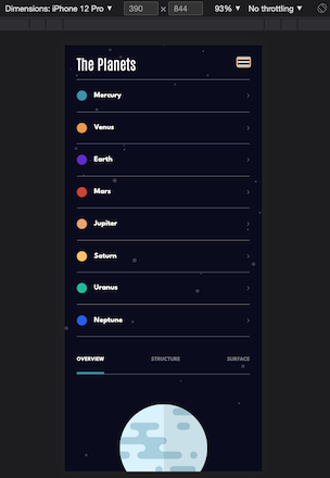
This is a solution to the Planets fact site challenge on Frontend Mentor. Frontend Mentor challenges help you improve your coding skills by building realistic projects.
Note: Delete this note and update the table of contents based on what sections you keep.
Users should be able to:
- View the optimal layout for the app depending on their device's screen size
- See hover states for all interactive elements on the page
- View each planet page and toggle between "Overview", "Internal Structure", and "Surface Geology"
- Solution URL: EricWink GitHub
- Live Site URL: The Planets
- Semantic HTML5 markup
- CSS custom properties
- Flexbox
- CSS Grid
- Mobile-first workflow
- React
This project was excellent practice for utilizing CSS Grid and a Mobile-first workflow to streamline custominzing the layout at different screen sizes. Most importantly, keeping my CSS code as organized as possible was a high priority for this project, and I'm thrilled with my progression.
This project has boosted my confidence to tackle more challenging designs, layouts, and interactivity. I'll be seeking out additional challenges to continue to push my skillset.
- Mobile-First Build Playlist by The Net Ninja - A playlist of videos that demonstrate the process of building a website utilizing mobile-first practices. This really helped all of the concepts I already knew click together for me.
- A Complete Guide to Grid - A wonderful cheat sheet for all things CSS Grid
- A Complete Guide to Flexbox - Another great cheat sheet for all things flexbox
- Website - EricWink GitHub
- Frontend Mentor - @ericwink
- Twitter - @ericwinkdev


