This is the companion repository for the paper (Vossen et al. 2023) we submitted to the 2023 Integrated Communication, Navigation and Surveillance Conference (ICNS).
Our work uses GraphWave (Donnat et al. 2018) to analyse and highlight the structural impacts the impact of the COVID-19 pandemic on the European Aviation network.
In this repository you can find:
- a subset of the data: six weeks of flight list data for 2019, 2020, 2021, and 2022
- the code to reproduce the model of the paper using the sample dataset above
- the validation paper of the used model
We suggest you to create a dedicated conda environment for this project,
we refer to it as aviation-network in the following paragraphs.
Note that we use Python 3.9 even if the GraphWave repo states it was
developed in 2.7 (and we define do NOT use version 2.1 of networkx as
per the GraphWave
repo).
So to make graphwave import-able we have to fix the print statements
in graphwave/utils/graph_tools.py from print "message" to
print("message")
$ conda create -n aviation-network python=3.9 \
    numpy networkx pandas scikit-learn pillow=9.0.0 \
    matplotlib seaborn pygsp
$ conda activate aviation-network
$ pip install pyemd
Clone (or copy the relevant folder) graphwave source
code in the parent
directory of this project.
This is the structure expected by the code:
<somewhere>
├── aviation-network-structure-model
│   ├── data
│   │   ├── ...
│   │   └── sample_2022.csv
│   └── sample_code_for_repo.R
│   └── ...
└── graphwave
    ├── graphwave
    │   └── ...
    └── requirements.txt
You can run the script sample_code_for_repo.R to reproduce the
analysis of the paper on the sample data.
But the same code will be explained little by little below.
Here we provide with sample code and data to run the analyses as described in the “Studying the impact of COVID-19 on the European Air Transportation Network” (Vossen et al. 2023). This sample code uses a combination of R and Python; GraphWave (Donnat et al. 2018), the unsupervised method for learning node embeddings based on structural similarity in networks, is implemented in Python.
library(data.table)
library(tidyverse)
library(foreach)
library(fdm2id)
library(pruatlas)
library(rnaturalearth)
library(Partiallyoverlapping)
library(reticulate)
library(here)
library(flexclust)

set.seed(42)

# Load Python packages
use_condaenv("aviation-network", required = TRUE)
graphwave <- import_from_path(
  module = "graphwave",
  path = here("..", "graphwave", "graphwave"))
np <- import("numpy")
nx <- import("networkx")
pd <- import("pandas")
sk <- import("sklearn")
The data consist of origin-destination flight data for flights departing from, or arriving at airports in EUROCONTROL member states of six weeks (i.e, week 26 to 31) in 2019, 2020, 2021 and 2022 is provided. Each flight is classified using the statfor market segment classification (i.e., Low-cost, Mainline, Regional, Business, Non-scheduled, Military, and Other).
net2019 <- fread(file = here("data", "sample_2019.csv"))
net2020 <- fread(file = here("data", "sample_2020.csv"))
net2021 <- fread(file = here("data", "sample_2021.csv"))
net2022 <- fread(file = here("data", "sample_2022.csv"))

weeks   <- net2019$week %>% unique()
n_weeks <- weeks %>% length()

extract_airports <- function(net) {
  airports_to <- net %>%
    filter(
      type.destination %in% c("medium_airport", "large_airport") &
        !to_member_status == ""
    ) %>%
    select(destination) %>% unique() %>% unlist()
  airports_from <- net %>%
    filter(type.origin %in% c("medium_airport", "large_airport") &
             !from_member_status == "") %>%
    select(origin) %>% unique() %>% unlist()
  airports <- c(airports_from, airports_to) %>% unique()
  return(airports)
}

airports19 <- extract_airports(net2019)
airports20 <- extract_airports(net2020)
airports21 <- extract_airports(net2021)
airports22 <- extract_airports(net2022)

head(net2019)
#>    origin destination week market_segment type.origin type.destination
#> 1:   AFIL        EDDK   28          Other                large_airport
#> 2:   AFIL        EDDV   30          Other                large_airport
#> 3:   AFIL        EDLE   28          Other                small_airport
#> 4:   AFIL        EDTD   29       Business               medium_airport
#> 5:   AFIL        EGXW   29       Military               medium_airport
#> 6:   AFIL        EGXW   30       Military               medium_airport
#>    from_member_status to_member_status weight
#> 1:                                   M      1
#> 2:                                   M      1
#> 3:                                   M      1
#> 4:                                   M      1
#> 5:                                   M      1
#> 6:                                   M      1
Before running the analysis we remove entries containing airports with code AFIL and ZZZZ, as these codes do not relate to actual airports, but are unique identifiers of flight plans that are received in-flight, and unidentified origins. Leaving these connections in the network can result in artifical connections between otherwise unconnected regions (i.e., two airports sharing the same neighbor ZZZ or AFIL). Additionally, as we are interested in connectivity between airports, we remove self loops (i.e., flights originating and arriving at the same airport).
preprocess_network <- function(net,
                               remove_self_loops = TRUE,
                               remove_AFIL_ZZZZ = TRUE) {
    if (remove_self_loops == TRUE) {
      net <- net %>% filter(origin != destination)
    }

    if (remove_AFIL_ZZZZ == TRUE) {
      net <- net %>% filter(!origin %in% c("AFIL", "ZZZZ") &
                              !destination %in% c("AFIL", "ZZZZ"))
    }

    return(net)
  }

net2019 <- preprocess_network(net2019)
net2020 <- preprocess_network(net2020)
net2021 <- preprocess_network(net2021)
net2022 <- preprocess_network(net2022)The first step in the analysis consists of running the GraphWave algorithm on our networks. The GraphWave algorithm takes as input a graph object that we create using networkx.
create_nx_graph <- function(net, weighted = TRUE) {
  net <-
    net %>%
    select(origin, destination, weight) %>%
    as.data.frame() %>%
    rename(source = origin,
           target = destination)

  net <- pd$DataFrame(net)
  if (weighted == TRUE) {
    g <-
      nx$from_pandas_edgelist(net,
                              edge_attr = TRUE,
                              create_using = nx$DiGraph)

  } else {
    g <- nx$from_pandas_edgelist(net[, 1:2], create_using = nx$DiGraph)

  }

  return(g)
}
nodes_to_string <- function(nodes) {
  nodes <- toString(nodes)
  nodes <- substr(nodes, 3, nchar(nodes) - 2)
  nodes <- stringr::str_remove_all(nodes, "'")
  nodes <- stringr::str_split(nodes, ", ")[[1]]
  return(nodes)
}
Starting with 2019, we create an embedding of each week in our dataset.
As 2019 will be our reference for the study, we set taus option of the
GraphWave algoritm to “auto”. This allows the algorithm to find the
optimal signal to propagate through the network.
embeddings_2019 <- list()
taus_2019 <- list()

for (wk in weeks) {
  #print(paste("Processing week", wk))
  el <- create_nx_graph(net2019 %>% filter(week == wk))
  emb <-
    graphwave$graphwave_alg(el,
                            seq(0, 100, length.out = 25),
                            taus = "auto",
                            verbose = FALSE)
  embedding <- emb[[1]] %>% as.data.frame()
  embedding$name <- nodes_to_string(el$nodes)
  embeddings_2019[[wk]] <- embedding
  taus_2019[[wk]] <- emb[[3]]
}
For the networks in the weeks in 2020-2022, we now use the optimal tau values from the baseline network. This way we can compare our target weeks under the same conditions as our reference weeks.
embeddings_2020 <- list()
for (wk in weeks) {
  #print(paste("Processing week", wk))
  el <- create_nx_graph(net2020 %>% filter(week == wk))
  emb <- graphwave$graphwave_alg(
    el,
    seq(0, 100, length.out = 25),
    taus = taus_2019[[wk]],
    verbose = FALSE)
  embedding <- emb[[1]] %>% as.data.frame()
  embedding$name <- nodes_to_string(el$nodes)
  embeddings_2020[[wk]] <- embedding
}

embeddings_2021 <- list()
for (wk in weeks) {
  #print(paste("Processing week", wk))
  el <- create_nx_graph(net2021 %>% filter(week == wk))
  emb <-
    graphwave$graphwave_alg(el,
                            seq(0, 100, length.out = 25),
                            taus = taus_2019[[wk]],
                            verbose = F)
  embedding <- emb[[1]] %>% as.data.frame()
  embedding$name <- nodes_to_string(el$nodes)
  embeddings_2021[[wk]] <- embedding
}

embeddings_2022 <- list()
for (wk in weeks) {
  #print(paste("Processing week", wk))
  el <- create_nx_graph(net2022 %>% filter(week == wk))
  emb <-
    graphwave$graphwave_alg(el,
                            seq(0, 100, length.out = 25),
                            taus = taus_2019[[wk]],
                            verbose = F)
  embedding <- emb[[1]] %>% as.data.frame()
  embedding$name <- nodes_to_string(el$nodes)
  embeddings_2022[[wk]] <- embedding
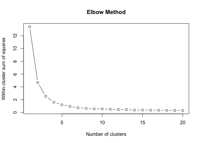
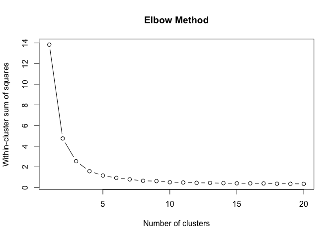
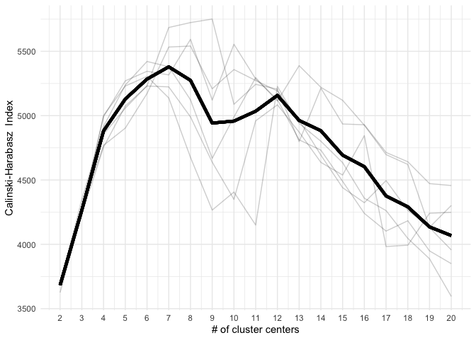
}To find the structural roles in the network, we first run a k-means clustering algorithm to find clusters of airports that have a similar heat propagation signature. We make use of the Calinski-Harabasz index to evaluate the optimal number of clusters.
create_scree_plot <- function(data, k_centers) {
  wcss <- list()
  ch_index <- list()

  # fit the k-means model for different values of the number of clusters
  for (i in 1:k_centers) {
    kmeans_fit <- kmeans(data, centers = i, iter.max = 50)
    wcss[[i]] <- kmeans_fit$tot.withinss

    if (i > 1) {
      ch_index[[i]] <-
        sk$metrics$calinski_harabasz_score(data, kmeans_fit$cluster)
    }
  }

  # plot the WCSS values against the number of clusters
  plot(
    1:k_centers,
    unlist(wcss),
    type = "b",
    main = "Elbow Method",
    xlab = "Number of clusters",
    ylab = "Within-cluster sum of squares"
  )

  return(list(
    wcss = unlist(wcss),
    ch_index = unlist(ch_index)
  ))
}

clustering_index <- list()
for (i in weeks) {
  clustering_index[[i]] <- create_scree_plot(
    embeddings_2019[[i]][, 1:100],
    k_centers = 20)
}
clust <- do.call(rbind, clustering_index)data.frame(
ch_index = do.call(c, clust[, 2]),
n_clust = rep(2:20, n_weeks),
week = foreach(i = weeks, .combine = c) %do% {
rep(i, 19)
}) %>%
group_by(n_clust) %>%
mutate(group_mean = mean(ch_index)) %>%
group_by(week) %>%
ggplot(aes(x = n_clust, group = week)) +
geom_line(aes(y = ch_index), alpha = .2) +
scale_x_continuous(breaks = 2:20) +
geom_line(aes(y = group_mean), lwd = 1.5) +
theme_minimal() +
xlab("# of cluster centers") +
ylab("Calinski-Harabasz Index")Even these 6 consecutive weeks show variability in the optimal number of clusters. To find the optimal number of clusters for this timeperiod we rank each clustering solution based on its ch index score and average each rank score across the weeks.
data.frame(
  ch_index = do.call(c, clust[, 2]),
  n_clust = rep(2:20, n_weeks),
  week = foreach(i = weeks, .combine = c) %do% {
    rep(i, 19)
  }
) %>%
  group_by(week) %>%
  reframe(rank = rank(ch_index),
          ch_index = ch_index,
          n_clust = n_clust) %>%
  group_by(n_clust) %>%
  summarise(rank = mean(rank)) %>%
  arrange(desc(rank))%>%
  slice(1:5)
#> # A tibble: 5 × 2
#>   n_clust  rank
#>     <int> <dbl>
#> 1       6  17
#> 2       7  17
#> 3       8  16
#> 4       5  14.2
#> 5      12  14.2
Next we use the optimal number of clusters we create a model for each week that classifies each airport in the network based on its heat propagation signature. One issue with using multiple baseline models (i.e., one for each week), is that k-means predictions have no inherent sense of ordinality, meaning that for instance the largest airports do not always end it in the cluster with the largest value. To circumvent this problem, we use a heuristic using PCA to reduce our signals to 2 dimensions and fix the axes as such that the largest airport is in the (“LFTM”) is in the top right corner, as such that increase in pca dimension 1 relates to airports with increasing levels of connectivity.
Clusters are then renamed based on their occurrence on the pca dimension 1, as such that the cluster containing the least connective airports get assigned 1, and the cluster with the most connective airports are assigned 6. This approach works for six clusters, as the change in connectivity is nicely captured by PCA dimension 1. Note that with overlapping clusters, a different approach should be tried.
generate_clusters <- function(data, kmeans_model) {
  data$cluster <- predict(kmeans_model, data[, 1:100])
  pca1 <- prcomp(data[, 1:100])$x[, 1]
  pca2 <- prcomp(data[, 1:100])$x[, 2]

  if (pca1[data$name == "LTFM"] < 0) {
    pca1 <- -pca1
  }
  if (pca2[data$name == "LTFM"] < 0) {
    pca2 <- -pca2
  }

  clustering <- data[, 101:102] %>% left_join(
    data.frame(pca1, pca2, data$cluster) %>%
      arrange(pca1) %>% select(data.cluster) %>% unique() %>%
      mutate(clust = unique(1:n())) %>%
      rename(cluster = data.cluster)
  ) %>%
    select(name, clust)

  return(clustering)
}
clust6_kmeans_models <- list()
for (i in weeks) {
clust6_kmeans_models[[i]] <-
kmeans(embeddings_2019[[i]][, 1:100], 6)
}
net2019_clust_list <- list()
net2020_clust_list <- list()
net2021_clust_list <- list()
net2022_clust_list <- list()
for (i in weeks) {
net2019_clust <-
generate_clusters(embeddings_2019[[i]], clust6_kmeans_models[[i]])
net2020_clust <-
generate_clusters(embeddings_2020[[i]], clust6_kmeans_models[[i]])
net2021_clust <-
generate_clusters(embeddings_2021[[i]], clust6_kmeans_models[[i]])
net2022_clust <-
generate_clusters(embeddings_2022[[i]], clust6_kmeans_models[[i]])
net2019_clust$week <- i
net2020_clust$week <- i
net2021_clust$week <- i
net2022_clust$week <- i
net2019_clust$year <- 2019
net2020_clust$year <- 2020
net2021_clust$year <- 2021
net2022_clust$year <- 2022
net2019_clust_list[[i]] <- net2019_clust
net2020_clust_list[[i]] <- net2020_clust
net2021_clust_list[[i]] <- net2021_clust
net2022_clust_list[[i]] <- net2022_clust
}
net2019_clust <- do.call(rbind, net2019_clust_list)
net2020_clust <- do.call(rbind, net2020_clust_list)
net2021_clust <- do.call(rbind, net2021_clust_list)
net2022_clust <- do.call(rbind, net2022_clust_list)To visualize the heat propagation for a given airport in a given week, we need to access the heat signatures that are stored in the graphwave embedding. Each tau given to the algorithm, or two if the default setting is used, has a heat signature related to it.
airports <- fread(here("data", "airports_20221025.csv"))
node.coords <- airports[, c("ident",
                            "latitude_deg",
                            "longitude_deg",
                            "type")]
net <- net2019%>%filter(week == weeks[1])

el <- create_nx_graph(net)
emb <- graphwave$graphwave_alg(
  el,
  seq(0,100,length.out = 25),
  taus = "auto",
  verbose = TRUE)

embedding <- emb[[1]]%>%as.data.frame()
embedding$name <- nodes_to_string(el$nodes)
embedding <- embedding%>%filter(name %in% airports19)

heat_df_lower <- pd$DataFrame(emb[[2]][[1]]$toarray())
heat_df_upper <- pd$DataFrame(emb[[2]][[2]]$toarray())
heat_df <- (heat_df_lower + heat_df_upper)/2
heat_df <- heat_df_upper
heat_df$name <- nodes_to_string(el$nodes)
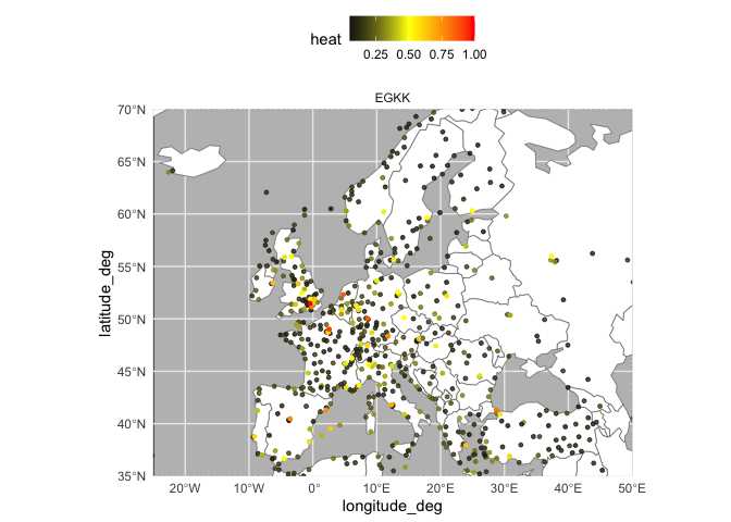
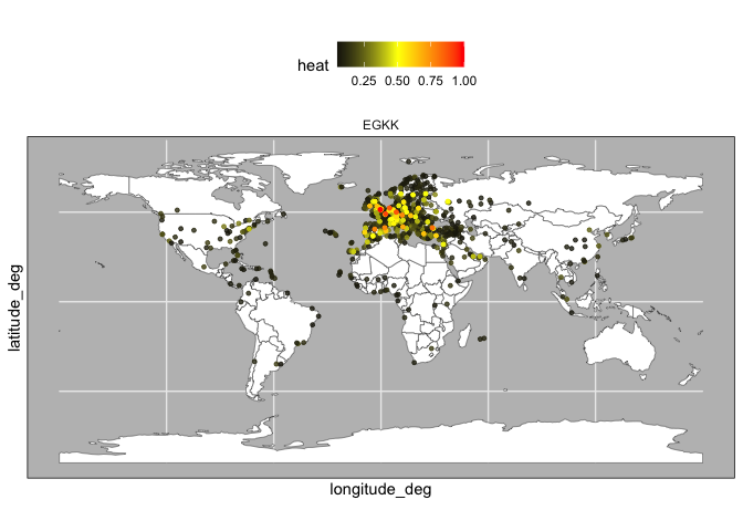
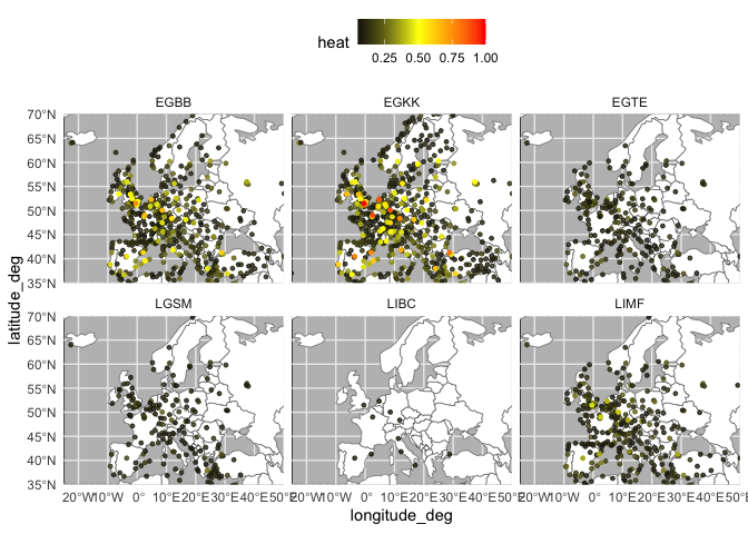
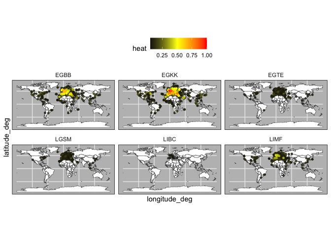
Each row in the data.frame represent the amount of energy that is sent from a given airport to each other airport in the network (which are represented by the columns). The following code allows us to create a plot that shows the heat that is being propagated from a focal airport.
heat_by_airport <- heat_df %>%
  filter(name %in% c("LIBC","LGSM",'EGTE',"LIMF","EGBB","EGKK")) %>%
  reshape2::melt()
heat_by_airport$variable <- heat_by_airport$variable %>%
  as.character() %>%
  as.numeric()

heat_by_airport <- heat_by_airport %>%
  left_join(data.frame(variable = 0:(nrow(heat_df)-1),
                       target = heat_df$name)) %>%
  rename(focal_airport = name)

plot_heat <- function(df,what = "EU"){
  world <- ne_countries(scale = "small", returnclass = "sf")
  data = left_join(node.coords,df,by=c("ident" = "target"))

  p <- ggplot(world) +
    geom_sf(fill = "white") +
    geom_point(aes(y = latitude_deg, x = longitude_deg,col=value),
               data %>%
                 filter(!is.na(value) & value <= .35 & value > .05),
               size=1,alpha = .8) +
    geom_point(aes(y = latitude_deg, x = longitude_deg,col=value),
               data %>%
                 filter(!is.na(value) & value <= .45 & value > .35),
               size=1,alpha = 1) +
    geom_point(aes(y = latitude_deg, x = longitude_deg,col=value),
               data %>%
                 filter(!is.na(value) & value <= .65 & value > .45),
               size=1,alpha = 1) +
    geom_point(aes(y = latitude_deg, x = longitude_deg,col=value),
               data %>%
                 filter(!is.na(value) & value > .65),
               size=1) +
    scale_color_gradient2(
      high="red",
      mid="yellow",
      low = "black",
      midpoint = .5) +
    facet_wrap(~ focal_airport) +
    theme_minimal() +
    labs(color = "heat") +
    theme(panel.background = element_rect(fill = "grey"),
          legend.position = "top")

  if(what == "EU"){
    p + coord_sf(xlim = c(-25,50), ylim = c(35,70), expand = FALSE)
  } else {
    p
  }
}
Specifically, the code normalizes the energy to show which airports have are the most strongly connected (i.e., receive the most energy).
heat_EGKK <- heat_by_airport %>%
  filter(focal_airport == "EGKK") %>%
  mutate(value = (value - min(value)) / (max(value) - min(value))) %>%
  arrange(desc(value))

plot_heat(heat_EGKK,what = "EU")plot_heat(heat_EGKK,what = "world")Note that when we include multiple airports, the normalization now compares the amount heat propagated between the airports.
heat_norm <- heat_by_airport %>%
  mutate(value = (value - min(value)) / (max(value) - min(value))) %>%
  arrange(desc(value))

plot_heat(heat_norm,what = "EU")plot_heat(heat_norm,what = "world")Next, we can use our classified airports to find changes in cluster membership between two years. For this we use a function that calculates the difference of the average cluster membership for the baseline year and the target year.
find_clust_diff <- function(net1, net2, what, type = "sum") {

  net1_full <-
    data.frame(name = sort(rep(net1$name %>% unique(), n_weeks)),
               week = rep(weeks, net1$name %>% unique() %>% length()))
  net2_full <-
    data.frame(name = sort(rep(net2$name %>% unique(), n_weeks)),
               week = rep(weeks, net2$name %>% unique() %>% length()))
  tab_base <- net1_full %>%
    left_join(net1[, c("name", "clust", "week")]) %>%
    replace(is.na(.), 0) %>%
    select(name, clust) %>%
    table()
  tab_new <- net2_full %>%
    left_join(net2[, c("name", "clust", "week")]) %>%
    replace(is.na(.), 0) %>%
    select(name, clust) %>%
    table()
  if (what == "region") {
    res <- tab_base %>%
      as.data.frame() %>%
      rename(Freq1 = Freq) %>%
      full_join(tab_new %>% as.data.frame() %>% rename(Freq2 = Freq)) %>%
      replace(is.na(.), 0) %>%
      mutate(clust = as.numeric(clust) - 1,
             sum1 = clust * Freq1,
             sum2 = clust * Freq2) %>%
      group_by(name) %>%
      summarise(avg_role_base = sum(sum1) / n_weeks,
                avg_role_new = sum(sum2) / n_weeks) %>%
      mutate(diff = avg_role_new - avg_role_base) %>%
      mutate(region = substr(name, 1, 2))
    if (type == "absolute") {
      res <- res %>% group_by(region) %>%
        summarise(diff = sum(abs(diff))) %>% # Find regions with most class mobility
        arrange(desc(diff))
    } else if (type == "mean") {
      res <- res %>% group_by(region) %>%
        summarise(diff = mean(diff))
        arrange(desc(diff))
    } else if (type == "median") {
      res <- res %>% group_by(region) %>%
        summarise(diff = median(diff))
        arrange(desc(diff))
    } else if (type == "sum") {
      res <- res %>% group_by(region) %>%
        summarise(diff = sum(diff)) %>%
        arrange(desc(diff))
    }
  }
  if (what == "airport") {
    res <- tab_base %>% as.data.frame() %>%
      rename(Freq1 = Freq) %>%
      full_join(tab_new %>% as.data.frame() %>% rename(Freq2 = Freq)) %>%
      replace(is.na(.), 0) %>%
      mutate(clust = as.numeric(clust) - 1,
             sum1 = clust * Freq1,
             sum2 = clust * Freq2) %>%
      group_by(name) %>%
      summarise(avg_role_base = sum(sum1) / n_weeks,
                avg_role_new = sum(sum2) / n_weeks) %>%
      mutate(diff = avg_role_new - avg_role_base) %>%
      arrange(desc(diff))
  }
  return(res)
}
airport_diff <- find_clust_diff(
net2019_clust %>% filter(name %in% airports19),
net2022_clust %>% filter(name %in% airports22),
"airport",
type = "sum"
) %>%
arrange(diff)
regional_diff <- find_clust_diff(
net2019_clust %>% filter(name %in% airports19),
net2022_clust %>% filter(name %in% airports22),
"region",
type = "sum"
) %>%
arrange(diff)
head(airport_diff)
#> # A tibble: 6 × 4
#> name avg_role_base avg_role_new diff
#> <fct> <dbl> <dbl> <dbl>
#> 1 UKBB 5 0 -5
#> 2 UKKK 4 0 -4
#> 3 UKLL 3.5 0 -3.5
#> 4 LIRI 3 0 -3
#> 5 UKHH 3 0 -3
#> 6 UKOO 3 0 -3
head(regional_diff)
#> # A tibble: 6 × 2
#> region diff
#> <chr> <dbl>
#> 1 UK -29.8
#> 2 ES -3.33
#> 3 LT -3.17
#> 4 LF -2.17
#> 5 EF -1
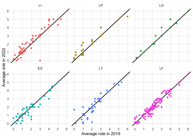
#> 6 UG -0.833We can then use these outputs to compare change in connectivity between two adjacent years. Note that this plot differs from the plot used in our paper, as we are now only focusing on a smaller period of time.
top3_incr <- regional_diff[order(regional_diff$diff,decreasing = TRUE),]$region[1:3]
top3_decr <- regional_diff$region[2:4] #excluding Ukraine

find_clust_diff(net2019_clust%>%filter(name %in% airports19),
                net2022_clust%>%filter(name %in% airports22),
                "airport",type = "sum")%>%
  mutate(name = substr(name,1,2))%>%
  filter(name %in% c(top3_incr,top3_decr))%>%
  mutate(region = factor(name,levels = c("LI","LP","LG",
                                         "ES","LT","LF")))%>%
  ggplot(aes(x=avg_role_base,y=avg_role_new,label=name,color=region))+
  geom_abline(intercept = 0,slope=1,linewidth=.75)+facet_wrap(~region)+geom_point()+
  scale_x_continuous(breaks=0:6,minor_breaks = 0:6)+scale_y_continuous(breaks=0:6,minor_breaks = 0:6)+
  xlab("Average role in 2019")+ylab("Average role in 2022")+theme_minimal()+
  theme(legend.position = "none")
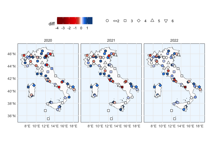
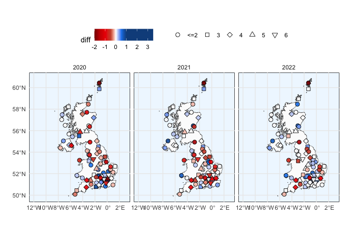
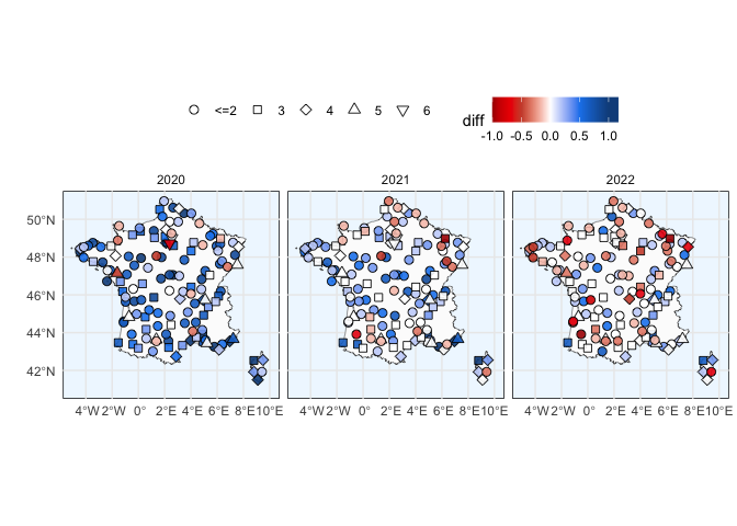
Additionally, we can also use the output to create a regional plot that shows changes in cluster membership for airports in a given region.
airports <- fread(here("data", "airports_20221025.csv"))
node.coords <- airports[, c("ident",
                            "latitude_deg",
                            "longitude_deg",
                            "type")]

data20 <-
  find_clust_diff(
    net2019_clust %>% filter(name %in% airports19),
    net2020_clust %>% filter(name %in% airports20),
    "airport",
  ) %>%
  left_join(node.coords, by = c("name" = "ident"))
data21 <-
  find_clust_diff(
    net2019_clust %>% filter(name %in% airports19),
    net2021_clust %>% filter(name %in% airports21),
    "airport"
  ) %>%
  left_join(node.coords, by = c("name" = "ident"))
data22 <-
  find_clust_diff(
    net2019_clust %>% filter(name %in% airports19),
    net2022_clust %>% filter(name %in% airports22),
    "airport"
  ) %>%
  left_join(node.coords, by = c("name" = "ident"))
data_full <- rbind(cbind(data20, year = 2020),
                   cbind(data21, year = 2021),
                   cbind(data22, year = 2022))

plot_region <- function(region, country_name, data, years = 2020:2022) {
  colour_breaks <- c(-3, -2,-1,-.5, 0, .5, 1)

  colours <-
    c("red4",
      "red3",
      "red2",
      "tomato3",
      "white",
      "dodgerblue2",
      "dodgerblue4")

  ggplot(ne_countries(
    country = country_name,
    returnclass = "sf",
    scale = "large"
  )) +
    geom_sf(fill = "grey99") +
    geom_jitter(
      aes(
        y = latitude_deg,
        x = longitude_deg,
        fill = diff,
        shape = factor(ifelse(
          round(avg_role_base) <= 2,
          "<=2", as.character(round(avg_role_base))
        ))
      ),
      data %>% filter(substr(name, 1, 2) == region) %>% filter(year %in% years),
      size = 2.5,
      alpha = .9
    ) +
    scale_shape_manual(values = c(21, 22, 23, 24, 25)) +
    scale_fill_gradientn(
      limits  = range(data[substr(data$name, 1, 2) == region, ]$diff),
      colours = colours[c(1, seq_along(colours), length(colours))],
      values  = c(0, scales::rescale(colour_breaks,
                                     from = range(data[substr(data$name, 1, 2) == region, ]$diff)), 1),
    ) +
    theme_minimal() +
    theme(panel.background = element_rect(fill = "aliceblue")) +
    labs(shape = "") +
    facet_wrap( ~ year)
}plot_region("LI", "Italy", data_full) + theme(legend.position = "top") +
ylab("") + xlab("")plot_region("EG", "United Kingdom", data_full) + theme(legend.position = "top") +
ylab("") + xlab("") + coord_sf(xlim = c(-12, 3))plot_region("LF", "France", data_full) + theme(legend.position = "top") +
ylab("") + xlab("") + coord_sf(xlim = c(-5, 10),ylim = c(41,51))To study cluster performance we first need to compute the individual coverage of the N-Hop neighborhood of each airport for each week in our baseline and target years.
neighborhod_indices_airport <-
  function(nodes, net, full, full_ms, hop = 1) {
    create_subgraph <- function(el, nodes, hop) {
      subset_el <- function(el, nodes) {
        sub_el <- el %>% filter(from %in% nodes |
                                  to %in% nodes)
        rest <- el %>% filter(!from %in% nodes &
                                !to %in% nodes)
        return(list(sub_el,
                    rest))
      }
      if (sum(names(el) %in% "n") > 0) {
        el <- el %>% rename(weight = n)
      }
      if (sum(names(el) %in% "origin") > 0) {
        el <- el %>% rename(from = origin,
                            to = destination)
      }
      net <- el
      if (hop >= 1) {
        hop_1 <- subset_el(net, nodes)
      }
      if (hop >= 2) {
        hop_1_nodes <- c(hop_1[[1]]$to, hop_1[[1]]$from) %>% unique()
        hop_1_nodes <-
          hop_1_nodes[!hop_1_nodes %in% c("ZZZZ", "AFIL")]
        hop_2 <- subset_el(hop_1[[2]], hop_1_nodes)
      }
      if (hop == 3) {
        hop_2_nodes <- c(hop_2[[1]]$to, hop_2[[1]]$from) %>% unique()
        hop_2_nodes <-
          hop_2_nodes[!hop_2_nodes %in% c("ZZZZ", "AFIL")]
        hop_3 <- subset_el(hop_2[[2]], hop_2_nodes)
      }
      if (hop == 1) {
        return(hop_1[[1]])
      } else if (hop == 2) {
        return(rbind(hop_1[[1]], hop_2[[1]]))
      } else {
        return(rbind(hop_1[[1]], hop_2[[1]], hop_3[[1]]))
      }
    }
    if (sum(names(net) %in% "n") > 0) {
      net <- net %>% rename(weight = n)
    }
    if (sum(names(net) %in% "origin") > 0) {
      net <- net %>% rename(from = origin,
                            to = destination)
    }

    # "Scheduled" is no longer used from 2019 onward. Data contained handfull of instances of Scheduled
    net <- net %>% filter(market_segment != "Scheduled")
    nb <- create_subgraph(net, nodes, hop)
    sub <- nb %>% group_by(week) %>%
      summarise(
        v = c(from, to) %>% unique() %>% length(),
        e = paste(from, to) %>% unique() %>% length(),
        w = sum(weight),
        avg_weights = round(w / e, 2)
      )
    sub <- left_join(sub, full)
    sub <- sub %>%
      mutate(
        perc_edges = round(e / e_full, 4),
        perc_vertices = round(v / v_full, 4),
        perc_weights = round(w / w_full, 4)
      ) %>%
      select(week,
             v,
             e,
             w,
             avg_weights,
             perc_edges,
             perc_vertices,
             perc_weights)
    sub$market_segment <- "All-flights"
    sub_ms <- nb %>% group_by(week, market_segment) %>%
      summarise(
        v = c(from, to) %>% unique() %>% length(),
        e = paste(from, to) %>% unique() %>% length(),
        w = sum(weight),
        avg_weights = round(w / e, 2)
      )
    sub_ms <-
      left_join(sub_ms, full_ms, by = c("week", "market_segment"))
    sub_ms <- sub_ms %>%
      mutate(
        perc_edges = round(e / e_full, 4),
        perc_vertices = round(v / v_full, 4),
        perc_weights = round(w / w_full, 4)
      ) %>%
      select(week,
             market_segment,
             v,
             e,
             w,
             avg_weights,
             perc_edges,
             perc_vertices,
             perc_weights)
    result <- rbind(sub, sub_ms)
    result$name = nodes
    return(result)
  }

full <- net2019 %>%
  rename(from = origin,
         to = destination) %>%
  group_by(week) %>%
  summarise(
    v_full = c(from, to) %>% unique() %>% length(),
    e_full = paste(from, to) %>% unique() %>% length(),
    w_full = sum(weight)
  )
full_ms <- net2019 %>%
  rename(from = origin,
         to = destination) %>% group_by(week, market_segment) %>%
  summarise(
    v_full = c(from, to) %>% unique() %>% length(),
    e_full = paste(from, to) %>% unique() %>% length(),
    w_full = sum(weight)
  )

rbind(
  neighborhod_indices_airport("EHAM", net2019, full, full_ms, hop = 1)%>%mutate(hop=1),
  neighborhod_indices_airport("EHAM", net2019, full, full_ms, hop = 2)%>%mutate(hop=2),
  neighborhod_indices_airport("EHAM", net2019, full, full_ms, hop = 3)%>%mutate(hop=3))
#> # A tibble: 162 × 11
#>     week     v     e     w avg_weights perc_edges perc_vertices perc_weights
#>    <int> <int> <int> <int>       <dbl>      <dbl>         <dbl>        <dbl>
#>  1    26   364   649 10408       16.0      0.0172         0.185       0.0433
#>  2    27   361   648 10436       16.1      0.0175         0.185       0.0435
#>  3    28   374   660 10476       15.9      0.0178         0.190       0.0437
#>  4    29   360   645 10483       16.2      0.0176         0.184       0.044
#>  5    30   342   617  9946       16.1      0.0169         0.177       0.0421
#>  6    31   344   624 10385       16.6      0.0174         0.176       0.044
#>  7    26   128   171   290        1.7      0.0147         0.112       0.0162
#>  8    26    54    74   264        3.57     0.0381         0.129       0.0368
#>  9    26   152   281  2507        8.92     0.0218         0.274       0.0319
#> 10    26   157   299  4635       15.5      0.0351         0.230       0.0557
#> # ℹ 152 more rows
#> # ℹ 3 more variables: market_segment <chr>, name <chr>, hop <dbl>
This is a computationally intensive process, as for instance the 2019 network contains 870 airports of interest. For the sake of brevity, we include a pre-computed dataset for each of the weeks including in this sample which we join together with the airport classifications.
net2019_nb_airport <- fread(here("data", "sample_2019_nb.csv")) %>%
  left_join(net2019_clust) %>%
  filter(!is.na(clust))
net2020_nb_airport <- fread(here("data", "sample_2020_nb.csv")) %>%
  left_join(net2020_clust) %>%
  filter(!is.na(clust))
net2021_nb_airport <- fread(here("data", "sample_2021_nb.csv")) %>%
  left_join(net2021_clust) %>%
  filter(!is.na(clust))
net2022_nb_airport <- fread(here("data", "sample_2022_nb.csv")) %>%
  left_join(net2022_clust) %>%
  filter(!is.na(clust))
The basis for the analysis is the partially overlapping samples t-test. This test allows us to specify which cases of the samples that we want to compare exist in both samples (i.e., an airport that was in cluster 6 that is still in cluster 6) and which cases do not exist in both samples (i.e., an airport that was in cluster 6 that dropped to cluster 5 or vice versa).
compare_overlapped_distributions <- function(base, new, outcome) {
  sample1 <- new %>% mutate(name = paste(name, week))
  sample2 <- base %>% mutate(name = paste(name, week))
  unpaired.s1 <- sample1 %>% filter(!name %in% sample2$name)
  unpaired.s2 <- sample2 %>% filter(!name %in% sample1$name)
  paired.s1 <- sample1 %>% filter(name %in% sample2$name)
  paired.s2 <- sample2 %>% filter(name %in% sample1$name)

  res <-
    Partover.test(
      x1 = unpaired.s1 %>% select(all_of(outcome)) %>% unlist(),
      x2 = unpaired.s2 %>% select(all_of(outcome)) %>% unlist(),
      x3 = paired.s1 %>% select(all_of(outcome)) %>% unlist(),
      x4 = paired.s2 %>% select(all_of(outcome)) %>% unlist(),
      conf.level = .95
    )

  return(
    data.frame(
      mean_new = sample1 %>% select(all_of(outcome)) %>% unlist() %>% mean(),
      mean_base = sample2 %>% select(all_of(outcome)) %>% unlist() %>%
        mean(),
      estimate = res$estimate,
      statistic = res$statistic,
      df = res$parameter,
      p.value = res$p.value,
      conf.ll = res$conf.int[1],
      conf.ul = res$conf.int[2]
    )
  )

}
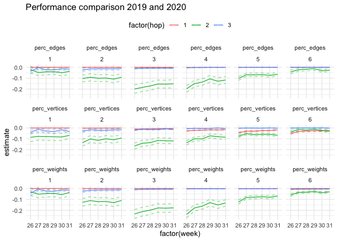
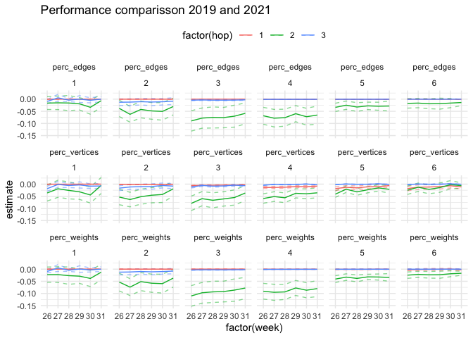
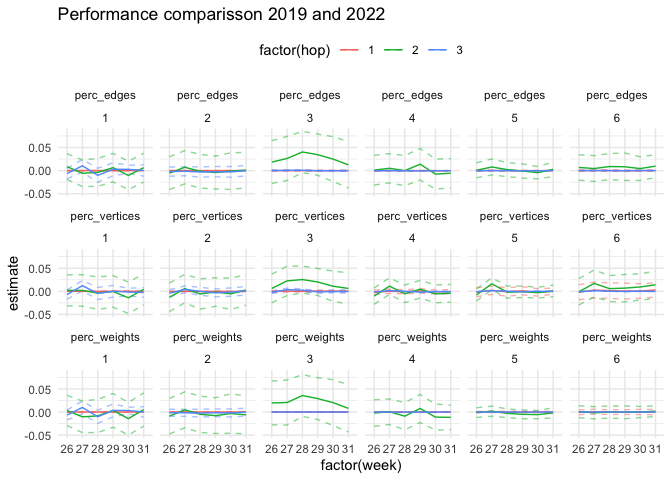
The following code applies the test to each combination of cluster, hop, and week. Note that in the paper we look at a monthly level, rather than a weekly level.
create_ttest_table <- function(base, new, outcome, weeks) {
  if (outcome %>% length() > 1) {
    tab <- foreach(out = outcome, .combine = rbind) %do% {
      tab1 <- foreach(h = 1:3, .combine = rbind) %:%
        foreach(ci = 1:max(base$clust), .combine = rbind) %:%
        foreach(i = weeks, .combine = rbind) %do% {
          res <- compare_overlapped_distributions(
            base %>% filter(clust %in% ci & hop == h & week == i),
            new %>% filter(clust %in% ci & hop == h & week == i),
            out
          )
          res <- cbind(
            week = i,
            cluster = ci,
            hop = h,
            round(res, 4)
          )
          res
        }
      cbind(outcome = out, tab1)

    }
  } else {
    tab <- foreach(h = 1:3, .combine = rbind) %:%
      foreach(ci = 1:max(base$clust), .combine = rbind) %:%
      foreach(i = weeks, .combine = rbind) %do% {
        res <- compare_overlapped_distributions(
          base %>% filter(clust %in% ci & hop == h & week == i),
          new %>% filter(clust %in% ci & hop == h & week == i),
          outcome
        )
        res <- cbind(week = i,
                     cluster = ci,
                     hop = h,
                     round(res, 4))
        res

      }

  }

  return(tab)

}

ttest_19_20 <- create_ttest_table(
  net2019_nb_airport %>%
    filter(name %in% airports19 &
             market_segment == "All-flights"),
  net2020_nb_airport %>%
    filter(name %in% airports20 &
             market_segment == "All-flights"),
  c("perc_vertices", "perc_edges", "perc_weights"),
  weeks
)

ttest_19_21 <- create_ttest_table(
  net2019_nb_airport %>%
    filter(name %in% airports19 &
             market_segment == "All-flights"),
  net2021_nb_airport %>%
    filter(name %in% airports21 &
             market_segment == "All-flights"),
  c("perc_vertices", "perc_edges", "perc_weights"),
  weeks
)
ttest_19_22 <- create_ttest_table(
  net2019_nb_airport %>%
    filter(name %in% airports19 &
             market_segment == "All-flights"),
  net2022_nb_airport %>%
    filter(name %in% airports22 &
             market_segment == "All-flights"),
  c("perc_vertices", "perc_edges", "perc_weights"),
  weeks
)
ttest_19_20 %>%
ggplot(aes(
x = factor(week),
y = estimate,
group = hop,
color = factor(hop)
)) +
geom_line(
aes(
x = factor(week),
y = conf.ul,
group = hop,
color = factor(hop)
),
alpha = .5,
linetype = "dashed"
) +
geom_line(
aes(
x = factor(week),
y = conf.ll,
group = hop,
color = factor(hop)
),
alpha = .5,
linetype = "dashed"
) +
geom_line() +
facet_wrap( ~ outcome + cluster, ncol = 6) +
theme_minimal() + theme(legend.position = "top")+
labs(title = "Performance comparison 2019 and 2020")ttest_19_21 %>%
ggplot(aes(
x = factor(week),
y = estimate,
group = hop,
color = factor(hop)
)) +
geom_line(
aes(
x = factor(week),
y = conf.ul,
group = hop,
color = factor(hop)
),
alpha = .5,
linetype = "dashed"
) +
geom_line(
aes(
x = factor(week),
y = conf.ll,
group = hop,
color = factor(hop)
),
alpha = .5,
linetype = "dashed"
) +
geom_line() +
facet_wrap( ~ outcome + cluster, ncol = 6) +
theme_minimal() + theme(legend.position = "top")+
labs(title = "Performance comparisson 2019 and 2021")ttest_19_22 %>%
ggplot(aes(
x = factor(week),
y = estimate,
group = hop,
color = factor(hop)
)) +
geom_line(
aes(
x = factor(week),
y = conf.ul,
group = hop,
color = factor(hop)
),
alpha = .5,
linetype = "dashed"
) +
geom_line(
aes(
x = factor(week),
y = conf.ll,
group = hop,
color = factor(hop)
),
alpha = .5,
linetype = "dashed"
) +
geom_line() +
facet_wrap( ~ outcome + cluster, ncol = 6) +
theme_minimal() + theme(legend.position = "top")+
labs(title = "Performance comparisson 2019 and 2022")Donnat, Claire, Marinka Zitnik, David Hallac, and Jure Leskovec. 2018. “Learning Structural Node Embeddings via Diffusion Wavelets.” In International ACM Conference on Knowledge Discovery and Data Mining (KDD). Vol. 24.
Vossen, Juul, Enrico Spinielli, Quinten Goens, and Rainer Koelle. 2023. “Studying the Impact of COVID-19 on the European Air Transportation Network.” In 2023 Integrated Communication, Navigation and Surveillance Conference (ICNS), 1–12. Herndon, VA, USA. https://doi.org/10.1109/ICNS58246.2023.10124296.
