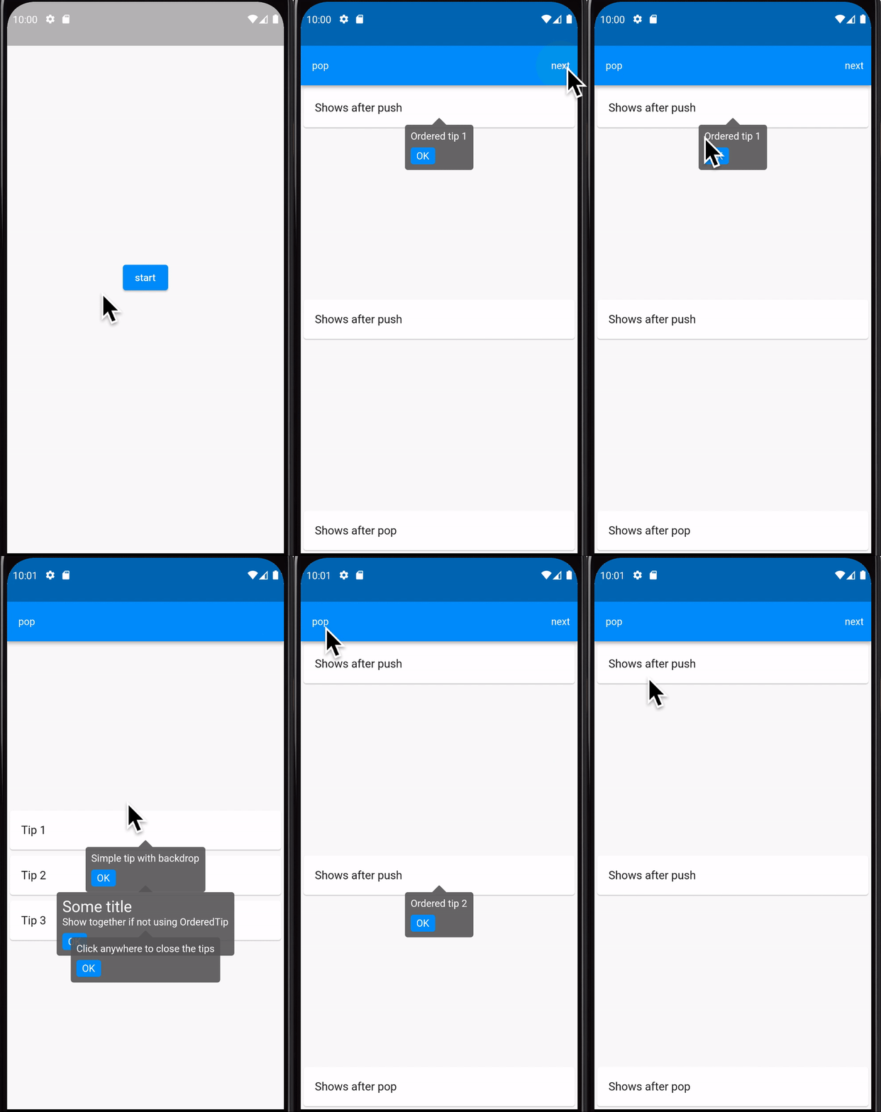
Simple Tip
A widget for showing tips to it's child that automatically setup position.
This package is separated from my project POS-System.
How to use
All in one screen
Wrap your widget with SimpleTip, and give some tips!
Widget build(context) {
  return SimpleTip(
    message: 'This is my tip!',
    child: Text('Hello world'),
  );
}
In order
Wrap your widget with OrderedTip and give grouper and id for each tip.
Widget build(context) {
  final grouper = GlobalKey<TipGrouperState>();
  final observer = RouteObserver<ModalRoute<void>>();

  return TipGrouper(
    key: grouper,
    id: 'group',
    candidateLength: 2,
    routeObserver: observer,
    child: Scaffold(
      body: Column(children: [
        OrderedTip(
          order: 1,
          version: 1,
          id: 't-1',
          message: 'Tip content 1',
          grouper: grouper,
          child: const Card(
            child: const Text('First tip'),
          ),
        ),
        OrderedTip(
          order: 2,
          version: 1,
          id: 't-2',
          message: 'Tip content 2',
          grouper: grouper,
          child: const Text('Second tip'),
        ),
      ]),
    ),
  );
}
You SHOULD setup
defaultStateManager, otherwise it only works in-memory. Which means when you restart your app, tips will show up again!
Configuration
Two main widget you can use, SimpleTip and OrderedTip.
You can follow Dart provided API document
SimpleTip
-
title,String?,null- The title to display in the tip.
-
message,String?,null- The message to display in the tip. MUST set if
contentnot set. - This value will also use for semantics.
- The message to display in the tip. MUST set if
-
content,Widget?,null- Content of the tip.
- This will "win" when
messageandcontentboth set. - Example:
final content = Text('hi');-
boxConstraints,BoxConstraints?,BoxConstraints(minHeight: 24.0)- Tip's content constraints
-
decoration,Decoration?, see below- Tip's container decoration
- Default:
ShapeDecoration(
  color: (isDark ? Colors.white : Colors.grey[700]!).withOpacity(0.9),
  shape: TipShapeBorder(arrowArc: 0.1, target: target),
)textStyle,TextStyle?, see below- Tip's text default style
- Default:
Theme.of(context).textTheme.bodyText1!.copyWith(
  color: isDark ? Colors.black : Colors.white,
)onClosed,VoidCallback?,null- A callback after the start of closing tip.
- This will be needed if you handle tip by filesystem, eg: SharedPreferences, hive
- Example:
final isDisabled = instance.read('myTip') == 1;
final onClosed = () {
  instance.write('myTip', 1);
}-
padding,EdgeInsets,EdgeInsets.all(8.0)- The amount of space by which to inset the tip's content.
-
margin,EdgeInsets,EdgeInsets.symmetric(horizontal: 16.0)- The empty space that surrounds the tip.
- Defines the tip's outer
Container.margin. By default, a long tip will span the width of its window. If long enough, a tip might also span the window's height. This property allows one to define how much space the tip must be inset from the edges of their display window.
-
verticalOffset,double,24.0- The vertical gap between the widget and the displayed tip.
- When
preferBelowis set to true and tips have sufficient space to display themselves, this property defines how much vertical space tips will position themselves under their corresponding widgets. Otherwise, tips will position themselves above their corresponding widgets with the given offset.
-
closerText,String,OK- Text of button to close tip.
-
waitDuration,Duration,Duration.zero- The length of time that a tip will wait for showing.
- Defaults to 0 milliseconds (tips are shown immediately after created).
-
excludeFromSemantics,bool,false- Whether the tip's
SimpleTip.messageshould be excluded from the semantics tree. - A tip will add a
Semanticslabel that is set toSimpleTip.message. Set this property to true if the app is going to provide its own custom semantics label.
- Whether the tip's
-
isDisabled,bool,false- Disable tip.
- Wrap
SimpleTipwithStatefulWidgetand dynamically set this value.
-
withBackdrop,bool,false- Whether use backdrop
-
preferBelow,bool,true- Whether the tips defaults to being displayed below the widget.
- Defaults to true. If there is insufficient space to display the tip in the preferred direction, the tip will be displayed in the opposite direction.
-
child,Widget, required- The widget below this widget in the tree.
OrderedTip
IMPORTANT you should set up TipGrouper static property
defaultStateManagerto "remember" that user had read this tip.
-
id,String, required- ID of this tip.
- It should be unique in the same group
-
grouper,GlobalKey<TipGrouperState>, required- State of grouper that contains many [OrderedTip]
- If one screen have multiple groups, it should show many tips in one screen.
-
version,int,0- The version it should be.
SimpleTip.isDisabledwill befalseif version is not equal to given version fromstatic getVersion.- Implement detail:
if (TipOrdered.getVersion(groupId, id) != version) {
  enabledTip = id;
  break; // break the loop
}order,int,0- The order to show the tip, lower order higher priority.
- Implement:
tipList.sort((a, b) => a.order.compareTo(b.order))title,String?, same asSimpleTip.titlemessage,String?, same asSimpleTip.messagecontent,Widget?, same asSimpleTip.content
State Manager
There are two method you need to override:
shouldShow,int Function(String groupId, TipItem item), see below- Get
OrderedTip.versionfrom your filesystem, eg: SharedPreferences, hive - Default using in-memory data to get version:
- Get
bool shouldShow(String groupId, TipItem item) {
  final lastVersion = _records['$groupId.${item.id}'];
  return lastVersion == null ? true : lastVersion < item.version;
}tipRead,Future<void> Function(String groupId, TipItem item), see below- Set
OrderedTip.versionafter user manually close it - Default using in-memory data to record version:
- Set
Future<void> tipRead(String groupId, TipItem item) async {
  _records['$groupId.${item.id}'] = item.version;
}
Example of using shared_preferences:
void initialize() async {
  final service = await SharedPreferences.getInstance();
  OrderedTip.stateManager = PrefStateManager(service);
}

class PrefStateManager extends StateManager {
  final SharedPreferences pref;

  const PrefStateManager(this.pref);

  @override
  bool shouldShow(String groupId, TipItem item) {
    final lastVersion = pref.getInt('$groupId.${item.id}');
    return lastVersion == null ? true : lastVersion < item.version;
  }

  @override
  Future<void> tipRead(String groupId, TipItem item) {
    return pref.setInt('$groupId.${item.id}', item.version);
  }
}
Example of using Hive
void initialize() async {
  final box = Hive.box('myBox');
  OrderedTip.stateManager = HiveStateManager(box);
}

class HiveStateManager extends StateManager {
  final Box box;

  const HiveStateManager(this.box);

  @override
  bool shouldShow(String groupId, TipItem item) {
    final lastVersion = box.get('$groupId.${item.id}');
    return lastVersion == null ? true : lastVersion < item.version;
  }

  @override
  Future<void> tipRead(String groupId, TipItem item) {
    return box.put('$groupId.${item.id}', version);
  }
}
How it works
Main idea is inspired from Tooltip, which using overlayState.insert to show tips.
SimpleTip build tips and backdrop on the Overlay, and detect click on backdrop to close it. Multiple tips should build single backdrop and close all tips once it been clicked.
You can also close it by
- User tap
closeButton disposeordeactivatehas been fired
LICENSE
See in LICENSE

