Visualizing Tweets on a map. Built on Dash by Plotly.
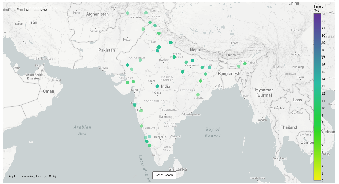
The frontend denotes tweets per day, colour coded by the time of tweet.
The backend / pre-processing for this is available on kaustubhhiware/Savitr
pip install -r requirements.txt
gunicorn app:server
-
A search bar at the top of the page. Whenever a term is entered into the search bar, the map refreshes and shows tweets pertaining to that query term. It also supports multiple search queries like "Dengue, Malaria".
-
The tweets on the map are color coded according to the time of the day. Tweets posted in the night are darker.
-
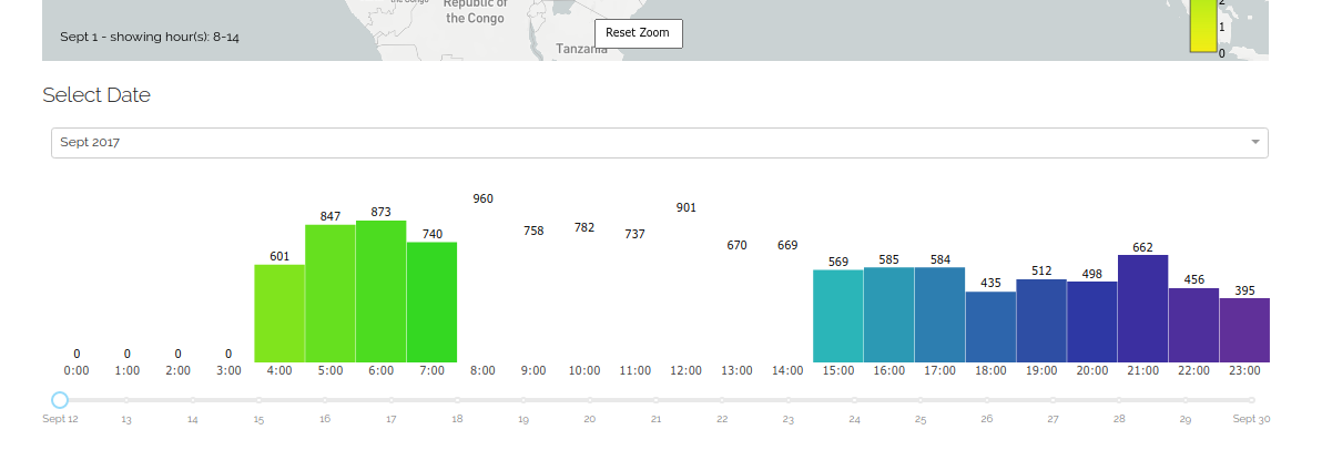
A date-picker – if one wishes to visualize tweets posted during a particular time duration, this provides fine grained date selection, both at the month and date level.
-
A Histogram – this shows the number of relevant (tagged) tweets posted per day.
-
Untagged tweets – Finally, at the bottom of the page we display the tweets for which location could not be inferred (and hence they could not be shown on the map).
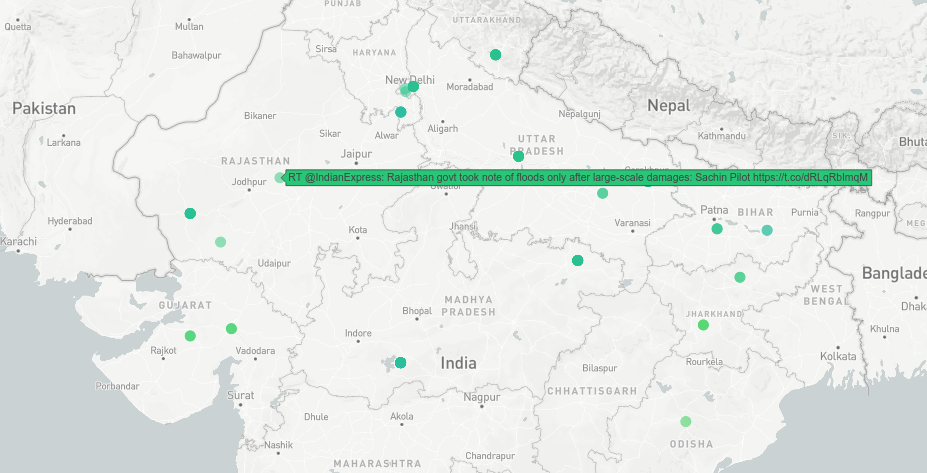
Hovering over any point reveals the tweet text.
Using the bar chart underneath, it is possible to restrict the view only to a certain hours.
For tweets in which the location could not be detected, all untagged tweets are displayed in a tabular form.
The MIT License (MIT) 2018 - Avijit Ghosh. Have a look at the LICENSE for more details.


