This is a simple lovelace card to display a multiline text input field bound on an input_text or var entity.
However, snarky-snark's var component is recommended to use since Home Assistant's input_text is limited to a maximum of only 255 characters. At this point I will not forget to mention that this great component is capable of so much more - have a look at it!
Plus, I borrowed some code and inspiration from benct's awesome Xiaomi Vacuum Card - many thanks for that one, Ben!
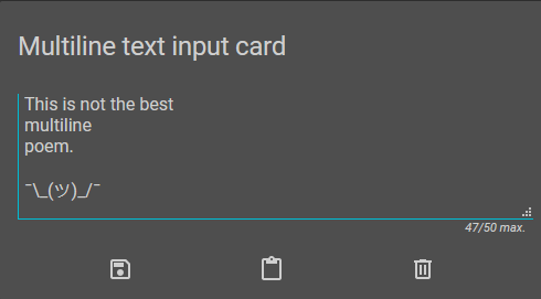
Default appearance with save, paste and clear buttons, and a max_length of 50.
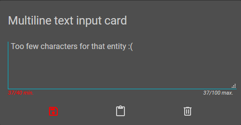
Appearance of the min_length behaviour. The save button is highlighted and disabled (as is the autosave function).
Download lovelace-multiline-text-input-card.js
to /www/lovelace-multiline-text-input-card/ folder and add the following lines to the resources section in your ui-lovelace.yaml file:
resources:
  - url: /local/lovelace-multiline-text-input-card/lovelace-multiline-text-input-card.js
    type: module
OR install using HACS and add this instead:
resources:
  - url: /hacsfiles/lovelace-multiline-text-input-card/lovelace-multiline-text-input-card.js
type: module| Name | Type | Default | Description |
|---|---|---|---|
| type | string | Required | custom:lovelace-multiline-text-input-card |
| entity | string | Required | An input_text or var entity |
| autosave | bool | false |
Save text automatically one second after input |
| min_length | int | 0 |
The minimum text length allowed to be saved to the entity (*) |
| max_length | int/bool | false |
The maximum text length to be allowed (*) |
| placeholder_text | string | Placeholder text to be displayed when empty | |
| save_on_clear | bool | false |
Save empty text after pressing the clear button (no effect along with min_length) |
| show_success_messages | bool | true |
Display message whether backend calls (e.g. saving) were successful or not |
| title | string | friendly_name | The card title (if undefined, falls back to the entity's friendly_name attribute) |
| buttons | object/bool | (see below) | Set to false to hide button row |
| icons | object | (see below) | Set custom button icons (same keys as buttons object) |
(*) Note: If necessary, the entity's min/max length attributes will be taken into account and overwrite the config.
| Name | Type | Default | Description |
|---|---|---|---|
| save | int/bool | 1 |
Show or hide save button |
| paste | int/bool | 2 |
Show or hide clipboard paste button (*) |
| clear | int/bool | 3 |
Show or hide clear button |
You can now arrange buttons by giving them indices, beginning from the left. True/false still works as a value, keeping the default arrangement save / paste / clear.
(*) Note: Clipboard paste does not work in all browsers!
| Name | Type | Default | Description |
|---|---|---|---|
| save | string | mdi:content-save-outline |
Save button icon |
| paste | string | mdi:content-paste |
Paste button icon |
| clear | string | mdi:trash-can-outline |
Clear button icon |
Don't forget to add your input_text or var entity in your configuration.yaml! ;)
- type: custom:lovelace-multiline-text-input-card
  entity: input_text.input_text_entity
With the simplest configuration applied, min_length and max_length solely depend on the entity. Default appearance with three buttons for save, paste and clear and their respective icons. The card title will be the entity's friendly_name attribute. Autosave is turned off, as is the save-on-clear.
- type: custom:lovelace-multiline-text-input-card
  autosave: true
  entity: input_text.input_text_entity
  max_length: 50
  min_length: 10
  placeholder_text: 'Text entered here is going to be saved automatically when between 10 and 50 characters length.'
  show_success_messages: false
  title: Multiline text input card
  buttons:
    clear: 1
    paste: 2
    save: false
  icons:
    clear: mdi:other-icon
In this example, the min_length and max_length behaviour of the entity will be overwritten, if possible. That means, the allowed text length range can be narrowed down, but of course not increased. The card title is set manually and the save button will not be shown in favour of the enabled autosave function. The clear button will appear on the left with the paste button on the right. Last but not least, the icon of the clear button will be changed.


