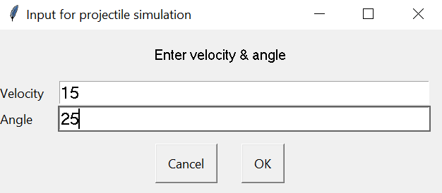
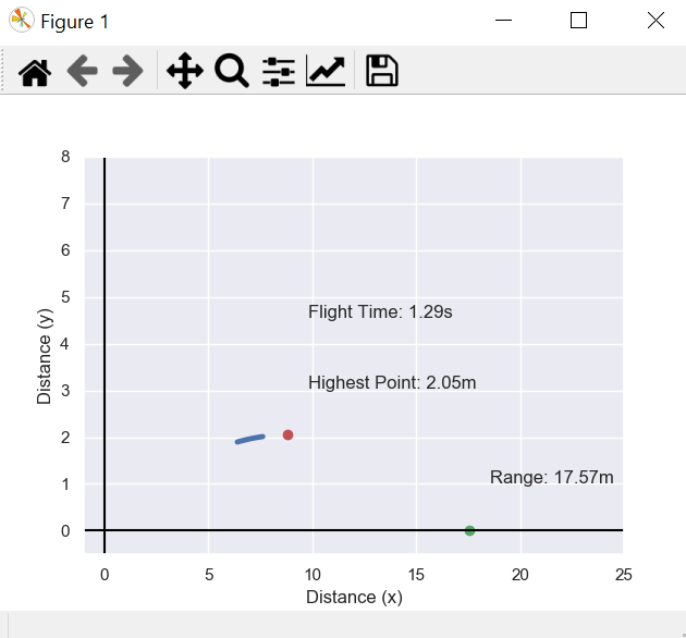
Enter the initial velocity and launch angle & click OK to start the matplotlib animation.
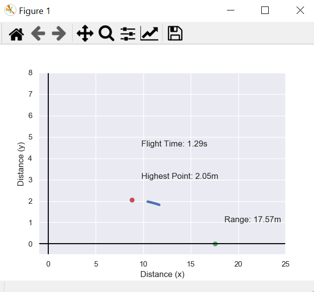
The curved line will go through the projectile's trajectory. The red dot represents the highest point of the trajectory & the green one shows the horizontal distance or the range of the projectile. It also shows the output value of both including the value of total flight time.
from IPython.display import HTML
HTML(ani.to_html5_video())
or
from IPython.display import HTML
HTML(ani.to_jshtml())We will be taking two input by using easygui.multenterbox.
fieldNames = ["Velocity","Angle"]
fieldValues = []
fieldValues = easygui.multenterbox(msg,title, fieldNames)
If we don't get exact two values for the formulae, easygui will ask again to enter the values.
while 1:
    if fieldValues == None: break
    errmsg = ""
    for i in range(len(fieldNames)):
        if fieldValues[i].strip() == "":
            errmsg = errmsg + ('"%s" is a required field.\n\n' % fieldNames[i])
    if errmsg == "": break # no problems found
    fieldValues = easygui.multenterbox(errmsg, title, fieldNames, fieldValues)
print ("Reply was:", fieldValues)g = 9.81
v = float(fieldValues[0])
theta = float(fieldValues[1]) * np.pi / 180.0
t = 2 * v * np.sin(theta) / g
r_for_h= v*np.cos(theta)*(t/2)
h=((v**2) *(np.sin(theta)**2))/(2*g)
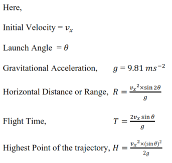
r= (v**2) * np.sin(2*theta) / gHere, 'h' refers to the highest point, 'v' is the initial horizontal velocity, 'g' is the gravitational acceleration, 'theta' is the launching angle, r is the horizontal range. 'v' and 'theta' are going to get their values from fieldValues[0] and fieldValues[1] respectively.
Used the formulae for the other variables and derived 'r_for_h' which is the horizontal distance when the vertical distance is the highest.
sns.set()
fig, ax = plt.subplots()
sns.set() is for setting up the aesthetic parameters in one step.plt.subplots() is a function that returns a tuple containing a figure and axes object(s). Thus when using fig, ax = plt.subplots() you unpack this tuple into the variables fig and ax.
time_text="Flight Time: "+str(round(t,2))+'s'
h_point="Highest Point: "+str(round(h,2))+'m'
range_projectile="Range: "+str(round(r,2))+'m'
plt.plot(r,0,'go')
plt.plot(r_for_h,h,'ro')
plt.text(r_for_h+1, h+1, h_point)
plt.text(r+1, 1, range_projectile)
plt.text(r_for_h+1, h+2.5, time_text)
From the code shown above, we can se 'time_text', 'h_point', 'range_projectile' variables to so the Flight time, Highest Point, Range of the projectile respectively. Then, we plotted the points and the texts on the graph using plt.plot and plt.text.
t = np.arange(0, 0.1, 0.01)
x = np.arange(0, 0.1, 0.01)
line, = ax.plot(x, v * np.sin(theta) * x - (0.5) * g * x**2)

def animate(i):

    line.set_linestyle("-")
    line.set_linewidth(3.5)
    line.set_xdata(v * np.cos(theta) * (t + i /100.0))
    line.set_ydata(v * np.sin(theta) * (x + i /100.0) - (0.5) * g * (x + i / 100.0)**2)
    return line,
The newly created variable 'x' is a numpy array that will be used in the 'line,' to plot x and y in time. The other new variable 't' is used for line.set_xdata and line.set_ydata. Here, I used a comma after the line variable because ax.plot() returns a tuple which contains only one element. If you assign it without the comma, you just assign the tuple.
plt.axhline(0, color='black')
plt.axvline(0, color='black')
plt.xlabel('Distance (x)')
plt.ylabel('Distance (y)')
plt.axis([-1.0, 25.0, -0.5, 8.0])
ax.set_autoscale_on(False)

ani = animation.FuncAnimation(fig, animate,np.arange(1, 200),interval=20)
plt.show()
To create to x-axis and y-axis "plt.axhline(0, color='black')" and "plt.axvline(0, color='black')" are used. I labelled the axis as Distance (x) and Distance (y). After that, set the graph size from -1 to 25 in the x-axis and -0.5 to 8 in the y-axis. Here, in the 'frames' parameter I used an array to create a loop of the simulation. The 'interval' parameter is for the speed of the simulation or visualization of the projectile.


