Course taken from Udemy on Advanced css and Sass. Works related to it are tracked here.
- transition - easy way to do it. Put transition always in the initial state.
- @keyframes - writing a function to do. more advanced.
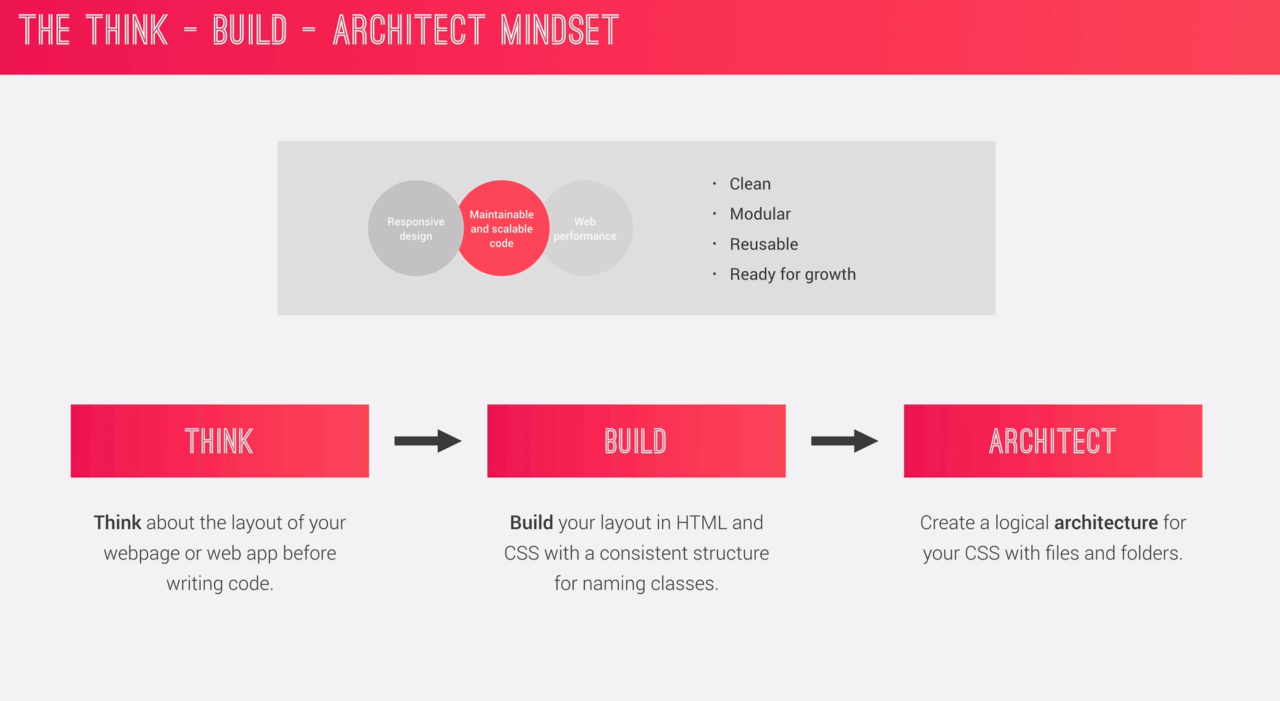
- Responsive Design
- Wiriting Maintainable and Scalable code
- Web Performance
- Fluid layouts
- Media queries
- Responsive images
- Correct units
- Desktop-first vs mobile-first
- Clean
- Easy-to-understand
- Growth
- Reusable
- How to organize files
- How to name classes
- How to structure HTML
- Less HTTP requests
- Less code
- Compress code
- Use CSS preprocessor
- Less images
- Compress images
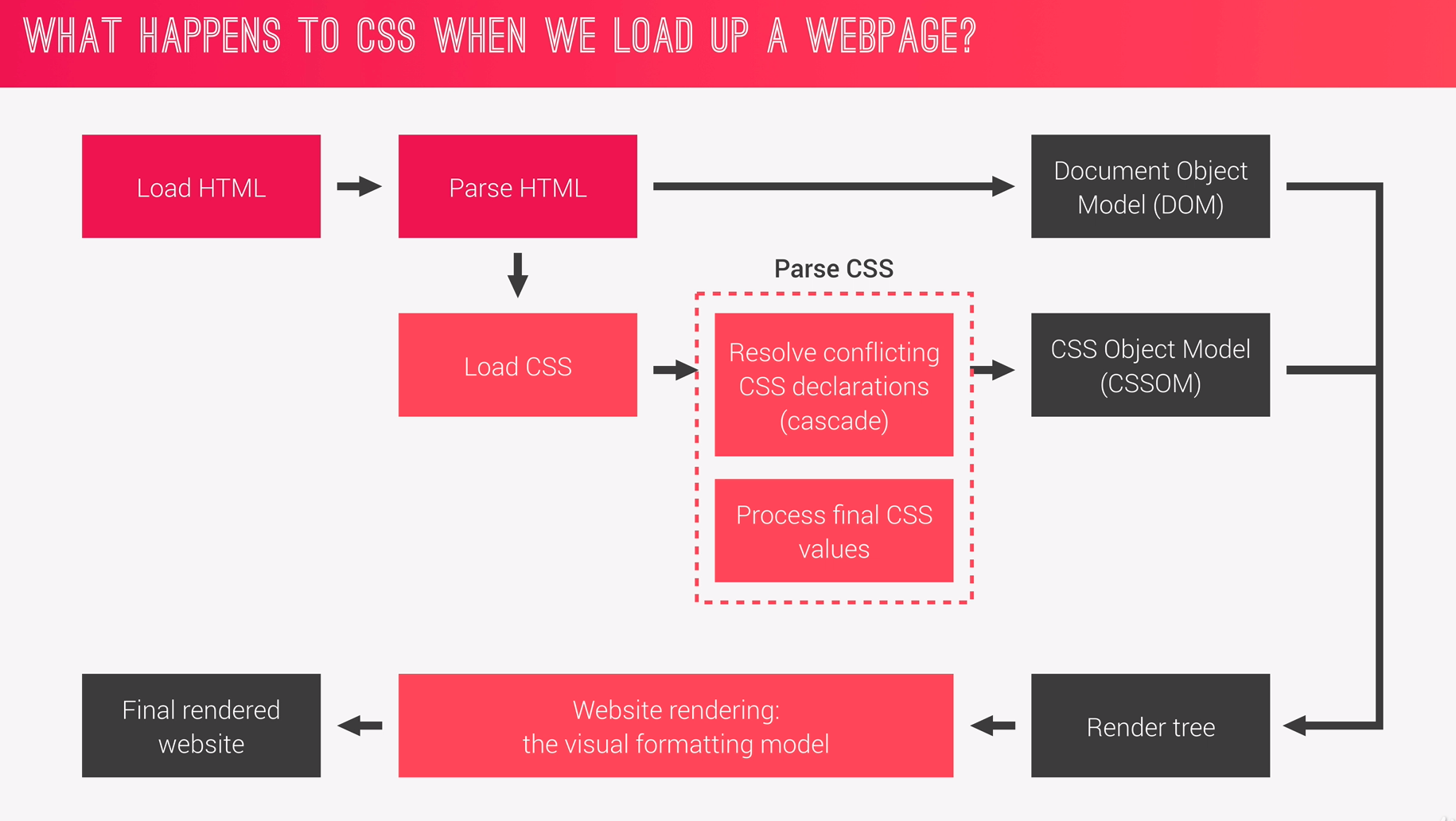
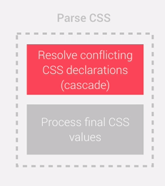
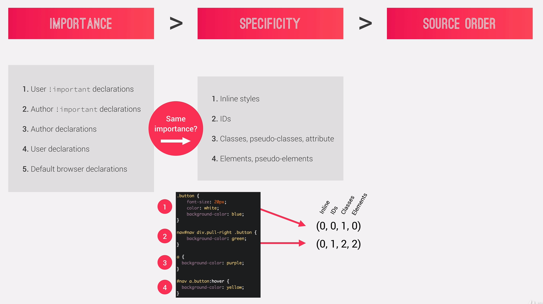
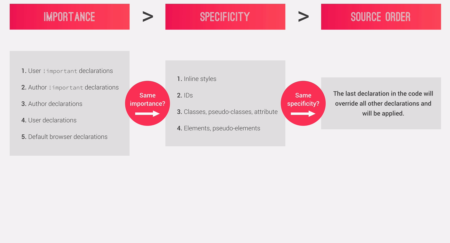
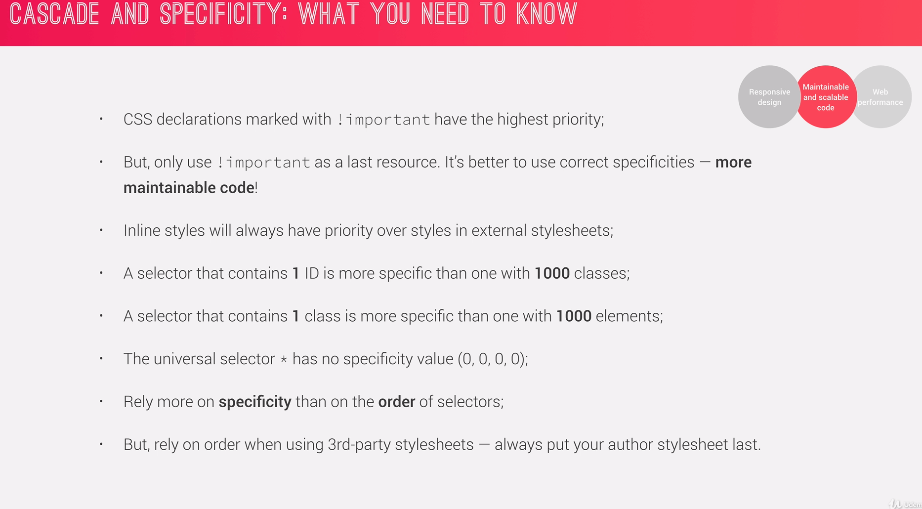
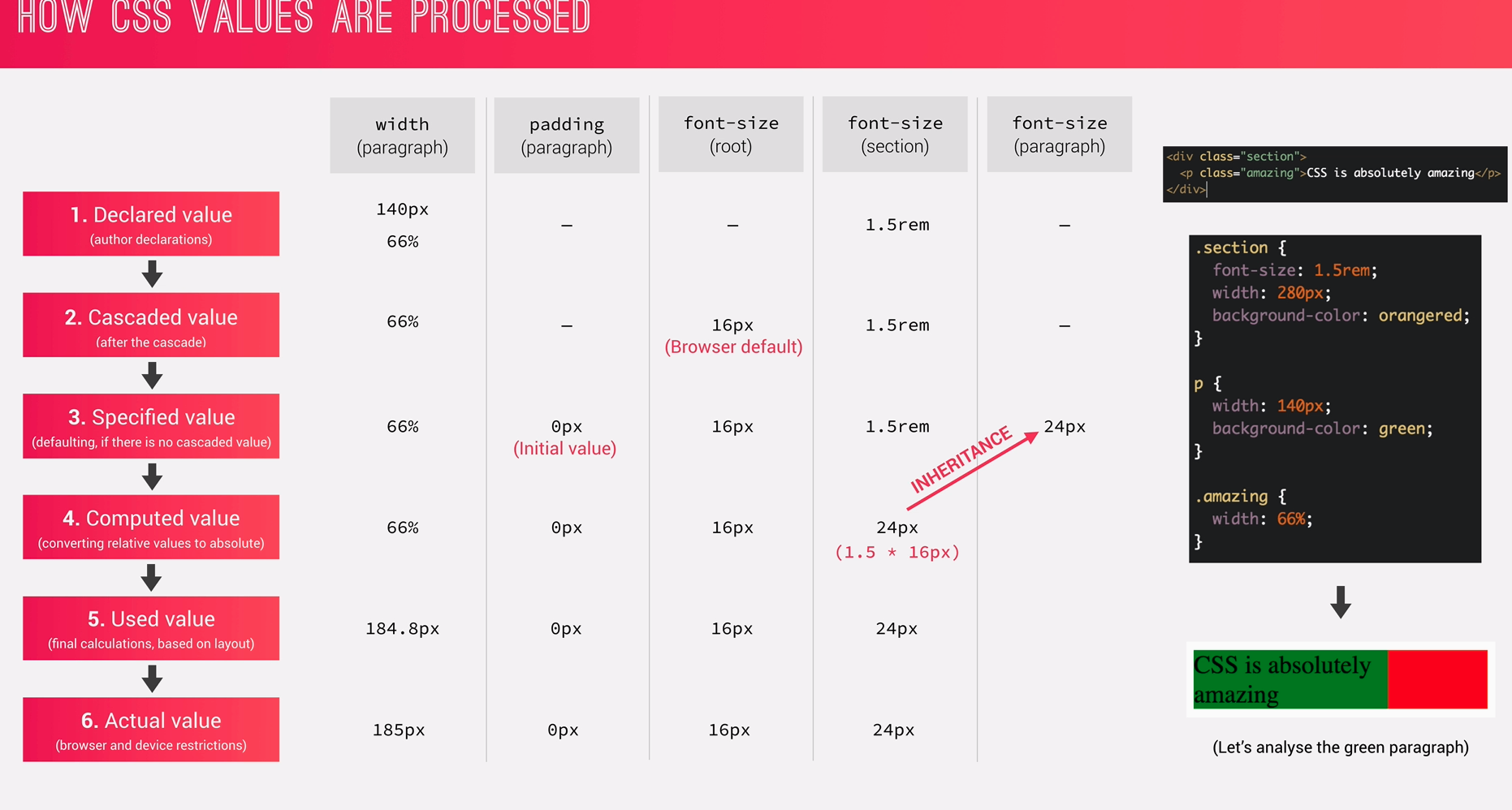
Process of combining different stylesheets and resolving conflicts between CSS rules and declarations, when more than one rule applies to a certain element.
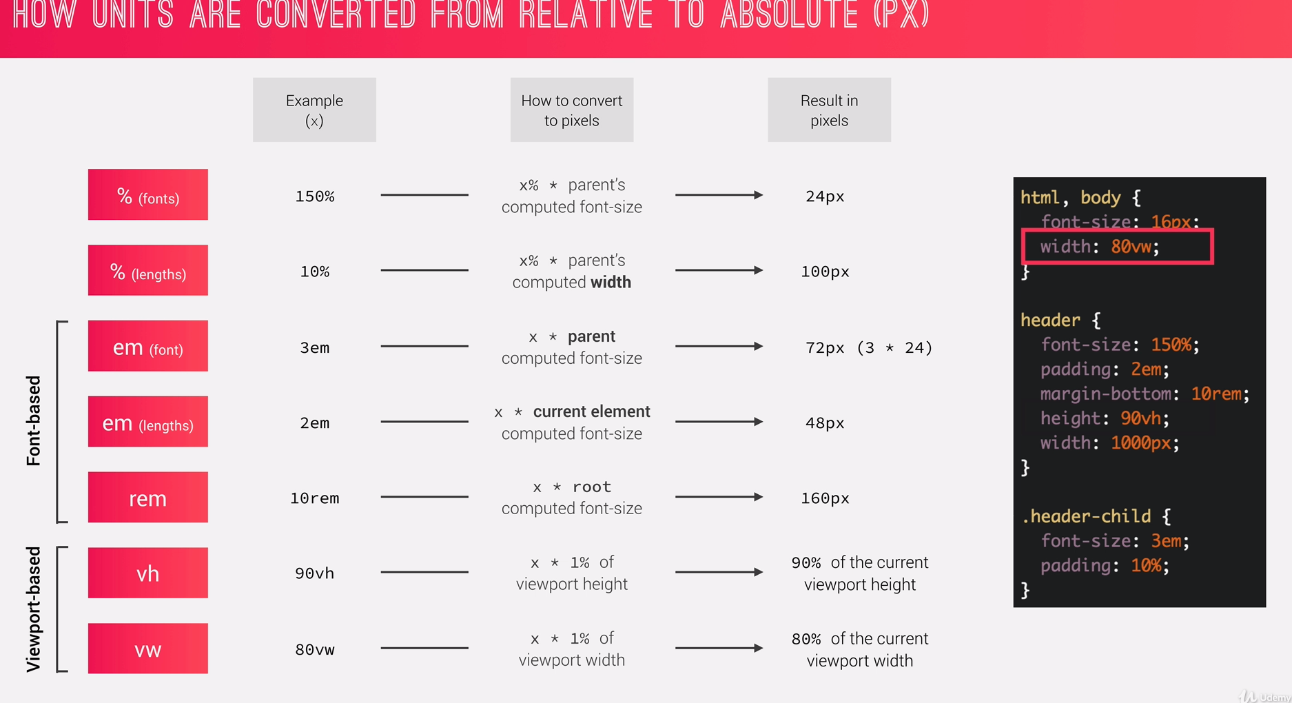
When Fonts are used in percentage like font-size: 150% then it's
x% * parent's computed font-size So in our case, 150 * 16px (assuming parent is html/body with root font-size: 16px)
which yields 24px
When length are declared in percentage, then it means x% * parent's computed width
Remember with % lengths it's always the computed width of parent element.
For ex:
header {
    font-size: 150%;
    padding: 2em;
    marigin-bottom: 10rem;
    height: 90vh;
    width: 1000px
}

.header-child {
    font-size: 3em;
/* Padding will be calculated
* from the parent computed width
*/
    padding: 10%;
}
em - uses current or parent element for relative reference. rem - uses the root element (html) for the relative reference.
-
em (fonts):
Notice the
3emon thefont-sizein the.header-child, so it would take from the parent computed font-size which is 24px (150% * 16) So the result here would be, 72px (3 * 24) -
em (lengths):
Notice the
padding: 2emon the.header, so it would take the current element computed font-size So the result would be, 48px (2 * 24)Takeaway:
- for
emfonts, it takes from the parent computed font-size - for
emlength, it takes from the current element computed font-size
- for
-
rem:
10rem means, x * root computed font-size which yields 160px
- vh:
1vh means 1% of the view-port height so, 90vh is simply 90% of the view-port height.
(we may not know length in pixels of the view-port, but the browser painting it knows)
- vw:
Similarly, for view-port width. 80vw is 80% of the view-port width.
-
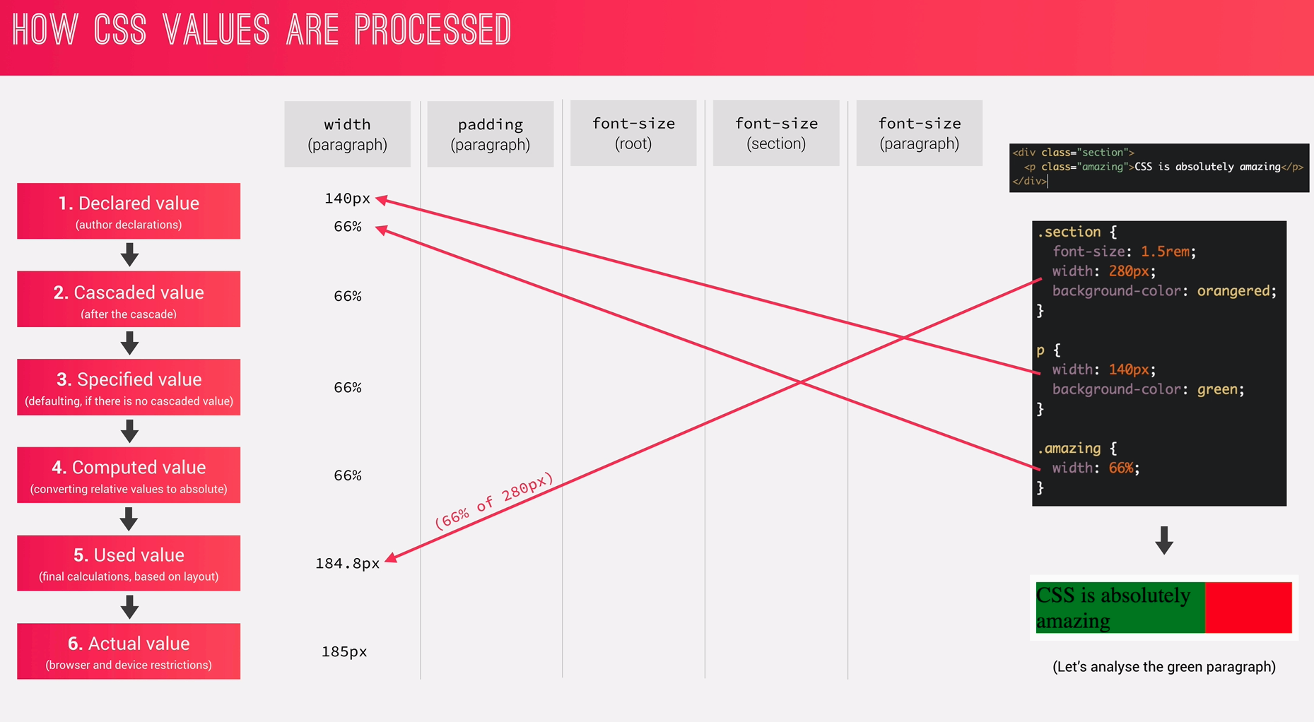
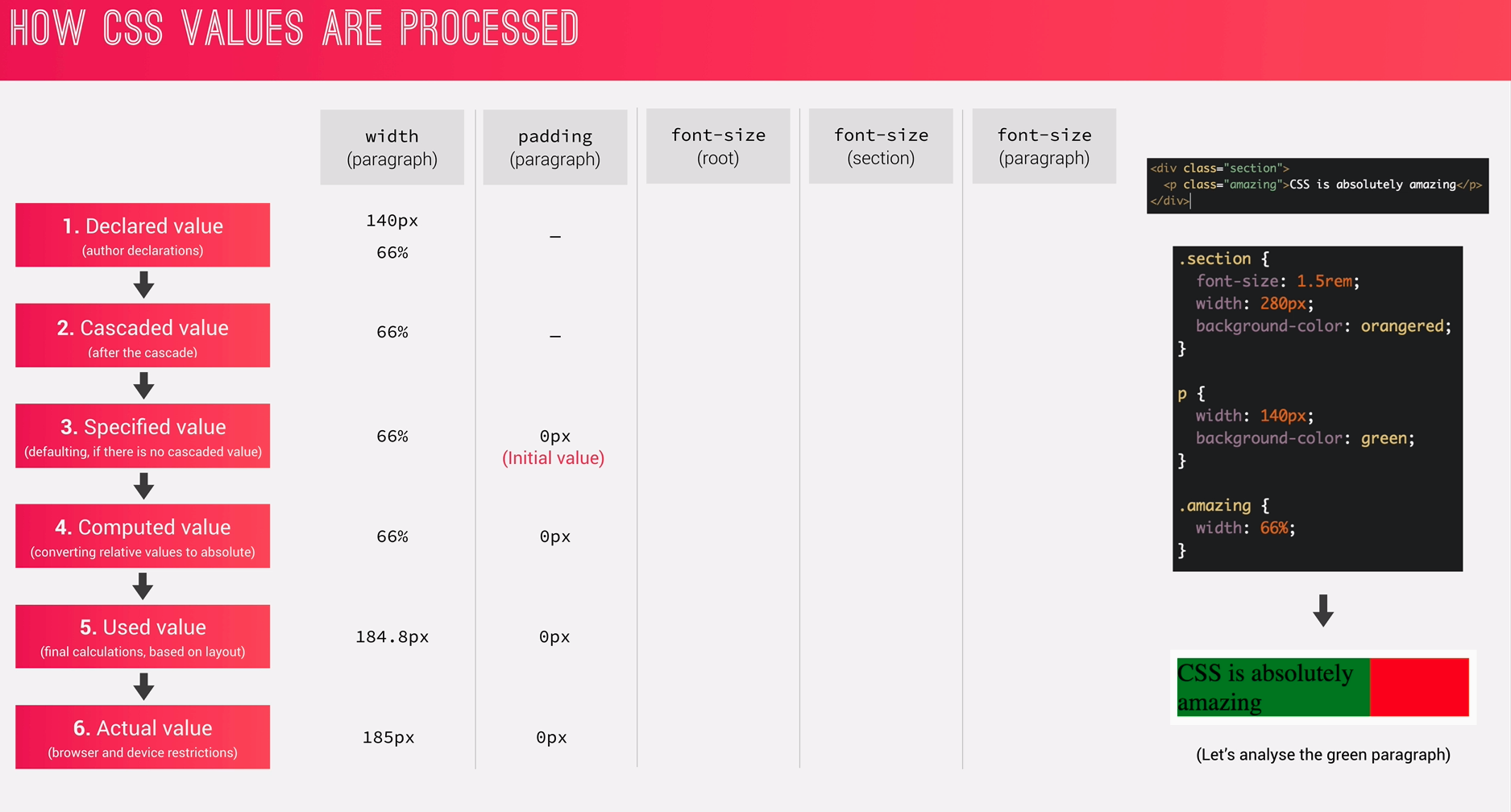
Each property has an intial value, used if nothing is declared. (and if there is no inhertance).
-
Browser specify a root font-size for each page (usually 16px) (so this is a user-agent spec, not from css initial value spec.)
-
Percentages and relative values are always converted to pixels
-
Percentages -
- are measured relative to their parent's font-size, if used to specify
font-szie; - are measured relative to their parent's width, if used to specify lengths.
- are measured relative to their parent's font-size, if used to specify
-
em -
- are measured relative to their parent font-size, if used to specify font-size
- are measured relative to their current font size, if used to specify lengths.
-
rem are always measured relative to document's root font size.
-
vhandvware simply percentage measurements of the viewport'sheightandwidth
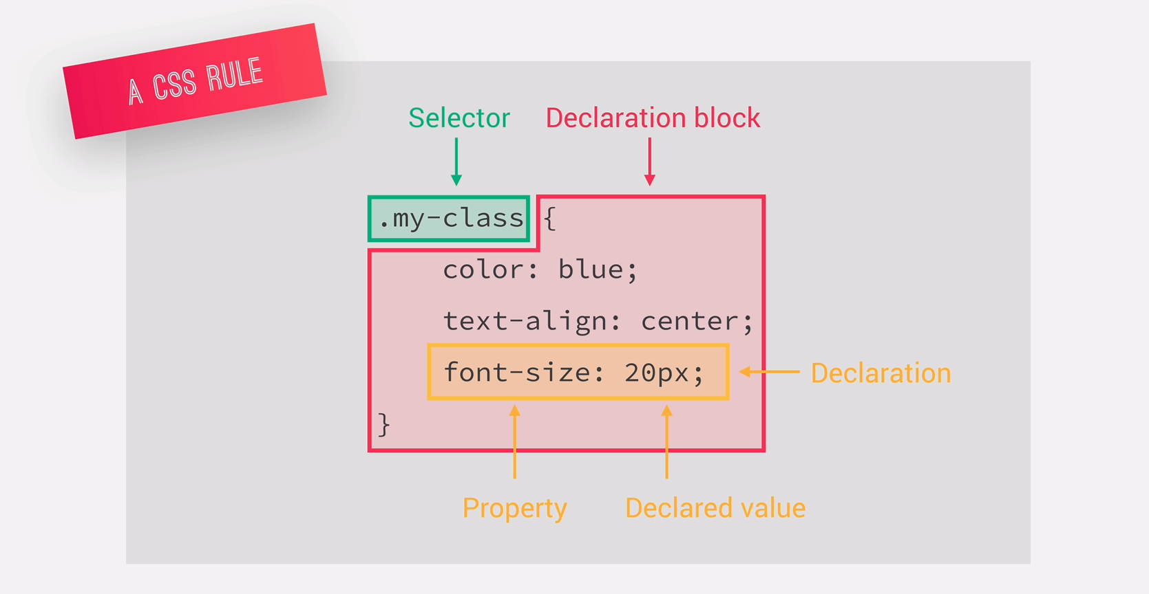
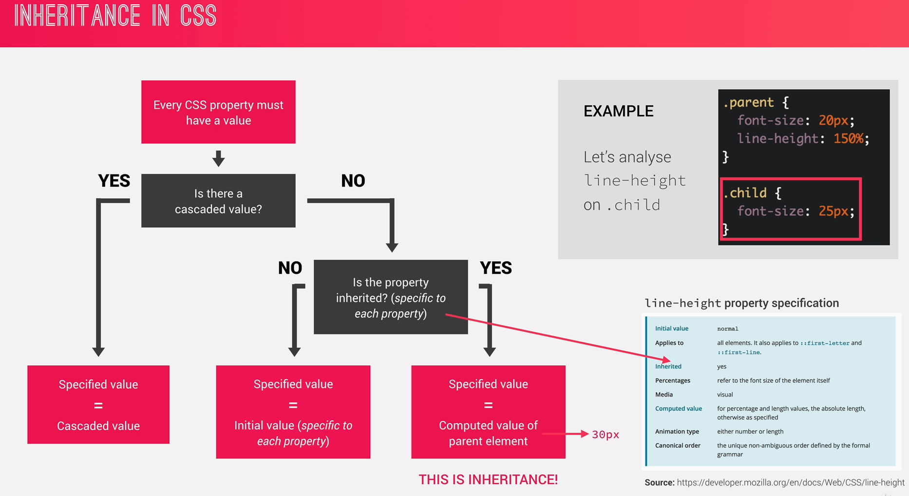
Every CSS property must have a value!
- Inheritance passed the values for some specific properties from parents to children. -- more maintainable code
- Properties related to text are inherited!:
font-family, font-size, color etc. padddingandmariginis not inherited (for obvious reasons!).- The computed value of a property is what gets inherited. not the declared value.
- Inheritance of a property only works if no one declares a value for the property.
- the
inheritkeyword resets a property to its initial value.
Algorithm that calculates boxes ad determines the layout of these boxes, for each element in the render tree, in order to determine the final layout of the page.
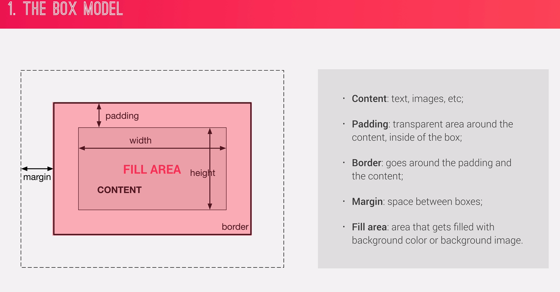
- Dimensions of boxes: the box model
- Box type: inline, block, inline-block
- Positioning scheme: floats and positioning.
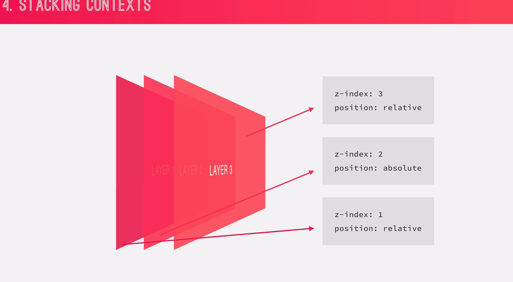
- Stacking contexts.
- other elements in the render tree
- Viewport size, dimensions of images etc..
Heights and Widths:
total width = right border + right padding + specified width + left padding + left border
total height = top border + top padding + specified height + bottom padding + bottom border
Example height = 0 + 20px + 100px + 20px + 0 = 140px
With box-sizing: border-box;, we wont add paddings and borders to the element height and width.
But rather, we would just decrease the content width and height.
With Box-Sizing: Border-Box:
total width = right border + right padding + specified width + left padding + left border
total height = top border + top padding + specified height + bottom padding + bottom border
Example height = 0 + 20px + 100px + 20px + 0 = 140px 100px
- Block-level boxes:
- Elements formatted visually as blocks.
- 100% of parent's width.
- Vertically, one after another.
Ex:
display: block;
(display: flex)
(display: list-item)
(display: table)
- Inline Boxes:
- Content is distributed in lines.
- Occupies only content's space
- No line-breaks
- No heights and widths.
- Paddings and marigins only horizontal(left and right)
Ex:
display: inline;
Okay, We just saw that we cannot apply heights and widths. also, there are restrictions in paddings and marigins. uff. to overcome that we have yet another type.
- Inline-block Boxes:
- A mix of block and inline.
- Occupies only content's space
- No line-breaks
- Box-model applies as showed
Ex:
display: inline-block;
- Normal Flow:
- Default positioning scheme.
- NOT floated
- NOT absolutely positioned
- Elements laid out according to their order. Ex:
position: relative;
- Floats:
- Element is removed from the normal flow
- Text and inline elements will wrap around the floated element.
- The container will not adjust its height to the element. (use
clearfixto fix that)
Ex:
float: left;
float: right;
- Absolute positioning:
- Element is removed from the normal flow
- No impact on surrounding content and elements.
- We use
top,bottom,left,rightto offset the element from its relatuvely positioned container.
Ex:
position: absolute;
position: fixed;
Not just z-index produces stacking context. there are other properties like opacity, filters, transform also creates stacking context.
Sass is a CSS preprocessor, an extension of CSS that adds power and elegance to the basic language.
- Variables: for reusable values such as colors, font-sizes, spacing etc..
- Nesting: to nest selectors inside of one another, allowing us to write less code.
- Operators: for mathematical operations right inside of CSS;
- Partials and imports: to write CSS in different files and importing them all into one signal file.
- Mixins: to write reusable pieces of CSS code.
- Functions: similar to mixins, with the difference that they produce a value that can then be used later.
- Extends: to make different selectors inherit declarations that are common to all of them.
- Control Directives: for writing complex code using conditional and loops. (need to cover seperatly)
- FLUID GRIDS and LAYOUTS
TO allow content to easily adapt to current viewport width used to browse the website. Uses
%rather thanpxfor all layout-related lengths. - FLEXIBLE/RESPONSIVE IMAGES
Images behave differently than text content, and so we need to ensure that they also adapt nicely to the current viewport.
- MEDIA QUERIES
To change styles on certain viewport widths (breakpoints). allowing us to create different version of our website for different widths.
