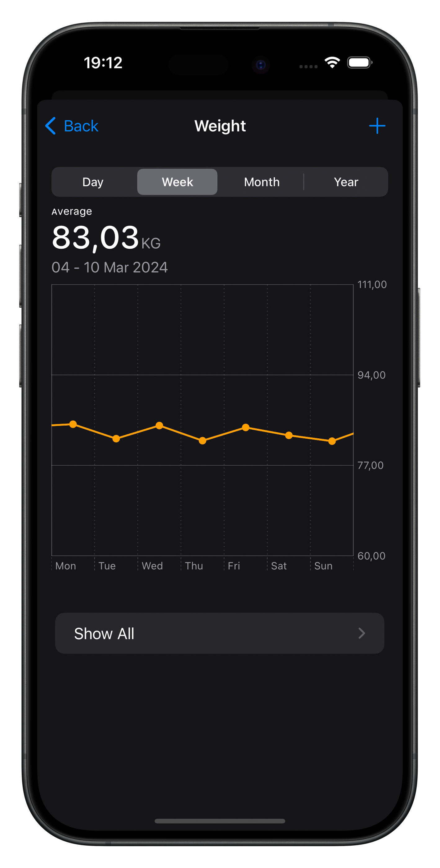
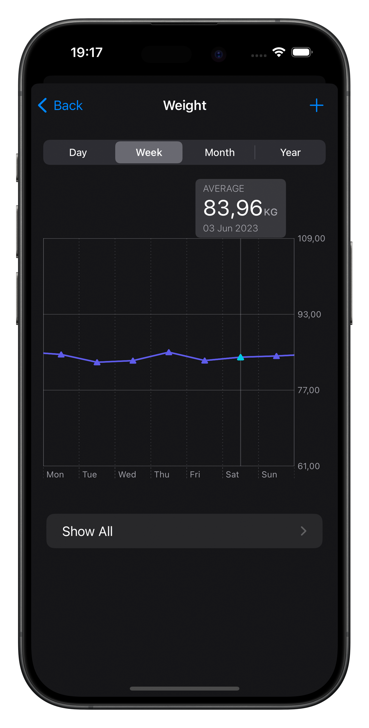
The MeasurementChartsUI package introduces a user-friendly SwiftUI MeasurementChartView,
inspired by the native Apple Health's charts.
It offers a comprehensive solution for displaying measurement data across various dimensions,
making it easy to incorporate interactive scrollable charts into your SwiftUI applications.
- Apple Health-Inspired Design: Draws inspiration from Apple Health's intuitive and informative charts.
- Dynamic Grouping: Supports various grouping strategies (daily, weekly, monthly, yearly).
- Interactive Selection: Enables users to select specific data points within the chart.
- Custom Display Options: Offers customization options for the display unit, precision, foreground style, and symbol shapes.
- Custom Header: Offers the ability to include a custom header for the chart.
Take a look at MeasurementChartView in action:
To integrate MeasurementChartsUI into your package, you can add it as a dependency in your Package.swift file:
dependencies: [
 .package(url: "https://github.com/fcollf/MeasurementChartsUI.git", .upToNextMajor(from: "1.0.0"))
]
Alternatively, if you're working on an Xcode project:
- Open your project in Xcode.
- Go to File -> Add Package Dependencies....
- Paste the repository URL: https://github.com/fcollf/MeasurementChartsUI
- Choose the version you want to use (e.g., Up to Next Major).
Xcode will fetch the latest version of MeasurementChartsUI and integrate it into your project.
After installing the MeasurementChartsUI package in your project, incorporating the MeasurementChartView
into your SwiftUI application involves a few simple steps:
Begin by importing the MeasurementChartsUI package in the SwiftUI view file where the chart will be displayed:
import MeasurementChartsUIYour data model must conform to the ChartDataEntry protocol.
This ensures each data entry has a date and a measurement:
struct MyMeasurementEntry<U: Dimension>: ChartDataEntry {

    // Conformance to Identifiable
    var id = UUID()

    // Date of the measurement
    var date: Date

    // Measured data
    var measurement: Measurement<U>
}To display your measurement data, instantiate MeasurementChartView in your SwiftUI view by
passing in your sequence of measurement entries. Optionally, you can also choose a default
grouping strategy for the data presentation.
Here's a simple example to get started:
struct ContentView: View {

     let entries: [MyMeasurementEntry<UnitMass>] = [
         // Your array of measurement entries goes here
     ]

    var body: some View {
        MeasurementChartView(entries, displayIn: .kilograms, grouping: .weekly)
    }
}
Tip
To focus the chart on a specific point in time, you can pass a Date object to the initializer
This lets you highlight data for a particular date, immediately bringing it to the user's attention,
and enhancing the chart's contextual relevance:
MeasurementChartView(entries, displayIn: .kilograms, displayAt: .now, grouping: .weekly)If no date is specified, the chart will automatically display the page for the most recent measurement available.
MeasurementChartView offers a range of modifiers to customize its appearance, including
options for unit display, precision, foreground styles, symbol shapes, and more.
Here’s how you can use these modifiers to tailor the chart to your preferences:
Adjust the number of decimal places for measurement values displayed in the chart. This allows you to control the granularity of the data presentation.
MeasurementChartView(entries, displayIn: .kilograms, grouping: .weekly)
.precision(2) // Displays values with two decimal placesCustomize the appearance of the chart's foreground elements, like lines and symbols, using any ShapeStyle.
Additionally, specify a distinct style for the marker when selecting an element in the chart with the selection parameter.
If no selection style is specified, the chart uses the default foreground style for selected elements.
MeasurementChartView(entries, displayIn: .kilograms, grouping: .weekly)
.foregroundStyle(Color.blue, selection: Color.red)Change the shape of the symbols used in the chart, like the points representing data entries. This can enhance the visual distinction of your data points.
MeasurementChartView(entries, displayIn: .kilograms, grouping: .weekly)
.symbolShape(.diamond)Control the visibility of the grouping picker, which allows users to switch between
different grouping modes (daily, weekly, monthly, yearly).
MeasurementChartView(entries, displayIn: .kilograms, grouping: .weekly)
.groupingPickerHidden()Incorporate a custom header into your chart for additional context or controls. This is done by utilizing the initializer that accepts a view builder.
MeasurementChartView(entries, displayIn: .kilograms, grouping: .weekly) {
    Text("Custom Header")
}This package is licensed under the MIT License - see the LICENSE file for details


