View contents
- Always include alt attribute on an image
- Avoid auto-playing audio on your website
- Buttons that only show up on hover
- Always feature optimal contrast
- Don't remove
:focuson elements - Use labels on
formfields - Make self-validating forms accessible
- Follow heading hierarchy
- Avoid non-semantic patterns
- Use skip-links
- Make
tabfriendly navigation - When you need to display tabular data use
tableinstead series ofdivelements
View contents
View contents
Screen readers for the blind and visually impaired read out alt attribute text and therefore make your images accessible. alt attribute should describe meaningful images and be left empty if the image serves decorative purposes. Never leave the alt since screen readers will read the source of the image which makes for terrible user experience.
Do not auto-play any audio or video material on page load. Users with screen readers will hear both 3rd party audio and their screen reader which makes for a poor user experience.
Be mindful of a pattern where buttons are hidden and only get displayed when parent element is hovered: this can make the buttons inaccessible from keyboard. instead us using display:none or visibility: hidden, consider using alternative methods, e.g. using position: absolute and pushing it off the screen.
Whenever possible make your websites accessible to the eye by avoiding poor contrast between text and background.
If an element is interactive never remove the highlight by setting outline: none; on a focused state of that element. If the default browser outline doesn't align with the design be sure to replace it with a custom accessible one instead of hiding it completely. Removing an element's highlight on focus makes filling out forms difficult for some users.
Once implemented properly, label elements make the form accessible. Each label element should have a for attribute that has the value of the corresponding filed's id.
If your form needs to meet specific input criteria and errors on mistaken input be sure to provide feedback to the user. Alongside the common red border include a text-based informative explanation of the encountered error.
Screen reader users navigate pages by using the heading structure. Do not use headings by picking the one that fits the appropriate size in design. Instead, use heading elements h1 to h6 with the hierarchy in mind and style them later.
Use semantic HTML elements that clearly define their content as much as possible. By using semantic elements you provide the user with a more meaningful way to navigate and interact with your website. Semantic elements, such as <header>, <main> and <article> are by default accessible compared to non-semantic elements like <div> or <span>. Avoid using non-accessible <div class="button"> when <button> is already available to you. If for some reason you must use non-semantic elements be sure to implement accessibility functionality to them.
Let users skip long navigation by implementing invisible focusable links that leads to the main content. Screen readers perceive the page from top to bottom which means that if there is no skip-link implemented and the website is already familiar to the end user, the screen reader will read redundant navigation.
Allow users to use keyboard-only navigation on your website by ensuring that all interactive elements are focusable and in a logical order.
When you need to display some tabular data be sure to use the semantically correct <table> element as it is accessible by default, in contrast to non-semantic elements like <div>. You should provide a <caption> for your <table> element and allow users to skip through the table with a skip-link if they don't want it read by the screen reader.
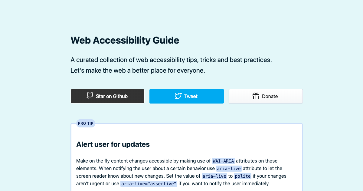
Make on the fly content changes accessible by making use of WAI-ARIA attributes on those elements. When notifying the user about a certain behavior use aria-live attribute to let the screen reader know about new changes. Set the value of aria-live to polite if your changes aren't urgent or use aria-live="assertive" if you want to notify the user immediately.
Put a full stop at the end of an image's description inside the alt attribute, so that screen readers can make a short pause which leads to better user experience.
Complex or even simple animations can make it hard for some users to focus on the actual content of the webpage. Therefore your website should allow users to stop animations on the webpage at a particular keyframe.
Hearing screen readers pronounce the description of your logo over and over gets tiresome. Use a descriptive alt tag just on the first image of your logo. Remember to include an empty alt tag on others since screen readers will read the image source as the fallback.
Although scope attributes aren't mandatory in table elements it's is highly recommended to use the scope to indicate what type of data each column contains and what should be read out as a row.
Videos on your websites should have proper captioning. When transcribing video content, it is considered a good practice to avoid vocal pauses and verbal missteps.
Some screen readers can not figure out the styled layout, so they work with the plain HTML document to figure out in which order they should read the page. Although many screen readers support styled layouts, the safest method is to structure your HTML in a logical flow, so the content is understandable without the need for styles.
Testing your websites for accessibility with off the shelf solutions like Lighthouse isn't enough. Instead, manually test your websites. There are great extensions to help you simulate common user conditions.
Enhance accessibility and user experience by making your content more comfortable to read. Text on the webpage should be justified to the left with a font-size of 16px at a minimum. line-height of 1.5 is optional to make for a pleasant reading experience.
This README is built using markdown-builder.
