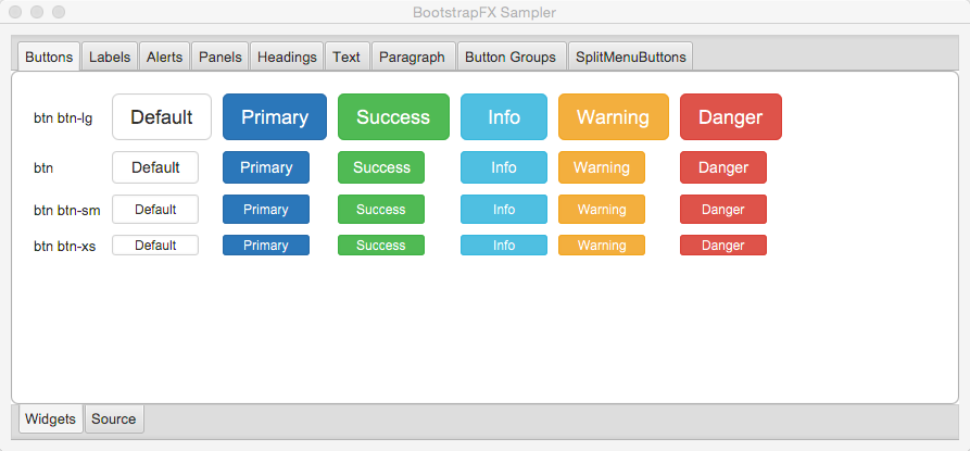
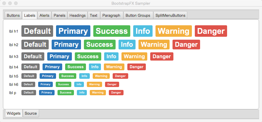
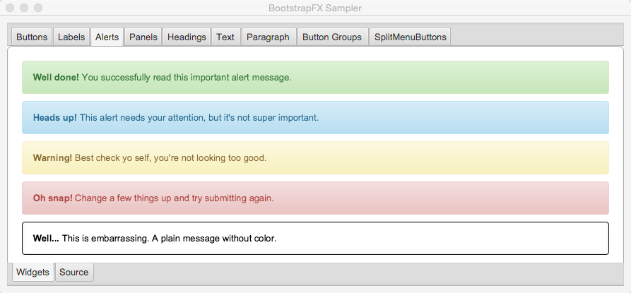
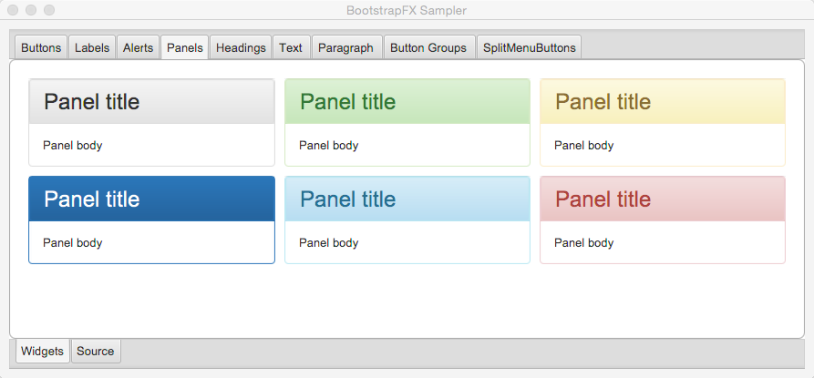
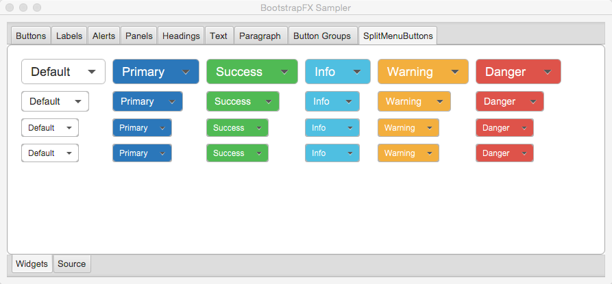
BootstrapFX is a partial port of Twitter Bootstrap for JavaFX. It mainly provides a CSS stylesheet that closely resembles the original while being custom tailored for JavaFX’s unique CSS flavor.
It’s worth mentioning that Twitter Bootstrap delivers more than just a standardized look for common widgets. It also provides new widgets, behavior and a grid system. Some of these features may be ported at a later stage to BootstrapFX.
You can get the latest version of BootstrapFX directly from Bintray’s JCenter repository.
Once the bootstrapfx-core dependency is in your classpath you just need to apply the boostrapfx.css stylesheet to
an scene, for example
import javafx.application.Application;
import javafx.geometry.Insets;
import javafx.scene.Node;
import javafx.scene.Scene;
import javafx.scene.control.Button;
import javafx.scene.layout.BorderPane;
import javafx.stage.Stage;
import org.kordamp.bootstrapfx.scene.layout.Panel;

public class Sampler extends Application {
    @Override
    public void start(Stage primaryStage) throws Exception {  //(1)
        Panel panel = new Panel("This is the title");
        panel.getStyleClass().add("panel-primary");           //(2)
        BorderPane content = new BorderPane();
        content.setPadding(new Insets(20));
        Button button = new Button("Hello BootstrapFX");
        button.getStyleClass().setAll("btn","btn-danger");    //(2)
        content.setCenter(button);
        panel.setBody(content);

        Scene scene = new Scene(panel);
        scene.getStylesheets().add("bootstrapfx.css");        //(3)

        primaryStage.setTitle("BootstrapFX");
        primaryStage.setScene(scene);
        primaryStage.sizeToScene();
        primaryStage.show();
    }
}-
Custom widget from BootstrapFX
-
Apply CSS class to widgets
-
Apply BootstrapFX stylesheet to scene
You must meet the following requirements:
-
JDK8u40 as a minimum
-
Gradle 2.6
You may used the included gradle wrapper script if you don’t have gradle installed.
-
Download Gradle from http://gradle.org/downloads
-
Unzip the file into a directory without spaces (recommended).
-
Create a GRADLE_HOME environment variable that points to this directory.
-
Adjust your PATH environment variable to include $GRADLE_HOME/bin (%GRADLE_HOME%\bin on Windows).
-
Test your setup by invoking
gradle --version.
-
Follow the instructions found at http://sdkman.io/ to install SDKMAN.
-
You need a POSIX environment if running Windows. We recommend using Babun Shell (http://babun.github.io/)
-
Once SDKMAN is installed invoke
sdk install gradle 2.6. -
Test your setup by invoking
gradle --version.
GDub is a wrapper script that facilitates invoking gradle tasks anywhere within a Gradle project. It’s smart enough to use the gradle wrapper if available or your global gradle command. This is an optional download.
-
Follow the instructions found at https://github.com/dougborg/gdub to install gdub
-
b, strong
-
i, em, italic, dfn
-
small
-
code, kbd, pre, samp
-
h1, h2, h3, h4, h5, h6
-
lead
-
p
-
text-mute
-
text-primary, text-success, text-info, text-warning, text-danger
-
bg-primary, bg-success, bg-info, bg-warning, bg-danger
-
btn
-
btn-default, btn-primary, btn-success, btn-info, btn-warning, btn-danger
-
btn-lg, btn-sm, btn-xs
-
split-menu-btn
-
split-menu-btn-default, split-menu-btn-primary, split-menu-btn-success, split-menu-btn-info, split-menu-btn-warning, split-menu-btn-danger
-
split-menu-btn-lg, split-menu-btn-sm, split-menu-btn-xs
-
panel
-
panel-default, panel-primary, panel-success, panel-info, panel-warning, panel-danger
-
panel-heading
-
panel-title
-
panel-body
-
panel-footer


