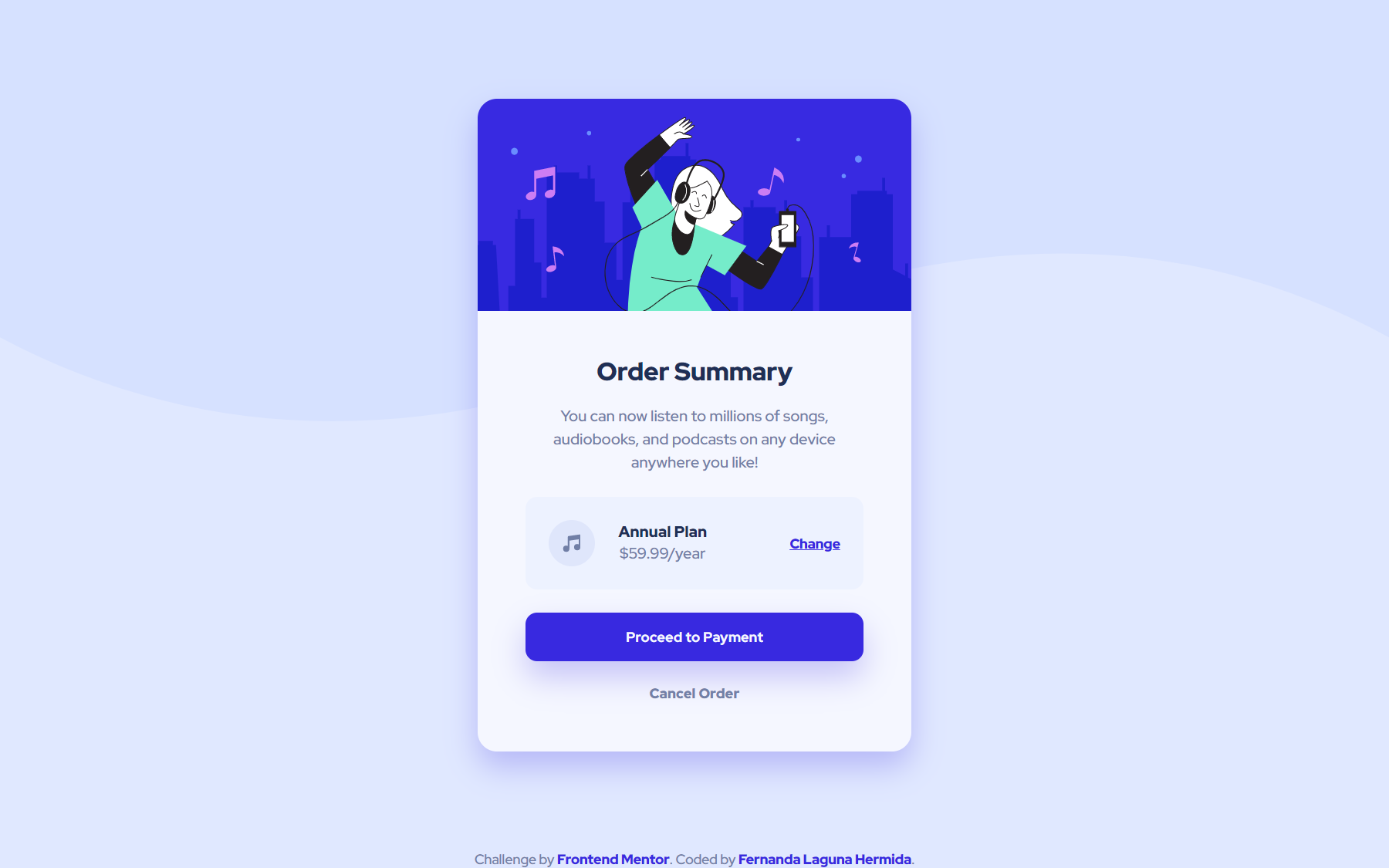
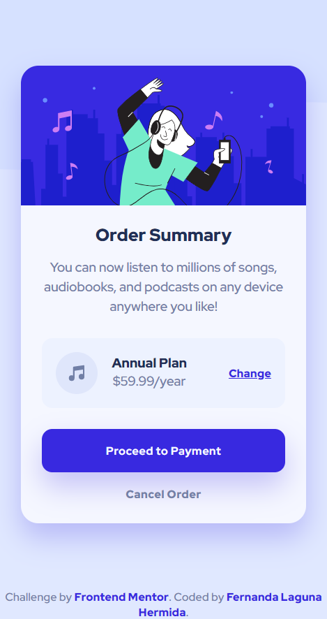
This is a solution to the Order summary card challenge on Frontend Mentor. Frontend Mentor challenges help you improve your coding skills by building realistic projects.
A responsive card component for an order preview.
Users should be able to:
- See hover states for interactive elements
- Solution URL: https://www.frontendmentor.io/solutions/responsive-component-without-breakpoints-wji40H3dEv
- Live Site URL: https://ferlagher.github.io/FMC-Order-summary-component
I challenged myself to build this solution without using breakpoints. I started learning Sass a few day ago, so I wanted to try out the functions. I only used one media query for changing the background image. The other elements use a clamp() function to scale according to the viewport size. The min() function inside clapm() makes the card width:100% only in small devices.
- Semantic HTML5 markup
- Sass ♥
- Flexbox
- CSS Grid
I really love Sass, everyday I learn something new. Today I learned how to use some usefull CSS functions.
$width-card: clamp(min(100%, 327px), 33vw, 450px);I want to try out more complex Sass functions and loops.
Next challenge: Stats preview card component
- LinkedIn - ferlagher
- Frontend Mentor - @ferlagher
- Instagram - @ferlagher
Thank you very much for reading. ♥

