- Demo
- Installation
- Description
- Example
- ShadowDOM Example
- Browsers support
- Options
- How does it work?
- Testing
- Caveats
You can check out Vue-custom-element demos at https://karol-f.github.io/vue-custom-element/
npm install vue-custom-element --saveimport vueCustomElement from 'vue-custom-element'
Vue.use(vueCustomElement);To build your web-component using vue-cli, you have to use the following command:
vue-cli-service build --target lib --name your-component-name src/main.jsNote: the command vue-cli-service build --target wc does not work, since it using vue's own vue-web-component-wrapper.
If you are using Vue globally, just include vue-custom-element.js and it will automatically install the Vue.customElement method.
<script src="path/to/vue-custom-element.js"></script>For cross-browser compatibility (IE9+) use Custom Elements polyfill.
<script src="https://cdnjs.cloudflare.com/ajax/libs/document-register-element/1.4.1/document-register-element.js"></script>or
import 'document-register-element/build/document-register-element';
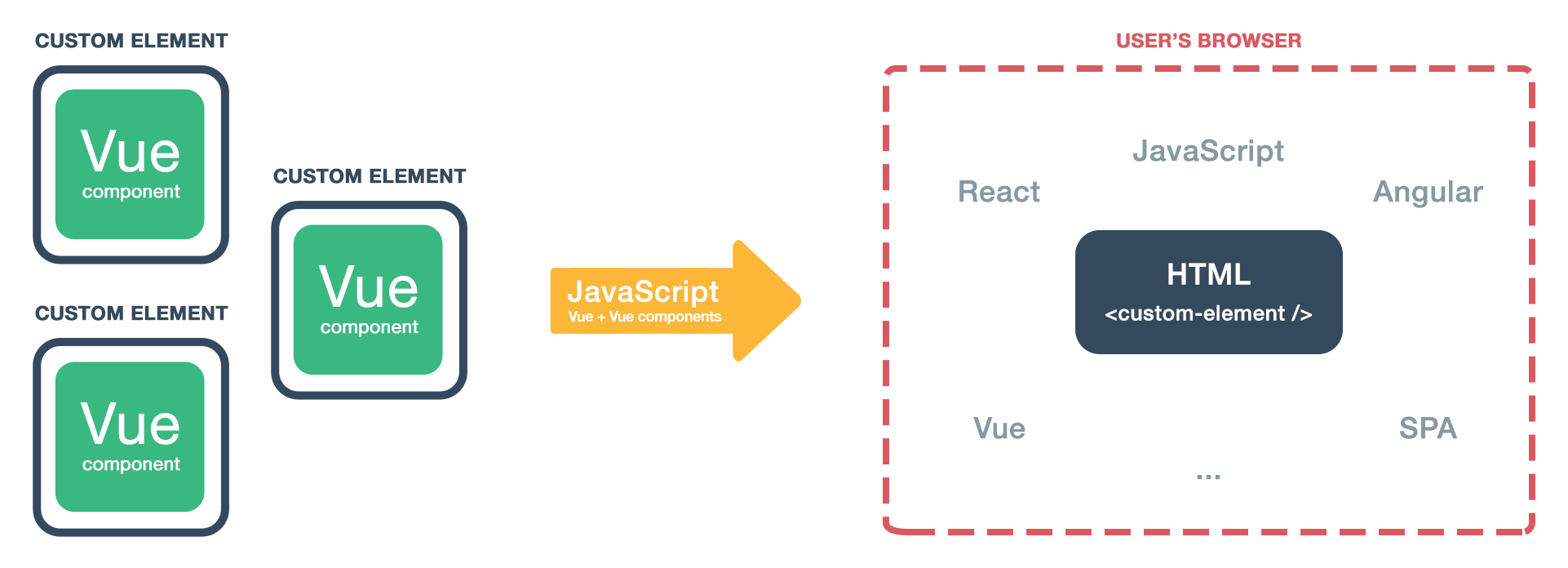
Vue-custom-element is a tiny wrapper around Vue components. It provides a seamless way to use Vue components in HTML, plain JavaScript, Vue, React, Angular etc., without manually initialising Vue. It's using power of Web Components' Custom Elements.
- Works with Vue 0.12.x, 1.x and 2.x
- Small - 2.7 kb min+gzip, optional polyfill - 5 kb min+gzip
It might be confusing for users to understand the different use cases of Vue components vs Custom Elements .
Why might you need Vue-custom-element? Simple, for your Vue components user's convenience. All they will need to do is include your JavaScript file and then they can:
- include components as HTML tags (e.g.
<my-component></my-component>) at any time of the document lifecycle. You can use your elements in e.g. SPA application just by including HTML tag - no Vue initialization or JavaScript usage is needed. Custom Elements will auto initialize when mounted into document. You can include them in e.g. Vue, Angular or React projects and browser will take care of detecting it and initialization - use a simple API that allows for interacting with underlaying Vue instance by changing attributes, props or listening to events
- take advantage of features like lazy-loading, that allows for loading components on demand, only when user add them to document
- Simplicity - only
tag-nameand Vue componentobjectare needed forVue.customElement()usage - Compatibility - using the optional polyfills a wide range of browsers is supported, including IE9+, Android and IOS
- Full featured - you can use nesting, HMR, slots, lazy-loading, native Custom Elements callbacks.
- reactive props and HTML attributes
- automatic props casting (numbers, booleans) so they won't be available as strings but proper data types
- listening to Vue component $emit'ed events
- 'default' and 'named' slots are available for passing static content, check out the demo for an example
- Hot Module Replacement for seamless developer experience (unminimized build, Vue 2.x+)
- lazy-loading - you can download a component after it's attached to document. Useful for e.g. UI library authors. Check out the demo for an example
- detect if detached callback is not invoked due to opening vue-custom-element in modal - element is then detached and attached to DOM again. It would be undesirable to destroy it immediately
- Custom Elements v1 - compatible with latest specifications. Vue-custom-element will use native implementation if supported
Check out the demo site to see it in action.
For additional examples and detailed description check the demos page.
<widget-vue prop1="1" prop2="string" prop3="true"></widget-vue>Vue.customElement('widget-vue', {
props: [
'prop1',
'prop2',
'prop3'
],
data: {
message: 'Hello Vue!'
},
template: '<p>{{ message }}, {{ prop1 }}, {{prop2}}, {{prop3}}</p>'
});document.querySelector('widget-vue').prop2 // get prop value
document.querySelector('widget-vue').prop2 = 'another string' // set prop valueYou can also change <widget-vue> HTML attributes and changes will be instantly reflected.
By default, vue-custom-element does not mount underneath a ShadowDOM. While this is easier to develop and debug, CSS stylings for the parent can contaminate the component, and stylings for the component can contaminate the parent. This is most prevalent when using prebuilt UI libraries which assume the component is the only content on the page (i.e. Vuetify). A ShadowDOM prevents this contamination by isolating the components and stylings within an HTML document fragment.
In these situations, components should be mounted underneath a shadowDOM using the option
Vue.customElement('widget-vue', CustomWidget, {
  shadow: true,
  beforeCreateVueInstance(root) {
    const rootNode = root.el.getRootNode();

    if (rootNode instanceof ShadowRoot) {
      root.shadowRoot = rootNode;
    } else {
      root.shadowRoot = document.head;
    }
    return root;
  },
});
The additional beforeCreateVueInstance is only required if your Vue component has bundled stylings and you are using css-modules with Webpack to bundle (which is most use cases). In addition, if you are using vue-loader and vue-style-loader plugins with Webpack, you will need to pass the shadowMode: true option to the plugins also. This is required so the plugins know they that CSS styles should be attached under the shadowDOM and not in the document.head (which is the default behavior).
webpack.config.js example for scss stylings
{
    test: /\.vue$/,
    use: [
        {
            loader: 'vue-loader',
            options: {
            	shadowMode: true
            }
        }
    ]
},
{
    test: /\.scss$/, //as example I used scss
    use: [
        {
            loader: 'vue-style-loader',
            options: {
                shadowMode: true
            }
        }
    ]
}
vue.config.js for Vue CLI 3
function enableShadowCss(config) {
  const configs = [
    config.module.rule('vue').use('vue-loader'),
  ];
  // based on common rules returned by `vue inspect`
  const ruleSets = ['css', 'postcss', 'scss', 'sass', 'less', 'stylus'];
  const ruleNames = ['vue-modules', 'vue', 'normal-modules', 'normal'];

  ruleSets.forEach((ruleSet) => {
    if (config.module.rules.store.has(ruleSet)) {
      ruleNames.forEach((rName) => {
        if (config.module.rule(ruleSet).oneOfs.store.has(rName)) {
          if (config.module.rule(ruleSet).oneOf(rName).uses.store.has('vue-style-loader')) {
            configs.push(config.module.rule(ruleSet).oneOf(rName).use('vue-style-loader'));
          }
        }
      });
    }
  });
  if (!process.env.BUILD_MODE) {
    process.env.BUILD_MODE = config.store.get('mode');
  }
  configs.forEach((c) => c.tap((options) => {
    options.shadowMode = true;
    return options;
  }));
}

module.exports = {
  chainWebpack:
    (config) => {
      enableShadowCss(config);
    },
  css: {
    sourceMap: true,
    extract: false,
  },
};
Note: for stylings to work, CSS must be bundled in JS and injected at runtime. Otherwise you will need to manually link the CSS under the shadowDOM inside your component (which is obviously an anti-pattern).
For additional ShadowDom examples see: https://github.com/bryanvaz/vue-custom-element-shadow-examples
 Firefox |
 Chrome |
 Safari |
 Opera |
 iOS |
 Android |
|---|---|---|---|---|---|
| 59+ (--flag) | 54+ | 10.1+ | 42+ | 10.3+ | 55+ |
 IE / Edge |
 Firefox |
 Chrome |
 Safari |
 Opera |
 iOS |
 Android |
|---|---|---|---|---|---|---|
| IE9+, Edge | ✓ | ✓ | ✓ | ✓ | ✓ | ✓ |
Additional, optional, third parameter to Vue.customElement() is options object. You can pass following methods.
'This' in callbacks points to Custom Element's DOM Node.
{
  // 'constructorCallback' can be triggered multiple times when e.g. vue-router is used
  constructorCallback() {
      console.info('constructorCallback', this);
  },

  // element is mounted/inserted into document
  connectedCallback() {
    console.info('connectedCallback', this);
  },

  // element is removed from document
  disconnectedCallback() {
    console.warn('disconnectedCallback', this);
  },

  // one of element's attributes (Vue instance props) is changed
  attributeChangedCallback(name, oldValue, value) {
    console.info('attributeChangedCallback', name, oldValue, value);
  },

  // Root component's definition is passed to this hook just before Vue instance creation - so you can modify it
  beforeCreateVueInstance(RootComponentDefinition) {
    console.info('beforeCreateVueInstance', RootComponentDefinition);
    return RootComponentDefinition;
  },

  // Vue instance is created
  vueInstanceCreatedCallback() {
    console.info('vueInstanceCreatedCallback');
  },

  // in case of using vue-custom-element with modals, we destroy  it after defined timeout. Use "null" value if you want to manually "$destroy" it.
  destroyTimeout: 3000,

  // only needed when using lazy-loading - 'props' are not accessible on Custom Element registration so we have to provide them
  props: [],

  // you can set shadow root for element. Only works if native implementation is available.
  shadow: false,

  // you can set CSS that will be available in Shadow DOM.
  shadowCss: ''
}
Example options usage:
import MyElement from './MyElement.vue';

Vue.customElement('my-element', MyElement, {
  shadow: true,
  shadowCss: `
  .card {
     background-color: blue;
  }`
});
Callbacks are executed before the lifecycle hooks from Vue component passed to Vue-custom-element. It's a better idea to just use Vue component lifecycle hooks (e.g. created, mounted, beforeDestroy).
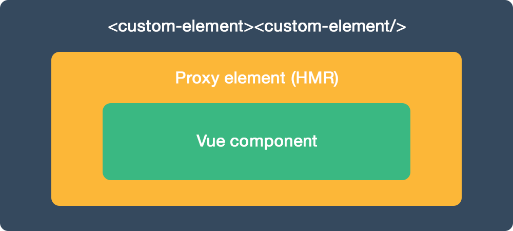
Inside HTML tags of the defined custom element, Vue-custom-element will create:
- Proxy component for seamless Hot Module Replacement, using render function for performance (Vue 2.x+)
- Vue component is passed to Vue-custom-element
Custom Element HTML tag will expose API to interact with underlying Vue component - you can change HTML attributes or props, using JavaScript.
For advanced access, when exposed API is not enough, defined custom element can expose Vue instance via getVueInstance() method.
console.info(document.querySelector('widget-vue').getVueInstance())- custom elements must contain a hyphen in its tag name. For example,
my-elementis valid, butmyelementis not - in dev mode Vue will display console warning about element not being registered. It's desirable behaviour as we want to use browser's Custom Elements registration. You can use https://vuejs.org/v2/api/#ignoredElements to get rid of this warnings.
npm install
npm run dev:demo
npm run build
This command will compile vue-custom-element.js and docs files.
Please take a note that npm run build will use config.build.assetsPublicPath, which is set to Github Pages path in config/index.js.


