Short Analysis of West Los Angeles Housing
Back Story
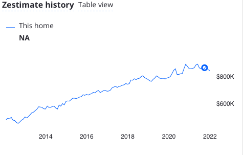
Shortly before Christmas 2021 I was poking around Zillow, and I noticed that every apartment I looked at had a Zestimate that looked like this:
Huh, it looks like housing prices are in some kind of plateau. Why? Zillow has been in the news lately for shuttering their house trading business because they overbid on the houses they were buying. I'm pretty skeptical of the Zestimate. So, I decided to go get my own data for West Los Angeles.
Los Angeles Housing Data
It turns out that, if you want to know what is going on with Los Angeles housing, the Los Angeles Assessor's (LAA) office has an easily searched database. Unfortunately, the search function isn't very smart. You can't just put in a zip code and scrape all the data. It isn't THAT easy.
So, I found a list of Los Angeles Addresses, filtered for the zip codes I wanted and then searched those addresses on the LAA website. That list can be found in Addresses_in_the_City_of Los Angeles.csv. Then I turned this into a zip-code-filtered pandas dataframe.
I suppose I could have gone straight to scraping the data that I really wanted but, in order to spare the LAA backend, I put in a wait of 1-2 seconds between queries. Given that I am looking at tens of thousands of records, that is a lot of time, and I wanted to collect valid AINs while writing the JSON processing and plotting parts.
main.py
After I have a list of addresses, I searched them one-by-one on the LAA website. Instead of looking for specific hits, I'd just search and then scrape all the addresses with the correct zip codes. By filtering for Assessor Identification Number (AIN), I don't get any duplicate records. This created a pandas dataframe of something like 30k unique AINs.
Now, I scrape the LAA website by AIN. This allows me to directly retrieve the JSON files from their back end. I save all the information in separate JSON files. I've had some bad experiences with corrupted files, and I wanted each to be separate when saved while scraping over a few days and nights.
I'm primarily interested in the sales records that the LAA makes available.
json_reader.py
I combine the JSON files into a pandas dataframe, filter for ambiguous cases (what is a '2+' bedroom, anyway?) and do type conversion on the various data types. This results in about 90,000 unique sales records from 1980 (or so) until today.
I also had to do an inflation adjustment. I got three indexes from the Bureau of Labor Statistics:
- CWUR0000SAH1 = CPI for Urban Wage Earners and Clerical Workers (CPI-W)
- CWSR0000SAH1 = Shelter in U.S. city average, urban wage earners and clerical workers, seasonally adjusted
- CWURS49ASA0 = All items in Los Angeles-Long Beach-Anaheim, CA, urban wage earners and clerical workers, not seasonally adjusted
These seem like reasonable indexes: wages, shelter in the urban US, and the cost of goods in Los Angeles.
plots.py
Finally, I can plot the data I want to see. Let me simply dump the plots here, first.
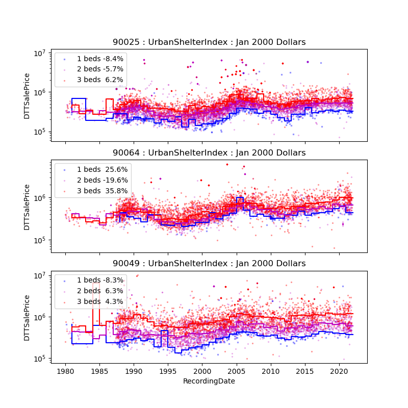
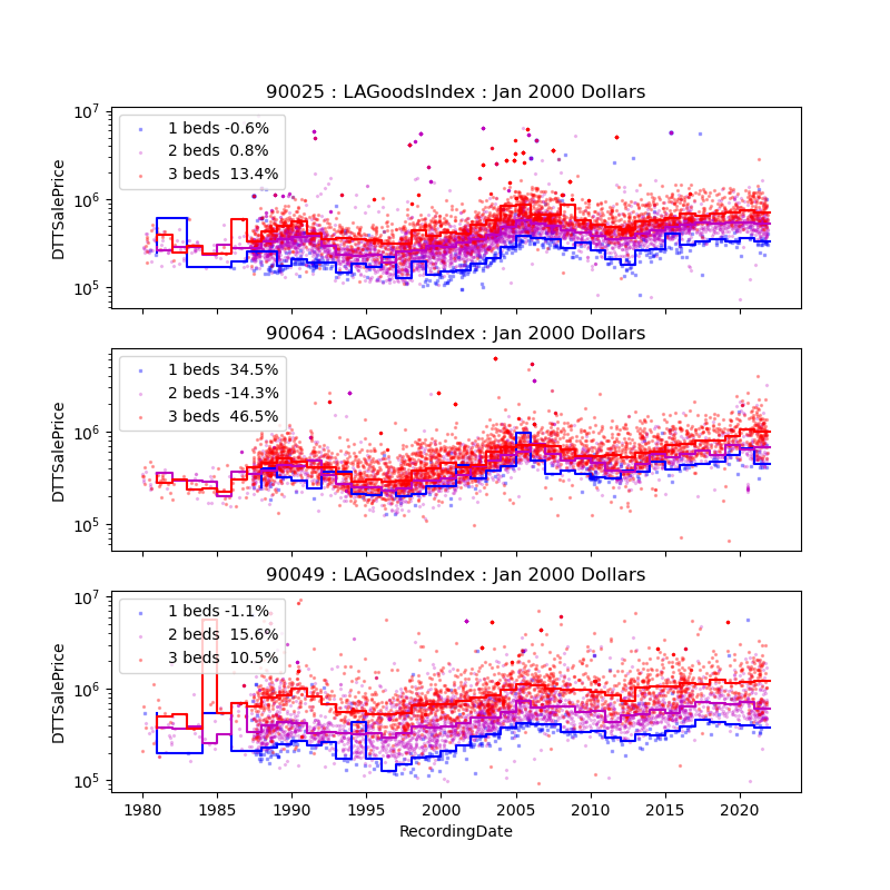
I've plotted the sales price for 1, 2, and 3 bedroom housing in the three listed zip codes. The legends show the color scheme for the different bedroom counts and a percent that I will get to later. In each plot, I have also given a step plot of the yearly median price of each of the scatter plots. Since the scale is log, it is hard to tell, but it looks like price appreciation might have just matched the peak of the housing bubble prices (when controlled for the various indexes).
I filtered for prices between $100k and $10m.
On the one hand, there are some very pricey places in Los Angeles, and I don't
particularly care what is happening to them. On the other, anything below
$100k in sales price has to be some kind of anomaly, especially if it has a
geniune bedroom count. This left about 29,000 records (about 1/3 of the
records were kept).
The percentage shown in the legends is the percent change in price from 2006 to 2020. That first year is the peak of the Case-Schiller Index for Los Angeles , which is around the peak of the housing bubble.
The CPI-W and UrbanShelter indexed changes are nearly identical, suggesting that I'm not picking up any new information when using both indexes. The 90025 and 90049 zip codes have shown lackluster net growth over that time period. The crash of 2007/2008 really took a long time to recover. On the other hand 90064 appears to have done much better for itself. The 2 bedroom result doesn't look likely to be real. There is a cluster sales in 2020 at approximately $100k that is dragging down the median.
There also appears to be some duplicate sales on the high side of the price as well. Some of the dots in the $5m range are very dark, indicating there are multiple points at nearly the same date and price. This could be bubble-driven flipping leading to lots of turn over. But that is too convenient a description for my taste.
At any rate, 90049 contains Brentwood, a very upscale neighborhood. So it doesn't really surprise me that it is doing better than the other two zip codes.
Conclusion
I started out this project attempting to figure out if the plateau in housing value on Zillow was accurate. Looking at the trend lines in the above plots, I'd say the answer to that question is yes, the plateau is reflected in the data collected by the Los Angeles Assessor's office.
How to use the repo
In main, set chunk_size and chunks to however many records you want to pull and
at what rate you want to save the dataframe they are stored in. This is mostly
to protect against getting shutdown by the LAA backend, but that never happened
to me. Then: python -m real_estate
Go get inflation data (or simply use the data I provide here).
After you have as many records as you want (or can get), compile the sales data
into a dataframe with python -m real_estate.real.json_reader
Finally, run python -m real_estate.plots, import your data and make some
plots.
Have fun!


