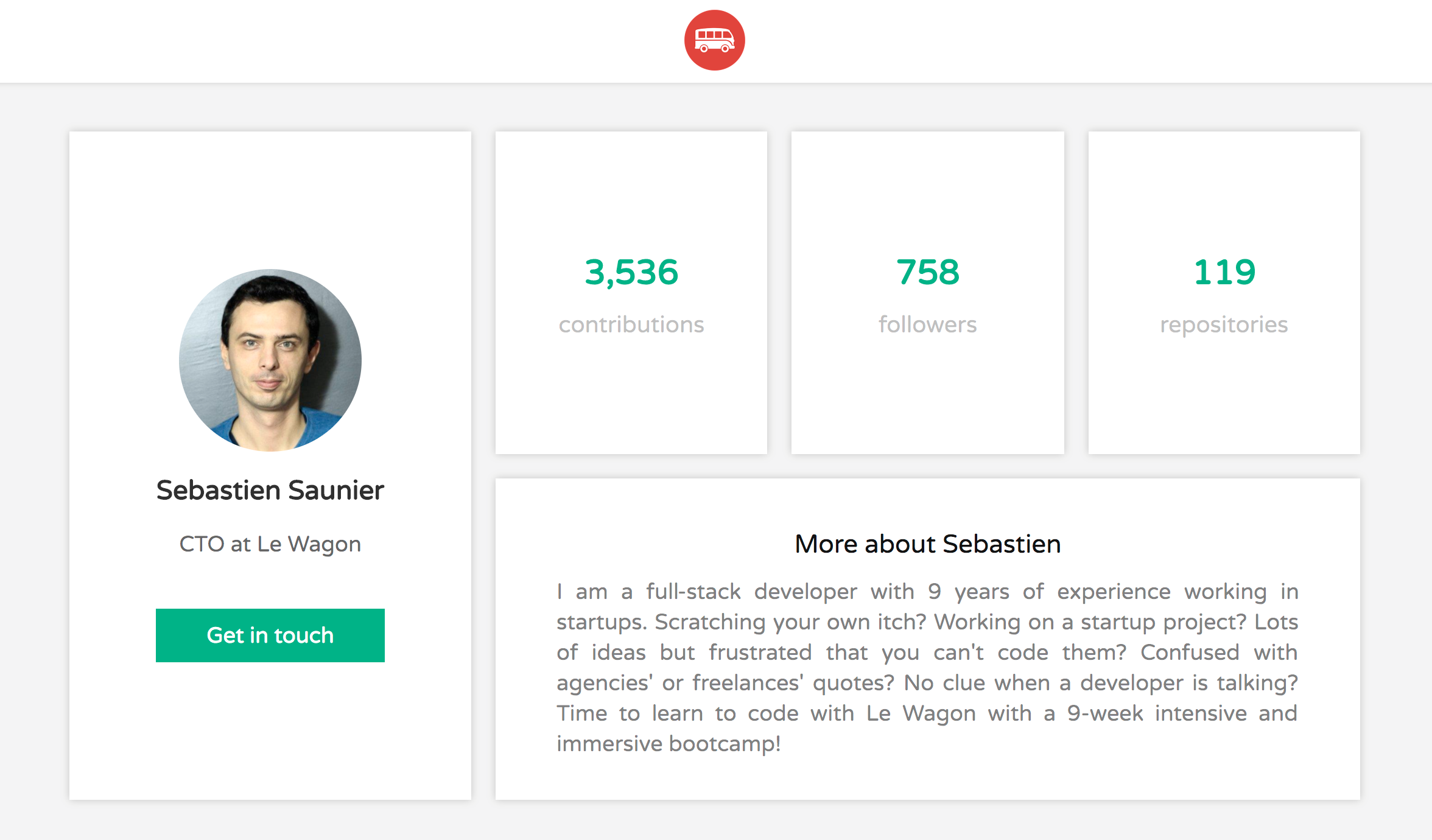
The purpose of this document is to give you a step by step approach to solve the following exercise from Le Wagon:
04-Front-End/03-Bootstrap/05-Dashboard-layout
Our starting point
    <div class="container text-center">
      <div class="card">
        <div class="card-content">
          <img src="images/seb.jpeg" alt="" width="150" class="img-circle">
          <h2>Sebastien Saunier</h2>
          <p>CTO at Le Wagon</p>
          <a href="#" class="btn btn-primary btn-lg">Get in touch</a>
        </div>
      </div>
      <div class="card">
        <div class="card-content">
          <h3>3,536</h3>
          <p>contributions</p>
        </div>
      </div>
      <div class="card">
Our cards are inside the container and we want to them laid out in a grid.
We want two rows of equal height and four columns where the three last have the same size. Add the .container selector to the profile.css, then add the display: grid and define the columns and rows.
Before going on, take a minute to look at this example:
https://developer.mozilla.org/en-US/docs/Web/CSS/CSS_Grid_Layout
We define the grid in the container class and then position each card in the grid.
To do so, we add a class to each card: main, one, two, three and description.
.container {
  display: grid;
  grid-template-columns: 350px 1fr 1fr 1fr;
  grid-template-rows: 50% 50%;
} <div class="container text-center">
<div class="main card">...
</div>
<div class="one card">...
</div>
<div class="two card">...
</div>
<div class="three card">...
</div>
<div class="description card">...
</div>
</div>
`.main {
grid-column: 1;
grid-row: 1 / span 2;
}
.one {
grid-column: 2 ;
grid-row: 1 ;
}
.two {
grid-column: 3 ;
grid-row: 1 ;
}
.three {
grid-column: 4 ;
grid-row: 1 ;
}
.description {
grid-column: 2 / span 3;
grid-row: 2;
}And our cards nicely find their places and it looks nice.
One last thing. If we would like the cards to have the same height, we can add a height to the container div. For example 90vh. It is up to you, what you prefer.
.container {
  display: grid;
  grid-template-columns: 350px 1fr 1fr 1fr;
  grid-template-rows: 50% 50%;
  height: 90vh;
}
I hope this solution shows you how to used Bootstrap Grid. Feedback is welcome.
Finn Pedersen


