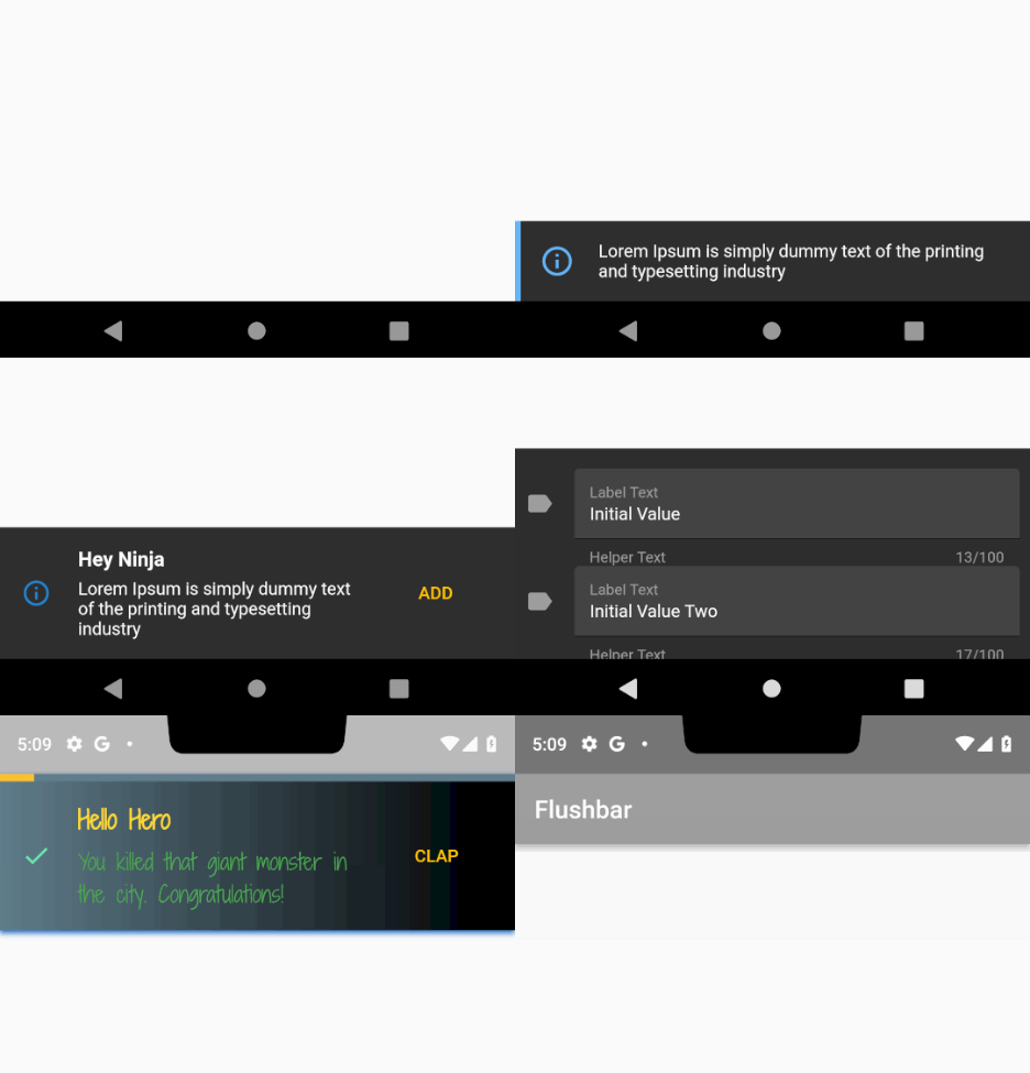
Use this package if you need more customization when notifying your user. For Android developers, it is made to substitute toasts and snackbars. IOS developers, I don't know what you use there, but you will like it.
See the install instructions.
Since customization requires a lot of properties, here is a quick cheatsheet:
| Property | What does it do |
|---|---|
| title | The title displayed to the user |
| message | The message displayed to the user. |
| titleText | Replaces [title]. Although this accepts a [widget], it is meant to receive [Text] or [RichText] |
| messageText | Replaces [message]. Although this accepts a [widget], it is meant to receive [Text] or [RichText] |
| icon | You can use any widget here, but I recommend [Icon] or [Image] as indication of what kind of message you are displaying. Other widgets may break the layout |
| shouldIconPulse | An option to animate the icon (if present). Defaults to true. |
| maxWidth | Used to limit Flushbar width (usually on large screens) |
| margin | Adds a custom margin to Flushbar |
| padding | Adds a custom padding to Flushbar. The default follows material design guide line |
| borderRadius | Adds a radius to all corners of Flushbar. Best combined with [margin]. I do not recommend using it with [showProgressIndicator] or [leftBarIndicatorColor] |
| borderColor | Adds a border to every side of Flushbar. I do not recommend using it with [showProgressIndicator] or [leftBarIndicatorColor] |
| borderWidth | Changes the width of the border if [borderColor] is specified |
| backgroundColor | Flushbar background color. Will be ignored if [backgroundGradient] is not null. |
| leftBarIndicatorColor | If not null, shows a left vertical bar to better indicate the humor of the notification. It is not possible to use it with a [Form] and I do not recommend using it with [LinearProgressIndicator]. |
| boxShadows | The shadows generated by Flushbar. Leave it null if you don't want a shadow. You can use more than one if you feel the need. Check this example |
| backgroundGradient | Flushbar background gradient. Makes [backgroundColor] be ignored. |
| mainButton | A [FlatButton] widget if you need an action from the user. |
| onTap | A callback that registers the user's click anywhere. An alternative to [mainButton] |
| duration | How long until Flushbar will hide itself (be dismissed). To make it indefinite, leave it null. |
| isDismissible | Determines if the user can swipe or click the overlay (if [overlayBlur] > 0) to dismiss. It is recommended that you set [duration] != null if this is false. If the user swipes to dismiss or clicks the overlay, no value will be returned. |
| dismissDirection | FlushbarDismissDirection.VERTICAL by default. Can also be [FlushbarDismissDirection.HORIZONTAL] in which case both left and right dismiss are allowed. |
| flushbarPosition | Flushbar can be based on [FlushbarPosition.TOP] or on [FlushbarPosition.BOTTOM] of your screen. [FlushbarPosition.BOTTOM] is the default. |
| flushbarStyle | Flushbar can be floating or be grounded to the edge of the screen. If grounded, I do not recommend using [margin] or [borderRadius]. [FlushbarStyle.FLOATING] is the default |
| forwardAnimationCurve | The [Curve] animation used when show() is called. [Curves.easeOut] is default. |
| reverseAnimationCurve | The [Curve] animation used when dismiss() is called. [Curves.fastOutSlowIn] is default. |
| animationDuration | Use it to speed up or slow down the animation duration |
| showProgressIndicator | true if you want to show a [LinearProgressIndicator]. |
| progressIndicatorController | An optional [AnimationController] when you want to control the progress of your [LinearProgressIndicator]. |
| progressIndicatorBackgroundColor | a [LinearProgressIndicator] configuration parameter. |
| progressIndicatorValueColor | a [LinearProgressIndicator] configuration parameter. |
| barBlur | Default is 0.0. If different than 0.0, blurs only Flushbar's background. To take effect, make sure your [backgroundColor] has some opacity. The greater the value, the greater the blur. |
| overlayBlur | Default is 0.0. If different than 0.0, creates a blurred overlay that prevents the user from interacting with the screen. The greater the value, the greater the blur. |
| overlayColor | Default is [Colors.transparent]. Only takes effect if [overlayBlur] > 0.0. Make sure you use a color with transparency e.g. Colors.grey[600].withOpacity(0.2). |
| userInputForm | A [TextFormField] in case you want a simple user input. Every other widget is ignored if this is not null. |
| onStatusChanged | a callback for you to listen to the different Flushbar status |
If you use a lot of those properties, it makes sense to make a factory to help with your Flushbar's base appearance. Things like shadows, padding, margins, text styles usually don't change within the app. Take a look at FlushbarHelper class and use it as an example.
While studying Flutter I stumbled on two amazing tutorials on how to use Flushbar. Make sure you show those guys some love.
- A beginners tutorial by Matej Rešetár
- A more advanced usage by Javier González Rodríguez
The examples bellow were updated for version 1.3.0. Changes might have been made. See the changelog if any of the examples do not reflect Flushbar's current state.
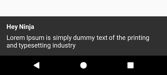
The most basic Flushbar uses only a message. Failing to provide it before you call show() will result in a runtime error.
Duration, if not provided, will create an infinite Flushbar, only dismissible by code, back button clicks, or a drag (case isDismissible is set to true).
- Note that only
messageis a required parameter. All the other ones are optional
class YourAwesomeApp extends StatelessWidget {

  @override
  Widget build(BuildContext context) {
    return MaterialApp(
      title: 'YourAwesomeApp',
      home: Scaffold(
        Container(
          child: Center(
            child: MaterialButton(
              onPressed: (){
                Flushbar(
                  title:  "Hey Ninja",
                  message:  "Lorem Ipsum is simply dummy text of the printing and typesetting industry",
                  duration:  Duration(seconds: 3),
                )..show(context);
              },
            ),
          ),
        ),
      ),
    );
  }
}Here is how customized things can get.
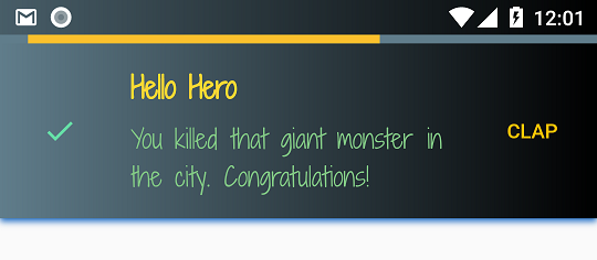
Flushbar(
      title: "Hey Ninja",
      message: "Lorem Ipsum is simply dummy text of the printing and typesetting industry",
      flushbarPosition: FlushbarPosition.TOP,
      flushbarStyle: FlushbarStyle.FLOATING,
      reverseAnimationCurve: Curves.decelerate,
      forwardAnimationCurve: Curves.elasticOut,
      backgroundColor: Colors.red,
      boxShadows: [BoxShadow(color: Colors.blue[800], offset: Offset(0.0, 2.0), blurRadius: 3.0)],
      backgroundGradient: LinearGradient(colors: [Colors.blueGrey, Colors.black]),
      isDismissible: false,
      duration: Duration(seconds: 4),
      icon: Icon(
        Icons.check,
        color: Colors.greenAccent,
      ),
      mainButton: FlatButton(
        onPressed: () {},
        child: Text(
          "CLAP",
          style: TextStyle(color: Colors.amber),
        ),
      ),
      showProgressIndicator: true,
      progressIndicatorBackgroundColor: Colors.blueGrey,
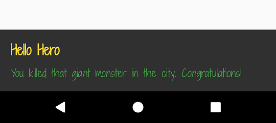
      titleText: Text(
        "Hello Hero",
        style: TextStyle(
            fontWeight: FontWeight.bold, fontSize: 20.0, color: Colors.yellow[600], fontFamily: "ShadowsIntoLightTwo"),
      ),
      messageText: Text(
        "You killed that giant monster in the city. Congratulations!",
        style: TextStyle(fontSize: 18.0, color: Colors.green, fontFamily: "ShadowsIntoLightTwo"),
      ),
);- Don't forget to call
show()or the bar will stay hidden. - To deactivate any of those properties, pass
nullto it.
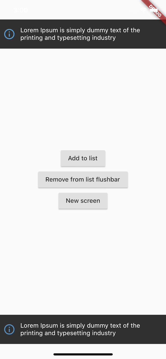
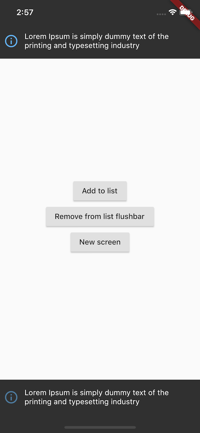
Flushbar can be either floating or grounded to the edge of the screen.
I don't recommend using margin or borderRadius if you chose FlushbarStyle.GROUNDED style.
Flushbar(flushbarStyle: FlushbarStyle.FLOATING)or
Flushbar(flushbarStyle: FlushbarStyle.GROUNDED)| Floating Style | Grounded Style |
|---|---|
 |
 |
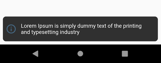
You can give it some padding and a border radius. Works best with FlushbarStyle.FLOATING
Flushbar(
  margin: EdgeInsets.all(8),
  borderRadius: 8,
);
Flushbar has a lateral bar to better convey the humor of the notification. To use it, simple give leftBarIndicatorColor a color.
Flushbar(
  message: "Lorem Ipsum is simply dummy text of the printing and typesetting industry",
  icon: Icon(
    Icons.info_outline,
    size: 28.0,
    color: Colors.blue[300],
    ),
  duration: Duration(seconds: 3),
  leftBarIndicatorColor: Colors.blue[300],
)..show(context);If you need a more fancy text, you can use Text or RichText
and pass it to the titleText or messageText variables.
- Note that
titlewill be ignored iftitleTextis notnull - Note that
messagewill be ignored ifmessageTextis notnull
Flushbar(
  title: "Hey Ninja", //ignored since titleText != null
  message: "Lorem Ipsum is simply dummy text of the printing and typesetting industry", //ignored since messageText != null
  titleText: Text("Hello Hero", style: TextStyle(fontWeight: FontWeight.bold, fontSize: 20.0 color: Colors.yellow[600], fontFamily:"ShadowsIntoLightTwo"),),
  messageText: Text("You killed that giant monster in the city. Congratulations!", style: TextStyle(fontSize: 16.0, color: Colors.green[fontFamily: "ShadowsIntoLightTwo"),),
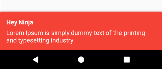
)..show(context);You can paint the background with any color you want. You can use any shadow you want.
Just give it a backgroundColor and boxShadows.
Flushbar(
  title: "Hey Ninja",
  message: "Lorem Ipsum is simply dummy text of the printing and typesetting industry",
  backgroundColor: Colors.red,
  boxShadows: [BoxShadow(color: Colors.red[800], offset: Offset(0.0, 2.0), blurRadius: 3.0,)],
)..show(context);
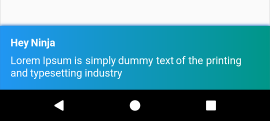
Want a gradient in the background? No problem.
- Note that
backgroundColorwill be ignored whilebackgroundGradientis notnull
Flushbar(
  title: "Hey Ninja",
  message: "Lorem Ipsum is simply dummy text of the printing and typesetting industry",
  backgroundGradient: LinearGradient(colors: [Colors.Colors.teal],),
  backgroundColor: Colors.red,
  boxShadows: [BoxShadow(color: Colors.blue[800], offset: Offset(0.0, 2.0), blurRadius: 3.0,)],
)..show(context);Let us put a Icon that has a PulseAnimation. Icons have this animation by default and cannot be changed as of now.
Also, let us put a button. Have you noticed that show() returns a Future?
This Future will yield a value when you call dismiss([T result]).
I recommend that you specify the result generic type if you intend to collect an user input.
Flushbar flush;
bool _wasButtonClicked;
@override
Widget build(BuildContext context) {
return Container(
child: Center(
child: MaterialButton(
onPressed: () {
flush = Flushbar<bool>(
title: "Hey Ninja",
message: "Lorem Ipsum is simply dummy text of the printing and typesetting industry",
icon: Icon(
Icons.info_outline,
color: Colors.blue,),
mainButton: FlatButton(
onPressed: () {
flush.dismiss(true); // result = true
},
child: Text(
"ADD",
style: TextStyle(color: Colors.amber),
),
),) // <bool> is the type of the result passed to dismiss() and collected by show().then((result){})
..show(context).then((result) {
setState(() { // setState() is optional here
_wasButtonClicked = result;
});
});
},
),
),
);
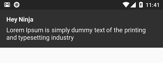
}Flushbar can be at FlushbarPosition.BOTTOM or FlushbarPosition.TOP.
Flushbar(
  flushbarPosition: FlushbarPosition.TOP,
  title: "Hey Ninja",
message: "Lorem Ipsum is simply dummy text of the printing and typesetting industry",)..show(context);By default, Flushbar is infinite. To set a duration, use the duration property.
By default, Flushbar is dismissible by the user. A right or left drag will dismiss it.
Set isDismissible to false to change this behaviour.
Flushbar(
  title: "Hey Ninja",
  message: "Lorem Ipsum is simply dummy text of the printing and typesetting industry",
  duration: Duration(seconds: 3),
  isDismissible: false,
)..show(context);If you are loading something, use a LinearProgressIndicator
If you want an undetermined progress indicator, do not set progressIndicatorController.
If you want a determined progress indicator, you now have full control over the progress since you own the AnimationController
- There is no need to add a listener to your controller just to call
setState(){}. Once you pass in your controller,Flushbarwill do this automatically. Just make sure you call_controller.forward()
AnimationController _controller = AnimationController(
      vsync: this,
      duration: Duration(seconds: 3),
    );

Flushbar(
  title: "Hey Ninja",
  message: "Lorem Ipsum is simply dummy text of the printing and typesetting industry",
  showProgressIndicator: true,
  progressIndicatorController: _controller,
  progressIndicatorBackgroundColor: Colors.grey[800],
)..show(context);You can set custom animation curves using forwardAnimationCurve and reverseAnimationCurve.
Flushbar(
  forwardAnimationCurve: Curves.decelerate,
  reverseAnimationCurve: Curves.easeOut,
  title: "Hey Ninja",
  message: "Lorem Ipsum is simply dummy text of the printing and typesetting industry",
)..show(context);You can listen to status update using the onStatusChanged property.
- Note that when you pass a new listener using
onStatusChanged, it will activate once immediately so you can check in what state the Flushbar is.
Flushbar flushbar = Flushbar(title: "Hey Ninja", message: "Lorem Ipsum is simply dummy text of the printing and typesetting industry");

  flushbar
    ..onStatusChanged = (FlushbarStatus status) {
      switch (status) {
        case FlushbarStatus.SHOWING:
          {
            doSomething();
            break;
          }
        case FlushbarStatus.IS_APPEARING:
          {
            doSomethingElse();
            break;
          }
        case FlushbarStatus.IS_HIDING:
          {
            doSomethingElse();
            break;
          }
        case FlushbarStatus.DISMISSED:
          {
            doSomethingElse();
            break;
          }
      }
    }
    ..show(context);
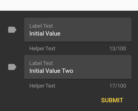
Sometimes we just want a simple user input. Use the propertyuserInputForm.
- Note that buttons, messages, and icons will be ignored if
userInputForm != null dismiss(result)will yield result.dismiss()will yield null.
Flushbar<List<String>> flush;
final GlobalKey<FormState> _formKey = GlobalKey<FormState>();
TextFormField getFormField(String text) {
return TextFormField(
initialValue: text,
style: TextStyle(color: Colors.white),
maxLength: 100,
maxLines: 1,
maxLengthEnforced: true,
decoration: InputDecoration(
fillColor: Colors.white10,
filled: true,
icon: Icon(
Icons.label,
color: Colors.grey[500],
),
border: UnderlineInputBorder(),
helperText: "Helper Text",
helperStyle: TextStyle(color: Colors.grey),
labelText: "Label Text",
labelStyle: TextStyle(color: Colors.grey)),
);
}
flush = Flushbar<List<String>>(
userInputForm = Form(
key: _formKey,
child: Column(
mainAxisSize: MainAxisSize.min,
children: [
getTextFormField("Initial Value"),
getTextFormField("Initial Value Two"),
]
Align(
alignment: Alignment.bottomRight,
child: Padding(
padding: const EdgeInsets.only(top: 8.0),
child: MaterialButton(
textColor: Colors.amberAccent,
child: Text("SUBMIT"),
onPressed: () {
flush.dismiss([_controller1.value.text, _controller2.value.text]);
},
),
),
)
],),),
)..show(context).then((result) {
if (result != null) {
String userInput1 = result[0];
String userInput2 = result[1];
}
});This example tries to mimic the Material Design style guide
I made a helper class to facilitate the creation of the most common Flushbars.
FlushbarHelper.createSuccess({message, title, duration});
FlushbarHelper.createInformation({message, title, duration});
FlushbarHelper.createError({message, title, duration});
FlushbarHelper.createAction({message, title, duration flatButton});
FlushbarHelper.createLoading({message,linearProgressIndicator, title, duration, progressIndicatorController, progressIndicatorBackgroundColor});
FlushbarHelper.createInputFlushbar({textForm});