@FoodForestNetwk recently tweeted that the USDA Plant Hardiness Zone Map is woefully out of date. This repo contains an initial exploration of the problem.
or see the notebook used to generate the interactive map
There is also an in-progress observable notebook for this map: https://observablehq.com/@fletchgraham/us-plant-hardiness-zones-voronoi
- Create a map of plant hardiness zones in the US
- The map should reflect the latest available data
- The map should be interactive
- add more constraints here
To figure out what kind of data to look for, a hardiness zone needs to be defined. From looking at the USDA hardiness map I gleaned that the zones are simply defined by the average extreme minimum temperature for the year.
On the NOAA NCEI site I found that I could download a "Global Summary of the Year" for the entire world which seemed to have the minimum temperature data I was after.
The dataset is quite large with a lot of extra info so I spent some time in a notebook filtering it down. Also to save my poor laptop I got rid of any years before 2019 though in some spots it goes back to the seventies.
See the jupyter notebook which contains python code for fetching the data, filtering it, and saving out a winnowed CSV.
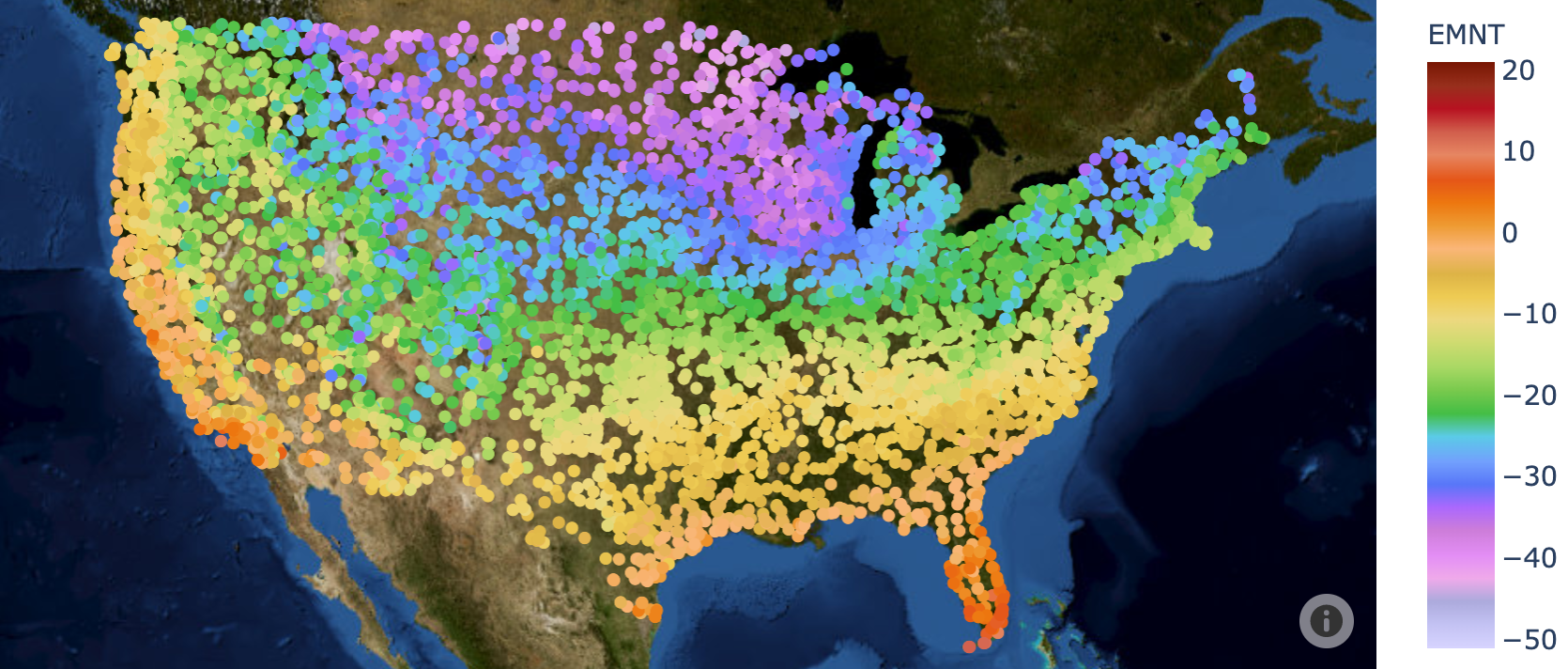
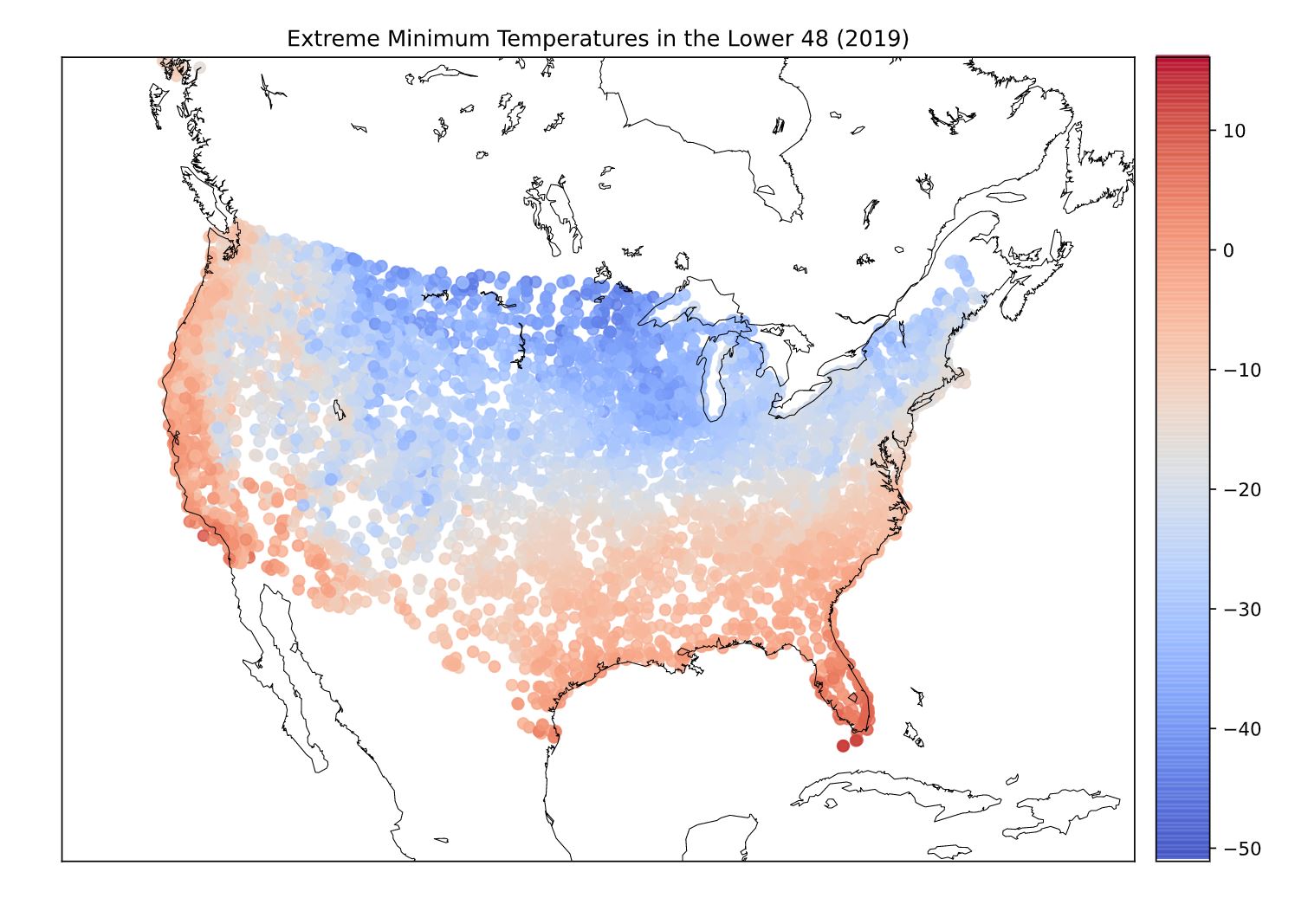
After filtering, I was left with ~5000 rows. Just to see what I was working with I scattered the filtered data onto a map using a deprecated python library called Basemap.
Encouraging! looks about as one would expect. see the notebook that generated this plot
The interactive map was created using Plotly which provides a high level way to scatter data onto a Mapbox map. The map fetches USGS tiles from ArcGIS.
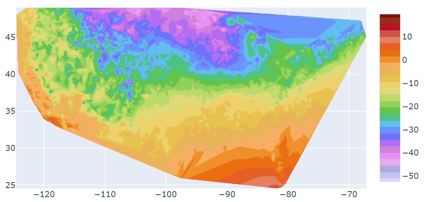
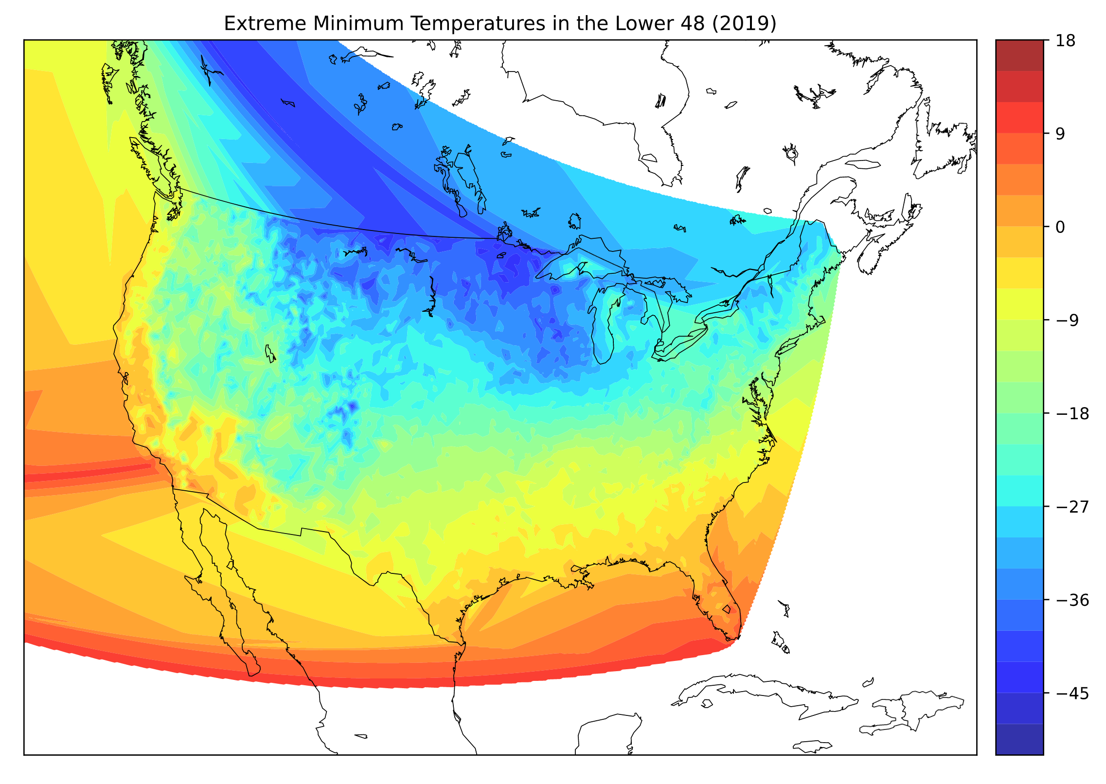
What we're after is a "filled contour plot" which plotly can make, but I haven't figured out how to draw those polygons onto the Plotly mapbox map.
I managed to make such a contour plot on an actual map, but it was using the deprecated Basemap library:
- Interpolation: http://www.bisolutions.us/A-Brief-Introduction-to-Spatial-Interpolation.php
- I'm also looking at Holoviz Datashader to potentially solve this problem
- just found this about drawing polygons on a plotly map: https://community.plotly.com/t/draw-polygon-in-mapbox-with-dash-python/34917/5
- and if we want to use D3 there is this https://observablehq.com/@d3/geotiff-contours?collection=@d3/d3-contour
- helpful blog post about gdal and creating geotiff from scattered data http://geoexamples.blogspot.com/2012/05/creating-grid-from-scattered-data-using.html


