

- Super Lightweight Component
- Smooth Animation
- Add Your own Component To Bottom Sheet
- Customize Whatever You Like
- Support Drag Down Gesture
- Support All Orientations
- Support Both Android And iOS
- Top Search Ranking (react native bottom sheet) at npms.io
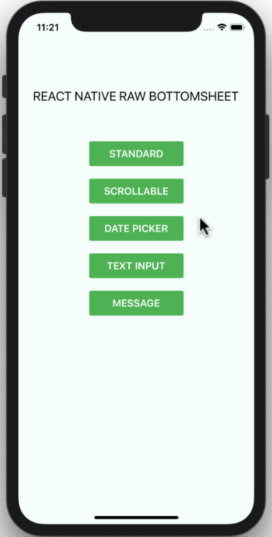
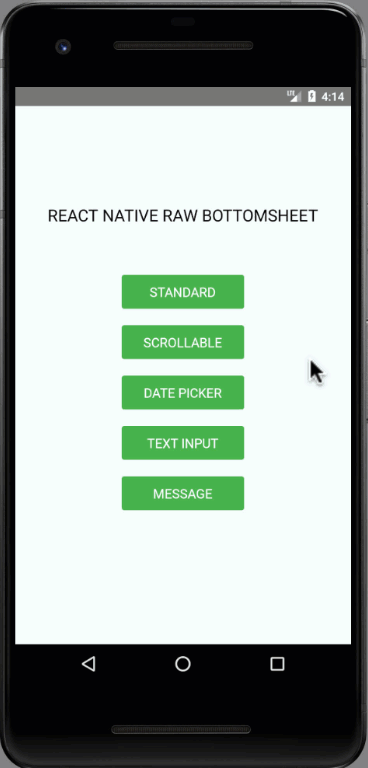
| Showcase iOS | Showcase Android |
|---|---|
 |
 |
npm i react-native-raw-bottom-sheet --save
yarn add react-native-raw-bottom-sheet
import React, { Component } from "react";
import { View, Text, Button } from "react-native";
import RBSheet from "react-native-raw-bottom-sheet";

class Example extends Component {
  render() {
    return (
      <View style={{ flex: 1, justifyContent: "center", alignItems: "center" }}>
        <Button
          title="OPEN BOTTOM SHEET"
          onPress={() => {
            this.RBSheet.open();
          }}
        />
        <RBSheet
          ref={ref => {
            this.RBSheet = ref;
          }}
          height={300}
          duration={250}
          customStyles={{
            container: {
              justifyContent: "center",
              alignItems: "center"
            }
          }}
        >
          <YourOwnComponent />
        </RBSheet>
      </View>
    );
  }
}

const YourOwnComponent = () => <Text>Your Pretty Component Goes Here</Text>;

export default Example;renderItem = (item, index) => (
<View>
<Button title={`OPEN BOTTOM SHEET-${index}`} onPress={() => this[RBSheet + index].open()} />
<RBSheet
ref={ref => {
this[RBSheet + index] = ref;
}}>
<YourOwnComponent onPress={() => this[RBSheet + index].close()} />
</RBSheet>
</View>
);| Props | Type | Description | Default |
|---|---|---|---|
| animationType | string | Background animation ("none", "fade", "slide") | "none" |
| height | number | Height of Bottom Sheet | 260 |
| minClosingHeight | number | Minimum height of Bottom Sheet before close | 0 |
| duration | number | Duration of Bottom Sheet animation | 300 (ms) |
| closeOnDragDown | boolean | Use gesture drag down to close Bottom Sheet | false |
| closeOnPressMask | boolean | Press the area outside to close Bottom Sheet | true |
| closeOnPressBack | boolean | Press back android to close Bottom Sheet (Android only) | true |
| onClose | function | Callback function when Bottom Sheet has closed | null |
| customStyles | object | Custom style to Bottom Sheet | {} |
customStyles: {
  wrapper: {...}, // The Root of Component (You can change the `backgroundColor` or any styles)
  container: {...}, // The Container of Bottom Sheet
  draggableIcon: {...} // The Draggable Icon (If you set closeOnDragDown to true)
}
| Method Name | Description |
|---|---|
| open | Open Bottom Sheet |
| close | Close Bottom Sheet |
- Always set
reftoRBSheetand call each method by usingthis.RBSheet.methodName()like example above. - If you want to use
Scrollable ComponentlikeScrollView,FlatListor something else insideRBSheet, you have to set propscloseOnDragDowntofalseotherwise it won't work. - The demo source codes are in
example folder.
If you think this project is helpful just give me a ⭐️ Star is enough because i don't drink coffee :D
This project is licensed under the MIT License - see the LICENSE.md file for details
Made with ❤️ by NY Samnang.