CSS to the Rescue @cmda-minor-web 18-19
Summary
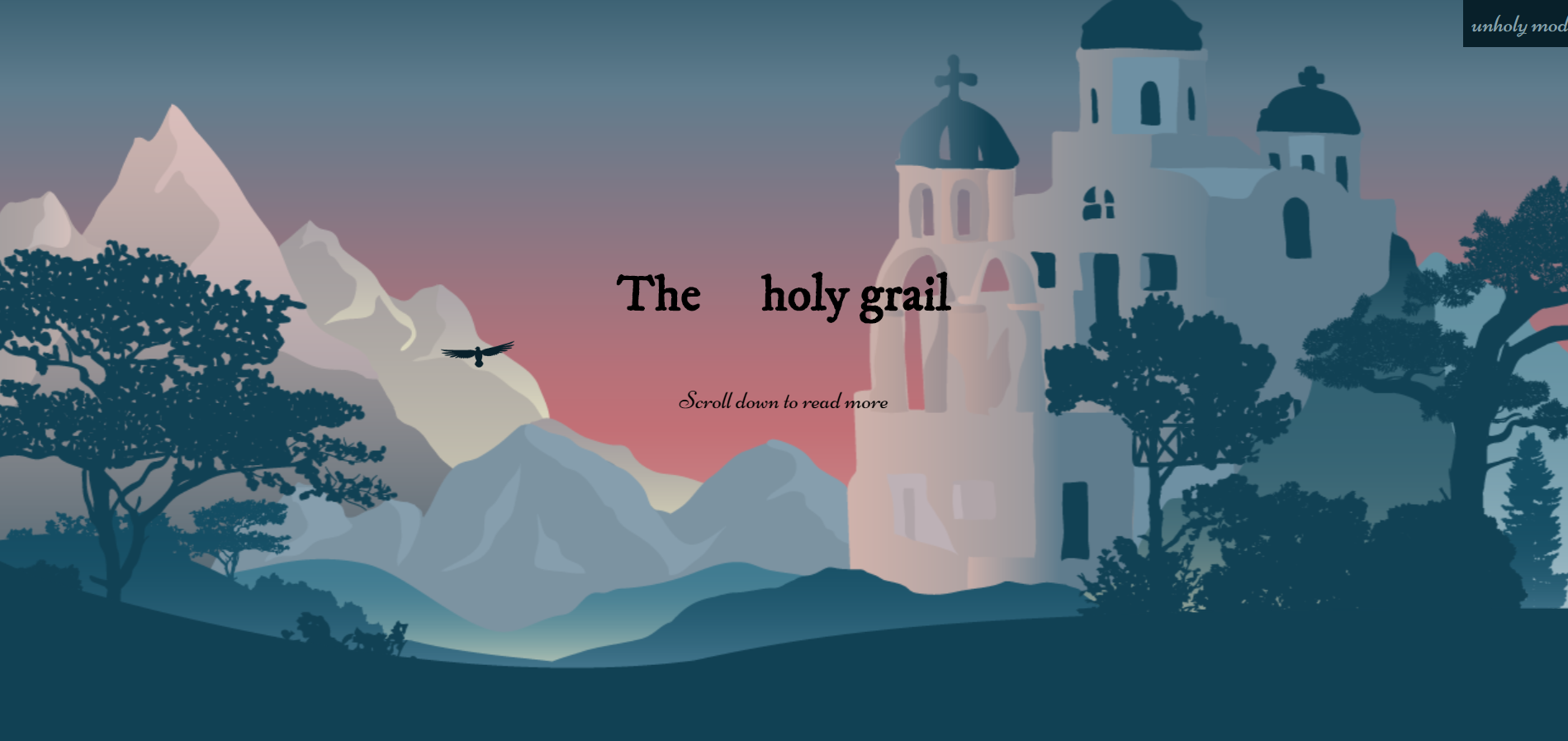
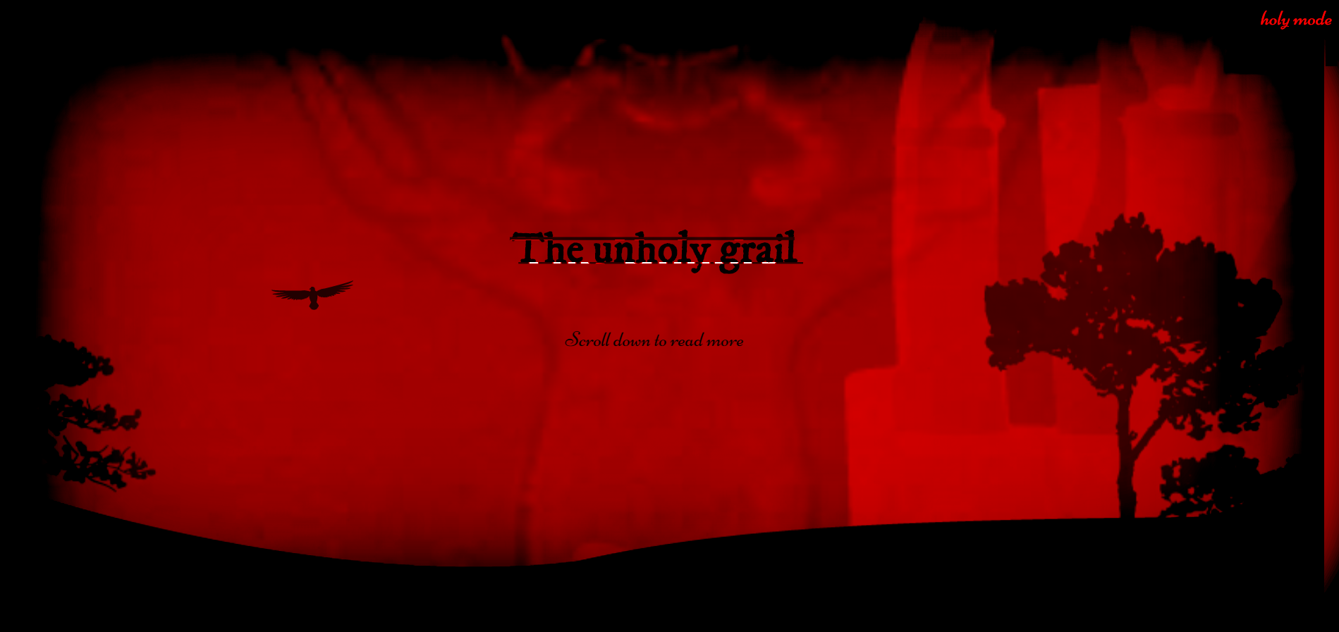
A magazine article layout which features a holy mode and unholy mode. The holy mode is nice and peaceful while the unholy mode introduces.
Live demo
https://follywolly.github.io/css-to-the-rescue-1819/src/
Table of contents
Assignment
Magazine Layout with dark mode/light mode
I implemented a holy and unholy mode since it works well with the theme of the article.


Methodology
BEM
BEM is a way of structuring your css selectors. It works as follows:
B lock (block)
E lement (block__element)
M odifier (block__element--modifier)
Let's take a block as example: a card . In your HTML it looks like this:
<article class="card"> <!-- block -->
  <img class="card__image" /> <!-- element -->
  <div class="card__content"> <!-- element -->
    <h3 class="card__title">Some title</h3> <!-- element -->
    <p class="card__text">A small paragraph</p>
    <p class="card__text card__text--bolder">A small paragraph, but bolder</p> <!--element with modifier -->
  </div>
</article>
As you can see, subchildren of block children don't take the class of their parent as a prefix: the block is the only prefix you get. So, no nested class names.
.card { /* block */
  margin: 1rem;
}
.card__content { /* parent element */
  padding: 1rem;
}
.card__text { /* child element */
  font-weight: normal;
  font-size: 1rem;
  color: white;
}
.card__text--bolder { /* modifier */
  font-weight: bolder;
}
Or more concise in SCCS, like this:
.card { //block
  margin: 1rem;
  &__content { // parent element
    padding: 1rem;
  }
  &__text { // child element
    font-weight: normal;
    font-size: 1rem;
    color: white;
    &--bolder { // modifier
      font-weight: bolder;
    }
  }
}
Restrictions
- Two colors
- Responsive without media queries
Two colors
I used white and lightblue as the two main colors: when you switch to dark mode you get red and black.
Responsive without media queries
The site is fully functional on mobile.