A multiselect widget created using Web Components.
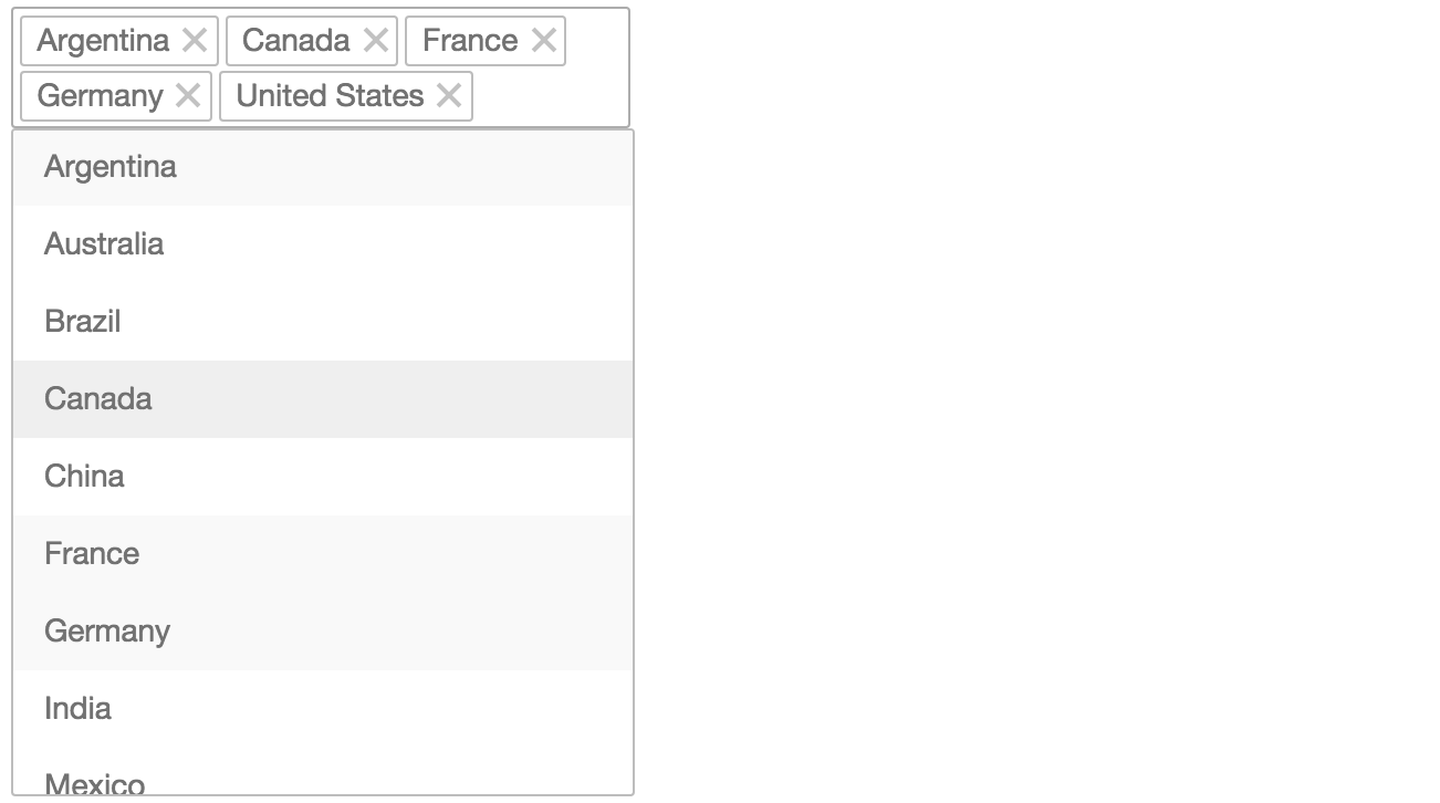
Import multiselect.html and use <x-multiselect> element. Define items with <li> elements. To make an item selected add selected attribute.
<!DOCTYPE html>
<html>
<head>
    <meta charset="UTF-8">
    <link rel="import" href="multiselect.html">
</head>
<body>
    <x-multiselect placeholder="Select Value">
        <li value="1" selected>Item 1</li>
        <li value="2">Item 2</li>
        <li value="3" selected>Item 3</li>
        <li value="4">Item 4</li>
    </x-multiselect>
</body>
</html>Add attribure placeholder to set multiselect placeholder (text to be displayed when no items are selected).
    <x-multiselect placeholder="Multiselect Placeholder">
    ...
</x-multiselect>Returns selected item values as an Array.
// returns an array of values, e.g. [1, 3]
var selectedItems = multiselect.selectedItems();Is fired each time selected items are changes.
multiselect.addEventListener('change', function() {
    // print selected items to console
    console.log('Selected items:', this.selectedItems());
});
Browser support is limited by support of Web Components.
Add webcomponentjs polyfill to be able to use the component in all modern browsers.