We have used the Superstore Sales dataset to learn about the Tableau environment interface, including the Start page, Data Source page, and Workspace. Then, we explored the useful visualizations that can be created in Tableau Public. Finally, we discussed how we can combine the vizzes in our workbooks to create dashboards to communicate our insights. Now it's your turn to apply your skills in Tableau.
In this exercise, you will use knowledge of the Tableau interface, data visualizations, and dashboards to create the Super Store Sales dashboard.
To recreate the dashboard, follow the instructions below. When you are finished, save and publish to Tableau Public. Then, add the link to this assignment and click submit. You've just created your first interactive dashboard with Tableau Public!
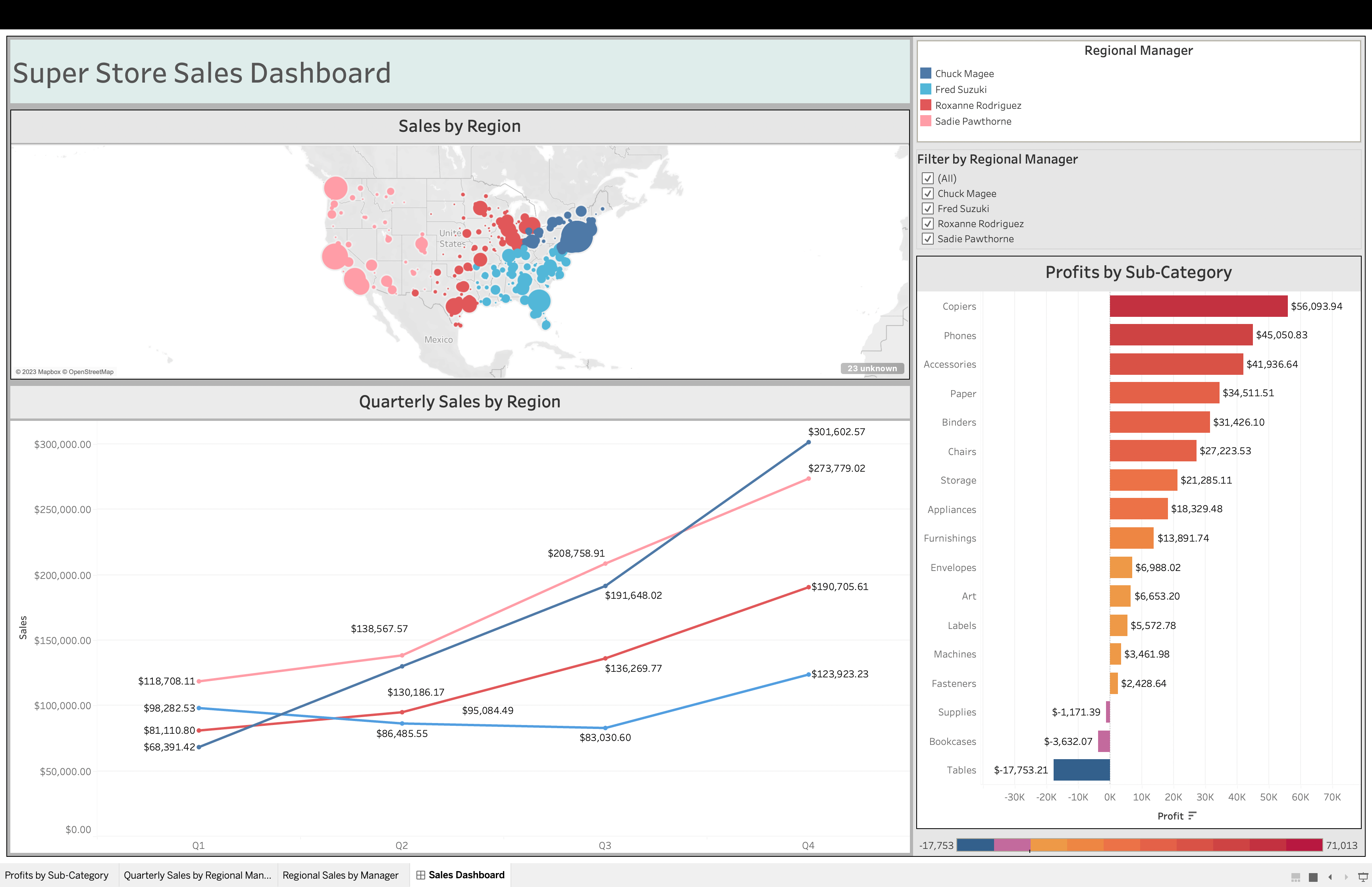
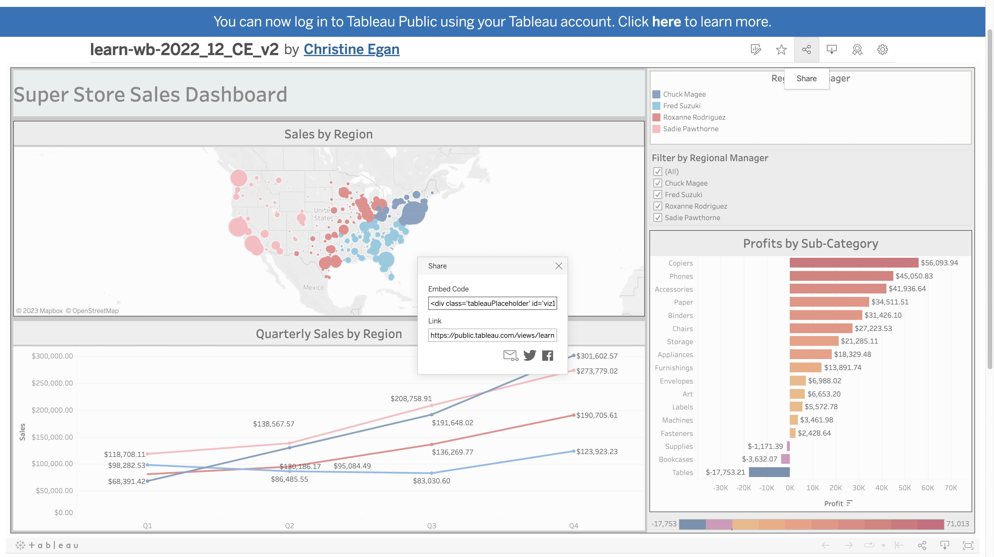
The final product should look like this:
|
For Part A, use lessons "Tableau Public: Getting Started", "Tableau Public: The Data Source Page", and "Tableau Public: Customizing Data Sources" as a reference.
- Launch Tableau and from the Start page, use the Connect pane to open the SuperStore Sales dataset.
- From the Data Source page, populate Canvas logical layer with the
Orderstable and thePeopletable.
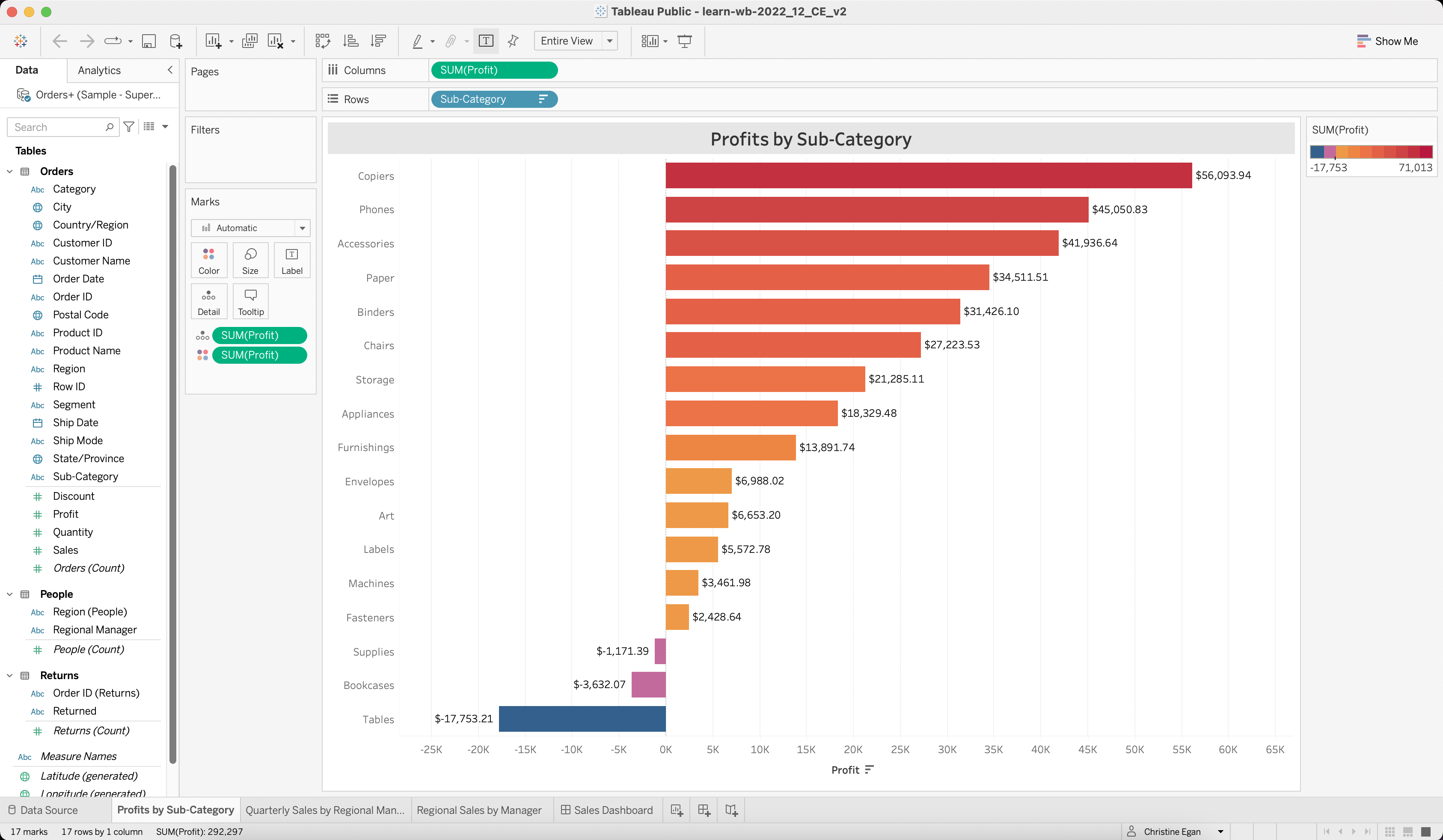
For Part B, use lessons "Tableau Visualizations: Visualization Basics" and "Tableau Visualizations: Visualization Basics Lab" as a reference.
- Create a new worksheet.
- Drag the
Profitspill to the Columns shelf from the Data Pane. - Drag the
Sub-Categorypill to the Rows shelf from the Data Pane. - Change the title of the chart to "Profits by Sub-Category". Change the font size to 16. Center the title and change the background to light gray.
- Then, order the bars in the bar chart in descending order.
- Next, drag the
Profitspill from the Data pane to the Marks card, and use the Marks card to change the color of the bars to "Sunrise-Sunset Diverging". - Next use the Marks card to add labels that indicate the sum of the profits for each of the bars by dragging another
Profitspill from the Data pane and using the label attribute. (Don't forget the currency symbols!) - Fit the visualization to "Entire View".
|
For Part C, use lessons "Tableau Visualizations: Visualization Basics" and "Tableau Visualizations: Visualization Basics Lab" as a reference.
- Create a new worksheet.
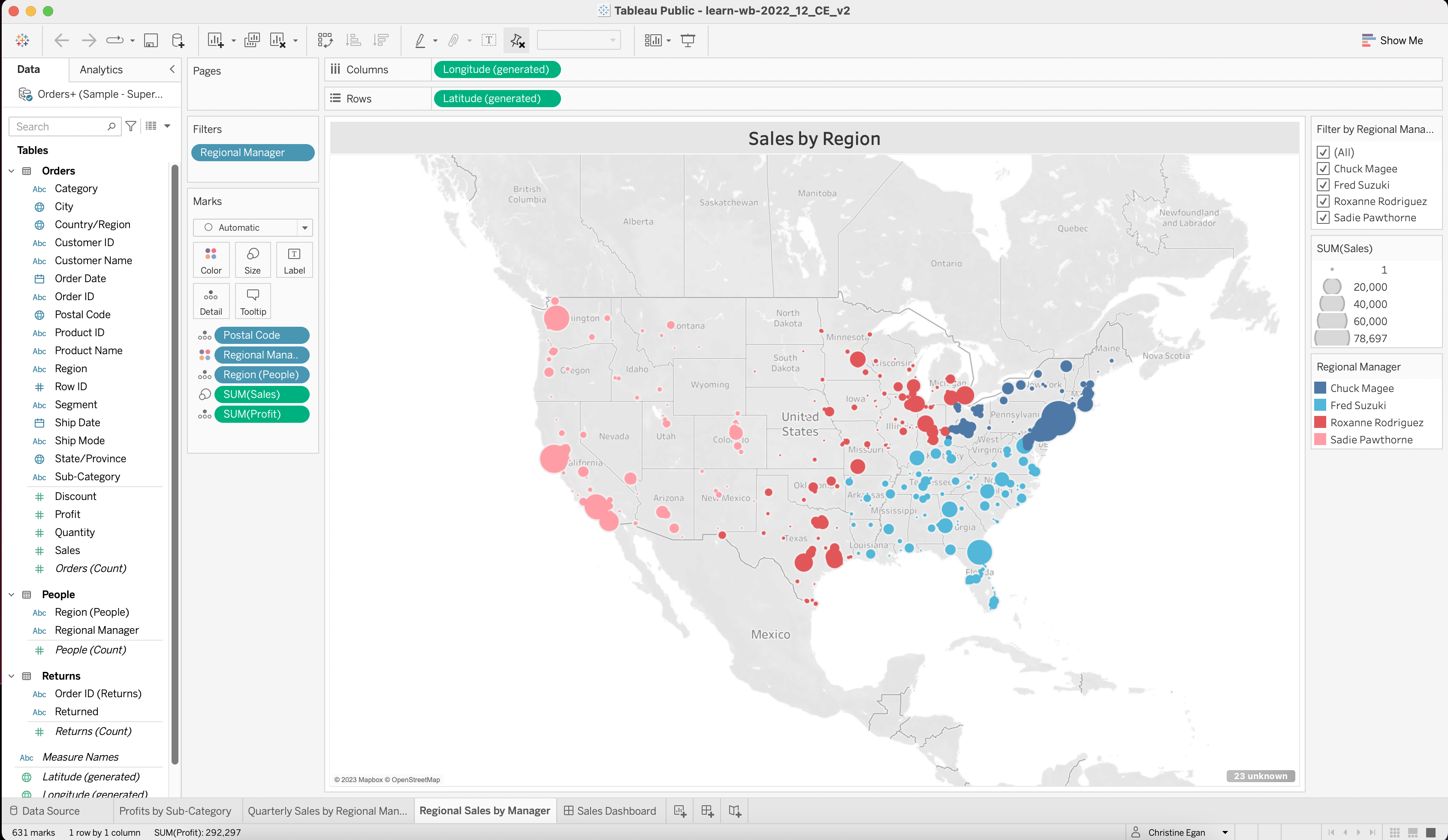
- Drag the
LongitudeandLatitudeto the Row shelf and the Column shelf. - Change the title of the chart to "Sales by Regional Manager". Change the font size to 16. Center the title and change the background to light gray by right clicking the title, then using Format Title > Shading dropdown.
- Add
Salesto the Marks card, and select the Size attribute. Then, addPostal Codeto the Marks card and select the Detail attribute. This will populate the map with sales by postal code. - Add
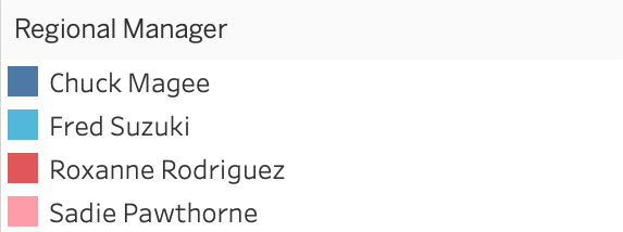
Regional Managerto the Marks card, and select the Color attribute. Then, click the Color icon and select Edit Color. Then, select Lightening Default. Assign the following colors to each Regional Manager:
|
- Next, drag
Profitto the Marks card and add the Detail attribute. This will allow users to view the profits in conjunction with sales (becuase high sales does not always mean high profits). - Then, drag
Regional Managerto the Filter shelf.
|
For Part D, use lessons "Tableau Visualizations: Visualization Basics" and "Tableau Visualizations: Visualization Basics Lab" as a reference.
- Create a new worksheet.
- Drag the
SalesandOrder Datepills from the Data pane to the Row shelf and the Column shelf. You will notice thatSalesbecomesSUM(Sales)and thatOrder DatebecomesYEAR(Order Date). On theYEAR(Order Date)pill, click the arrow directly to the right of the text on theYEAR(Order Date)pill. This will reveal a drop down menu. Select Quarter from the dropdown, which will changeYEAR(Order Date)toQuarter(Order Date). - Change the title of the chart to "Quarterly Sales by Region". Change the font size to 16. Center the title and change the background to light gray by right clicking the title, then using Format Title > Shading dropdown.
- Add
Salesto the Marks card, and select the Size attribute. Then, addPostal Codeto the Marks card and select the Detail attribute. This will populate the map with sales by postal code. - Add
Regional Managerto the Marks card, and select the Color attribute. Then, click the Color icon and select Edit Color. Then, select Lightning Default. Assign the following colors to each Regional Manager:
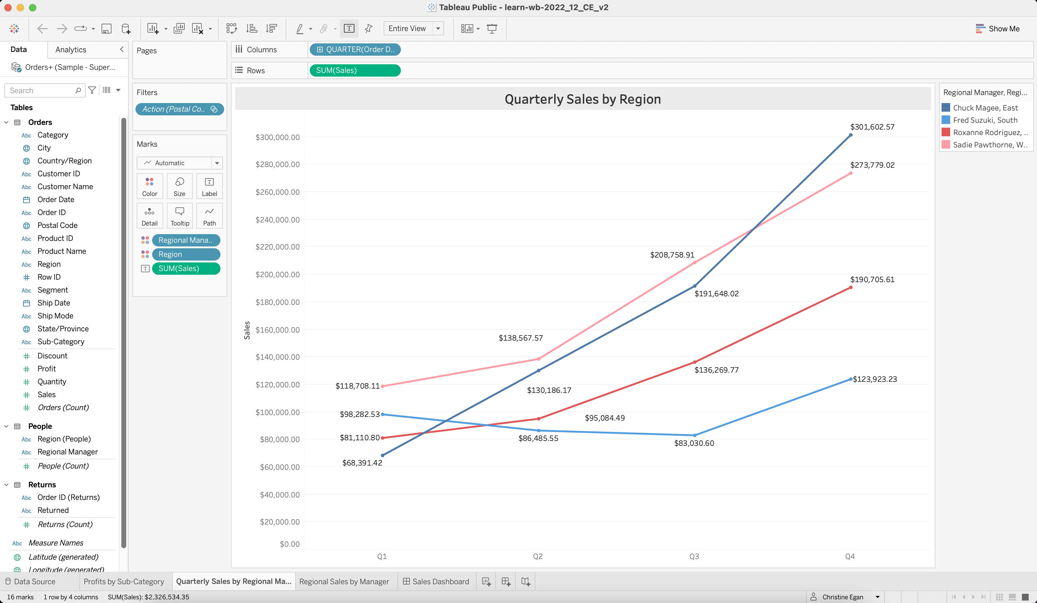
|
For Part E, use lessons "Tableau Dashboards: Introduction", "Tableau Dashboards: Dashboard Basics" and "Tableau Dashboards: Dashboard Basics Lab" as a reference.
- Adjust the layout from Phone to Desktop. Select Fit Width and set Height to 1060px. Then, select Custom and Tiled from the layout card.
- Check Show Dashboard Title and change the title to "Super Store Sales Dashboard". Change the font size to 26. Center the title and change the background to light blue.
- When the title is selected, select the Layout tab on the left bar menu, then choose Background and change the background to gray.
- Add a Horizontal Container under the dashboard title and set the layout to Tiled.
- On the legends, change the font size of the legend title to 12, and center the title. (You can change the title on legends the same way the title is changed on dashboards and visualizations.
- Using two Vertical Containers, position the charts and legends in the layout displayed below.
|
|
-
Save and publish to Tableau Public as
learn-wb-MM-DD-YY-XXwhereXXis your initials andMMDDYYrefers to the current month, date, and year. -
Locate the share link on your Tableau Public site and submit your workbook link.
|