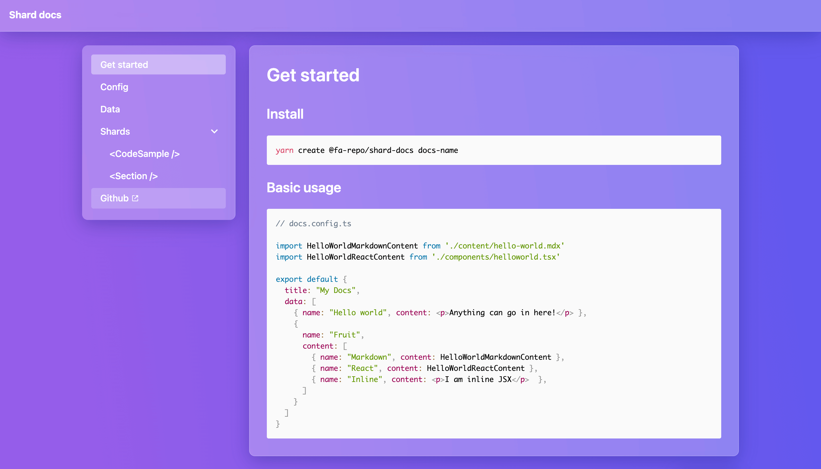
yarn create @fa-repo/shard-docs docs-nameRun locally
yarn devBuild to deploy
yarn build// docs.config.ts
import MarkdownHelloWorldContent from './content/hello-world.mdx'
import ReactHelloWorldContent from './components/helloworld.tsx'
export default {
title: "My Docs",
data: [
{ name: "Hello world", content: <p>Anything can go in here!</p> },
{
name: "Fruit",
content: [
{ name: "Markdown", content: MarkdownHelloWorldContent },
{ name: "React", content: ReactHelloWorldContent },
{ name: "Inline", content: <p>I am inline JSX</p> },
]
}
]
}// docs.config.ts
export default {
/**
* The title of the docs.
* @optional
* @string
*/
title: "My Docs",
/**
* Add a prefix to all routes. E.g. "/docs/".
* @optional
* @string
* @default "/"
*/
basePath: "/docs/",
/**
* Hide "Built with Shard Docs" at the bottom of the sidebar.
* @optional
* @boolean
* @default false
*/
hideBuiltWithShardDocs: true,
/**
* Use react routers BrowserRouter instead of HashRouter for routing.
* @string "hash"|"browser"
* @default "hash"
*/
routerType: "browser",
/**
* The schema of the data is explained further down.
* @array
*/
data: data,
}Data passed to ShardDocs is composed of three types of items. Pages, Categories and Links. To keep the schema as simple as possible, each item shares the same fields and the type is implicitly determined by the data provided.
The anatomy of an item
Each item shares a name field and the type of data provided to content determins how the item is treated.
type item = {
  name: string;
  content: react.ReactNode | item[] | string;
}
Pages are created by providing JSX, this could be inline or an imported component.
type page = {
  name: string;
  content: React.ReactNode;
}
Categories are created by providing an array of items, this will render a collapsible sub menu on the sidebar.
type category = {
  name: string;
  content: item[];
}
Links are created by providing a url. Relative urls will use the internal router, absolute urls will open in a new tab.
type link = {
  name: string;
  content: string;
}Shard docs comes with a few pre-built shards (components you can drop in on the page).
This shard displays a component in a preview box, with access to the source code and a link to github.
import { CodeSampleShard } from "@fa-repo/shard-docs";
import "@fa-repo/shard-docs/dist/shards/CodeSampleShard.css";

...

<CodeSampleShard>
<h1>Hello world</h1>
</CodeSampleShard>| Name | Type | Default | Required | Description |
|---|---|---|---|---|
| github | string | "" |
Link to Github. | |
| lang | string | jsx |
Supported languages: markup, bash, clike, c, cpp, css, css-extras, javascript, jsx, js-extras, coffeescript, diff, git, go, graphql, handlebars, json, less, makefile, markdown, objectivec, ocaml, python, reason, sass, scss, sql, stylus, tsx, typescript, wasm, yaml. |
|
| useIframe | boolean | false |
Load the code sample in an iframe. | |
| iframeHead | string | "" |
Add things to the iframe <head />. |
|
| iframeStyle | object | {} |
Set the iframes inline style. |
This shard displays content in a collapsible area.
import { SectionShard } from "@fa-repo/shard-docs";
import "@fa-repo/shard-docs/dist/shards/SectionShard.css";

...

<SectionShard title="Heading">
  Lorem ipsum...
</SectionShard>| Name | Type | Default | Required | Description |
|---|---|---|---|---|
title |
string | "" |
required | Title of the section. |
persistState |
string | "" |
sometimes | Provide a custom id to persist collapsed state on page refresh. |
- Add github corner feature
- Add search feature
- Fully optimise package size
MIT


