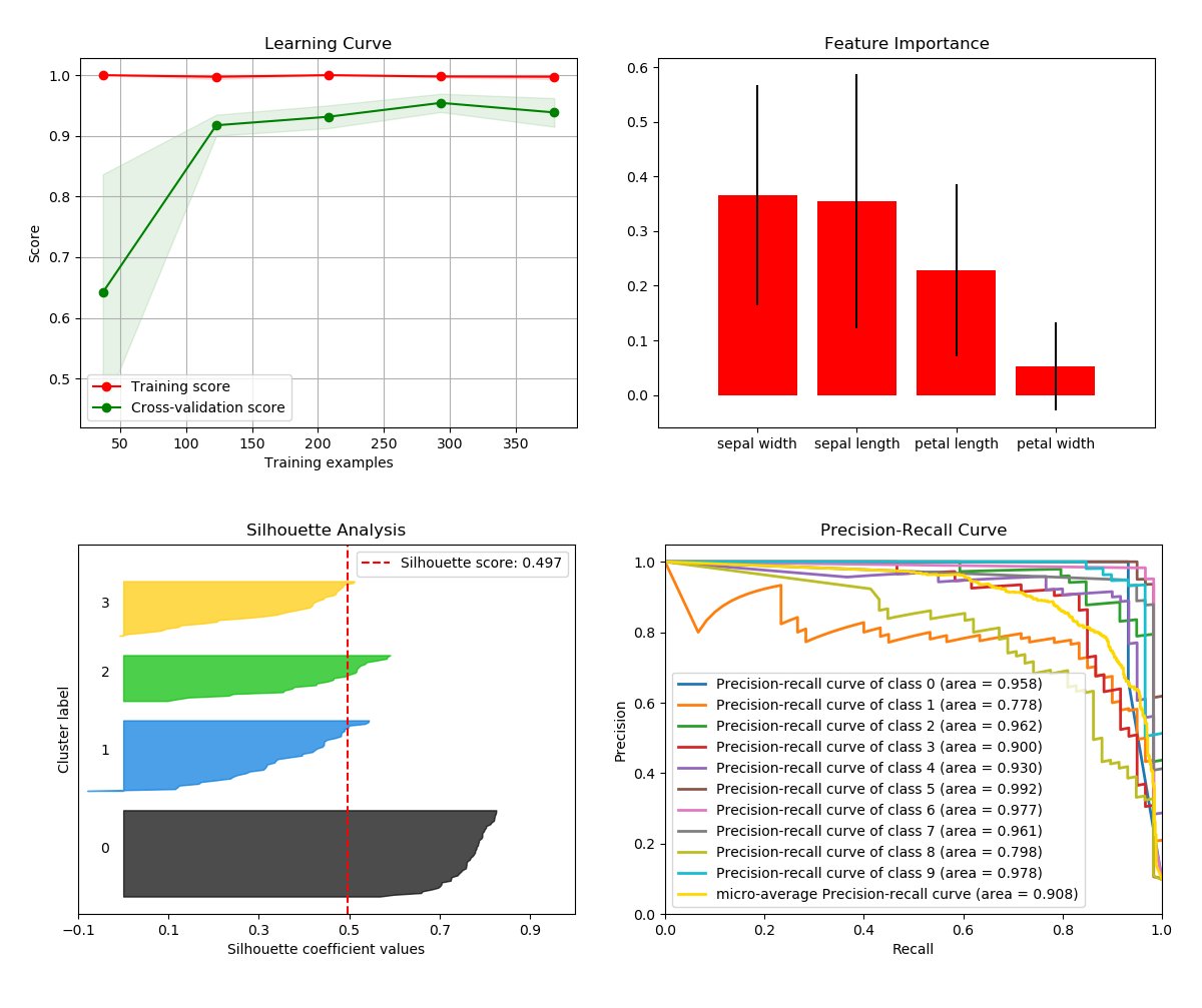
Scikit-plot is the result of an unartistic data scientist's dreadful realization that visualization is one of the most crucial components in the data science process, not just a mere afterthought.
Gaining insights is simply a lot easier when you're looking at a colored heatmap of a confusion matrix complete with class labels rather than a single-line dump of numbers enclosed in brackets. Besides, if you ever need to present your results to someone (virtually any time anybody hires you to do data science), you show them visualizations, not a bunch of numbers in Excel.
That said, there are a number of visualizations that frequently pop up in machine learning. Scikit-plot is a humble attempt to provide aesthetically-challenged programmers (such as myself) the opportunity to generate quick and beautiful graphs and plots with as little boilerplate as possible.
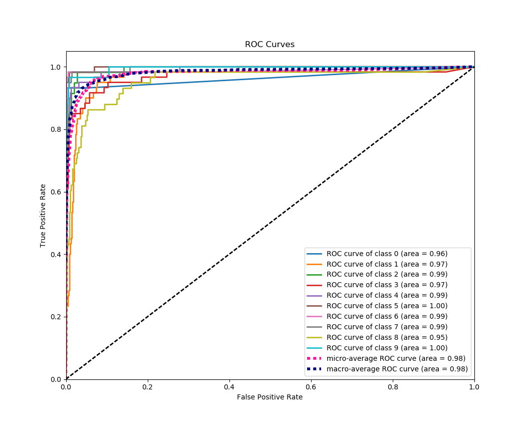
Say we use Naive Bayes in multi-class classification and decide we want to visualize the results of a common classification metric, the Area under the Receiver Operating Characteristic curve. Since the ROC is only valid in binary classification, we want to show the respective ROC of each class if it were the positive class. As an added bonus, let's show the micro-averaged and macro-averaged curve in the plot as well.
Using scikit-plot with the sample digits dataset from scikit-learn.
from sklearn.datasets import load_digits as load_data
from sklearn.naive_bayes import GaussianNB

# This is all that's needed for scikit-plot
import matplotlib.pyplot as plt
from scikitplot import classifier_factory

X, y = load_data(return_X_y=True)
nb = GaussianNB()
classifier_factory(nb)
nb.plot_roc_curve(X, y, random_state=1)
plt.show()
Pretty.
So what happened here? First, we created a regular Naive Bayes classifier instance from scikit-learn and assigned it to nb. We then passed nb to classifier_factory. Then, like magic, we call nb's instance method plot_roc_curve and pass it a features array and corresponding label array. Finally, we call plt.show() to display the corresponding plot.
Wait, what? The scikit-learn GaussianNB classifier doesn't have a plot_roc_curve method. How does this not throw an error? Well, classifier_factory is a function that modifies an instance of a scikit-learn classifier. When we passed nb to classifier_factory, it appended new plotting methods to the instance, one of which was plot_roc_curve, while leaving everything else alone.
This means that our classifier instance nb will behave the same way as before, with all its original variables and methods intact. In fact, if you take any of your existing scripts, pass your classifier instances to classifier_factory at the top and run them, you'll likely never notice a difference!
Classifiers aren't the only Scikit-learn objects. Scikit-plot offers a clusterer_factory function for generating common clustering plots. Visit the docs for a complete list of what you can accomplish.
Finally, compare and view the non-scikit-plot way of plotting the multi-class ROC curve. Which one would you rather do?
Although convenient, the Factory API may feel a little restrictive for more advanced users and users of external libraries. Thus, to offer more flexibility over your plotting, Scikit-plot also exposes a Functions API that, well, exposes functions.
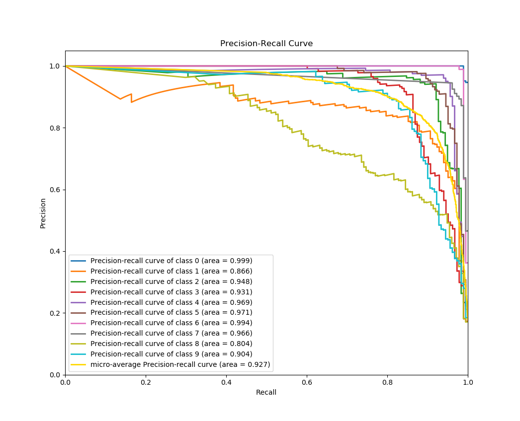
Here's a quick example to generate the precision-recall curves of a Keras classifier on a sample dataset.
# Import what's needed for the Functions API
import matplotlib.pyplot as plt
import scikitplot.plotters as skplt

# This is a Keras classifier. We'll generate probabilities on the test set.
keras_clf.fit(X_train, y_train, batch_size=64, nb_epoch=10, verbose=2)
probas = keras_clf.predict_proba(X_test, batch_size=64)

# Now plot.
skplt.plot_precision_recall_curve(y_test, probas)
plt.show()
You can see clearly here that skplt.plot_precision_recall_curve needs only the ground truth y-values and the predicted probabilities to generate the plot. This lets you use anything you want as the classifier, from Keras NNs to NLTK Naive Bayes to that groundbreaking classifier algorithm you just wrote.
The possibilities are endless.
Installation is simple! First, make sure you have the dependencies Scikit-learn and Matplotlib installed.
Then just run:
pip install scikit-plotOr if you want, clone this repo and run
python setup.py installat the root folder.
Explore the full features of Scikit-plot.
You can find detailed documentation here.
Examples are found in the examples folder of this repo.
Reporting a bug? Suggesting a feature? Want to add your own plot to the library? Visit our contributor guidelines.
Are you using Scikit-plot in an academic paper? You should be! Reviewers love eye candy.
If so, please consider citing Scikit-plot with DOI
Reiichiro Nakano. (2017). reiinakano/scikit-plot: v0.2.1 [Data set]. Zenodo. http://doi.org/10.5281/zenodo.293191
[1]Reiichiro Nakano, “reiinakano/scikit-plot: v0.2.1”. Zenodo, 19-Feb-2017.
[1]Reiichiro Nakano 2017. reiinakano/scikit-plot: v0.2.1. Zenodo.
Happy plotting!


