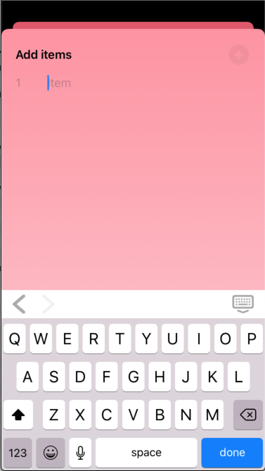
A (almost) drop-in replacement for SwiftUI's TextField, but with a customisable input accessory view. A significant part of this is based on work by Swift Student - SwiftUI InputAccessoryView - but I've removed the need for an accessoryViewController instance in the containing view, and added quite a bit in the way of customisation options for the consumer.
In Xcode:
- File ⭢ Swift Packages ⭢ Add Package Dependency...
- Use the URL https://github.com/franklynw/InputAccessoryTextField.git
NB: All examples require
import InputAccessoryTextFieldat the top of the source file
The only additional requirement for using an InputAccessoryTextField instead of a TextField is that the containing view conforms to Identifiable, with a String id.
var body: some View {

    InputAccessoryTextField(parentView: self, tag: 1, text: viewModel.searchTerm)
        .returnKey(type: .search) {
            viewModel.beginSearch()
        }
        .foregroundColor(Color(viewModel.titleColor))
        .disableAutocorrection(!viewModel.autocorrect)
        .autocapitalization(viewModel.itemCapitalizationPolicy)
        .startInput()
}
To use with the "previous" and "next" buttons on the accessory view, each textField in the view needs to have a unique tag. Pressing "next" will show the field with the next-highest tag, pressing "previous" will show the field with the next lowest. If there is only one textField, these buttons will be hidden.
There are some additional features apart from the input accessory view -
You can set the textField's placeholder text. The placeholder is an Enum case, "PlaceHolder", which allows for a normal String - .text("My placeholder") - or an attributed string - .attributed(myNSAttributedString), which lets you specify colour, etc
InputAccessoryTextField(parentView: self, text: viewModel.searchTerm)
    .placeholder(.text("Enter search text"))
or
InputAccessoryTextField(parentView: self, text: viewModel.searchTerm)
.placeholder(.attributed(viewModel.attributedPlaceholder))You can set the textField's font using either a UIFont, or with Font.TextStyle & Font.Weight
InputAccessoryTextField(parentView: self, text: viewModel.searchTerm)
    .font(UIFont.systemFont(ofSize: 18, weight: .semibold))
or
InputAccessoryTextField(parentView: self, text: viewModel.searchTerm)
.font(.title, weight: .semibold)InputAccessoryTextField(parentView: self, text: viewModel.searchTerm)
.foregroundColor(.red)Set the background colour of the textField
InputAccessoryTextField(parentView: self, text: viewModel.searchTerm)
.backgroundColor(.lightGray)Set the background colour of the textField's input accessory view ToolBar
InputAccessoryTextField(parentView: self, text: viewModel.searchTerm)
    .toolBarColor(.lightGray)
or using the static var (once per view rather than for each textField) -
InputAccessory.barColor = .purpleSet the colour of the textField's input accessory view buttons
InputAccessoryTextField(parentView: self, text: viewModel.searchTerm)
    .toolBarTintColor(.darkGray)
or using the static var (once per view rather than for each textField) -
InputAccessory.barTintColor = .greenYou can set the keyboard type -
InputAccessoryTextField(parentView: self, text: viewModel.searchTerm)
.keyboardType(.numberPad)You can set the return key type and its action -
InputAccessoryTextField(parentView: self, text: viewModel.searchTerm)
    .returnKey(type: .search) {
        viewModel.beginSearch()
}InputAccessoryTextField(parentView: self, text: viewModel.searchTerm)
.showsClearButtonAutocorrection can be switched on or off -
InputAccessoryTextField(parentView: self, text: viewModel.searchTerm)
.disableAutocorrection(!viewModel.autocorrect)The autocapitalisation policy can be set -
InputAccessoryTextField(parentView: self, text: viewModel.searchTerm)
.autocapitalization(viewModel.autocapitalizationPolicy)InputAccessoryTextField(parentView: self, text: viewModel.searchTerm)
.insets(EdgeInsets(top: 0, leading: 20, bottom: 0, trailing: 20))You can make the textField automatically become the first resonder (ie, it brings up the keyboard as soon as it appears) -
InputAccessoryTextField(parentView: self, text: viewModel.searchTerm)
    .startInput($viewModel.startEditing)
This modifier can also take a Bool binding to become first responder on demand.
or -
InputAccessoryTextField(parentView: self, text: viewModel.searchTerm)
    .startInput
This version of the modifier will simply make the textField become the first responder when it appears.
Adding this modifier & passing in true will resign the first responder from the tagged InputAccessoryTextField which is currently the first responder
InputAccessoryTextField(parentView: self, tag: 1, text: viewModel.searchTerm)
.endInput(shouldEndInput)Pass in a system image name to use that for the button. You can also set the action to be invoked when the button is pressed, in addition to it dismissing the keyboard. If no image is specified, it will default to "keyboard.chevron.compact.down"
InputAccessoryTextField(parentView: self, text: viewModel.searchTerm)
    .toolBarDoneButton("rectangle.and.pencil.and.ellipsis") {
        // do something
    }
You can also use the static var (once per view rather than for each textField) to set the done button image -
InputAccessory.dismissKeyboardButtonSystemImageName = "checkmark"You can add a button towards the left and/or the right of the toolBar
InputAccessoryTextField(parentView: self, text: viewModel.searchTerm)
    .additionalLeftButton(buttonConfig)
.additionalRightButton(otherButtonConfig)Sometimes you may want to hide the accessory view, while still keeping all the other features of the InputAccessoryTextField -
InputAccessoryTextField(parentView: self, text: viewModel.searchTerm)
.hideToolBarPerform an action when the textField ends editing
InputAccessoryTextField(parentView: self, text: viewModel.searchTerm)
    .editingEnded { text in
        // do stuff
}Requires FWCommonProtocols, which is linked. GitHub page is here
InputAccessoryTextField is available under the MIT licence
