React-Color-Popover-Picker
A React Componnent based on react-color and rc-tooltip
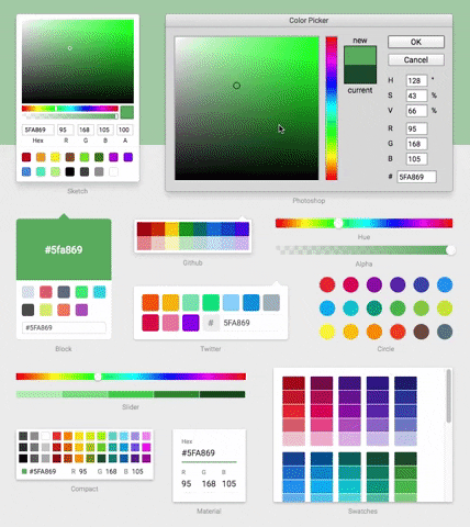
Demo
Installation & Usage
npm install react-color-popover-picker --saveInclude the Component and styles
import React from 'react'
import ReactColorPicker from 'react-color-popover-picker';
import "react-color-popover-picker/style";

class Component extends React.Component {

  render() {
    return (
        <ReactColorPicker />
    );
  }
}
API
Props
| name | type | default | description |
|---|---|---|---|
| value | string | http://casesandberg.github.io/react-color/#api-color | |
| onChange | Function | http://casesandberg.github.io/react-color/#api-onChange | |
| onAfterChange | Function | http://casesandberg.github.io/react-color/#api-onChangeComplete |
more props: https://github.com/react-component/tooltip/blob/master/README.md