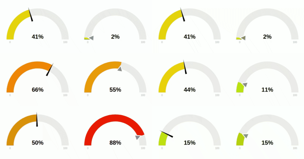
JustGage is a handy JavaScript plugin for generating and animating nice & clean dashboard gauges. It is based on Raphaël library for vector drawing.
Installing Justgage is as easy as...
bower install justgage-officialor maybe you wish to use NPM...
npm install justgage --saveor you can always download the CSS and JS files...
<!-- Raphael must be included before justgage -->
<script type="text/javascript" src="path/to/raphael.min.js"></script>
<script type="text/javascript" src="path/to/justgage.js"></script>
or if even don't want to download the files use cdnjs
<!-- Raphael must be included before justgage -->
<script type="text/javascript" src="https://cdnjs.cloudflare.com/ajax/libs/raphael/2.1.4/raphael-min.js"></script>
<script type="text/javascript" src="https://cdnjs.cloudflare.com/ajax/libs/justgage/1.2.9/justgage.min.js"></script>Html
<div id="gauge"></div>JS
var gauge = new JustGage({
            id: "gauge", // the id of the html element
            value: 50,
            min: 0,
            max: 100,
            decimals: 2,
            gaugeWidthScale: 0.6
        });

// update the value randomly
setInterval(() => {
  gauge.refresh(Math.random() * 100);
}, 5000)| Name | Default | Description |
|---|---|---|
| id | (required) | The HTML container element id |
| value | 0 |
Value Gauge is showing |
| parentNode | null |
The HTML container element object. Used if id is not present |
| defaults | false |
Defaults parameters to use globally for gauge objects |
| width | null |
The Gauge width in pixels (Integer) |
| height | null |
The Gauge height in pixels |
| valueFontColor | #010101 |
Color of label showing current value |
| valueFontFamily | Arial |
Font of label showing current value |
| symbol | '' |
Special symbol to show next to value |
| min | 0 |
Min value |
| minTxt | false |
Min value text, overrides min if specified |
| max | 100 |
Max value |
| maxTxt | false |
Max value text, overrides max if specified |
| reverse | false |
Reverse min and max |
| humanFriendlyDecimal | 0 |
Number of decimal places for our human friendly number to contain |
| textRenderer | null |
Function applied before redering text (value) => value |
| onAnimationEnd | null |
Function applied after animation is done |
| gaugeWidthScale | 1.0 |
Width of the gauge element |
| gaugeColor | #edebeb |
Background color of gauge element |
| label | '' |
Text to show below value |
| labelFontColor | #b3b3b3 |
Color of label showing label under value |
| shadowOpacity | 0.2 |
Shadow opacity 0 ~ 1 |
| shadowSize | 5 |
Inner shadow size |
| shadowVerticalOffset | 3 |
How much shadow is offset from top |
| levelColors | ["#a9d70b", "#f9c802", "#ff0000"] |
Colors of indicator, from lower to upper, in RGB format |
| startAnimationTime | 700 |
Length of initial animation in milliseconds |
| startAnimationType | > |
Type of initial animation (linear, >, <, <>, bounce) |
| refreshAnimationTime | 700 |
Length of refresh animation in milliseconds |
| refreshAnimationType | > |
Type of refresh animation (linear, >, <, <>, bounce) |
| donutStartAngle | 90 |
Angle to start from when in donut mode |
| valueMinFontSize | 16 |
Absolute minimum font size for the value label |
| labelMinFontSize | 10 |
Absolute minimum font size for the label |
| minLabelMinFontSize | 10 |
Absolute minimum font size for the min label |
| maxLabelMinFontSize | 10 |
Absolute minimum font size for the man label |
| hideValue | false |
Hide value text |
| hideMinMax | false |
Hide min/max text |
| showInnerShadow | false |
Show inner shadow |
| humanFriendly | false |
convert large numbers for min, max, value to human friendly (e.g. 1234567 -> 1.23M) |
| noGradient | false |
Whether to use gradual color change for value, or sector-based |
| donut | false |
Show donut gauge |
| relativeGaugeSize | false |
Whether gauge size should follow changes in container element size |
| counter | false |
Animate text value number change |
| decimals | 0 |
Number of digits after floating point |
| customSectors | {} |
Custom sectors colors. Expects an object |
| formatNumber | false |
Formats numbers with commas where appropriate |
| pointer | false |
Show value pointer |
| pointerOptions | {} |
Pointer options. Expects an object |
| displayRemaining | false |
Replace display number with the value remaining to reach max value |
Example:
customSectors: {
  percents: true, // lo and hi values are in %
  ranges: [{
    color : "#43bf58",
    lo : 0,
    hi : 50
  },{
    color : "#ff3b30",
    lo : 51,
    hi : 100
}]Example:
pointerOptions: {
  toplength: null,
  bottomlength: null,
  bottomwidth: null,
  stroke: 'none',
  stroke_width: 0,
  stroke_linecap: 'square',
  color: '#000000'
}Used to refresh Gauge value and max value
refresh(val, max, min, label)
val: The Gauge value (required)max: The Gauge Max value (optional)min: The Gauge Min value (optional)label: The Gauge label text (optional)
Used to destroy the Gauge element
destroy()
Click here to see a demo
Click here for a list of examples
Check out the auto-generated Changelog
Or here you can find the old changelog (up to version 1.2.9)
This project is licensed under MIT License


