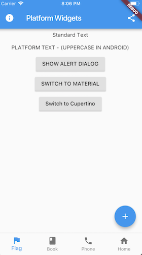
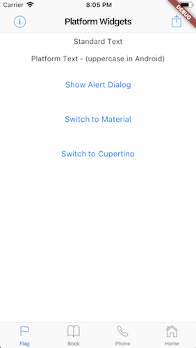
This project is an attempt to see if it is possible to create widgets that are platform aware. Currently in order to render targted Android or iOS device specific styles, you need to either conditionaly check the platform or create a set of widgets to render differently depending on the running platform.
This package only supports at most the Beta release. Dev or Master channels are not supprted.
Pubspec: https://pub.dartlang.org/packages/flutter_platform_widgets
These set of widgets allow for rendering based on the target platform using a single cross platform set of widget.
Each PlatformWidget provides common properties directly as constructor arguments. If required further customization can be achieved by using the platform widget builder. See the Enhance section of each widget.
- PlatformWidget
- PlatformText
- PlatformSwitch
- PlatformTextField
- PlatformButton
- PlatformIconButton
- PlatformApp
- PlatformScaffold
- PlatformAppBar
- PlatformNavBar
- PlatformAlertDialog
- PlatformDialogAction
- PlatformCircularProgressIndicator
- PlatformPageRoute
A widget that will render either the android widget or cupertino widget based on the target platform. The widgets themselves do not need to be specifically Material or Cupertino.
return PlatformWidget(
  ios: (_) => Icon(CupertinoIcons.flag),
  android: (_) => Icon(Icons.flag),
);A widget that will render uppercase for Android. iOS will remain unchanged.
return PlatformText('Cancel');A switch widget that will use a Switch for android or a CupertinoSwitch for iOS.
return PlatformSwitch(
  onChanged: (bool value) {},
  value: value,
);return PlatformSwitch(
onChanged: (bool value) {},
value: value,
android: (_) => MaterialSwitchData(...),
ios: (_) => CupertinoSwitchData(...)
);A text field widget that will use a TextField for android or a CupertinoTextField for iOS.
return PlatformTextField();return PlatformTextField(
android: (_) => MaterialTextFieldData(...),
ios: (_) => CupertinoTextFieldData(...)
);A button that will render a RaisedButton for android or a CupertinoButton for iOS.
return PlatformButton(
  onPressed: () => print('send'),
  child: PlatformText('Send'),
);Extend with WidgetBuilder for android or iOS.
return PlatformButton(
  onPressed: () => print('send'),
  child: PlatformText('Send'),
  android: (_) => MaterialRaisedButtonData(...),
  ios: (_) => CupertinoButtonData(...)
);A clickable (tappable) button with an icon. Uses IconButton for android or CupertinoButton for ios.
return PlatformIconButton(
  onPressed: () => print('info pressed'),
  iosIcon: Icon(
    CupertinoIcons.info,
    size: 28.0,
  ),
  androidIcon: Icon(Icons.info)
);Extend with WidgetBuilder for android or iOS.
Widget infoIconButton() {
  return PlatformIconButton(
    onPressed: () => print('info pressed'),
    iosIcon: Icon(CupertinoIcons.info),
    androidIcon: Icon(Icons.info),
    android: (_) => MaterialIconButtonData(...),
    ios: (_) => CupertinoIconButtonData(...),
  );
}A top level widget for the applciation that uses MaterialApp for android or CupertinoApp for ios.
return PlatformApp(
  title: 'Flutter Demo',
  home: ...
);
#### Enhance
Extend with `WidgetBuilder` for android or iOS.

```dart
return PlatformApp(
  home:  ...
  android: (_) => MaterialAppData(...)
  ios: (_) => CupertinoAppData(...)
);
A Scaffold that provides the correctly hosted header (AppBar) and navigation bar (Bottom Bar) for each platform. Uses Scaffold for android or CupertinoTabScaffold for ios with bottom tabs or CupertinoPageScaffold for ios without bottom tabs.
return PlatformScaffold(
  appBar: PlatformAppBar()
  body: _buildContent(),
  bottomNavBar: PlatformNavBar(),
  iosContentPadding: false,
  iosContentBottomPadding: false
);
Note that the use of
iosContentPadding = trueis only required if the content is being obstruced behind the appBar.iosContentBottomPaddingis used if the content needs to be above the navBar and not go behind it
Extend with WidgetBuilder for android or iOS.
return PlatformScaffold(
  appBar: PlatformAppBar()
  body: _buildContent(),
  bottomNavBar: PlatformNavBar(),
  android: (_) => MaterialScaffoldData(...)
  ios: (_) => CupertinoScaffoldData(...);
);
Both the android and ios builders are optional. If not provided the
Containerplaceholder widget will be returned.
The AppBar is the top Header bar with a title, leftside or rightside buttons. Uses AppBar for android or CupertinoNavigationBar for ios.
return PlatformAppBar(
    title: new Text('Platform Widgets'),
    leading: PlatformIconButton()),
    trailingActions: <Widget>[
      PlatformIconButton(),
    ],
);Extend with WidgetBuilder for android or iOS.
return PlatformAppBar(
  title: new Text('Platform Widgets'),
  leading: PlatformIconButton()),
  trailingActions: <Widget>[
    PlatformIconButton(),
  ],
  android: (_) => MaterialAppBarData(...),
  ios: (_)=> CupertinoNavigationBarData(...),
);Note: hasNotch has been removed to allow for the widget to work with the change on the development branch of flutter. To work around the breaking change either use the Material
BottomAppBardirectly or cast the result from PlatformNavBar toBottomAppBarfor android builds and set thehasNotchproperty. Otherwise target version 0.2.0
The NavBar is placed at the bottom of the page with a set of buttons that typically navigate between screens. Implementing this widget requires the parent widget to manage the currentIndex of the page and to set PlatformNavBar.currrentIndex. Uses BottomAppBar with BottomNavigationBar for android or CupertinoTabBar for ios.
return PlatformNavBar(
  currentIndex: _selectedTabIndex,
  itemChanged: (index) => setState(
        () {
          _selectedTabIndex = index;
        },
      ),
  items: [
    BottomNavigationBarItem(),
    BottomNavigationBarItem(),
  ],
);Extend with WidgetBuilder for android or iOS.
return PlatformNavBar(
  currentIndex: _selectedTabIndex,
  itemChanged: (index) => setState(
        () {
          _selectedTabIndex = index;
        },
      ),
  items: [
    BottomNavigationBarItem(),
    BottomNavigationBarItem(),
  ],
  android: (_) => MaterialNavBarData(...);
  ios: (_) => CupertinoTabBarData(...),
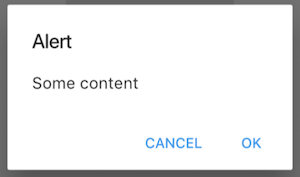
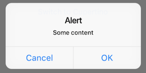
);The AlertDialog will render a caption/title, body/text and a set of action buttons specific for the platform. Uses AlertDialog for android or CupertinoAlertDialog for ios.
Note use
showPlatformDialoginstead of eithershowDialogfrom the Material library orshowCupertinoDialogfrom the Cupertino library.
showPlatformDialog(
  context: context,
  builder: (_) => PlatformAlertDialog(
    title: Text('Alert'),
    content: Text('Some content'),
    actions: <Widget>[
      PlatformDialogAction(),
      PlatformDialogAction(),
    ],
  ),
);Extend with WidgetBuilder for android or iOS.
showDialog(
  context: context,
  builder: (_) => PlatformAlertDialog(...);
  ios: (_) => CupertinoAlertDialogData(...),
  android: (_) => MaterialAlertDialogData(...),
)The DialogAction widget is used to describe the set of buttons on the AlertDialog. Uses FlatButton for android or CupertinoDialogAction for ios.
PlatformDialogAction(
  child: PlatformText('Cancel'),
  onPressed: () => Navigator.pop(context),
),Extend with WidgetBuilder for android or iOS.
PlatformDialogAction(
  child: PlatformText('Cancel'),
  onPressed: () => Navigator.pop(context),
  android: (_) => MaterialDialogActionData(...),
  ios: (_) => CupertinoDialogActionData(...),
),A circular looking progress indicator. Uses CircularProgressIndicator for android or CupertinoActivityIndicator for ios.
return PlatformCircularProgressIndicator();Extend with WidgetBuilder for android or iOS.
return PlatformCircularProgressIndicator(
  android: (_) => MaterialProgressIndicatorData(...),
  ios: (_)=> CupertinoProgressIndicatorData(...),
);This function can be used within the Navigator to push either the MaterialPageRoute for android or CupertinoPageRoute for ios.
  Navigator.push(
    context,
    platformPageRoute(
      builder: pageToDisplayBuilder,
    ),
);When importing flutter_platform_widgets you can check isMaterial or isCupertino to determine what style will be used. This is independent to Platform.isAndroid or Platform.isIOS from 'import 'dart:io'
See the example code for how this is used.
- Setting
BottomNavigationBarType.shiftingwill cause the icon and text to render white: flutter/flutter#15280.
Best to set to fixed if the number of navigation items are 4 or more.
return PlatformNavBar(
   android: (_) => MaterialNavBarData(
      type: BottomNavigationBarType.fixed,
),-
Setting
BottomNavigationBar.fixedColorto anything has no effect. -
If using the Cupertino widgets it may complain that there is no Material parent when using material widgets further doen the widget tree and using MaterialApp. If this is the case you need to place
Materialas a parent widget to the PlatformWidget
return PlatformScaffold(
  body: Material(
    color: Colors.white,
    child: _theBodyOfThePageWithMaterialWidgets(),
  );
);Please create an issue to provide feedback or an issue.
Inspired by the example given by Swav Kulinski (https://github.com/swavkulinski/flutter-platform-specific-widgets)


