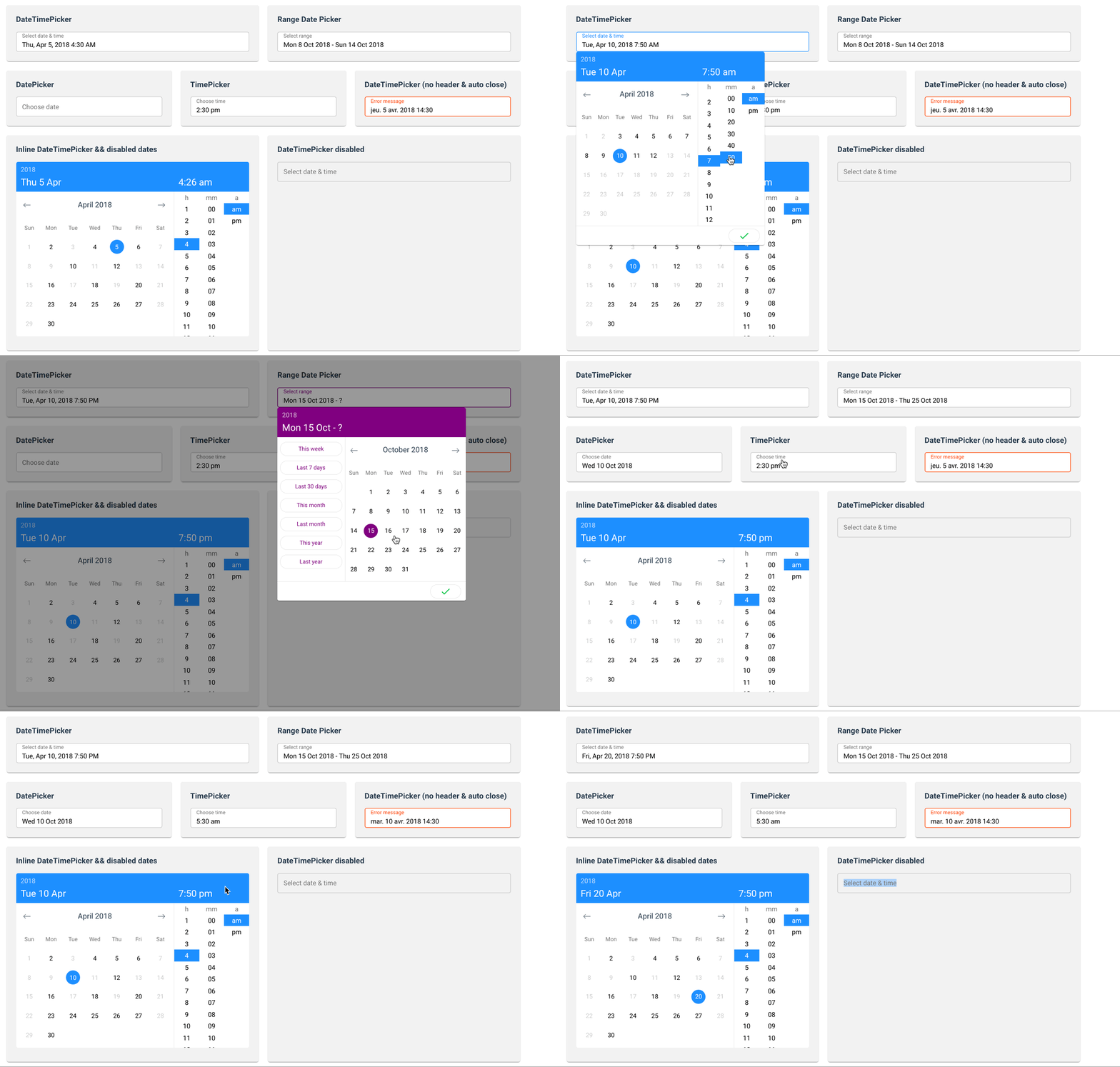
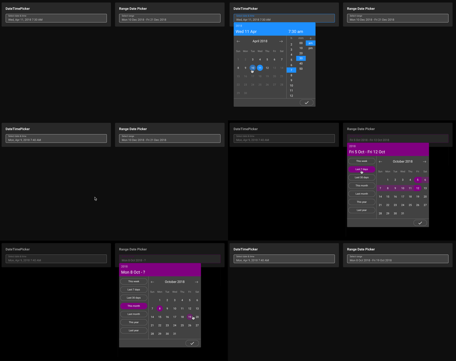
A vue component for select dates (range mode available) & time
Yarn
yarn add vue-ctk-date-time-picker
NPM
npm i --save vue-ctk-date-time-picker
import VueCtkDateTimePicker from 'vue-ctk-date-time-picker';
import 'vue-ctk-date-time-picker/dist/vue-ctk-date-time-picker.min.css';

Vue.component('vue-ctk-date-time-picker', VueCtkDateTimePicker);<vue-ctk-date-time-picker></vue-ctk-date-time-picker><vue-ctk-date-time-picker></vue-ctk-date-time-picker>
<script src="https://unpkg.com/vue" charset="utf-8"></script>
<script src="./dist/umd/vue-ctk-date-time-picker.min.js" charset="utf-8"></script>
<link rel="stylesheet" type="text/css" href="./dist/umd/vue-ctk-date-time-picker.min.css">
<script type="text/javascript">
Vue.component('vue-ctk-date-time-picker', window.VueCtkDateTimePicker.default);
</script>Here is an example of UMD implementation: https://codepen.io/louismazel/pen/jQWNzQ
| Props | Type | Required | Default |
|---|---|---|---|
| v-model | String/Int | yes | - |
| label | String | no | Select date & time |
| hint (1) | text | no | - |
| error-hint (2) | Boolean | no | false |
| color (3) | String (hex) | no | dodgerblue |
| minute-interval | Int | no | 1 |
| formatted | string | no | 'llll' (momentjs format) |
| format | string | no | - |
| time-format | string | no | 'H:mm a' |
| locale (4) | string | no | Browser Locale |
| time-zone (5) | string | no | Browser Time Zone |
| disable-time | Boolean | no | false |
| disable-date | Boolean | no | false |
| without-header | Boolean | no | false |
| id | string | no | CtkDateTimePicker |
| overlay | Boolean | no | true |
| enable-button-validate | Boolean | no | false |
| min-date (6) | string | no | - |
| max-date (6) | string | no | - |
| no-weekends-days | Boolean | no | false |
| auto-close | Boolean | no | false |
| without-input | Boolean | no | false |
| overlay-background | Boolean | no | false |
| disabled-dates (7) | Boolean | no | [] |
| range-mode | Boolean | no | false |
| dark | Boolean | no | false |
| withoutRangeShortcut | Boolean | no | false |
| shortcuts-translation (8) | Object | no | - |
(1) hint : Is a text that replaces the label/placeholder
(2) error-hint : When is true --> Input border & label are red
(3) color: Replace color for the hint, the borders & time selected in dropdown
(4) locale : Default value is the locale of the browser - Ex : Set locale="fr" to force to French language
(5) time-zone : Default value is the time-zone of the browser - Ex : Set Europe/Paris to force to French TZ. Do not forget to use a format like this YYYY-MM-DDTHH:mm:ssZ to get the TZ
(6) min-date & max-date : Must be 'YYYY-MM-DD' format
(7) Disabled-Dates is an Array of dates in 'YYYY-MM-DD' format (ex: ['2018-04-03', '2018-04-07', '2018-04-09'])
(8) shortcuts-translation : Must be an Object like that
{
  "this_week": "This week",
  "last_7_days": "Last 7 days",
  "last_30_days": "Last 30 days",
  "this_month": "This month",
  "last_month": "Last month",
  "this_year": "This year",
  "last_year": "Last year"
}
- Disable specific hours & minutes on TimePicker
- Custom shortcuts on RangeDatePicker
- UI Improvements for TimePicker (Issue #35)
- Custom elements for trigger the component
- Double Calendar on RangeDatePicker
- Inputs Text to choose values (Issue #30)
- Keyboard Accessibility
- Select Year directly on DatePicker
# install dependencies
npm install

# serve with hot reload at localhost:8080
npm run dev
Build configuration is located in the poi.config.js file, to build just run: npm run build, it will build to cjs and umd directories.
This template uses karma with chai by default, you can change test settings in poi.config.js
npm run test
npm run test:watch
npm run test:cov
This project is licensed under MIT License


