 |
 |
 |
 |
|---|
npm install react-modal-sheetor if you use yarn:
yarn add react-modal-sheetThe gestures and animations are handled by the excellent Framer Motion library so before you can start using this library you need to install framer-motion:
npm install framer-motionimport Sheet from 'react-modal-sheet';
import { useState } from 'react';
function Example() {
const [isOpen, setOpen] = useState(false);
return (
<>
<button onClick={() => setOpen(true)}>Open sheet</button>
<Sheet isOpen={isOpen} onClose={() => setOpen(false)}>
<Sheet.Container>
<Sheet.Header />
<Sheet.Content>{/* Your sheet content goes here */}</Sheet.Content>
</Sheet.Container>
<Sheet.Backdrop />
</Sheet>
</>
);
}The Sheet component follows the Compound Component pattern in order to provide a flexible yet powerful API for creating highly customizable bottom sheet components.
Since the final bottom sheet is composed from smaller building blocks (Container, Content, Scroller, Header, and Backdrop) you are in total control over the rendering output. So for example, if you don't want to have any backdrop in your sheet then you can just skip rendering it instead of passing some prop like renderBackdrop={false} to the main sheet component. Cool huh? 😎
Also, by constructing the sheet from smaller pieces makes it easier to apply any necessary accessibility related properties to the right components without requiring the main sheet component to be aware of them. You can read more about accessibility in the Accessibility section.
| Name | Required | Default | Description |
|---|---|---|---|
children |
yes | Use Sheet.Container/Content/Header/Backdrop to compose your bottom sheet. |
|
isOpen |
yes | Boolean that indicates whether the sheet is open or not. | |
onClose |
yes | Callback fn that is called when the sheet is closed by the user. | |
disableDrag |
no | false | Disable drag for the whole sheet. |
detent |
no | 'full-height' |
The detent in which the sheet should be in when opened. Available values: 'full-height' or 'content-height'. |
onOpenStart |
no | Callback fn that is called when the sheet opening animation starts. | |
onOpenEnd |
no | Callback fn that is called when the sheet opening animation is completed. | |
onCloseStart |
no | Callback fn that is called when the sheet closing animation starts. | |
onCloseEnd |
no | Callback fn that is called when the sheet closing animation is completed. | |
onSnap |
no | Callback fn that is called with the current snap point index when the sheet snaps to a new snap point. Requires snapPoints prop. |
|
snapPoints |
no | Eg. [-50, 0.5, 100, 0] - where positive values are pixels from the bottom of the screen and negative from the top. Values between 0-1 represent percentages, eg. 0.5 means 50% of window height from the bottom of the sceen. |
|
initialSnap |
no | 0 | Initial snap point when sheet is opened (index from snapPoints). |
rootId |
no | The id of the element where the main app is mounted, eg. "root". Enables iOS modal effect. | |
tweenConfig |
no | { ease: 'easeOut', duration: 0.2 } |
Overrides the config for the sheet tween transition when the sheet is opened, closed, or snapped to a point. |
mountPoint |
no | document.body |
HTML element that should be used as the mount point for the sheet. |
prefersReducedMotion |
no | false | Skip sheet animations (sheet instantly snaps to desired location). |
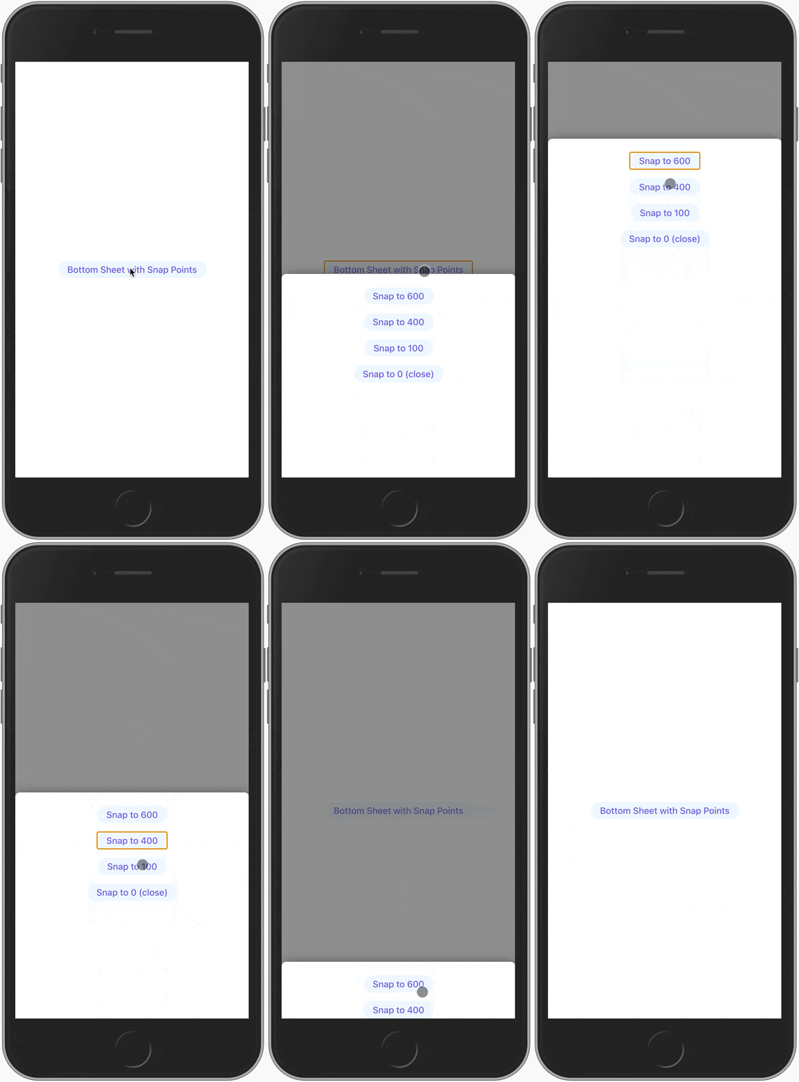
Imperative method that can be accessed via a ref for snapping to a snap point in given index.
import Sheet, { SheetRef } from 'react-modal-sheet';
import { useState, useRef } from 'react';

function Example() {
  const [isOpen, setOpen] = useState(false);
  const ref = useRef<SheetRef>();
  const snapTo = (i: number) => ref.current?.snapTo(i);

  return (
    <>
      <button onClick={() => setOpen(true)}>Open sheet</button>

      {/* Opens to 400 since initial index is 1 */}
      <Sheet
        ref={ref}
        isOpen={isOpen}
        onClose={() => setOpen(false)}
        snapPoints={[600, 400, 100, 0]}
        initialSnap={1}
        onSnap={snapIndex =>
          console.log('> Current snap point index:', snapIndex)
        }
      >
        <Sheet.Container>
          <Sheet.Content>
            <button onClick={() => snapTo(0)}>Snap to index 0</button>
            <button onClick={() => snapTo(1)}>Snap to index 1</button>
            <button onClick={() => snapTo(2)}>Snap to index 2</button>
            <button onClick={() => snapTo(3)}>Snap to index 3</button>
          </Sheet.Content>
        </Sheet.Container>
      </Sheet>
    </>
  );
}The y value is an internal MotionValue that represents the distance to the top most position of the sheet when it is fully open. So for example the y value is zero when the sheet is completely open.
Similarly to the snapTo method the y value can be accessed via a ref.
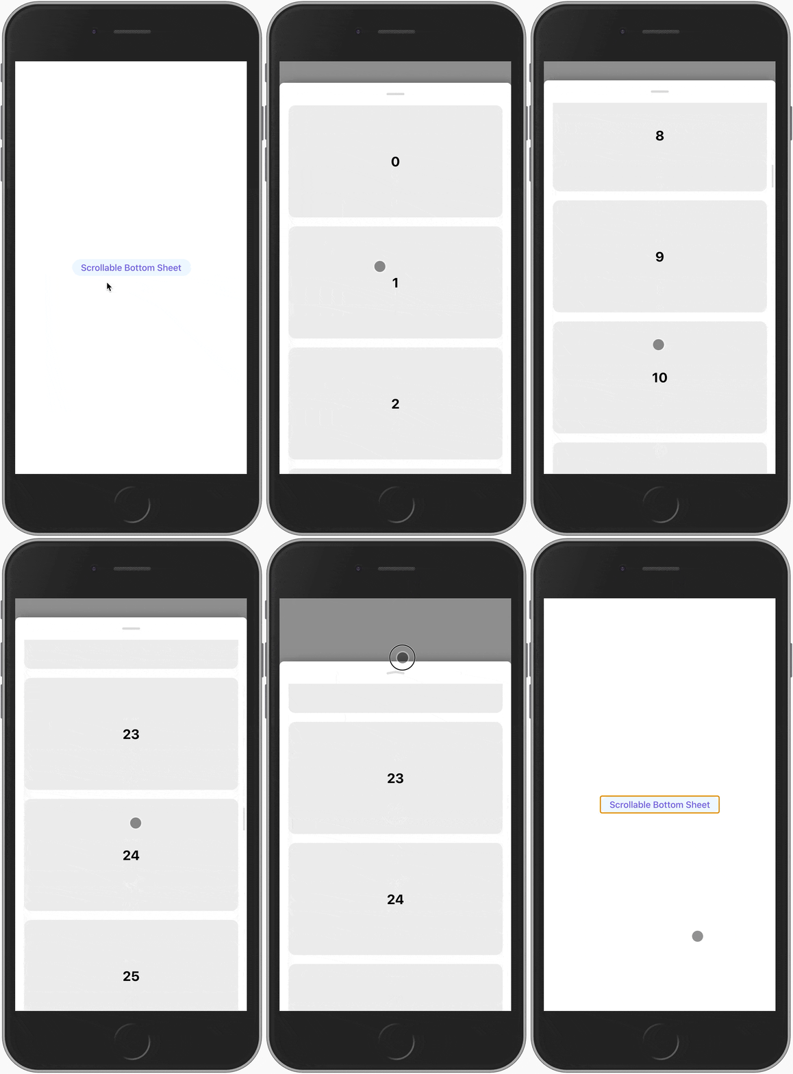
The y value can be useful for certain situtation eg. when you want to combine snap points with scrollable sheet content and ensure that the content stays properly scrollable in any snap point. Below you can see a simplified example of this situation and for a more detailed example take a look at the ScrollableSnapPoints component in the example app.
import Sheet, { SheetRef } from 'react-modal-sheet';
import { useState, useRef } from 'react';

function Example() {
  const [isOpen, setOpen] = useState(false);
  const ref = useRef<SheetRef>();

  return (
    <>
      <button onClick={() => setOpen(true)}>Open sheet</button>

      <Sheet
        isOpen={isOpen}
        onClose={() => setOpen(false)}
        snapPoints={[600, 400, 100, 0]}
        initialSnap={1}
      >
        <Sheet.Container>
          {/**
           * Since `Sheet.Content` is a `motion.div` it can receive motion values
           * in it's style prop which allows us to utilise the exposed `y` value.
           *
           * By syncing the padding bottom with the `y` motion value we introduce
           * an offset that ensures that the sheet content can be scrolled all the
           * way to the bottom in every snap point.
           */}
          <Sheet.Content style={{ paddingBottom: ref.current?.y }}>
            <Sheet.Scroller draggableAt="both">
              {/* Some content here that makes the sheet content scrollable */}
            </Sheet.Scroller>
          </Sheet.Content>
        </Sheet.Container>
      </Sheet>
    </>
  );
}By default the sheet will take the full height of the page minus top padding and safe area inset. If you want the sheet height to be based on it's content you can pass detent="content-height" prop to the Sheet component:
function Example() {
  const [isOpen, setOpen] = useState(false);

  return (
    <Sheet
      isOpen={isOpen}
      onClose={() => setOpen(false)}
      detent="content-height"
    >
      <Sheet.Container>
        <Sheet.Content>
          <Sheet.Scroller>
            <div style={{ height: 200 }}>Some content</div>
          </Sheet.Scroller>
        </Sheet.Content>
      </Sheet.Container>
    </Sheet>
  );
}
If the sheet height changes dynamically the sheet will grow until it hits the maximum full height after which it becomes scrollable.
It is possible to use snap points with detent="content-height" but the snap points are restricted by the content height. For example if one of the snap points is 800px and the sheet height is only 700px then snapping to the 800px snap point would only snap to 700px since otherwise the sheet would become detached from the bottom.
ℹ️ If you are wondering where the term
detentcomes from it's from Apple's Human Interface Guidelines.
Sheet is the root element that wraps the whole sheet. It renders a fixed positioned wrapper element that covers the whole screen to contain the actual sheet that is animated in (don't worry the root element is not interactive when the sheet is closed). All sheet compound components should be rendered within Sheet.
🖥 Rendered element:
motion.div.
Sheet container is positioned above the sheet backdrop and by default adds a small shadow and rounded corners to the sheet. Sheet.Content and Sheet.Header should be rendered inside Sheet.Container.
🖥 Rendered element:
motion.div.
Sheet header acts as a drag target and has a dragging direction indicator. Rendering any children inside Sheet.Header replaces the default header.
🖥 Rendered element:
motion.div.
| Name | Required | Default | Description |
|---|---|---|---|
disableDrag |
no | false | Disable drag for the sheet header. |
Sheet content acts as a drag target and can be used in conjunction with Sheet.Scroller to make sure that content which doesn't fit inside the sheet becomes scrollable.
🖥 Rendered element:
motion.div.
| Name | Required | Default | Description |
|---|---|---|---|
disableDrag |
no | false | Disable drag for the sheet content. |
Sheet scroller can be used to make the whole sheet content or parts of it scrollable in a way that drag gestures are properly disabled and enabled based on the scroll state. See the Scrolling on touch devices section for more details.
🖥 Rendered element:
motion.div.
| Name | Required | Default | Description |
|---|---|---|---|
draggableAt |
no | "top" |
Should the drag be enabled when the element is scrolled either to the top, bottom, or both. Available values: top, bottom, both. |
Sheet backdrop is a translucent overlay that helps to separate the sheet from it's background. By default the backdrop doesn't have any interaction attached to it but if you, for example, want to close the sheet when the backdrop is clicked you can provide tap handler to it which will change the rendered element from div to button.
onTap instead of onClick if you want to add a click handler to it.
🖥 Rendered element:
motion.divormotion.button.
Scrolling and dragging are the same gesture on touch devices which can create problems when you want to have scrollable content inside the sheet. React Modal Sheet provides a Sheet.Scroller component that is able to automatically disable and enable dragging inside the Sheet.Content component based on the scroll state. There are three modes for the Sheet.Scroller reflected in the draggableAt prop:
- Enable dragging when the scroller is not yet scrolled - it is at the
topposition. - Enable dragging when the scroller is scrolled all the way to the bottom - it is at the
bottomposition. - Enable dragging in
bothpositions.
The scroller component is in-between these states when the user has scrolled only some amount. Dragging is always disabled in this in-between state in order to avoid it getting mixed with dragging gestures. The Sheet.Scroller component applies the special handling only for touch devices.
The default value for the draggableAt prop is top which should be a good default for most use cases. You shouldn't need bottom or both unless you have scrollable content inside a sheet that also has snap points.
function ScrollableExample() {
  return (
    <Sheet>
      <Sheet.Container>
        <Sheet.Header />
        <Sheet.Content>
          <Sheet.Scroller>{/*...*/}</Sheet.Scroller>
        </Sheet.Content>
      </Sheet.Container>
      <Sheet.Backdrop />
    </Sheet>
  );
}In addition to the Sheet.Backdrop it's possible to apply a scaling effect to the main app element to highlight the modality of the bottom sheet. This effect mimics the iOS Modal View presentation style to bring more focus to the sheet and add some delight to the user experience.
 |
 |
|---|
To enable this effect you can provide the id of the root element where your application is mounted:
function Example() {
  return <Sheet rootId="root">{/*...*/}</Sheet>;
}
⚠️ Limitations: Since the effect is applied to the root element it will NOT work as desired if the HTML body element is scrolled down at all. One way to avoid this is to use something likeheight: 100vh;andoverflow: auto;on the root element to make it fill the whole screen and be scrollable instead of the body element.
The default styles for the Sheet component somewhat follows the styles of the previously mentioned iOS Modal View. However, if these default styles are not to your liking it's easy to make changes to them: you can provide a custom header or you can overwrite any style with CSS via the exposed class names.
Adding a custom header is as simple as providing your own header as the child component to Sheet.Header:
function Example() {
  return (
    <Sheet>
      <Sheet.Container>
        <Sheet.Header>
          <YourCustomSheetHeader />
        </Sheet.Header>
        <Sheet.Content>{/*...*/}</Sheet.Content>
      </Sheet.Container>
      <Sheet.Backdrop />
    </Sheet>
  );
}You can add your own styles or override the default sheet styles via the exposed class names. Note that you might need to use !important for style overrides since the inner styles are applied as inline styles which have higher specificity.
.react-modal-sheet-backdrop {
  /* custom styles */
}
.react-modal-sheet-container {
  /* custom styles */
}
.react-modal-sheet-header {
  /* custom styles */
}
.react-modal-sheet-drag-indicator {
  /* custom styles */
}
.react-modal-sheet-content {
  /* custom styles */
}import Sheet from 'react-modal-sheet';
import styled from 'styled-components';
import { useState } from 'react';
const CustomSheet = styled(Sheet)`
.react-modal-sheet-backdrop {
/* custom styles */
}
.react-modal-sheet-container {
/* custom styles */
}
.react-modal-sheet-header {
/* custom styles */
}
.react-modal-sheet-drag-indicator {
/* custom styles */
}
.react-modal-sheet-content {
/* custom styles */
}
`;
function Example() {
const [isOpen, setOpen] = useState(false);
return (
<>
<button onClick={() => setOpen(true)}>Open sheet</button>
<CustomSheet isOpen={isOpen} onClose={() => setOpen(false)}>
<Sheet.Container>
<Sheet.Header />
<Sheet.Content>{/*...*/}</Sheet.Content>
</Sheet.Container>
<Sheet.Backdrop />
</CustomSheet>
</>
);
}By default, react-modal-sheet doesn't include any built-in accessibility properties in order to not make any assumptions and to support a wide range of use cases. Additionally, not including 3rd party libraries for features like focus trapping or screen reader support makes it possible to utilize any accessibility libraries that your project may already use, eg. React Aria. This also helps to reduce JS bloat by not including similar libraries multiple times in your app bundle.
The example below utilizes React Aria to achieve an accessible modal-like bottom sheet that can be closed via a button rendered inside a custom sheet header.
ℹ️ The example was built by following the React Aria's useDialog documentation.
import Sheet from 'react-modal-sheet';
import { useRef } from 'react';
import { useOverlayTriggerState } from 'react-stately';

import {
  useOverlay,
  useModal,
  OverlayProvider,
  FocusScope,
  useButton,
  useDialog,
} from 'react-aria';

const A11yExample = () => {
  const sheetState = useOverlayTriggerState({});
  const openButtonRef = useRef(null);
  const openButton = useButton({ onPress: sheetState.open }, openButtonRef);

  return (
    <div>
      <button {...openButton.buttonProps} ref={openButtonRef}>
        Open sheet
      </button>

      <Sheet isOpen={sheetState.isOpen} onClose={sheetState.close}>
        <OverlayProvider>
          <FocusScope contain autoFocus restoreFocus>
            <SheetComp sheetState={sheetState} />
          </FocusScope>
        </OverlayProvider>
      </Sheet>
    </div>
  );
};

const SheetComp = ({ sheetState }) => {
  const containerRef = useRef(null);
  const dialog = useDialog({}, containerRef);
  const overlay = useOverlay(
    { onClose: sheetState.close, isOpen: true, isDismissable: true },
    containerRef
  );

  const closeButtonRef = useRef(null);
  const closeButton = useButton(
    { onPress: sheetState.close, 'aria-label': 'Close sheet' },
    closeButtonRef
  );

  useModal();

  // In real world usage this would be a separate React component
  const customHeader = (
    <div>
      <span {...dialog.titleProps}>Some title for sheet</span>
      <button {...closeButton.buttonProps}>🅧</button>
    </div>
  );

  return (
    <>
      <Sheet.Container
        {...overlay.overlayProps}
        {...dialog.dialogProps}
        ref={containerRef}
      >
        <Sheet.Header>{customHeader}</Sheet.Header>
        <Sheet.Content>{/*...*/}</Sheet.Content>
      </Sheet.Container>
      <Sheet.Backdrop />
    </>
  );
};
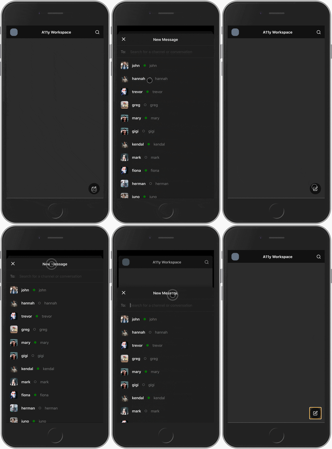
If you want to see a more real-world-like implementation you can take a look at the Slack example and try out the related demo (optimized for mobile).
In your projects it might make sense to build a reusable bottom sheet that has all the accessibility features included and can then be easily used in various places in the project. Take a look at the A11ySheet example to get some insight on how to build such a component. By incorporating all the accessibility features inside your own reusable component you don't need to repeat them every time you want to use a bottom sheet in your app.
