

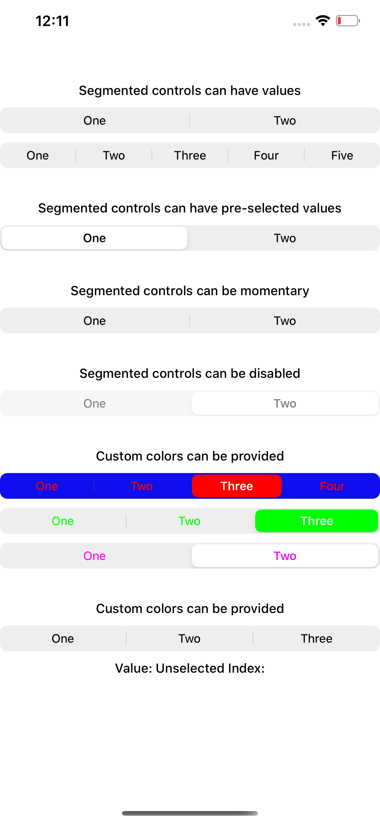
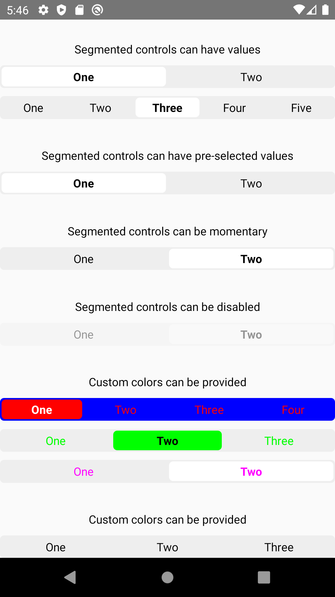
React Native SegmentedControl library. Use SegmentedControl to render a UISegmentedControl iOS.
For Android and Web, it has a js implementation that mocks iOS 13 style of UISegmentedControl.
| iOS | Android | Web |
|---|---|---|
 |
 |
 |
Install the library using either Yarn:
yarn add @react-native-community/segmented-control
or npm:
npm install --save @react-native-community/segmented-control
- React Native 0.60+
run cd ios && pod install
- React Native <= 0.59
run react-native link @react-native-community/segmented-control
or you can follow the instructions to manually link this package.
New React Native comes with autolinking feature, which automatically links Native Modules in your project. In order to get it to work, make sure you unlink Segmented Control first:
react-native unlink @react-native-community/segmented-control
This module was created when the segmentedControlIos was split out from the core of React Native. To migrate to this module you need to follow the installation instructions above and then change you imports from:
import {SegmentedControlIOS} from 'react-native';to:
import SegmentedControl from '@react-native-community/segmented-control';Start by importing the library:
Use SegmentedControl to render a UISegmentedControl iOS.
The selected index can be changed on the fly by assigning the selectedIndex prop to a state variable, then changing that variable. Note that the state variable would need to be updated as the user selects a value and changes the index, as shown in the example below.
import SegmentedControl from '@react-native-community/segmented-control';

return (
  <SegmentedControl
    values={['One', 'Two']}
    selectedIndex={this.state.selectedIndex}
    onChange={(event) => {
      this.setState({selectedIndex: event.nativeEvent.selectedSegmentIndex});
    }}
  />
);Inherits View Props.
If false the user won't be able to interact with the control. Default value is true.
| Type | Required |
|---|---|
| bool | No |
If true, then selecting a segment won't persist visually. The onValueChange callback will still work as expected.
| Type | Required | Platform |
|---|---|---|
| bool | No | iOS |
Callback that is called when the user taps a segment; passes the event as an argument
| Type | Required |
|---|---|
| function | No |
Callback that is called when the user taps a segment; passes the segment's value as an argument
| Type | Required |
|---|---|
| function | No |
The index in props.values of the segment to be (pre)selected.
| Type | Required |
|---|---|
| number | No |
Accent color of the control.
| Type | Required |
|---|---|
| string | No |
Text color of the control. (iOS 13+ only)
| Type | Required | Supported Version |
|---|---|---|
| string | No | iOS 13+ |
Text color of the active control. (iOS 13+ only)
| Type | Required | Supported Version |
|---|---|---|
| string | No | iOS 13+ |
Background color color of the control. (iOS 13+ only)
| Type | Required | Supported Version |
|---|---|---|
| string | No | iOS 13+ |
The labels for the control's segment buttons, in order.
| Type | Required |
|---|---|
| array of string | No |
(iOS 13 only) Overrides the control's appearance irrespective of the OS theme
| Type | Required | Platform |
|---|---|---|
| 'dark' | 'light' | No |
Please see the contributing guide.
The library is released under the MIT licence. For more information see LICENSE.