Okay Definitions
- Usually just means "different layout for different viewport width"
- Or, more concretely: "Does it look good on mobile and also on desktop?"
- Can also refer to things like "What does this look like when you print it?"
Better Definition
Responsive design is a page's ability to continue to look good across a wide variety of contents and contexts.
The question "How responsive is your page?" is answered by responding to questions like:
- "How does the page look at different viewport sizes?"
- "How does the page look with far more or far less text?"
- "How does the page look on different browsers and platforms?"
- "How does the page look with images of various sizes?"
- Short answer: Yes.
- Mobile traffic accounts for more than half of all internet traffic
- On some sites, it may be substantially more than half
- Just use Bootstrap (🤮) or some other CSS framework or component library
- Adaptive Web Design (Make 3 sites) (Not actually "responsive")
- Mobile Wikipedia, for example: https://en.m.wikipedia.org/wiki/Main_Page
- One page; Media queries change what you see dynamically
- Fluid layout: The page grows and shrinks dynamically and elegantly
Design Decision: Mobile first vs. Mobile separate vs. Mobile never
- Some eCommerce Site - Very bread-and-butter responsiveness
- BBC.com - More advanced information architecture at different viewport sizes
- Peaceful Restaurant -
Uh oh.Their site actually got alot better than it used to be! - Amazon - How does Amazon handle responsiveness?
- Guilt & Company's old website - Beautiful site, not mobile responsive... Their new site is responsive but boring 😏
"When you code CSS, you're writing abstract rules to take unknown content and organize it in an unknown medium. That shit is hard." - Keith J. Grant
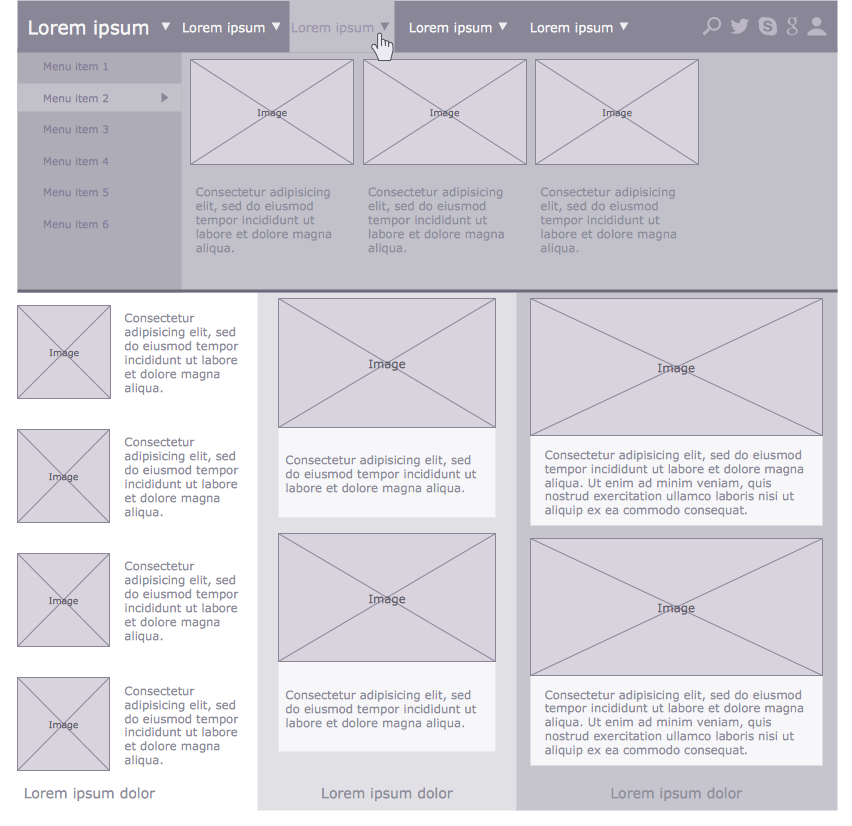
Often, a developer will receive a wireframe design like the following:
The intent is that the designer will have done some thinking about things such as proportions, margins, sizes, and perhaps font faces and colors. The developer has just to implement what the designer dreamed up. It'll be 45 minutes, tops.
But it isn't so simple. That may be true for the design of a page in a newspaper or magazine, but this is the web: The text will not be uniform-- How will the page adjust if the text content is much longer or much shorter than in the wireframe? The number of menu items may be variable. The window can end up being much wider or much narrower than intended.
Therefore, the first question a developer should ask before designing a responsive layout is "What content must these different components accomodate?" If user input is involved, what are the limitations on that? For example, if someone can make an account name that is 200 characters long, then everywhere that an account name appears must be able to handle names that are 200 characters long! Otherwise, maybe it's time to apply a constraint: Account names can only be twenty characters long. How would Twitter (or... Tweeter) look if tweets could be 500 words long? How would Instagram's UI be affected if you could post images that were 10px tall and 500px wide?
Once you know some of these requirements, the next question to ask should be "What happens at either end of the requirements scale?" What does this box look like when it's empty? What about when it overflows?
When you build a responsive layout, you are not just configuring static boxes on a static canvas... You are programming the behavior of those boxes, and the things that fill them.
Built into every webpage is behavior that defines how elements change in response to content, and in response to the things around it. The facts that words wrap and paragraphs stack are part of the behavior that browsers default to, and when they are not what we prefer, they can be overridden. Almost any rule about how to respond to variable content can be overridden-- We just need to decide what we want.
Flexbox is a good place to start.
<opinion>Flexbox is not the only correct way to do layout, but it's the most correct way to do layout.</opinion>
Flex container: The parent element, which has display: flex applied to it.
Flex item: An item inside of a flex container
Main axis: The direction that the flexbox arranges its items. This can be either a row, or a column.
Cross axis: The axis that is not the main axis, and is in fact orthogonal to it. If the flex container is arranging things lefty-righty, the cross axis is uppy-downy (and vice-versa, of course).
Justify: How things are arranged on the main axis.
Align: How things are arranged on the cross axis.
Flexbox is very powerful and expressive, but to get started with it, you only need to know four properties:
| Property | Values | Default Value | What It's For |
|---|---|---|---|
display |
flex |
block/inline, usually |
Tells a container that it's a flexbox, and all of its children are flex items |
flex-direction |
row, column |
row |
Determines whether the flex items line up horizontally (row) or vertically (column) |
justify-content |
flex-start, flex-end, center, space-around, space-between, space-evenly, stretch |
flex-start |
How items are arranged along the main axis |
align-items |
baseline, flex-start, flex-end, center, space-around, space-between, space-evenly, stretch |
stretch |
How items are arranged along the cross axis |
Note: Value lists are not exhaustive, but contain the ones that we are most interested in.
The following HTML will generate a simple flexbox: Four paragraphs, arranged in a row.
CSS
section {
  display: flex;
}
HTML
<section>
  <p>One</p>
  <p>Two</p>
  <p>Three</p>
  <p>Four</p>
</section>
With Flexbox, instead of defining rigid dimensions, we simply describe the behavior that we want and then let Flexbox determine the correct size of elements on the fly, based on the contents and context that the element is given.
By doing our layouts in this way, they are fluid, dynamic, and inherently responsive. That doesn't abolish the need for other responsive layout tools, but it significantly reduces the amount of repetitive work that needs to be done to make a single view look good in a variety of circumstances.
In the example above, we leverage the flex-grow and flex-shrink properties, as well as min-widths, to establish a plan for how elements on the page change sizes.
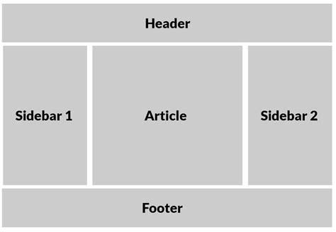
This layout was considered almost unattainable (or at least, unattainable without great sacrifice) for many years. With Flexbox though, it's easy. Here is what the layout looks like:
To get this layout, we start with markup like the following:
<body>
  <header></header>
  <main>
    <aside></aside>
    <article></article>
    <aside></aside>
  </main>
  <footer></footer>
</body>
Then, the core CSS is quite straightforward:
body {
  display: flex;
  flex-direction: column;
}

main {
  display: flex;
}
There's a little bit more to it than that, but essentially, we are ready to start making decisions about things like what content the layout will have (and how it will behave), what the min-width and max-width of the different elements will be, and when the page will switch to a different layout strategy.
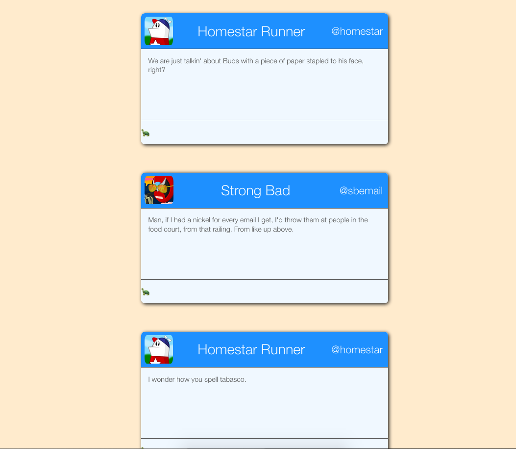
sectionrepresents the card- Flex column
header,main, andfootermean what it sounds like they mean- Flex row
- Header items are
space-between'd to get the first and last pushed all the way to the corners
<section>
  <header>
    <img src="homestar.jpg">
    <h1 class="name">Homestar Runner</h1>
    <h2 class="handle">@homestar</h2>
  </header>
  <main>
    <p>...</p>
  </main>
  <footer>
    <p></p>
  </footer>
</section>
Tolerances
When programming a dynamic layout, it's prudent to test how tolerant it is to extreme context and content. In this case, it starts breaking down around 35em (partly because we hard-coded cards to be 35em wide).
When a layout's tolerances are exceeded (like when the viewport becomes very small), we change to a different plan with media queries, which we will talk about later. Using Flexbox, we can use the same markup to restyle entire components:
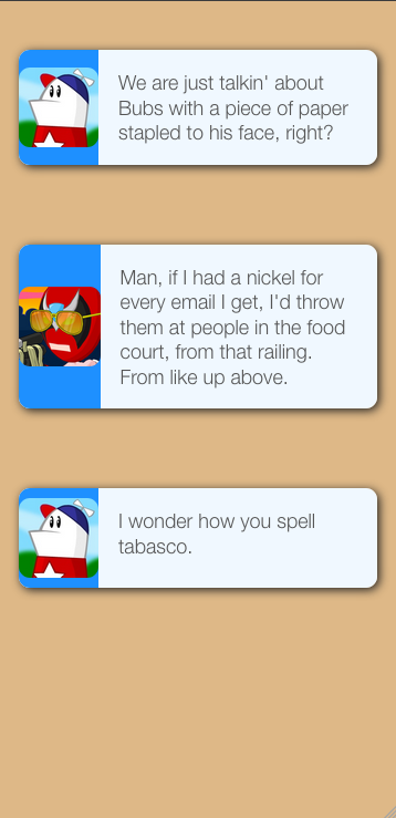
For the mobile version:
- Much of the styling is inherited
- The background is
burlywoodnow, just for contrast - Each section is
rowinstead ofcolumn - The content stretches more than before
- Some elements are hidden
So how does this desktop vs. mobile plan work?
- Plan B is for when the limitations of your fluid design plan are exceeded
- Plan B should usually be used in conjunction with (not instead of) Plan A.
- A media query has a media type and a number of media feature expressions.
- They can be combined with logical operators
There are only four media types:
all- Every devicescreen- Devices with screens; Laptops, phones, tablets, smart TVs, etc.print- Devices made of paper, such as pieces of paper. Also, print previews. This allows you to set special styling for someone wanting to print your page.speech- Intended for speech synthesizers.
There used to be more (tty, tv, projection, handheld, braille, embossed, and aural) but they have been deprecated. Not many people were developing websites in braille.
While media types are quite straightforward, there are many media features. Features are specific attributes about the context that the webpage is viewed in. The full list is available here:
https://developer.mozilla.org/en-US/docs/Web/CSS/Media_Queries/Using_media_queries#Media_features
For responsive design, however, the most common thing that we care about is viewport width. That is, whether the viewport is bigger/smaller than a certain size.
Usually, we will use a range prefix on the width attribute to say "All pixel ranges that are greater/less than n," where n is the number of pixels (or ems, or some other unit). These minimum and maximum values are often called breakpoints, or the point at which the CSS engine "breaks" into another layout plan.
| Attribute | Behavior | Example |
|---|---|---|
max-width |
Fire if the screen width is less than or equal to n | @media (max-width: 720px) |
min-width |
Fire if the screen width is greater than or equal to n | @media (min-width: 480px) |
img {
  max-width: 1080px;
}

@media (max-width: 480px) {
  img {
    max-width: 90%;
  }
}
- How do you decide what pixel values to set your breakpoints to?
- Old plan: Device widths
- This is bad
- Modern plan: Find the natural breakpoints in your layout
To make media queries work as expected, we need to define the size of the viewport with a meta tag in our page's head.
<meta name="viewport" content="width=device-width">
This meta tag says to the browser "This page's width adapts to the width of your device." This is necessary for reasons that are dumb and bad.
Details:
http://www.javierusobiaga.com/blog/stop-using-the-viewport-tag-until-you-know-ho/
https://webdesign.tutsplus.com/articles/quick-tip-dont-forget-the-viewport-meta-tag--webdesign-5972
SASS is a CSS preprocessor. A preprocessor is a piece of software that turns some code (SCSS in this case) into some other code (ordinary CSS). All CSS is valid SCSS. The significance of this is that in your SCSS, you can just write any normal CSS and it will work as normal.
But we can also do some cool stuff in our SCSS that really helps us scale our stylesheets:
One of the greatest features that SASS gives us is nesting. That allows us to turn regular CSS like this:
section {
  display: flex;
}

section > header {
  background: dodgerblue;
}

section > main {
  background: goldenrod;
}

section > footer {
  background: tomato;
}
Into something more like this:
section {
  display: flex;
  > header {
    background: dodgerblue;
  }
  > main {
    background: goldenrod;
  }
  > footer {
    background: tomato;
  }
}
We can also organize our stylesheets with partials, which we can then import just about anywhere we feel like-- Much how ejs partials work.
So we can take our CSS from the previous section and refactor it to look like this:
style.scss
section {
  display: flex;
  > header {
    background: dodgerblue;
  }
  > main {
    background: goldenrod;
  }
  @import 'footer';
}
_footer.scss
> footer {
  background: tomato;
}
This example is simplified, but as stylesheets get very very long, this is a powerful way to help break down your code and keep it organized. Of course, you can @import the same file in many different places, which helps DRY out your code.
On larger projects, you might have the server run SASS automatically when you recompile the app from source or something. On smaller projects though, you might want to run Sass manually.
After installing it (you can check to see if it's installed with which sass), you could run a command like this:
sass --watch **/*.scss
This tells the SASS compiler to watch every file with the .scss extension in every directory inside of the current directory for changes, and output a regular .css file to the same directory.
SASS has other neat tools, like mixins and inheritance, which help you organize your styles in more sophisticated ways. For a full list of SASS' features, check out the guide page, or ask Joel.
The article that coined the term (and described in detail the concept of) "Responsive Design:" https://alistapart.com/article/responsive-web-design
Everything you need to know about Flexbox: https://css-tricks.com/snippets/css/a-guide-to-flexbox/


