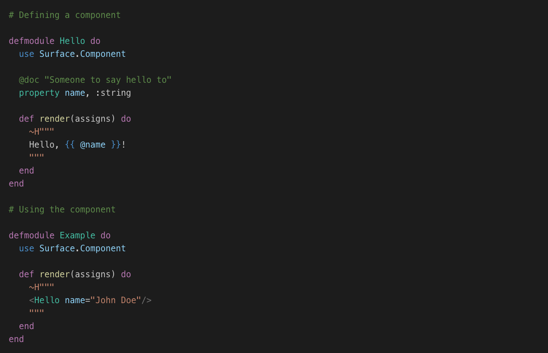
A component based library for Phoenix LiveView.
Built on top of the new LiveComponent API, Surface provides a more declarative way to express and use components in Phoenix.
A work-in-progress live demo with more details can be found at surface-demo.msaraiva.io
A VS Code extension that adds support for syntax highlighting is available at marketplace.visualstudio.com.
A lot of the concepts behind it were borrowed from some of the most popular frontend
solutions like React and Vue.js.
At compile time, Surface translates components defined in an extended HTML-like syntax into regular Phoenix templates. It also translates standard HTML nodes allowing us to extend their behaviour adding new features like syntatic sugar on attributes definition, directives, scoped styles, validation and more.
In order to have your code translated, you need to use the ~H sigil when defining your templates.
- Components as modules - they can be stateless, stateful, data-only or compile-time
- Declarative properties - explicitly declare the inputs (properties) of each component (like React)
- An HTML-centric templating language with built-in directives (
:for,:if, ...) and syntactic sugar for attributes (inspired by Vue.js) - Contexts - allows parent components to share data with its children without passing them as properties
- Compile-time checking of components and their properties
- Integration with editor/tools for warnings, syntax highlighting, jump-to-definition, auto-completion and more
Note: Some of the features are still experimental and subject to change.
Install Phoenix LiveView following the installation guide.
Then add surface to the list of dependencies in mix.exs:
def deps do
  [
    {:surface, "~> 0.1.0-alpha.0"}
  ]
end
In order to have ~H available for any Phoenix view, add the following import to your web
file in lib/my_app_web.ex:
  # lib/my_app_web.ex

  ...

  def view do
    quote do
      ...
      import Surface
    end
endTo create a component you need to define a module and use one of the available component types:
- Surface.Component - A stateless component.
- Surface.LiveComponent - A live stateful component.
- Surface.LiveView - A wrapper component around
Phoenix.LiveView. - Surface.DataComponent - A component that serves as a customizable data holder for the parent component.
- Surface.MacroComponent - A low-level component which is responsible for translating its own content at compile time.
  # A stateless component

  defmodule Button do
    use Surface.Component

    property click, :event
    property kind, :string, default: "is-info"

    def render(assigns) do
      ~H"""
      <button class="button {{ @kind }}" :on-phx-click={{ @click }}>
        {{ @inner_content.() }}
      </button>
      """
    end
  end

  # A live stateful component

  defmodule Dialog do
    use Surface.LiveComponent

    @doc "The title of the dialog"
    property title, :string, required: true

    data show, :boolean, default: false

    def render(assigns) do
      ~H"""
      <div class={{ "modal", isActive: @show }}>
        <div class="modal-background"></div>
        <div class="modal-card">
          <header class="modal-card-head">
            <p class="modal-card-title">{{ @title }}</p>
          </header>
          <section class="modal-card-body">
            {{ @inner_content.() }}
          </section>
          <footer class="modal-card-foot" style="justify-content: flex-end">
            <Button click="hide">Ok</Button>
          </footer>
        </div>
      </div>
      """
    end

    # Public API

    def show(dialog_id) do
      send_update(__MODULE__, id: dialog_id, show: true)
    end

    # Event handlers

    def handle_event("show", _, socket) do
      {:noreply, assign(socket, show: true)}
    end

    def handle_event("hide", _, socket) do
      {:noreply, assign(socket, show: false)}
    end
  end

  # A live view component

  defmodule Example do
    use Surface.LiveView

    def render(assigns) do
      ~H"""
      <Dialog title="Alert" id="dialog">
        This <b>Dialog</b> is a stateful component. Cool!
      </Dialog>

      <Button click="show_dialog">Click to open the dialog</Button>
      """
    end

    def handle_event("show_dialog", _, socket) do
      Dialog.show("dialog")
      {:noreply, socket}
    end
  end
Directives are built-in attributes that can modify the translated code of a component at compile time. Currently, the following directives are supported:
-
:for- Iterates over a list (generator) and renders the content of the tag (or component) for each item in the list. -
:if- Conditionally render a tag (or component). The code will be rendered if the expression is evaluated to a truthy value. -
:show- Conditionally shows/hides an HTML tag, keeping the rendered alement in the DOM even when the value isfalse. -
:bindings- Defines the name of the variables (bindings) in the current scope that represent the values passed internally by the component when calling the@contentfunction. -
:on-[event]- Sets aphxevent binding defining the component itself as the default handler (target). This is the prefered way to usephxevents in Surface as it can properly handle properties of type:event. Available directives are::on-phx-click,:on-phx-blur,:on-phx-focus,:on-phx-change,:on-phx-submit,:on-phx-keydownand:on-phx-keyup.
<div>
  <div class="header" :if={{ @showHeader }}>
    The Header
  </div>
  <ul>
    <li :for={{ item <- @items }}>
      {{ item }}
    </li>
  </ul>
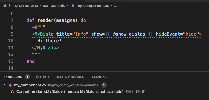
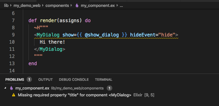
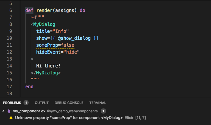
</div>Since components are ordinary Elixir modules, some static checking is already provided by the compiler. Additionally, we added a few extra warnings to improve user experience. Here are some examples:
Some experimental work on tooling around the library has been done. Here's a few of them:
- Syntax highlighting
- Jump to definition of modules (components)
- Jump to definition of properties
- Auto-complete/suggestions for properties (WIP)
- Show documentation on hover for components and properties
Having a standard way of defining components with typed properties allows us to
enhance tools that introspect information from modules. One already discussed was
the possibility to have ex_doc query that information to provide standard
documentation for properties, events, bindings, etc.
Copyright (c) 2019, Marlus Saraiva.
Surface source code is licensed under the MIT License.


