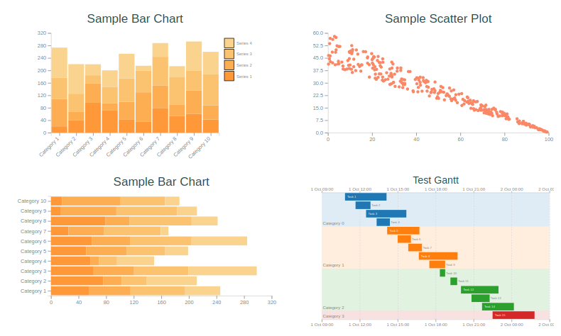
ContEx is a simple server side charting package for elixir. See these demos on the live site: https://contex-charts.org/
... and it works nicely in Phoenix LiveView
ContEx uses a simple Dataset structure - a list of lists or a list of tuples together with a list of column names.
For example:
 data = [{1, 1}, {2, 2}]
ds = Dataset.new(data, ["x", "y"])Data can be represented within different chart types. Currently supported charts are BarChart, PointPlot, LinePlot, GanttChart and Sparkline. Generally speaking, you can create a chart structure by calling new(<DataSet>) on the relevant module and Contex will take a reasonable guess at what you want. For example:
point_plot = PointPlot.new(ds)Will make a new point plot with the first column used for the x-axis, the second for the y-axis, and the scales set to look ok.
Each module has different option. For example, BarChart allows you to set the :padding between the bar groups, specify whether you want :type to be :grouped or :stacked. The options are described in each module's documentation and are set in new/2.
DataSet columns are mapped to the attributes each different chart type expects. For example, a PointPlot expects an x column and at
least one y column. These are set up by passing a :mapping option in the options when creating a new chart. For example,
   chart = PointPlot.new(
       dataset,
       mapping: %{x_col: :column_a, y_cols: [:column_b, column_c]}
     )
It isn't necessary to supply a mapping unless the DataSet is a list of maps. If no mapping is provided, columns will be allocated
automatically. For a PointPlot, the first column will be used for x, and the second for y.
Each chart type implements the PlotContent protocol which requires it to scale to a defined height and width, emit SVG and optionally emit SVG for a legend. Generally, you won't directly access this protocol however, because...
... Charts live within a Plot. Plots manage things like titles, margins, axis titles, legend placement etc.
So to generate SVG ready for your web-page you would do something like:
plot = Plot.new(600, 400, point_plot)
 |> Plot.plot_options(%{legend_setting: :legend_right})
 |> Plot.titles("My first plot", "With a fancy subtitle")

Plot.to_svg(plot)
#^ This generates something like {:safe, "<svg> fancy SVG chart rendering stuff representing your plot</svg>"}
There is a short-cut API which creates the PlotContent and plot in a single pass by providing the chart type module to Plot.new/5.
For example:
plot = Plot.new(dataset, Contex.PointPlot, 600, 400, mapping: %{x_col: :column_a, y_cols: [:column_b, column_c]})

Plot.to_svg(plot)
Scales are all about mapping attributes to plotting geometry. They handle transformation of data to screen coordinates (and other plotting attributes). They also handle calculation of tick intervals and the like where appropriate. Scales currently implemented are:
ContinuousLinearScale: A linear continuous scaleContinuousLogScale: A log version of continuous scaleOrdinalScale: For categories / discrete attributes. Used for plotting the category axis in aBarChart.CategoryColourScale: Maps unique attributes into coloursTimeScale: A continuous timescale forDateTimeandNaiveDateTimedata types
Others under consideration:
ContinuousColourScale: Generate colour gradients
Legends are generated for scales. Currently legend generation is only supported for a CategoryColourScale
There are quite a few things to tidy up to make this ready for the real world, and the API is likely to be unstable for a little while yet...
- Reasonable docs - the best resource currently is the accompanying demo project
- Default styling
- Upgrade Elixir required version to 1.10 and fix up some of the data comparison operators to use the new sort capabilities. Holding off on this for a while so we don't force an unwanted Elixir upgrade.
- Multiple series in point plot
- Line plot
- Some test coverage - it has been built interactively using a liveview page for testing / refinement. Thanks to @srowley for getting some test coverage in place.
- More test coverage... An approach for comparing "blessed" output SVG would make sense, including handling minor difference in spacing or element attribute order.
- Options handling - needs to be better structured and use keyword lists rather than maps
- Options for BarChart, PointPlot and GanttChart
- Plot options
- Colour handling
- Plot overlays (e.g. line chart on bar chart)
- SVG generation is poorly structured - lots of string interpolation.
- Benchmarks - particularly for the situation where large datasets are getting updated frequently and served via LiveViews.
- Pie Charts
The package can be installed
by adding contex to your list of dependencies in mix.exs:
def deps do
  [
    {:contex, "~> 0.5.0"}
  ]
endVarious details relating to scales, axes and SVG layout have been learnt from the excellent D3 library by Mike Bostock.
The theory of translating data into graphics is also very well handled by ggplot2 and various papers by Hadley Wickham, such as A Layered Grammar of Graphics
- GGity - modelled on ggplot2
- PlotEx - has good line & time-series support and more optimised for certain situations.
- Sasa Juric Homebrew - graph.html.leex has examples of injecting data into SVGs for very specific use cases.

