The link to my portfolio website may be found at the following address: https://genmauger.netlify.com/
- Problem
- MVP
- Research
- Pinterest/Mood board
- Figma
- Coding
- Going Live
- Future Changes
In completing this project, I hoped to solve a few problems:
- As a junior developer, how do I make my presence known to potential clients and employers?
- How do I present my website in a way that is succinct and to the point? Websites are evaluated quickly, information should be presented in a way that is easy to judge and consume.
- How do I want to be viewed by my audience? What is the best way to market myself to potential clients to achieve this?
The MVP for this product would be to at least create a static website that closely resembles my final design in Figma. Beyond that, I will be using flexbox to add responsiveness to my website, and to make all content easily viewable on phone, desktop, and tablet. Finally, I will be using some simple animation effects to make my website feel more interactive and dynamic.
Research and planning were easily the most important parts of this project for me. Once I had completed both a decided on my final design, coding my website was alot simpler than if I was trying to place objects blindly. HAving an end design to work towards kept me focussed.
The first step in my research was to think of themes that would provide inspiration for my color palette. I had a few ideas for this, ranging from the landscape I was surrounded by growing up, to calming pastel colors, to bright hues found in city street art. The themes I considered included:
- Country landscape
- Inner city/urban areas (greys mixed with bright, vibrant colors)
- Gardens - both green and drought-resistant (the pastel colors on various cacti provided some great inspiration)
- Minimalist building designs, good use of white space
My complete Figma inspiration board can be found here : https://www.figma.com/file/UfOKBrsAuQqowNzncKaPjiUz/Portfolio-Design-%231
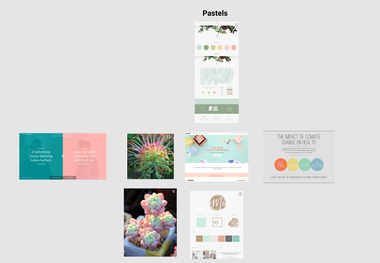
I found Pinterest to be an incredibly useful tool in generating visual inspiration for my website. I ended up making several Pinterest boards that I could draw inspiration from. I found being able to easily view groups of images side by side, and extract similar colors, a very helpful process. I also created a board for different font families, and a Pinterest board solely for logo design. Below is a link to some of the pictures I was drawing inspiration from:
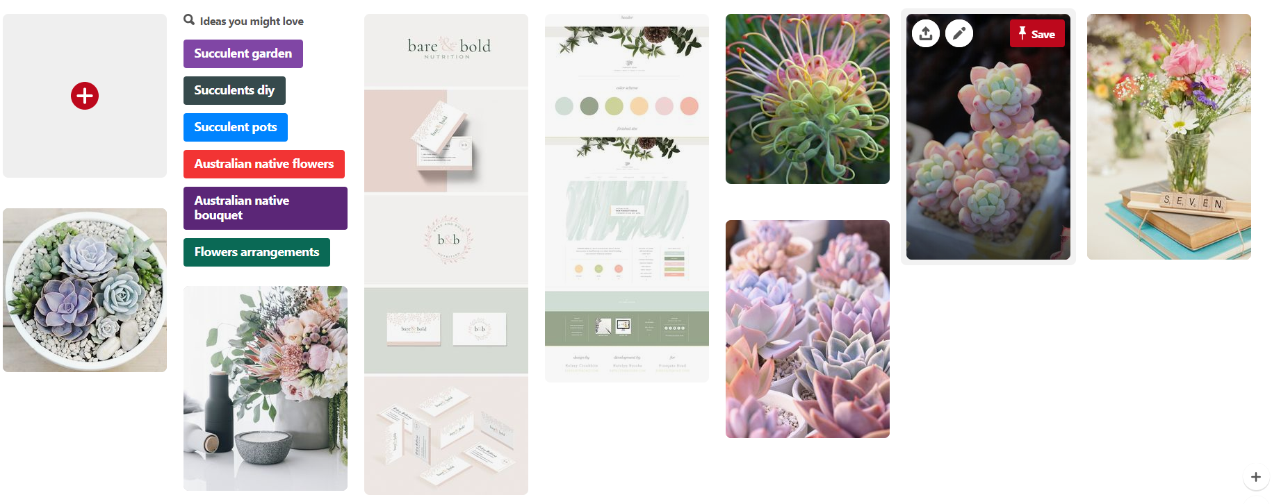
Pastels:
I found that I really enjoyed the light, softer colors. They were easy on the eye. I also felt they went together a lot more intuitively than 'bold' or stronger colors. Nevertheless, I was also interested in seeing if I could possibly incoporate some strong, bold colors into my design. I found I was also drawn to very minimalist designs, also with soft colors, but also good use of white space to give objects or elements room to breathe.
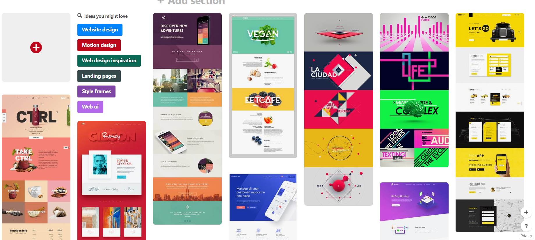
Bold colors:
I loved these websites, but even after extracting color palettes from the images, I was unsure as to how i would incoporate bold colors like these into my website.
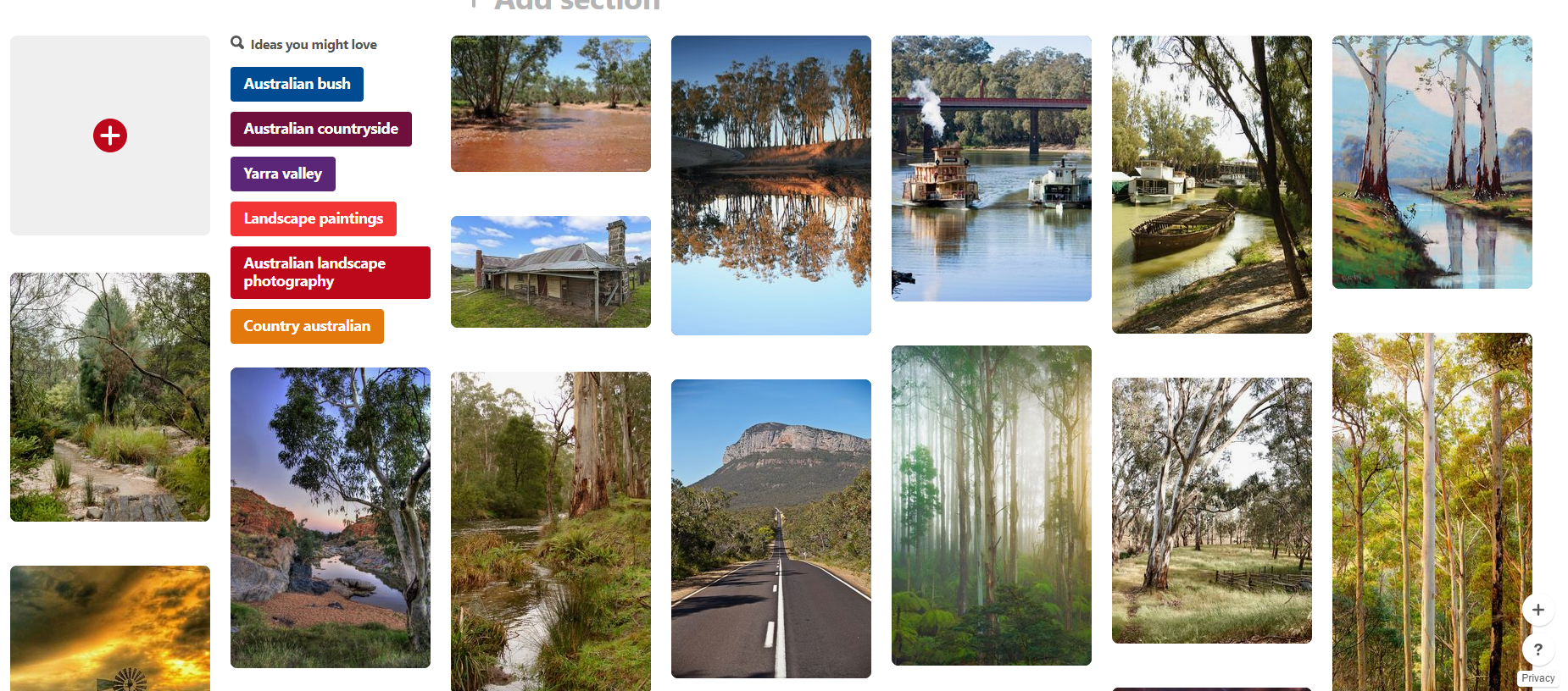
As I mentioned above, one of the other inspirations I was considering was classic country landscape. I felt any colors drawn from this would be a good choice. I grew up in the country, and felt that a palette created from this would have the added benefit of carrying personal meaning. Below are some of the images I was considering:
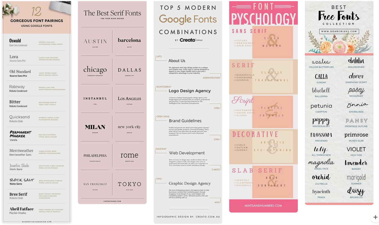
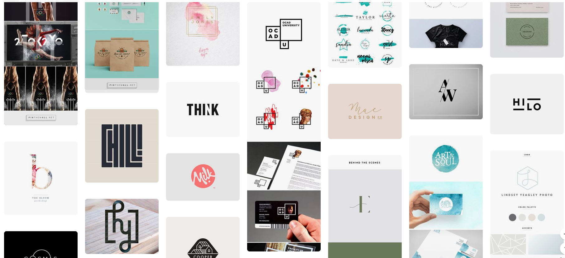
Below are images drawn from both my logo and font Pinterest boards:
For future reference, and for anyone who is interested, I am including links to all Pinterest boards I used in this project:
Bold colors: https://www.pinterest.com.au/genevieve_mauger/bold-colors/ Pastels: https://www.pinterest.com.au/genevieve_mauger/pastels/ Graffiti/Urban: https://www.pinterest.com.au/genevieve_mauger/grafitti/ Gardens: https://www.pinterest.com.au/genevieve_mauger/japanese-gardens/ Minimalist: https://www.pinterest.com.au/genevieve_mauger/minimalist/ Country Victoria: https://www.pinterest.com.au/genevieve_mauger/country-victoria/ Landscape: https://www.pinterest.com.au/genevieve_mauger/dry-landscape/
At this point I had pretty much narrowed my design choices down to two color schemes. It was a pity they were complete opposites:
- Pastels
- Bold colors
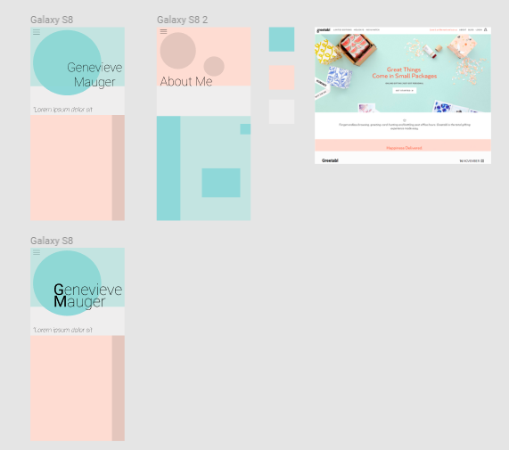
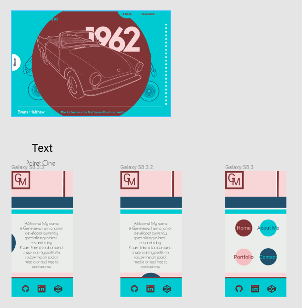
The best step for me at this point was to actually start designing my website in Figma. I started off with a pastel design. After viewing the colors on my pastel Pinterest board, I decided that I would like to use both blue and pinky/brown as my main colors, with a neutral white as a highlight. However, although I had an idea of the colors I wanted to use, I still had little idea of how I should combine these colors with other page elements to create an effective website. With this in mind, I began searching for examples of other pastel-inspired websites. I found a few, and, pinning them to the top of my Figma board, I began to design:
I was inpsired by one website in particular, and began using that particular color scheme with circles and squares to give it texture:
I was also inspired by another pastel-style website that I believe made great use of a wide range of colors, without appearing too messy. I created a few designs based off this website as well:
However, although I felt this design looked great, in the end, I felt that it was too similar to the original website design. I was also having a hard time imagining where I could take the design. In the end I abandoned that design.
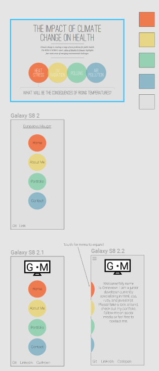
I was still interested in potentially creating a website with very bold colors, and felt I should at least give designing one a shot. I created a color palette from this website:
and set about making some designs. I did really enjoy the color palette, but it was very strong. I also felt I wasn't doing the colors themsleves justice. My design felt very constrained, and unimaginative. With this in mind, I returned to my original colors.
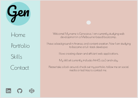
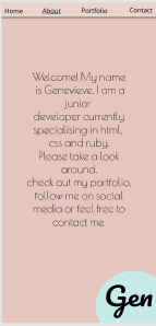
My main concern with these colors was that they were just too soft. I was concerned anything I did with them would simply be washed out. I felt since my colors were so light, using black text at least, was a necessity, for some contrast. I continued to experiement with placement of the colors, and ended up with the following designs, for desktop and mobile:
I really liked both these designs. I intended to keep the design fairly simple. This was partly because I was working to a deadline, and wanted to make sure I could deliver on MVP, and partly because, I was a fan of simple, minimalist designs. I was also happy to use a darker version of the pink/brown I had chosen earlier. I felt this gave my design a bit more strength.
The final colors I chose were:
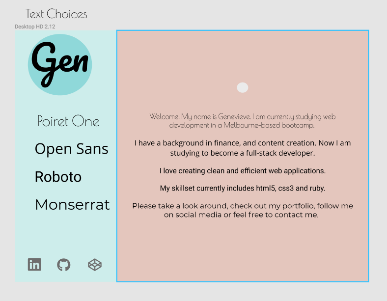
During this time I also tried out several different fonts. My logo made use of a cursive font, so I was interested in using a couple sans fonts for my website. These are some of the fonts I was considering.
I felt that just using blue and brown as static colors could be a little boring for the user, so I introduced a gradually ligtening gradient on the desktop site. On my mobile site, I had the vertical nav, transform into a brown top nav. To add a little more texture to the mobile site, I also used a gradient, however, this gradient moved through my chosen colors, brown, neutral white, and blue.
I was happy with my design, it was time to code.
Coding was a very mixed process for me. However, I do believe that it got easier the further I went along. Some of the major issues I ran into along the way included:
-
Making my vertcial nav in desktop view, collapse to a horizontal, fixed nav in mobile view. This was eventually solved with a media query, but caused me some problems in the meantime.
-
I felt that media query necessitated the use of media queries for many other elements. If I had used a fixed top nav for both desktop and mobile, resizing would have been much easier. However, I wanted to recreate a specific design that and this seemed to be the simplest way to accomplish it.
-
I used flexbox for mobile resposiveness. However, I ran into quite a few issues with content overflowing from divs when being resized. i am considering redoing my wesbite in css grid in future, as I feel that most of my content would fit quite neatly into a grid system.
-
A myriad of smaller resizing, aligning, and sizing issues.
I felt that by the end of the project, I had a MUCH better grasp on how flexbox worked, as well as parent-child div relationships.
I set my wesbite to go live through netlify. My website address is: https://genmauger.netlify.com/ The process itself was very simple. The only thing left to do after that was to set up my a working contact form on my wesbite.
There are a few changes I would like to make to my wesbite in future:
- Get a professional photo taken to use on my wesbite
- Reduce my website's reliance on media query breakpoints
- Look into possibly redesigning my wesbite in css grid
- Make my website backwards compatible with older browsers - I haven't done any work on this yet
