ReactGD is a extension tool used to create dynamic UIs with flexibility and efficiency, where the nodes are updated only when needed.
Extending a script with ReactComponent, you can use the function render, which you return a Godot's Dictionary.
In this dictionary, you put everything that must be rendered given the component's properties and state.
The component only renders when there's a change in it's state or when a parent ReactComponent change the properties of the component.
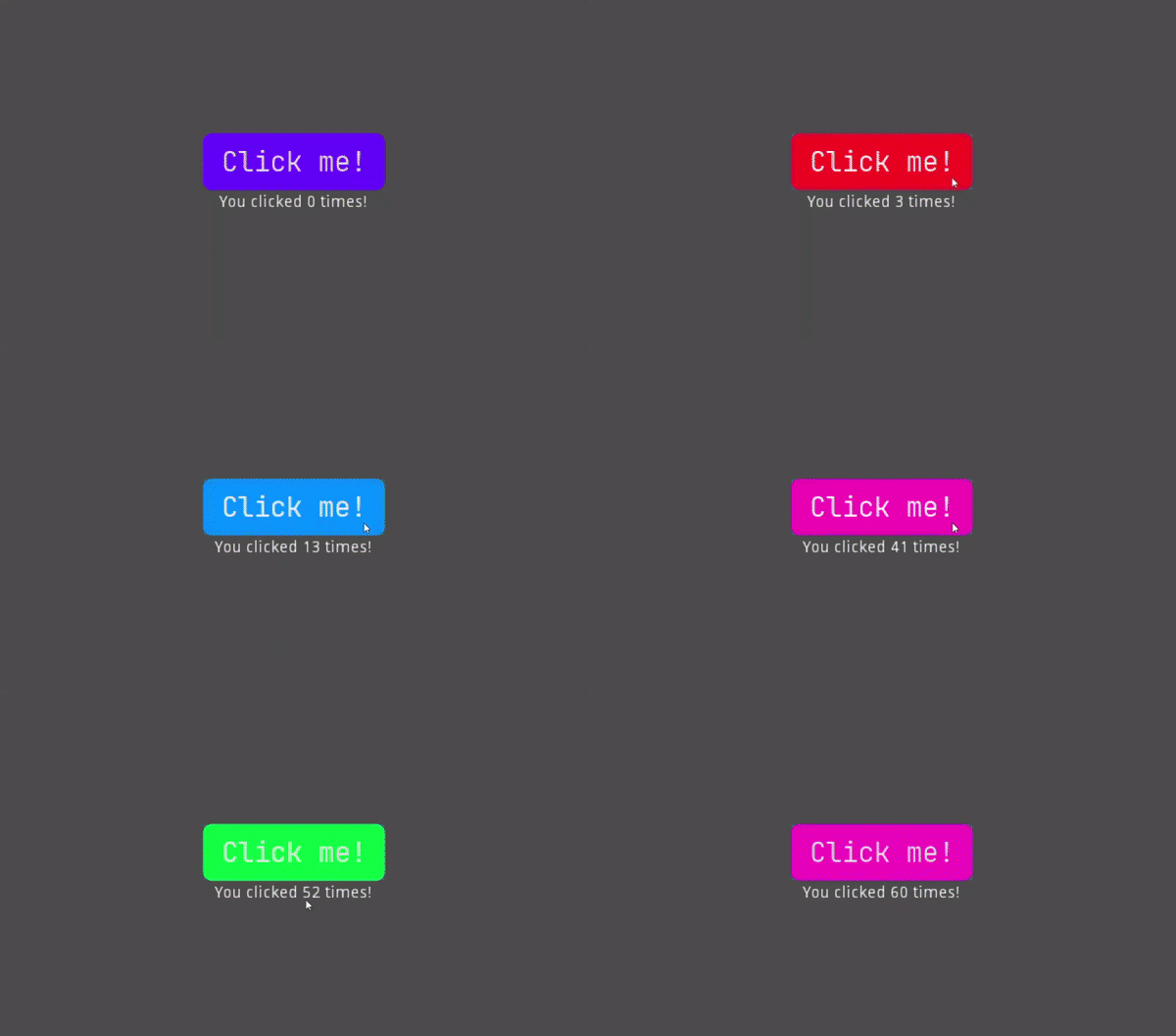
There's a example script of a simple button that tells how much times the button has clicked as text and changes the background color to a random color:
extends ReactUI

const font_path := "res://Fonts/JetBrains/fonts/ttf/JetBrainsMono-Regular.ttf"

func construct() -> void:
	self.state = {
		"click_count": 0,
		"color": Color.from_hsv(randf(), 1.0, 1.0)
	}

func on_button_click() -> void:
	self.set_state({
		"click_count": self.state.click_count + 1,
		"color": Color.from_hsv(randf(), 1.0, 1.0)
	})

func render():
	var click_count :int = self.state.click_count
	var color :Color = self.state.color

	var theme := {
		"click_button": {
			"styles": {
				["normal", StyleBoxFlat]: {
					"bg_color": color,
					"corner_radius": 8.0,
					"content_margin_horizontal": 16.0,
					"content_margin_vertical": 8.0
				},
				["hover", StyleBoxFlat]: {
					"bg_color": color,
					"corner_radius": 8.0,
					"content_margin_horizontal": 16.0,
					"content_margin_vertical": 8.0
				},
				["pressed", StyleBoxFlat]: {
					"bg_color": color,
					"corner_radius": 8.0,
					"content_margin_horizontal": 16.0,
					"content_margin_vertical": 8.0
				}
			},
			"fonts": {
				"font": {
					"size": 24.0,
					"use_filter": true,
					"src": font_path
				}
			}
		}
	}

	return (
		<VBoxContainer
			anchor_top: 0.0
			anchor_left: 0.0
			anchor_right: 1.0
			anchor_bottom: 1.0
			alignment: VBoxContainer.ALIGN_CENTER
		>
			<Button
				size_flags_horizontal: Control.SIZE_SHRINK_CENTER
				size_flags_vertical: Control.SIZE_SHRINK_CENTER
				name: "ClickButton"
				text: "Click me!"
				on_pressed: "on_button_click"
				theme: theme.click_button
				ref: "click_button"
			/>
			<Label
				size_flags_horizontal: Control.SIZE_SHRINK_CENTER
				size_flags_vertical: Control.SIZE_SHRINK_CENTER
				text: ("You clicked " + str(click_count) + " times!")
			/>
		</VBoxContainer>
	)
Here's the code in action:
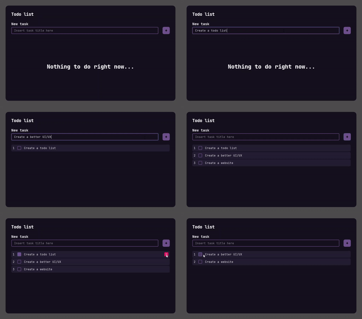
And here's a generic todo list:
All the demos can be found in Demo Scenes
- Add documentation;
- Improve gdx;
- Add functional based rendering (and hooks, maybe?);
- Create intellisense extension for Visual Studio Code;
- Add a easy way to create prop transitions (with tweens);
- Upload to Godot's Asset Library;
- Port to GDNative as a native plugin;
- Create custom import syntax.

