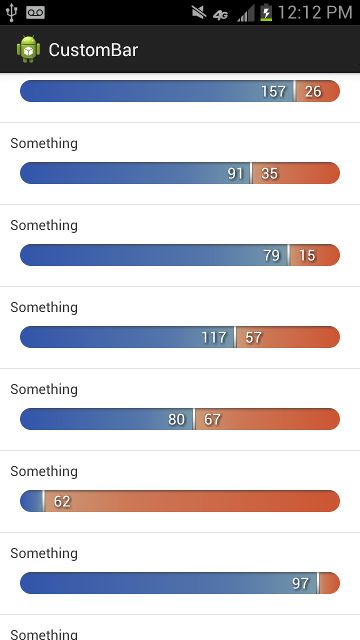
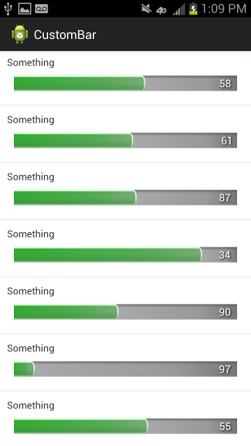
This is intended to be a "static" ProgressBar, customizable with three Drawables (left, right, center indicator). Could be easily extended to behave like a real ProgressBar or like a touch input.
In Eclipse, import the library as an Android library project.
You can setLeftCount() and setRightCount() on your view element and it will update the drawings.
<com.custombar.custombar.CustomBar
        android:id="@+id/custom_bar"
        android:layout_width="fill_parent"
        android:layout_height="22dp"
        android:layout_margin="10dp"
        app:leftCount="20"
        app:rightCount="10"
        app:centerDrawable="@drawable/center"
        app:leftDrawable="@drawable/left"
        app:rightDrawable="@drawable/right"
        app:textShadowDX="1dp"
        app:textShadowDY="1dp"
        app:textShadowRadius="2dp"
        app:textSize="15sp"
        app:centerOffset="0dp"
app:textOffset="10dp" />leftCount- count for leftrightCount- count for rightleftDrawable- a reference to the Drawable to be used as left bgcenterDrawable- a reference to the Drawable to be used as center indicatorrightDrawable- a reference to the Drawable to be used as right bgcenterOffset- margin around the center indicatortextLeft- whether to show the left text or not (default:true)rightLeft- whether to show the right text or not (default:true)textAnchorCenter- whether to anchor the text to the center indicator or or to anchor instead to the left and right sides, respectively (deafult:true)textOffset- margin around texttextSize- text sizetextColor- text colortextShadow- whether to show a text shadow or not (default:true)textShadowColor- color for the text shadowtextShadowRadius- radius for the text shadowtextShadowDX- horizontal offset for the text shadowtextShadowDY- vertical offset for the text shadowverticalPadding- use this to shrink the left and right bgs vertically (e.g.: if you want the center indicator to be higher than the bar itself).
The center indicator is drawn using its intrinsicSize

