This repo is a clone of the below React-Phone-Input-2 (2.9.3) The below repo however does not support IE.
This package has the necessary polyfills required for it to work. Namely String.prototype.startsWith
Highly customizable phone input component with auto formatting.


npm install react-phone-input-2 --saveimport ReactPhoneInput from 'react-phone-input-2'
import 'react-phone-input-2/dist/style.css'
<ReactPhoneInput defaultCountry={'us'} value={this.state.phone} onChange={handleOnChange}/>Your handler for the onChange event should expect a string as
parameter, where the value is that of the entered phone number. For example:
function handleOnChange(value) {
  this.setState({ phone: value })
}| Name | Type | Description | Example |
|---|---|---|---|
| excludeCountries | array | array of country codes to be excluded | ['cu','cw','kz'] |
| onlyCountries | array | country codes to be included | ['cu','cw','kz'] |
| preferredCountries | array | country codes to be at the top | ['cu','cw','kz'] |
| defaultCountry | string | initial country | 'us' |
| value | string | input state value | |
| placeholder | string | custom placeholder | |
| searchPlaceholder | string | custom search placeholder | |
| containerClass | string | class for container | |
| inputClass | string | class for input | |
| buttonClass | string | class for dropdown button | |
| dropdownClass | string | class for dropdown container | |
| searchClass | string | class for search field | |
| containerStyle | object | styles for container | |
| inputStyle | object | styles for input | |
| buttonStyle | object | styles for dropdown button | |
| dropdownStyle | object | styles for dropdown container | |
| searchStyle | object | styles for search field | |
| inputExtraProps | object | props to pass into the input | |
| autoFormat | bool | on/off phone formatting, true by default | |
| disableAreaCodes | bool | disable local codes for all countries | |
| disabled | bool | disable input and dropdown | |
| disableDropdown | bool | disable dropdown only, false by default | |
| disableCountryCode | bool | false by default | |
| enableLongNumbers | bool | false by default | |
| countryCodeEditable | bool | true by default | |
| enableSearchField | bool | enables search field in the dropdown | |
| disableSearchIcon | bool | hide icon for the search field | |
<ReactPhoneInput
  inputExtraProps={{
    name: 'phone',
    required: true,
    autoFocus: true
  }}
/>| Name | Type | Description |
|---|---|---|
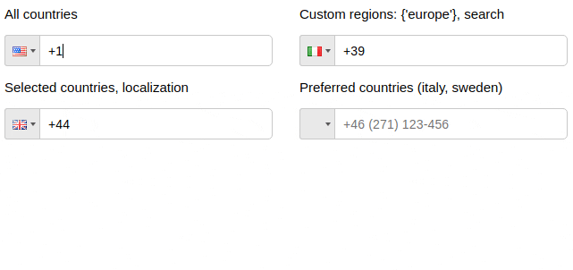
| regions | array/string | to only show codes from selected regions |
| Regions |
|---|
| ['america', 'europe', 'asia', 'oceania', 'africa'] |
| Subregions |
| ['north-america', 'south-america', 'central-america', 'carribean', 'european-union', 'ex-ussr', 'middle-east', 'north-africa'] |
Regions selected: {'europe'}
<ReactPhoneInput
  defaultCountry='it'
  regions={'europe'}
/>
Regions selected: {['north-america', 'carribean']}
<ReactPhoneInput
  defaultCountry='ca'
  regions={['north-america', 'carribean']}
/>| Name | Type |
|---|---|
| localization | object |
<ReactPhoneInput
  onlyCountries={['de', 'es']}
  localization={{'Germany': 'Deutschland', 'Spain': 'España'}}
/>

<ReactPhoneInput
  onlyCountries={['de', 'es']}
  localization={{'de': 'Deutschland', 'es': 'España'}}
/>| Name | Type |
|---|---|
| masks | object |
<ReactPhoneInput
  onlyCountries={['fr', 'at']}
  masks={{'fr': '+.. (...) ..-..-..', 'at': '+.. (....) ...-....'}}
/>| onChange | onFocus | onBlur | onClick | onKeyDown |
Country data object not returns from onKeyDown event
| Data | Type | Description |
|---|---|---|
| value/event | string/object | the event or the phone number |
| country data | object | the country object { name, dialCode, countryCode (iso2 format) } |
function handleOnChange(value, data) {
  this.setState({ rawPhone: value.replace(/[^0-9]+/g,'').slice(data.dialCode.length) })
}Code style changes not allowed
Based on react-phone-input