Utilities for accessibility (a11y) in Vue.js
- Why
- Getting Started
<VueAria>Componentv-ariaCustome DirectiveTravelMixinIdMixin<VueFocusTrap>ComponentShortcutsMixin<VueLive>Component
As the (WIP) Vue accessibility guide page says:
The World Health Organization estimate that 15% of the world's population has some form of disability, 2-4% of them severely so ... which can be divided roughly into four categories: visual impairments, motor impairments, hearing impairments and cognitive impairments.
table: issues for different impairments
| visual | motor | hearing | cognitive |
|---|---|---|---|
| 🖥 🔎 🎨 | 🖱 📱 ⌨️ 🕹 🎮 🎙 🖊 🎛 | 🔈 | content, layout, interaction |
Or there are also some accessibility issues for a normal person in such a situation like driving a car, having a meeting, using a mobile device with a bluetooth keyboard etc.
So actually accessibility is not just for the "less amount of people", but for almost everyone.
But some mistakes we often make in a real project like:
- Mouse-only in a desktop app
- Touch-only in a mobile app
- Remote-control-only in a TV app
- Operation through keyboard only is not possible or with low efficiency
- No text alternative for non-text content
- Have no fallback way for the creative interaction like e-pencil, audio input, face ID, touch ID, NFC etc.
- The color contrast is not enough
Each of them might make user confused, block the user flow or lead user to a no-way-out trap in some certain cases.
However, there are already some web standards and best practice to follow which let developers do it better.
In W3C there are 3 main parts of accessibility standards:
via: W3C Accessibility Standards Overview
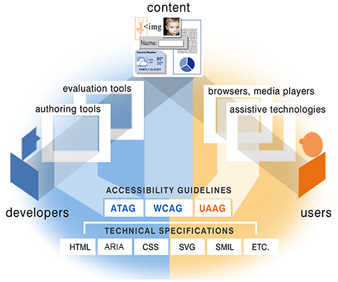
- WCAG: about web content, targeting websites.
- UAAG: about user agent, targeting browsers, screen readers etc.
- ATAG: about authoring tools, targeting CMS, WYSIWYG editor etc.
and a technical spec which is commonly used:
- WAI-ARIA: targeting web app.
For web developers, we may pay more attention on WCAG and WAI-ARIA. At the same time, we should know which user agents people use most and how about their support and compatibility to the standard.
Here is a survey about most common screen reader and browser combinations table:
| Screen Reader & Browser | # of Respondents | % of Respondents |
|---|---|---|
| JAWS with Internet Explorer | 424 | 24.7% |
| NVDA with Firefox | 405 | 23.6% |
| JAWS with Firefox | 260 | 15.1% |
| VoiceOver with Safari | 172 | 10.0% |
| JAWS with Chrome | 112 | 6.5% |
| NVDA with Chrome | 102 | 5.9% |
| NVDA with IE | 40 | 2.3% |
| VoiceOver with Chrome | 24 | 1.4% |
| Other combinations | 180 | 10.5% |
via Screen Reader User Survey by webaim.org
When you write a Vue app with full accessibility. You may meet some issues frequently. For example:
- Making sure the W3C WAI-ARIA roles & properties of each DOM element are set properly.
- Controling the focus and finish every use case elegantly only through keyboard.
- Using a central live region to read messages right now in a screen reader.
- Sometimes you need set a ID reference or ID reference list type aria attribute with ID of another DOM element. But we don't use ID in Vue to identify a DOM element right?
So that's why Vue A11y Utils is trying to supply a group of utilities to help Vue developers finish these jobs easier.
npm install vue-a11y-utilsor
yarn add vue-a11y-utils// choose the utils you need
import {
VueAria,
directiveAria,
MixinTravel,
MixinId,
VueFocusTrap,
MixinShortcuts,
VueLive
} from "vue-a11y-utils";See the docs below or preview some examples online.
For more complicated examples, there is another repo in Jinjiang/vue-a11y-examples you can preview online.
This component helps you to write role and aria-* attributes likely in a better way.
First you could put all aria-* attributes in an JS object. Second these a11y attributes could be inherited when more than 1 <VueAria> components nested. Third, it's more portable to use.
Another thing important is the tabindex attribute which could make an element focusable. But sometimes when the role changed into "none" or "appearance", there should be a easy way to control whether it is focusable as well.
<template>
  <VueAria role="menubutton" :aria="aria">
    <button>WAI-ARIA Quick Links</button>
  </VueAria>
</template>

<script>
import { VueAria } from "vue-a11y-utils";
export default {
  components: { VueAria },
  data() {
    return {
      aria: {
        haspopup: true,
        controls: "menu2"
      }
    };
  }
};
</script>
which is same to:
<template>
  <button id="menubutton" aria-haspopup="true" aria-controls="menu2">
    WAI-ARIA Quick Links
  </button>
</template>
So the content and structure in template is more clear than which with a lot of aria-* attribute in.
The aria prop could also be an Array which is convenient to merge multiple aria-* attribute from different places:
<template>
  <VueAria
    role="menubutton"
    :aria="[
      ariaData,
      ariaProps,
      otherAriaFromSomewhereElse
    ]"
  >
      <button>WAI-ARIA Quick Links</button>
  </VueAria>
</template>
And this component could be nested like:
<template>
  <VueAria :aria="otherAriaFromSomewhereElse">
    <VueAria :aria="ariaProps">
      <VueAria role="menubutton" :aria="ariaData">
        <button>WAI-ARIA Quick Links</button>
      </VueAria>
    </VueAria>
  </VueAria>
</template>
or:
<template>
  <VueAria role="menubutton">
    <VueAria :aria="aria">
      <button>WAI-ARIA Quick Links</button>
    </VueAria>
  </VueAria>
</template>
If you want to make a <div> focusable. You should give it a tabindex attribute. For example:
<template>
  <VueAria
    role="menubutton"
    :tabindex="0"
  >
    <div>WAI-ARIA Quick Links</div>
  </VueAria>
</template>
When you pass "none" or "appearance" value into role prop but without a tabindex prop. The tabindex attribute on the root element will finally be "" by default. For examples:
<template>
  <!-- won't be focused by click or TAB key -->
  <VueAria role="none">
    <div tabindex="0" role="menubutton">WAI-ARIA Quick Links</div>
  </VueAria>
</template>
<template>
  <!-- won't be focused TAB key but could be focused by click -->
  <VueAria role="none" :tabindex="-1">
    <div role="button" tabindex="0">WAI-ARIA Quick Links</div>
  </VueAria>
</template>
role:stringaria:ArrayorObjecttabindex:number
::: tip
When you pass "none" or "appearance" value into role prop but without a tabindex prop. The tabindex attribute on the root element will finally be "" by default.
:::
- default slot: the element you would put these a11y attributes on (only one root element is accepted)
If you prefer using directives rather than components, here is another choise: v-aria custom directive.
It helps you to write aria-* attributes better throught a Vue custom directive.
Almost the same to the aria prop in <VueAria> component, let you put all aria-* attributes in an object or array.
::: tip
Because the custom directive would modify the DOM element. It is different from component which renders virtual DOM. So v-aria will run after all <VueAria> executed if you put both of them on a same DOM element. And the performance of v-aria would be theoritically a little bit slower than <VueAria> if you use them bested quite a lot.
:::
<template>
  <i class="icon-save" role="button" v-aria="aria" />
</template>

<script>
import { directiveAria } from "vue-a11y-utils";
export default {
  directives: {
    aria: directiveAria
  },
  data() {
    return {
      aria: {
        label: "save your changes",
        controls: "id-of-a-textbox"
      }
    };
  }
};
</script>
This example above is same to:
<template>
  <i
    class="icon-save"
    role="button"
    aria-label="save your changes"
    aria-controls="id-of-a-textbox"
  >
</template>
Btw. there is no custom directive such as v-role and v-tabindex because you can set the two raw attributes directly on the same component or element with v-aria.
This mixin exposes a method named bindTravel($event: KeyboardEvent) which helps you use Arrow keys to travel through a group of focusable items or descendants. At the same time we support you fire some common actions by pressing ENTER, SPACE or ESC key.
Beside binding the method to a @keydown event, you should also config a special component option: $travel: TravelConfig. The config object must contain a setItems(vm) method to return an array of items you want to travel, and a pair of getIndex(vm), setIndex(vm, index) methods to access the current active index. And also you could define how to move(vm, event, newIndex, oldIndex, items) active index, how to fire action by enter(vm, event, index, items), space(vm, event, index, items) or esc(vm, event, index, items) keys. These 3 methods support returning a truthy value to avoid other following actions happened from the same event.
If there are more than one area you want to travel in a Vue component, we also provide another named travel way like: bindTravel($event, name) method + $travel: Record<string, TravelConfig> config.
Additionally, this travel config also accepts you define:
loopedto determine whether the travel would be looped back when we go next at the last item or go previously at the first item.orientationto determine the orientation of the Arrow keys:"horizontal"or"vertical".hasPaginationto firenextPage(vm, event, index, items)&prevPage(vm, event, index, items)when PageDown or PageUp pressed.hasSearchto firesearch(vm, next, keyword, index, items)when a letter or number key pressed.
::: tip
We suggest you define all the methods in TravelConfig config as pure functions. So the first parameter of each methods are always the Vue component instance object (vm). Don't forget to pass the right parameters when using them and using vm.foo or vm.foo(), not this.foo or this.foo(), to access the props/data/methods/... Vue component instance members in these methods.
:::
The second example is about focus travel using Arrow keys in a Vue component. There are 2 files:
-
App.vue:<template> <div role="list" @keydown="bindTravel"> <ListItem ref="items" v-for="option in options" :key="option.value" :text="option.text" :value="option.value" /> </div> </template> <script> import { MixinTravel } from "vue-a11y-utils"; const travelConfig = { looped: true, getItems(vm) { return vm.$refs.items; }, getIndex(vm) { return vm.currentIndex; }, setIndex(vm, index) { vm.currentIndex = index; const items = this.getItems(vm); const item = items[index]; item.$el.focus(); }, move(vm, event, newIndex) { this.setIndex(vm, newIndex); }, enter(vm, event, index, items) { items[index].fireAction(); } }; export default { mixins: [MixinTravel], components: { ListItem }, $travel: travelConfig, data() { return { currentIndex: 0 }; }, props: { options: Array } }; </script> -
ListItem.vue:<template> <div role="listitem" tabindex="-1" @click="fireAction">{{ text }}</div> </template> <script> export default { props: { text: String, value: String }, methods: { fireAction() { alert(this.value); } } }; </script>
Here are some points you may notice:
- Bind
@keydown="bindTravel"to the root DOM element of your component. - Define
getItems(vm),getIndex(vm),setIndex(vm, index)methods intravelConfigto make the travel runnable. - Define the
move()method to make the travel worked and define theloopedtravel way. - Define
enter()method to callfireAction()method in the current active<ListItem>component when user press ENTER.
Now you can focus the list first, and use ArrowUp and ArrowDown to travel each items. When you press ENTER, an alert with the value of the current focused item would be poped up.
-
bindTravel(event: KeyboardEvent[, name: string]): voidThe second parameter is optional. When you write
$traveloption like:$travel: { foo: travelConfigFoo, bar: travelConfigBar }
You can use the second parameter like:
bindTravel($event, 'foo')orbindTravel($event, 'bar')to match a certain travel config.
$travel: TravelConfig$travel: Record<string, TravelConfig>
The format of TravelConfig:
Basic config
getItems(vm): any[]: requiredgetIndex(vm): number: requiredsetIndex(vm, index): required
Basic movement config
orientation: string: optional,"vertical"(default value) or"horizontal"looped: booleanmove(vm, event, newIndex, oldIndex, items): optional, if you don't define this method the active index may be not possible to move when Arrow keys pressed.
Action config
enter(vm, event, index, items): optional, will be fired when ENTER key pressed.space(vm, event, index, items): optional, will be fired when SPACE key pressed.action(vm, event, index, items): optional, will be fired when ENTER or SPACE key pressed.esc(vm, event, index, items): optional, will be fired when Escape key pressed.
Pagination config
hasPagination: boolean: optionalnextPage(vm, event, index, items): optionalprevPage(vm, event, index, items): optional
Search config
hasSearch: boolean: optionalsearch(vm, event, keyword, index, items): optional
In modern web framework today, the id attribute of an HTML element is almost never used. But in WAI-ARIA, some aria-* attributes like aria-controls, aria-labelledby only accept ID reference or ID reference list. Another problem about id is that it's always global unique. But every Vue component has its own scope. It's not easy to make sure an id not used in other Vue components.
This mixin helps you generate unique id (sometimes as an id prefix) for HTML elements in a component by default. And you can also easily specify the id manually if necessary.
input.vue:
<template>
  <div :id="localId">
    <label ref="label" :id="`${localId}-label`">Username</label>
    <input
      ref="input"
      :id="`${localId}-input`"
      :aria-labelledby="`${localId}-label`"
    />
  </div>
</template>

<script>
import { MixinId } from "vue-a11y-utils";
export default {
  mixins: [MixinId]
};
</script>
In this example, the localId is a data member which is generated by Id mixin. It's globally unique so you don't need worry about that.
If you have a form with a group of inputs, it is suitable for set each input with a different auto-generated id in that way above.
Think about you should bind a clear button out of the input component above. Now you can easily set an id prop from parent like this:
foo.vue:
<template>
  <div>
    <VueInput id="foo" />
    <button aria-controls="foo-input">Clear</button>
  </div>
</template>

<script>
import VueInput from "input.vue";
import { MixinId } from "vue-a11y-utils";
export default {
  mixins: [MixinId],
  components: { VueInput }
};
</script>
Now the final generated DOM tree will be:
<div>
  <div id="foo">
    <label id="foo-label">Username</label>
    <input id="foo-input" aria-labelledby="foo-label" />
  </div>
  <button aria-controls="foo-input">Clear</button>
</div>id: string
localId: string
Usually, when you have a modal dialog in your Vue app, you should keep the focus always in it whatever you navigate by touch, mouse or keyboard.
<VueFocusTrap> gives you a easy way to wrap a modal content with trapped focus by just two events: gofirst and golast, which should bind handlers to reset the focus to the first or last focusable element in it.
But there must only be one trap in the whole Vue app, so by default the traps of all <VueFocusTrap> instances would be disabled by default. To control the enabled trap in one of them, you need instance methods:
open(): enable the current focus trap and push the previous focus trap in an "focus stack" internally. At the same time, save the previous focused element, and then emit aopenevent.replace(): enable the current focus trap and replace the last focus trap in the "focus stack" with the current one. At the same time, save the previous focused element, and then emit aopenevent.close(returnFocus): disable the current focus trap and enable the last focus trap in the "focus stack". Also you can determine whether auto-focus the previous focused element in that focus trap. And then emit aopen(prevTraget)event with the previous focused element whatever you determined.
In this example below, after you open the modal dialog by click the trigger button, the focus will always be in one of the 4 control elements in <form>, whatever you press tab, tab + shift or click somewhere out of the dialog:
<template>
  <div>
    <button ref="trigger" @click="shown = true">
      Open a Modal Dialog
    </button>
    <form class="dialog" v-show="shown">
      <VueFocusTrap ref="dialog" @open="open" @gofirst="goFirst" @golast="goLast">
        <label>Email: <input ref="email" type="email" /></label>
        <label>Password: <input ref="password" type="password" /></label>
        <button ref="login" @click="shown = false">Login</button>
        <button ref="cancel">Cancel</button>
      </VueFocusTrap>
    </form>
  </div>
</template>

<script>
import { VueFocusTrap } from "vue-a11y-utils";
export default {
  components: { VueFocusTrap },
  data() {
    return { shown: false };
  },
  watch: {
    shown(value) {
      if (value) {
        setTimeout(() => {
          const dialog = this.$refs.dialog;
          dialog.open();
        }, 50);
      } else {
        const dialog = this.$refs.dialog;
        dialog.close(true);
      }
    }
  },
  methods: {
    open() {
      this.goFirst();
    },
    goFirst() {
      this.$refs.email.focus();
    },
    goLast() {
      this.$refs.cancel.focus();
    }
  }
};
</script>
::: tip
Notice that for browser compatibility, please take an about >50ms timeout before focus the modal dialog after its v-if or v-show directive set truthy.
:::
open()replace()close(returnFocus: boolean)
- default slot: the content you would trap focus in.
open(prevTarget: HTMLElement | null): when it is enabledgofirst: when you should manually set focus to the first focusable elementgolast: when you should manually set focus to the last focusable element
In an app we may need some keyboard shortcuts to do operations more effectively. Fortunately we have a Shortcuts mixin.
In this example, this component will listen shortcut CMD + G globally:
<template>...</template>

<script>
import { MixinShortcuts } from "vue-a11y-utils";
export default {
  mixins: [MixinShortcuts],
  $shortcuts: [
    {
      key: "G",
      modifiers: { meta: true },
      handle(event) {
        alert("trigger: CMD + G");
      }
    }
  ]
};
</script>
Another way to config CMD + K, CMD + B as a keys sequence:
<template>...</template>

<script>
import { MixinShortcuts } from "vue-a11y-utils";
export default {
  mixins: [MixinShortcuts],
  $shortcuts: [
    {
      keys: [
        { key: "K", modifiers: { meta: true } },
        { key: "B", modifiers: { meta: true } }
      ],
      handle(event) {
        alert("trigger: CMD + K, B");
      }
    }
  ]
};
</script>
You can also quickly config each key in keys as a string if there is no modifiers to declare:
<template>...</template>

<script>
import { MixinShortcuts } from "vue-a11y-utils";
export default {
  mixins: [MixinShortcuts],
  shortcuts: [
    {
      keys: ["a", "s", "d", "f"],
      handle(event) {
        alert("trigger: A-S-D-F");
      }
    }
  ]
};
</script>
At last, if you would like to bind key shortcuts on a certain element, for example an input text box, we also supports named shortcuts config like below:
<template>
  <div>
    <input
      type="text" value="CMD + G"
      @keydown="bindShortcut($event, 'foo')"
    />
    <input
      type="text" value="CMD + K"
      @keydown="bindShortcut($event, 'bar')"
    />
  </div>
</template>

<script>
import { MixinShortcuts } from "vue-a11y-utils";
export default {
  mixins: [MixinShortcuts],
  $shortcuts: {
    foo: [
      {
        key: "g",
        modifiers: { meta: true },
        handle(event) {
          alert("trigger: CMD + G");
        }
      }
    ],
    bar: [
      {
        key: "k",
        modifiers: { meta: true },
        handle(event) {
          alert("trigger: CMD + K");
        }
      }
    ],
    default: [
      {
        keys: ["a", "s", "d", "f"],
        handle(event) {
          alert("trigger: A-S-D-F");
        }
      }
    ]
  }
};
</script>
And the default shortcuts config is still globally avaliable.
-
$shortcuts: Array<ShortcutConfig> -
$shortcuts: Record<string, ShortcutConfig> -
$shortcuts: Record<string, Array<ShortcutConfig>>The interface
ShortcutConfigis like:{ key: string, // we will introduce later modifiers: { ctrl?: boolean, shift?: boolean, alt?: boolean, // you can also use `option` meta?: boolean // you can also use `cmd` or `window` }, handle(event: KeyboardEvent) } | { keys[ { key: string, modifiers: { ctrl?: boolean, shift?: boolean, alt?: boolean, // you can also use `option` meta?: boolean // you can also use `cmd` or `window` } } | key: string ], handle(event: KeyboardEvent) }
The
keyvalue in interfaceShortcutConfigcould be one of them below:- letter: a-z (case-insensitive)
- number: 0-9
- common key names:
up,down,left,right,home,end,pagedown,pageup(case-insensitive) - any other valid
codevalue inKeyboardEvent
bindShortcut(event: KeyboardEvent, name: string)
inspired from react-aria-live by AlmeroSteyn
This component is actually a wrapper which generates a invisible WAI-ARIA live region and provides a default slot which injects some methods to announce live messages on its descendant components.
-
App.vue:<template> <VueLive> <Foo /> </VueLive> </template> <script> import { VueLive } from "vue-a11y-utils"; export default { components: { VueLive } }; </script> -
Foo.vue:<template> <div> Message: <input type="text" v-model="message" /> <button @click="announce(message)">Announce</button> </div> </template> <script> export default { inject: ["announce"], data() { return { message: "" }; } }; </script>
Now, if you enable VoiceOver or other a11y screen readers, there will be a live message announced when you input some text in the textbox and press the "announce" button.
The injected method announce(message) could announce live message to the screen reader.
But by default the live message will be announced "politely" after other voices spoken. If you want to announce the message immediately, you can pass a second parameter with a truthy value:
<template>
  <div>
    Message: <input type="text" v-model="message" />
    <input type="checkbox" v-model="immediately" />: immediately
    <button @click="announce(message, immediately)">Announce</button>
  </div>
</template>

<script>
export default {
  inject: ["announce"],
  data() {
    return {
      message: "",
      immediately: false
    };
  }
};
</script>
role: string:"log"by default, you can also choose other live region roleslabel: string: the label of the live region
- default slot: the content you would wrap.
announce(message: string, immediately: boolean): announce message to screen readermessage: the message text would be announcedimmediately: whether announce immediately or "politely"
isBusy(busy: boolean)if you set ittrue, only the last message you send during that time would be announced after you set itfalselater. (experimental, not sure screen readers support that well)