Coded by Giuseppe Petricca (@gmrpetricca)
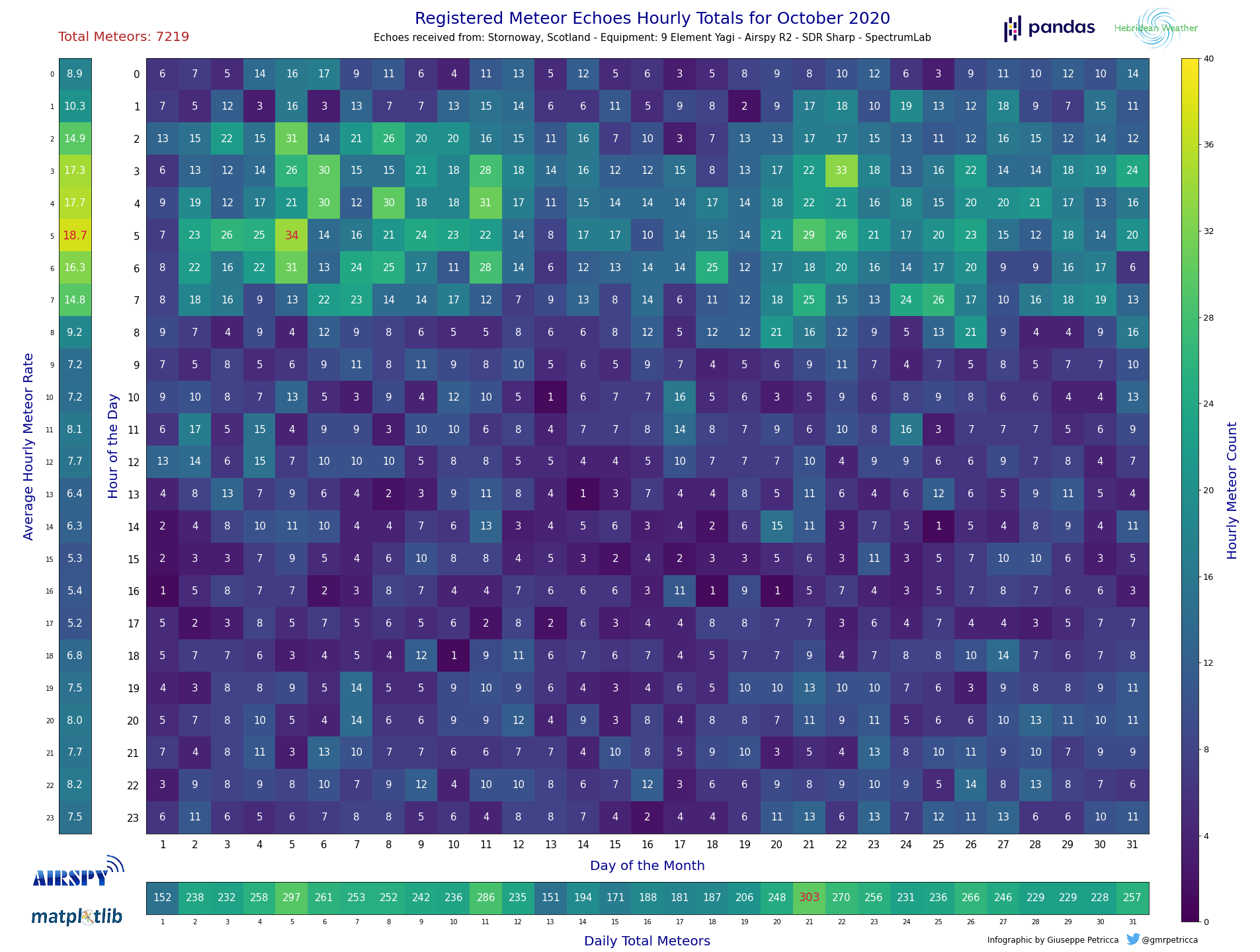
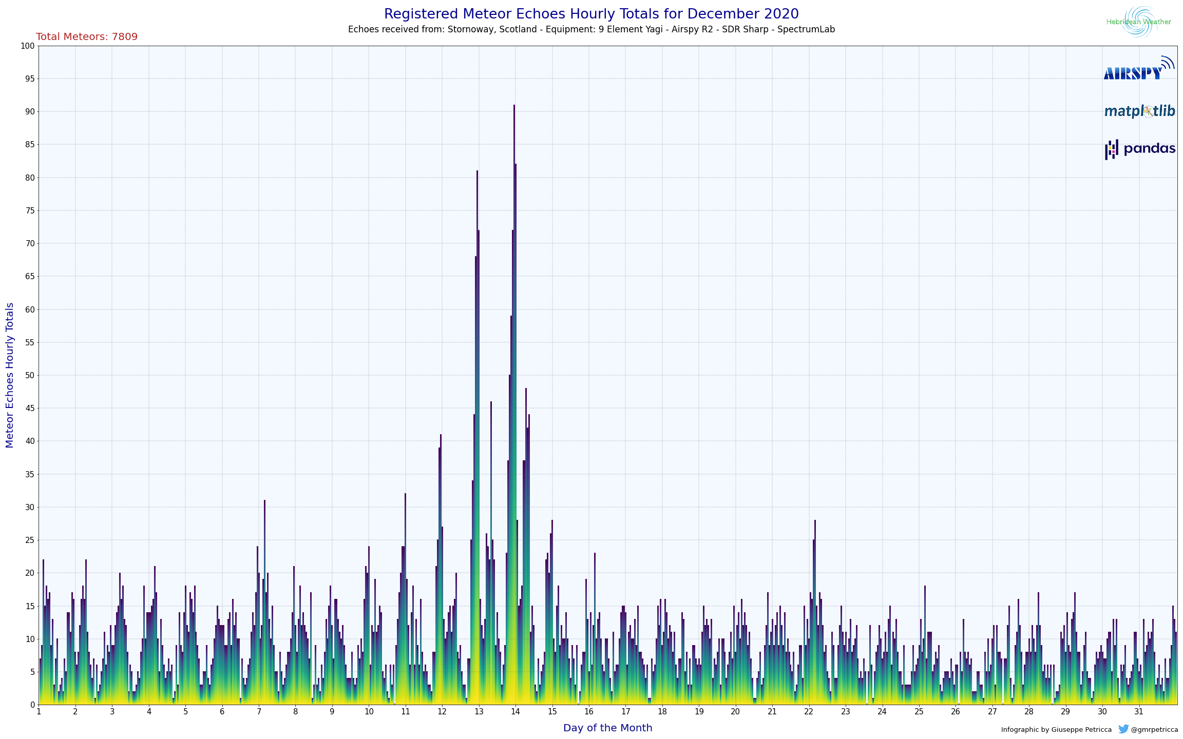
A straightforward script to read already compiled Meteor Echoes hourly data from a .xlsx file and then automatically create and save two comprehensive charts (grid and bars) based on the user selected month.
Required software and packages:
- Python 3
- Jupyter
- Matplotlib
- Numpy
- Pandas
- Pillow
- datetime
Installation via Anaconda:
# install the environment with the correct software:
conda create -n meteorechoes python=3 jupyter jupyterlab matplotlib numpy pandas pillow
# activate the environment
conda activate meteorechoes
# navigate to the folder where you have the Python code via command prompt
cd -local address of the Python folder-
# start Jupyter Lab
jupyter lab
Once this is done, it is possible to open the .ipynb file in the repository. Microsoft Excel is required to open the .xlsx file, please keep the two in the same folder.
Regarding the .xlsx file, please substitute the XXXX part of the name with the current year (or the year of your choice).
The process and file are commented throughout the various steps, however, this is a brief guide on how to use them:
- Open the
.xlsxfile and add the Meteor Echoes Hourly data in each cell. The columns are the days of the month, and the rows are the time of the day. Time is always UTC. - If there is a
hourly count = 0, then you can leave it, it will not create problems. However, leave any cells that have still to be filled (i.e. because they are future hours/days) empty, so that the script will color them differently. - Once done, save the
.xlsxfile and open theMeteors.ipynbfile. - On
lines 17-18it is possible to add some details of the rx station, which will be written in the title and subtitle of the two plots - On
line 24change the local address of the.xlsxfile to match the name and the location in which it is on your computer. (if they are in the same folder, then only the name will have to be changed) - Execute the script, and when prompted, insert a number for the desired month to be displayed.
- At the end of the process two images will be created in the same folder of the
.xlsxand the.ipynbfile.
Done!
Extra: if you have one, you can add your personal logo high on the right (in place of the Hebridean Weather one) by putting it in the img folder and modifying its address on lines 237-238 and lines 327-328 of the the .ipynb file.
Extra 2: If, for the bar charts, the maximum value is too low, it is possible to modify it on line 21 of the the .ipynb file.
Note: the script will not print empty months. There has to be at least a single value for the program to use.
-- Troubleshooting:
If required, the datetime package can be installed from within the environment with pip install DateTime.


