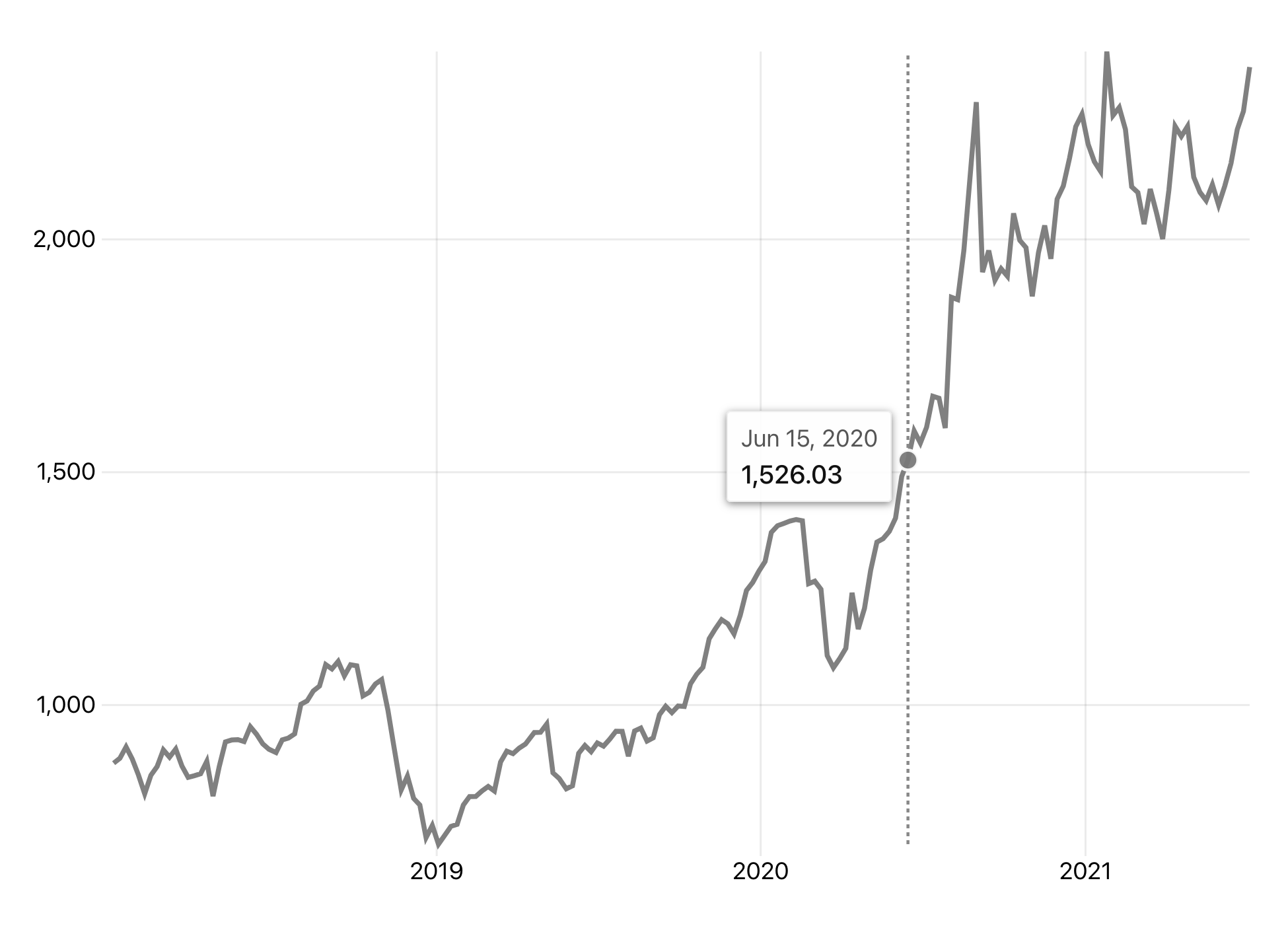
Graphique allows you to concisely create flexible and reusable interactive visualizations by:
- mapping variables in data to visual components or aesthetics specified by scales (how to draw)
- composing or layering relatively simple graphical objects or geometries (what to draw)
- using reasonable defaults that can be configured for flexibility
Examples and docs: https://graphique.dev
Install only the geometries you need.
npm install @graphique/graphique @graphique/geom-line @graphique/datasetsor
yarn add @graphique/graphique @graphique/geom-line @graphique/datasetsimport React from 'react'
import ReactDOM from 'react-dom'
import { GG } from '@graphique/graphique'
import { GeomLine } from '@graphique/geom-line'
import { stocks } from '@graphique/datasets'
// default basic line chart
const LineChart = () => {
return (
<GG
data={stocks.filter((d) => d.symbol === 'AAPL')}
aes={{
x: (d) => new Date(d.date),
y: (d) => d.marketCap,
}}
>
<GeomLine />
</GG>
)
}
ReactDOM.render(<LineChart />, document.getElementById('root'))To keep your Graphique visualization the width of its parent container, you only need to specify isContainerWidth and you'll get an appropriately-scaled and responsive version.
<GG
  data={stocks.filter((d) => d.symbol === 'AAPL')}
  aes={{
    x: (d) => new Date(d.date),
    y: (d) => d.marketCap,
  }}
  isContainerWidth
>
  <GeomLine />
</GG>Relative to existing data visualization tools and libraries for React applications, Graphique exists "above" low-level APIs and "below" high-level/out-of-the-box/"named chart" charting libraries.
As much as possible, the routine parts of visualizing data should be taken care of for you. This means (by default) you shouldn't need to manually create your own scales, axes, coordinate systems, tooltips, interactive legends, animated transitions, or responsive logic. But when it comes time, you can customize/override nearly everything to suit your specific needs.
With sensible defaults, Graphique aims to be just opinionated enough to make the process of creating highly customizable visualizations as streamlined as possible. Graphique is directly inspired by ggplot2, and under the hood it's built on d3.
// empty / no geoms
// defaults provide:
// x/y scales, coordinate system,
// grid, axes, ticks, dimensions, theme
<GG
  data={stocks}
  aes={{
    x: (d) => new Date(d.date),
    y: (d) => d.marketCap,
  }}
/>How to draw. The specifications for how data characteristics relate to visual characteristics (functional mappings/transformations applied to data).
| Aesthetic (Scale) | Specifies | Notes |
|---|---|---|
x (ScaleX) |
x positions of geometry objects, axis creation | |
y (ScaleY) |
y positions of geometry objects, axis creation | |
fill (ScaleFill) |
fill color of geometry objects, groups if categorical | |
stroke (ScaleStroke) |
stroke color of geometry objects, groups if categorical | |
strokeDasharray (ScaleDashArray) |
dash pattern of geometry objects, groups | categorical only |
size (ScaleSize) |
size of geometry objects | continuous only, GeomPoint only |
group (n/a) |
explicit groups for geometry objects | |
label (n/a) |
main label for geometry object tooltips | |
key (n/a) |
uniqueness/identity of geometry objects |
You can add one or more Scales directly to customize things like its type (d3 scale), domain, values, formatting, etc.
// a log-transformed y scale with
// custom domain and formatted as USD
<GG
  data={data}
  aes={{
    x: (d) => d.xVal,
    y: (d) => d.yVal,
  }}
>
  <ScaleY
    type={d3.scaleLog}
    domain={[0, 100000]}
    format={({ value }) => `$${value.toLocaleString()}`}
  />
</GG>What to draw. The shapes that give a visualization something to visualize.
GeomLine: line charts and other kinds of linesGeomPoint: scatterplots, dotplots, and bubble chartsGeomTile: rectangular charts like heatmapsGeomBar: bar charts (horizontal bars)GeomCol: column charts (vertical bars)GeomHist: histogramsGeomArea: area + stacked area charts and ribbon-like thingsGeomVLine: vertical lines / markersGeomHLine: horizontal lines / markers- TODO:
GeomLabel,GeomSmooth,GeomSegment,GeomDensity, and more on the way!
Give the main parts flexible, human-readable labels.
headerxy
Each Geom includes a <Legend> that can be added to your Graphique visualization. Continuous aes<->data return values get continuous legends. Categorical aes<->data return values get categorical legends.
Tooltips are provided for each Geom for free. They're configurable and you can roll your own based on the relevant contextual information (x value, y value, etc) with <Tooltip>. If you'd prefer the Geom to not use a tooltip, you can turn it off by passing showTooltip={false} to the Geom.
Customize the look and feel of your Graphique visualizations.
// a custom theme
<Theme
  grid={{ stroke: 'none' }}
  axis={{ tickStroke: '#ddd' }}
  axisX={{ showAxisLine: true }}
  font={{ family: 'Inter, system-ui, sans-serif' }}
/>- more
Geoms - linked graphics inside
<GGgroup>
npm testFor example, you can also choose to run only some tests with things like:
# run only GeomLine tests
npm test GeomLine

# run only Tooltip tests (multiple Geoms)
npm test TooltipFor a development sandbox / place to try out new package changes locally, there's an included Vitale notebook in ./notebooks/demo.vnb that's designed to work in Visual Studio Code.
Use the existing notebook as a reference, and/or create your own with a new file in ./notebooks ending in a .vnb extension.
To install Vitale in VS Code, you can follow these instructions.
Use npm run release to publish and release new version(s) of package(s).

