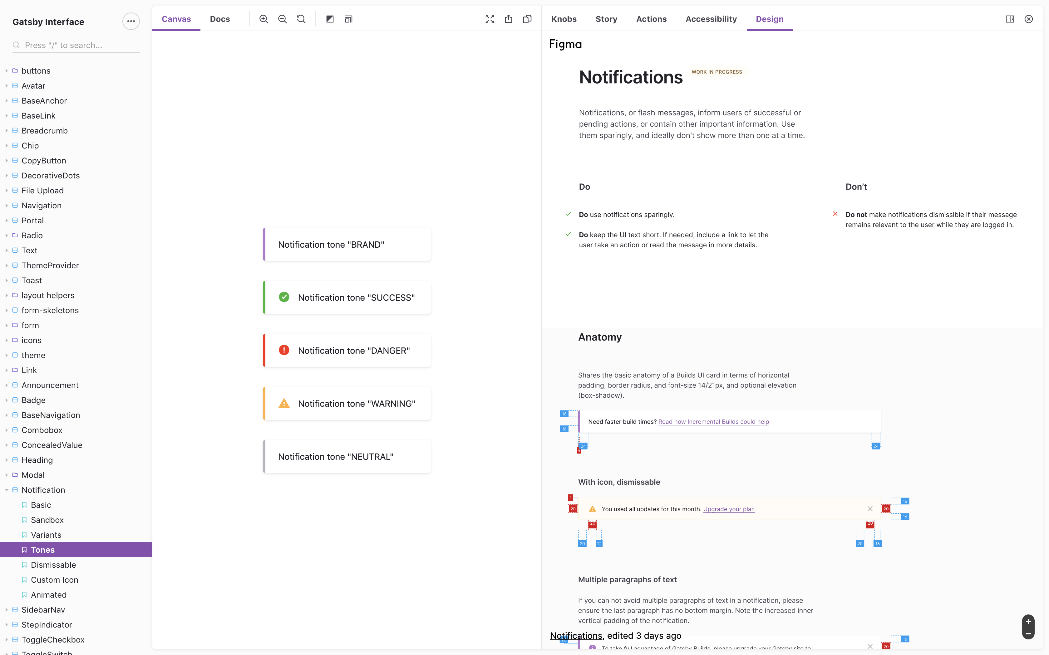


Storybook available at gatsby-interface.netlify.com:
Using npm:
npm install gatsby-interface --saveUsing Yarn:
yarn add gatsby-interfaceCertain Gatsby Interface components require the Futura PT webfont. These files are git-ignored to prevent the unauthorized release of licensed assets, and are not included in this repository.
Gatsby Inc. employees can download these fonts from our Google Drive. Put all those folders in src/assets/futura-pt and you should be good to go!
- Clone the repository:
git clone https://github.com/gatsby-inc/gatsby-interface.git. - Install dependencies:
yarn. - Run Storybook:
yarn storybook.
If you want to add a new component to gatsby-interface, run yarn scaffold:component to create stubs:
yarn scaffold:component MyNewComponentThis script will do the following:
- Create a
MyNewComponentdirectory for the component at./src/components - Generate a file for the component itself,
MyNewComponent.tsx, with stubs for props type, styles and even some variants - Generate a story file,
MyNewComponent.stories.tsx, which follows the suggestions from Component Checklist proposal. - Generate an index file,
index.ts, which reexports everything from the component file - Add export statements to library index files:
./src/index.tsand./index-ts-only.ts.
Everything that is generated should be working out of the box and be ready to shipped (though please avoid shipping the stubs 😅)
These are some patterns and best practices we use when contributing to gatsby-interface:
- Use React hooks and functional components: https://reactjs.org/docs/hooks-intro.html.
- Use CSS props for styling: https://emotion.sh/docs/css-prop.
- Use
gatsby-design-tokensfor styling constants: https://www.gatsbyjs.org/guidelines/design-tokens/. - Use compound components to make components more composable and flexible: https://kentcdodds.com/blog/compound-components-with-react-hooks.
- Make all PRs against the
devbranch. - Use
TONEandVARIANTprop (when appropriate) to definie color style and variant of a component — see e. g.<Button>. - Make the component as generic as possible so it can be used anywhere by anything.
- Components in the
skeletonsfolder provide only the functionality, but no styles, and can be used within other components. - Write Storybook stories for any component created: https://storybook.js.org/docs/basics/writing-stories/.
- Typscript coming soon!
- Unit tests coming soon!
To run the visual testing tool, run CHROMATIC_APP_CODE=<insert_app_code> yarn chromatic
You can find the app code in the Chromatic dashboard - https://www.chromaticqa.com
