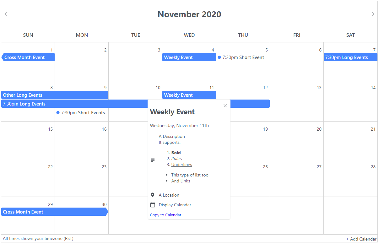
A react component that displays an event calendar using data from google's calendar api. It is intended to replace the embedded google calendar.
It handles reccuring events, deleted events, and changed events. It also handles and displays events of all lengths in a very similar way to google calendar and supports multiple calendars. All events are displayed in the user's timezone.
See it in action here or try it yourself in CodeSandbox here.
Design inspired by this calendar and Google Calendar. Icons from Material Design.
1. npm install react react-dom @emotion/react
2. npm install @ericz1803/react-google-calendar
First, get an api key from here by following step 1.
Alternately, you can go to https://console.developers.google.com/flows/enableapi?apiid=calendar.
Then, get the calendar id from the google calendar. It will look something like 09opmkrjova8h5k5k46fedmo88@group.calendar.google.com.
You can find it by going to a calendar's settings and scrolling down to the section that is labelled Integrate calendar.
import React from "react";
import Calendar from "@ericz1803/react-google-calendar";

const API_KEY = "YOUR_API_KEY";
let calendars = [
  { calendarId: "YOUR_CALENDAR_ID" },
  {
    calendarId: "YOUR_CALENDAR_ID_2",
    color: "#B241D1", //optional, specify color of calendar 2 events
  },
];

class Example extends React.Component {
  render() {
    return (
      <div>
        <Calendar apiKey={API_KEY} calendars={calendars} />
      </div>
    );
  }
}| Parameter | Type | Description |
|---|---|---|
apiKey |
string | google api key (required) |
calendars |
array of objects | google calendar id and display color (required) |
styles |
object | styles (optional, see more below) |
showArrow |
boolean | shows arrow for events that span multiple months (optional, defaults to true) |
showFooter |
boolean | whether or not to show footer (optional, defaults to true) |
language |
string | Available options : EN, ES, PT, FR, SL, DE, PL, IS default: EN |
You can customize the color of each calendar's events by specifying a color field with the calendar id (see examples).
To customize other aspects of the calendar (eg. borders, colors of the calendar), pass in a styles object. Each of the styles in the styles object should be an object style (the same as react inline styles) or an emotion css string style (see more here). If you choose to use emotion's css string styles, make sure to import { css } from "@emotion/react".
calendardaytodaytooltipeventeventTexteventCirclemultiEvent
import React from "react";
import Calendar from "@ericz1803/react-google-calendar";
import { css } from "@emotion/react";

const API_KEY = "YOUR_API_KEY";
let calendars = [
  {
    calendarId: "09opmkrjova8h5k5k46fedmo88@group.calendar.google.com",
    color: "#B241D1",
  }, //add a color field to specify the color of a calendar
  { calendarId: "hkr1dj9k6v6pa79gvpv03eapeg@group.calendar.google.com" }, //without a specified color, it defaults to blue (#4786ff)
  {
    calendarId: "rg4m0k607609r2jmdr97sjvjus@group.calendar.google.com",
    color: "rgb(63, 191, 63)",
  }, //accepts hex and rgb strings (doesn't work with color names)
];

let styles = {
  //you can use object styles (no import required)
  calendar: {
    borderWidth: "3px", //make outer edge of calendar thicker
  },

  //you can also use emotion's string styles
  today: css`
    /* highlight today by making the text red and giving it a red border */
    color: red;
    border: 1px solid red;
  `,
};

const language = "ES";

class Example extends React.Component {
  render() {
    return (
      <div>
        <Calendar
          apiKey={API_KEY}
          calendars={calendars}
          styles={styles}
          language={language}
        />
      </div>
    );
  }
}git clonenpm installnpm run storybook// use storybook to test locallynpm run build// build the projectnpm run test// run tests
MIT License
