This package overrides plotting functions from the margins R package
in order to produce ggplot2 objects. This makes it much easier for
users to customize the look of their marginal effects and predicted
probabilities plots.
To install this package, execute the following commands:
library(remotes)
install_github('vincentarelbundock/marginsplot')
To use the package, you need to load marginsplot after margins,
to ensure that the new plotting functions take precedence. For example:
library(margins)
library(marginsplot)
## Loading required package: ggplot2
## Registered S3 method overwritten by 'marginsplot':
## method from
## plot.margins margins
##
## Attaching package: 'marginsplot'
## The following object is masked from 'package:margins':
##
## cplot
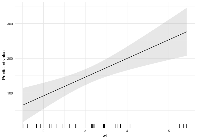
mod <- lm(hp ~ wt*drat, data = mtcars)
cplot(mod, dx = 'drat', x = 'wt')
Alternatively, you could explicitly prioritize marginsplot using the
conflicted package:
library(conflicted)
conflict_prefer('cplot', 'marginsplot')
## [conflicted] Will prefer marginsplot::cplot over any other package
conflict_prefer('plot', 'marginsplot')## [conflicted] Will prefer marginsplot::plot over any other package
The next section is a modified version of the margins README, which
shows how to customize the output of marginsplot.
The package implements several useful additional features for summarizing model objects, including:
- A
plot()method for the new “margins” class that ports Stata’smarginsplotcommand. - A plotting function
cplot()to provide the commonly needed visual summaries of predictions or average marginal effects conditional on a covariate. - A
persp()method for “lm”, “glm”, and “loess” objects to provide three-dimensional representations of response surfaces or marginal effects over two covariates. - An
image()method for the same that produces flat, two-dimensional heatmap-style representations ofpersp()-type plots.
plot() and cplot() return ggplot2 objects, which can be further
customized using themes and other ggplot2 options.
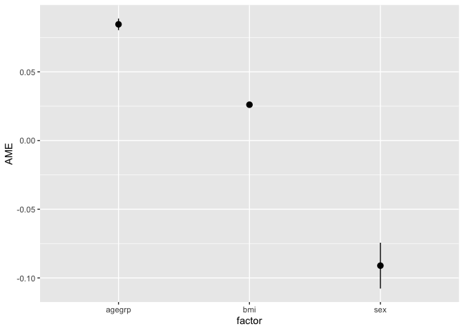
Using the plot() method yields an aesthetically similar result to
Stata’s marginsplot:
library("webuse")
webuse::webuse("nhanes2")
mod3 <- glm(highbp ~ sex * agegrp * bmi, data = nhanes2, family = binomial)
summary(marg3 <- margins(mod3))
## factor AME SE z p lower upper
## agegrp 0.0846 0.0021 39.4392 0.0000 0.0804 0.0888
## bmi 0.0261 0.0009 28.4995 0.0000 0.0243 0.0279
## sex -0.0911 0.0085 -10.7064 0.0000 -0.1077 -0.0744
plot(marg3)In addition to the estimation procedures and plot() generic,
margins offers several plotting methods for model objects. First,
there is a new generic cplot() that displays predictions or marginal
effects (from an “lm” or “glm” model) of a variable conditional across
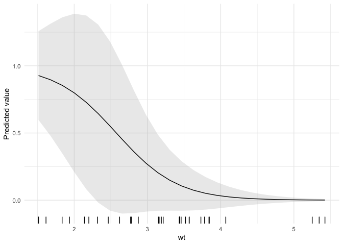
values of third variable (or itself). For example, here is a graph of
predicted probabilities from a logit model:
mod4 <- glm(am ~ wt*drat, data = mtcars, family = binomial)
cplot(mod4, x = "wt", dx = 'drat')
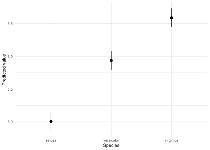
And fitted values with a factor independent variable:
cplot(lm(Sepal.Length ~ Species, data = iris))and a graph of the effect of drat across levels of wt:
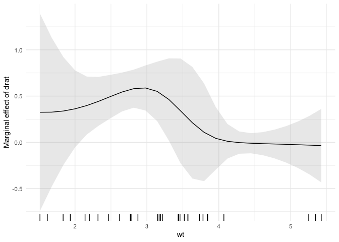
cplot(mod4, x = "wt", dx = "drat", what = "effect")Since cplot() and plot() return ggplot2 objects, the look is very
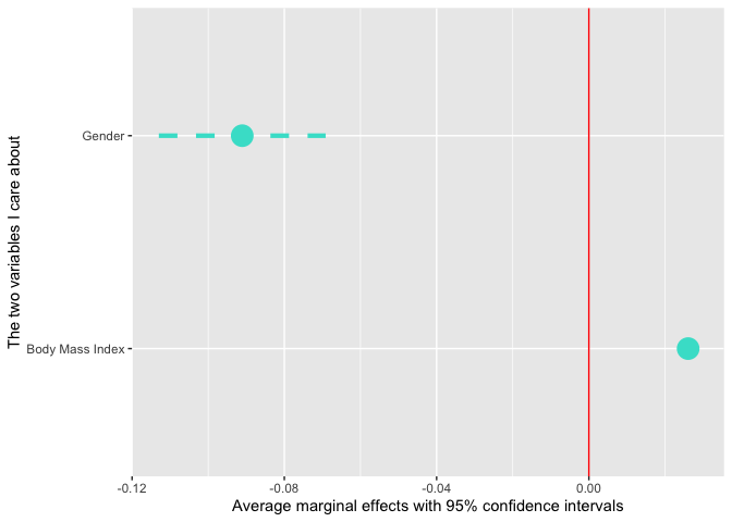
easy to customize. For example, we could flip the marginal effects plot
on its side, change the colors and line type, rename the variables, and
add a red line at 0:
library(ggplot2)
mod3 <- glm(highbp ~ sex * agegrp * bmi, data = nhanes2, family = binomial)
marg3 <- margins(mod3)
plot(marg3,
     level = .99,
     colour = 'turquoise', size = 1.5, linetype = 'dashed',
     term_map = c('Body Mass Index' = 'bmi','Gender' = 'sex')) +
  geom_hline(yintercept = 0, colour = 'red') +
  xlab('The two variables I care about') +
  ylab('Average marginal effects with 95% confidence intervals') +
  coord_flip()
Notice that the agegrp does not appear in the plot above because it
was omitted from the term_map argument. This gives you a convenient
way to omit terms from the plot.
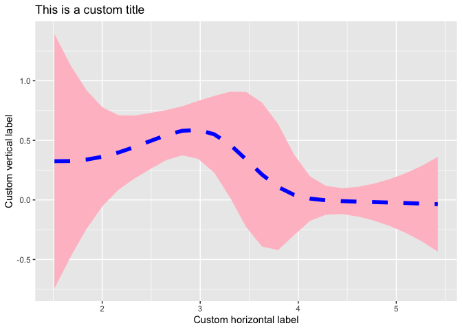
We can apply the same kinds of changes to graphs produced by cplot():
library(ggplot2)
cplot(mod4, x = "wt", dx = 'drat', what='effect', size=2, colour='blue',
      fill = 'pink', alpha=1, linetype='dashed', rugplot=FALSE) +
    theme_grey() +
    xlab('Custom horizontal label') +
    ylab('Custom vertical label') +
    ggtitle('This is a custom title')
You can even use one of many user-created themes that are floating
around the web. For instance, here is a plot drawn with the
ggpomological theme and
the Homemade Apple
font:
library(ggpomological)
cplot(mod4, x = "wt", dx = 'drat', what='effect', alpha=.5, fill='#efe1c6', colour='#6f5438') +
    theme_pomological_fancy()
If you would like even more control over your plots, cplot() can also
return a data frame of quantities of interest:
dat <- cplot(mod4, x = "wt", dx = "drat", what = "effect", draw = FALSE)
head(dat)
## xvals yvals upper lower factor
## 1.5130 0.3250 1.3927 -0.7426 drat
## 1.6760 0.3262 1.1318 -0.4795 drat
## 1.8389 0.3384 0.9214 -0.2447 drat
## 2.0019 0.3623 0.7777 -0.0531 drat
## 2.1648 0.3978 0.7110 0.0846 drat
## 2.3278 0.4432 0.7074 0.1789 drat
