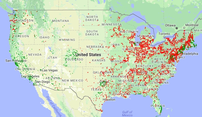
In this project, a model was built using demographic data including median age, home value, income, as well as the percent of homes lived in by owner and environmental data referencing amount of solar radiation for each zip code in the model. Demographic data was scraped from census.gov, solar average direct normal irradiance scraped from nrel.gov, and property price data was downloaded from Zillow. The intent of the project is to identify zip codes where the population had a higher rate of solar panels per capita than the rest of the country based on the previously mentioned inputs, using that data as a basis for generating a model for the type of market where the sale of solar panels would be easier than others.
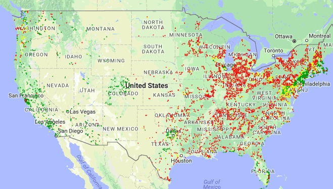
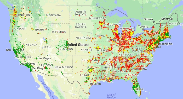
In this project, a (fully zoomable) 2 class version of the map and a 3 class version of the map were generated. Green and red in both maps identifying good and bad markets respectively. In the 3 class version, a medium market class was added to identify markets that straddle the line between the two classes.
Also generated is a 3 class version of the map, training data included in plotting. The training data was plotted along with the predicted data in this map because from a business perspective it still generates interesting information as a whole. This map is too complex to be rendered through the github html previewer. Feel free to download and explore locally but be aware it will be computationally expensive for your computer and it might hang when you zoom too close. For those of you with limited computational power a screenshot of the map zoomed out is available below.
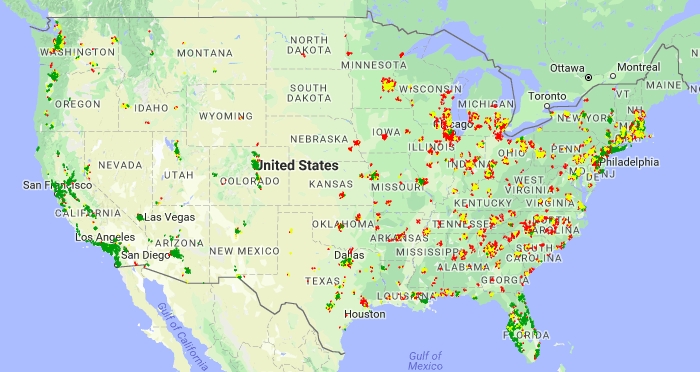
As a contrast here is a plot of just the training data Like the map with the training and predicted data together this map must be downloaded locally to view. Image prepared below for convenience.


