A Swift version available ModernLookOSXSampleSwift by thierryH91200
This project aims to provide a simple and customizable component set which can be used to create OSX applications with new style look.
A skeleton app showing ModernLook-OSX in action
IMPORTANT NOTICE
ModernLook-OSX requires OSX 10.10 to work properly. I have tested the components on OSX 10.9 with no success: generally the application runs well on 10.9, but some visual effect does not work. Probably some hacking can help, so if you can make it look better on 10.9 please let me know. However I think this new look does not fit well on older OSX UI.
ModernLook-OSX is the amalgamation of different ideas found all around the net (especially on stackoverflow.com ) discussing about how to achieve the look of application rewritten by Apple for Yosemite.
So there is nothing revolutionary, however I hope somebody could find it useful.
Most of the components are derived from NS* native components and add special UI code to fit into the general ModernLook. For example, there is the MLTextField component which is derived from NSTextField. The new component initializes the NSTextField with hardcoded values (font, colors, etc.) and overrides the original painting code to add a thin line beneath the component.
Here is the code of the MLTextField class.
- (void) commonInit {
	self.font = [NSFont fontWithName:@"Helvetica Neue Light" size:16.0];
	self.bordered = false;
	self.backgroundColor = [NSColor clearColor];
	self.focusRingType = NSFocusRingTypeNone;
}

- (void)drawRect:(NSRect)dirtyRect {
	[NSGraphicsContext saveGraphicsState];

	NSRect bounds = [self bounds];
	[[NSColor blackColor] set];

	NSBezierPath *bottomLine = [NSBezierPath bezierPath];
	NSPoint p = NSZeroPoint;//bounds.origin;
	p.y = bounds.size.height;
	[bottomLine moveToPoint:p];
	p.x += bounds.size.width;
	[bottomLine lineToPoint:p];
	[bottomLine stroke];

	[NSGraphicsContext restoreGraphicsState];
	[super drawRect:dirtyRect];
}
You can easily change it to meet your needs, for example draw the line with foreground color, instead of hardcoded black (I plan to add this to the component soon - implemented).
ModernLook-OSX contains several components to let you create exciting applications, however not all the OSX UI covered yet. I plan to add more component to the package, so stay tuned!
This component can be used to create a window for your application.
This component is used for MLMainWindow's contentView. It draws as a colored, rounded rectangle. You can specify it's color by overriding the backgroundColor property.
This component can be used for MLMainWindow's toolbar. This component has nothing common with standard NSToolbar, it is a simple NSView which just draws the window buttons. The content of the toolbar can be designed in IB. The background color can be specified with backgroundColor property, which is transparent by default.
You must use this component as your window content base class. The background color can be specified with backgroundColor property, which is transparent by default.
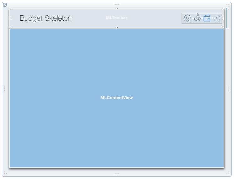
You can design your window in IB and it is up to you how to layout stuffs. Generally you should add a toolbar and content view to the window, specifying their Custom Class properties accordingly.
Window Setup in IB
Above you can see, that the toolbar portion of the window is a custom class of MLToolbar and the content view area is covered by an MLContentView.
You can add any other component to these views, however most of the native NS* components will look a bit strange. I have added a few components to the ModernLook-OSX and I am working on to more.
Very simple subclass of NSTextField. It just sets the default font, make the component transparent and draws a thin line beneath the component.
It is a component similar to NSComboBox, where you can specify the content of the dropdown. It involves the following steps:
- add an NSTextField to your content in IB and set its custom class to MLComboField
- create a dropdown content provider object derived from MLComboFieldDelegate and override
- (MLPopupContent*) createPopupContent; - create a view controller which is derived from MLPopupContent and override
- (void) moveSelectionUp:(BOOL)up;and- (NSString*) moveSelectionTo:(NSString*)str; - add your dropdown content provider to IB and set it as delegate of the MLComboField.
This component is derived from NSOutlineView and replaces the outline view header control to add custom drawing to it.
NEW as of 03.03.2015
- saveTreeSate
- restoreTreeState
these calls are save/restore the state of an MLOutlineView. The state information contains the expanded and selected items and the scroll position. They work not just with static content: for example you have a tree which is loaded from a DB, let's say date based, then autosave will not work. The only expectation that the outline structure should be the same, because save/restore is row based.
NEW as of 03.04.2015
- selectionColor
if this property is set, then it will be used as the selection background color.
This component is derived from NSTableView and replaces the outline view header control to add custom drawing to it.
NEW as of 03.04.2015
- selectionColor
if this property is set, then it will be used as the selection background color.
It is really not a component, just a manager to mimic Segmented Control and needs further improvements. Anyways, it works as follows: add an object with custom class as MLRadioGroupManager and an NSView to IB and place some NSButton into it. Configure the buttons style to square and type to switch. Assign the buttons' sent action to the MLRadioGroupManager. Also assign the buttons parent view to the MLRadioGroupManager as groupView. With this setup the MLRadioGroupManager will act like a radio button group, so only one button can be selected at a time. Yes, I know it is a bit confusing, but you should take a look at the sample application's toolbar.
It is an alert window provider. At the moment it provides just a Yes/No/Cancel possibility. You can use this component like this:
MLAlertResponse res = [MLAlert showQuestion:@"Create new Something?" title:@"Unknown Something" withCancel:NO];
switch(res) {
	case MLALERT_YES:break;
	case MLALERT_NO:break;
	case MLALERT_CANCEL:break;
}Calendar component for OSX inspired by some free iOS calendar
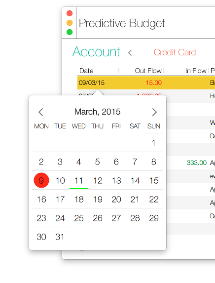
MLCalendarView in NSPopover
MLCalendarView is a date selector component which is represented as a month calendar.
The component uses the system Language & Region settings, so it will display the month and day names regarding to the system settings. Also it lays out the days according to the first day of week system setting.
MLCalendarView is derived from NSViewController and can be used as any other view.
The component contains the following properties to change the default colors used by the calendar.
@property (nonatomic, copy) NSColor* backgroundColor;
@property (nonatomic, copy) NSColor* textColor;
@property (nonatomic, copy) NSColor* selectionColor;
@property (nonatomic, copy) NSColor* todayMarkerColor;
@property (nonatomic, copy) NSColor* dayMarkerColor;
And the following two properties to set the selected date and the currently displayed month.
@property (nonatomic, strong) NSDate* date;
@property (nonatomic, strong) NSDate* selectedDate;
Also, there is a delegate for the calendar, which is used to send a message when the selected date changed.
@protocol MLCalendarViewDelegate <NSObject>
- (void) didSelectDate:(NSDate*)selectedDate;
@endIt is derived from NSButton and draws itself as a filled circle with an image or text. The visuals can be specified by the following properties.
@property (nonatomic, copy) NSColor* backgroundColor;
@property (nonatomic, copy) NSColor* hooverBackgroundColor;
@property (nonatomic, copy) NSColor* foregroundColor;
@property (nonatomic, copy) NSColor* hooveredForegroundColor;It looks and behaves similar to a hyperlink in a web browser. When the mouse hover over it will change the text color and underline the text. There is a
@property (nonatomic, copy) NSColor* hoveredTextColor;property to specify the text color when hovered.
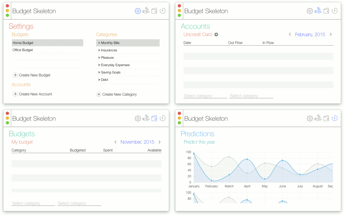
The provided sample application is an imagined Budget app. It has 4 separate area:
- Settings panel
- Accounts panel
- Budget panel
- Prediction panel
The application has a toolbar, where the user can switch between the application panels, by using MLRadioGroupManager. All the panels are derived from MLContentView and they use MLOutlienView, MLTableView, MLComboField and MLTextField.
NEW as of 03.10.2015
Added a calendar button to the toolbar to demonstrate MLCalendarView in action.
NEW as of 03.18.2015
Added an MLHoverButton to the toolbar to demonstrate its look.
NEW as of 03.19.2015
Change the toolbar title to be a hyperlink. When clicked it will log out a message to the console.
- the window buttons on the toolbar behave strange. There are no images in them and they don't highlighted when the window is not selected, they just remain grayed out when the mouse hovered over.
MLComboField dropdown remains on screen sometimes (switch to another windows, for example)- fixed.- MLTextField text selection covers the bottom thin line.
MIT


