React/NextJS Image slider
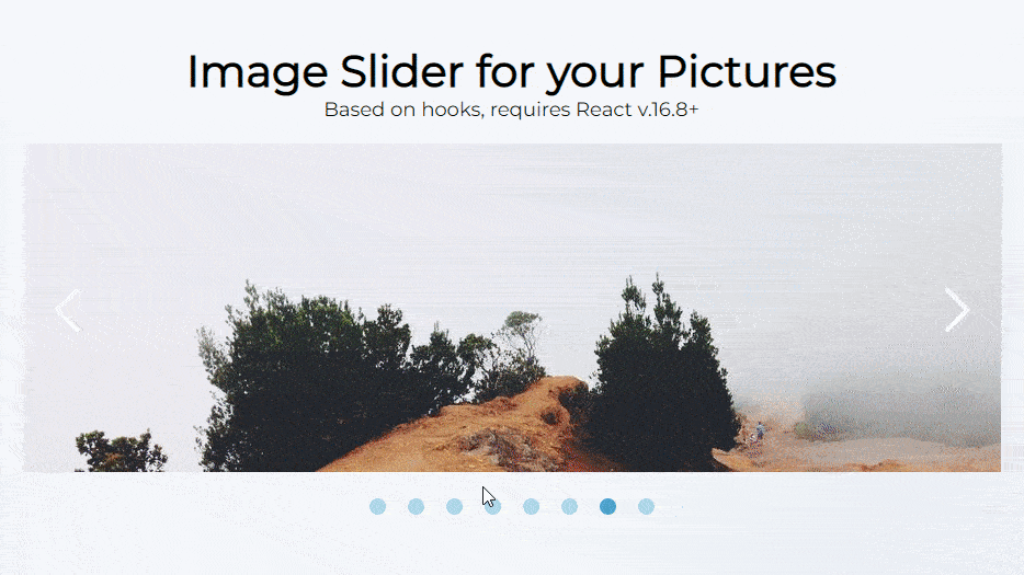
Demo: https://image-slider-madza.vercel.app
Installation
npm install @madzadev/image-sliderIf you are using NPM v7 or above, you need to add --legacy-peer-deps at the end of the command above.
Usage
import Slider from "@madzadev/image-slider";
import "@madzadev/image-slider/dist/index.css";
const images = [
{ url: "https://picsum.photos/seed/a/1600/900" },
{ url: "https://picsum.photos/seed/b/1920/1080" },
{ url: "https://picsum.photos/seed/c/1366/768" },
];<Slider imageList={images} width={1000} height={300} />imageList is the mandatory prop and requires to pass in
an array consisting of objects with url keys.
width and height are mandatory props that
set the dimension of the images shown.
Config for NextJS
If you are working on NextJS, there are 3 additional steps:
npm i next-images next-transpile-modules- create
next.config.jsin your project's root - paste this in the newly created config file:
const withImages = require("next-images");
const withTM = require("next-transpile-modules")(["@madzadev/image-slider"]);

module.exports = withImages(withTM());
Behavior
The default values of available options props are displayed.
<Slider
  loop={true}
  autoPlay={true}
  autoPlayInterval={3000} // in milliseconds
/>
Controls
The default values of available props are displayed.
<Slider showArrowControls={true} showDotControls={true} />Styling
If set, background color is displayed to fill the background if images are smaller than the slider wrapper.
<Slider bgColor="none" />Final notes
The project is under MIT licence, so be free to check it out and give contributions.