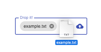
This library provides a reusable dropzone component infrastructure and Material Design implementation. Like the Angular Material repo, it uses a monorepo setup for maximum extensibility.
| Package | Description |
|---|---|
@ngx-dropzone/cdk |
Common dropzone interaction patterns. |
@ngx-dropzone/material |
Material Design implementation based on the CDK. |
While the CDK itself is basically headless, the Material implementation relies on the Angular Material components to provide a consistent style integration. See the DEMO for an example.
You may only want to install the dropzone CDK to apply your own styling.
npm install @ngx-dropzone/cdkFor the Material Design implementation, install both packages.
npm install @ngx-dropzone/cdk @ngx-dropzone/materialFor the versioning, we stay consistent with the major Angular releases.
So Angular (components) 19 will be compatible with @ngx-dropzone/cdk@19.x.x.
Please note, that v16 is the first officially supported version. For older Angular releases, use the libs at your own risk.
This describes how to use the Material dropzone. If you want to extend the CDK with your own styling, see below.
// in app.component.ts
import { MatFormField, MatLabel } from '@angular/material/form-field';
import { MatIcon } from '@angular/material/icon';
import { FileInputDirective } from '@ngx-dropzone/cdk';
import { MatDropzone } from '@ngx-dropzone/material';

@Component({
  ...
  imports: [
    MatFormField,
    MatLabel,
    MatIcon,
    MatDropzone,
    FileInputDirective,
  ],
  ...
})
Now you can use it in your markup.
<mat-form-field appearance="fill">
  <mat-label>Drop anything!</mat-label>
  <ngx-mat-dropzone>
    <input type="file" fileInput />
  </ngx-mat-dropzone>
  <mat-icon matSuffix color="primary">cloud_upload</mat-icon>
</mat-form-field>
Use the webkitdirectories attribute to support uploading folders.
All files from subdirectories will be provided as a flat File[], but with an additional relativePath property to keep tree structures.
The fileInput directive on the <input type="file" /> element makes it a valid target
for [(ngModel)] and [formControl] directives, so you can seamlessly integrate the
file upload into your form.
First, make sure to import the ReactiveFormsModule.
Then, you're able to define your form control element (incl. validation).
// in app.component.ts
import { ReactiveFormsModule } from '@angular/forms';

@Component({
  selector: "form-control-dropzone",
  imports: [
    ReactiveFormsModule,
    MatError,
    ...
  ],
  template: `
    <mat-form-field>
      <ngx-mat-dropzone>
        <input type="file" fileInput [formControl]="profileImg" />
      </ngx-mat-dropzone>
      <mat-error>Invalid file type</mat-error>
    </mat-form-field>
  `,
})
class DropzoneWithFormControl {
  validators = [FileInputValidators.accept("image/*")];
  profileImg = new FormControl<FileInputValue>(null, this.validators);
}
In the example above, you may have noticed two new classes, the FileInputValidators and FileInputValue.
The FileInputValue is just a type alias for File | File[] | null being the possible
values for the form control. Please note that a File[] is only valid, if the multiple
attribute is set on the <input type="file" /> element.
The FileInputValidators provides custom validator functions for files.
| Validator | Description |
|---|---|
FileInputValidators.accept |
Defines accepted file types. |
FileInputValidators.minSize |
Sets the required minimum file size in bytes. |
FileInputValidators.maxSize |
Sets the maximum allowed file size in bytes. |
In case you want to give a consistent user feedback about the selected files, we recommend to use the Material Chips.
<mat-form-field appearance="fill">
  <mat-label>Drop anything!</mat-label>
  <ngx-mat-dropzone>
    <input type="file" fileInput [formControl]="fileCtrl" />
    @if (fileCtrl.value) {
    <mat-chip-row (removed)="clear()">
      {{ fileCtrl.value.name }}
      <button matChipRemove>
        <mat-icon>cancel</mat-icon>
      </button>
    </mat-chip-row>
    }
  </ngx-mat-dropzone>
  <mat-icon matSuffix color="primary">cloud_upload</mat-icon>
</mat-form-field>
export class AppComponent {
fileCtrl = new FormControl();
clear() {
this.fileCtrl.setValue(null);
}
}Now that we have seen the minimal setup, here are some configuration options for the component markup.
| Property | Description | Options |
|---|---|---|
accept |
Defines the accepted file types. | See here |
mode |
On select, either replace (default) or append the new files. Works only with multiple attribute. | replace or append |
multiple |
Allow multiple files to be selected. | Boolean |
disabled |
Disables any interaction. | Boolean |
| Property | Description |
|---|---|
required |
Sets the native required property. |
placeholder |
The placeholder text has no effect, use <mat-label /> instead. |
Run npm run start:[cdk|material] to build and watch for changes on the
library packages.
Run npm run start:app for an example app dev server to test changes locally. Navigate to http://localhost:4200/. The app will automatically reload if you change any of the source files.
Other available commands are npm run [build|test|lint]:[cdk|material].
This library provides a ready-to-use Material Design implementation for the dropzone. However, you might want to apply your own custom styling (or library).
In this case, you're able to build upon the dropzone CDK. See the Material dropzone as an example.
The basic setup requires you to extend the DropzoneComponent in your app to apply your own styling and functionality.
Use the following skeleton as a starting point. You may always have a look at the
Material reference implementation linked above.
import { Component } from "@angular/core";
import { AcceptService, DropzoneComponent, DropzoneService, FileInputDirective } from "@ngx-dropzone/cdk";

@Component({
  selector: "my-dropzone",
  imports: [FileInputDirective, DropzoneComponent],
  providers: [DropzoneService, AcceptService],
  template: `
    <div class="my-dropzone">
      <ng-content select="[fileInput]"></ng-content>
    </div>
  `,
  styles: [
    `
      .my-dropzone {
        cursor: pointer;
        text-align: center;
        padding: 40px;
        background: platinum;
        border: 1px solid black;
      }

      .dragover > .my-dropzone {
        border-width: 2px;
      }
    `,
  ],
})
export class MyDropzone extends DropzoneComponent {}Please read our Code of Conduct to keep our community open and respectable. 💖
Want to report a bug, contribute some code, or improve the documentation? Excellent! Read up on our guidelines for contributing and then check out one of our issues labeled as help wanted or good first issue.
If you believe you have found a security vulnerability, we encourage you to responsibly disclose this and not open a public issue. Security issues in this open source project can be safely reported via hackingharold@mailbox.org.
This project is MIT-licensed.


