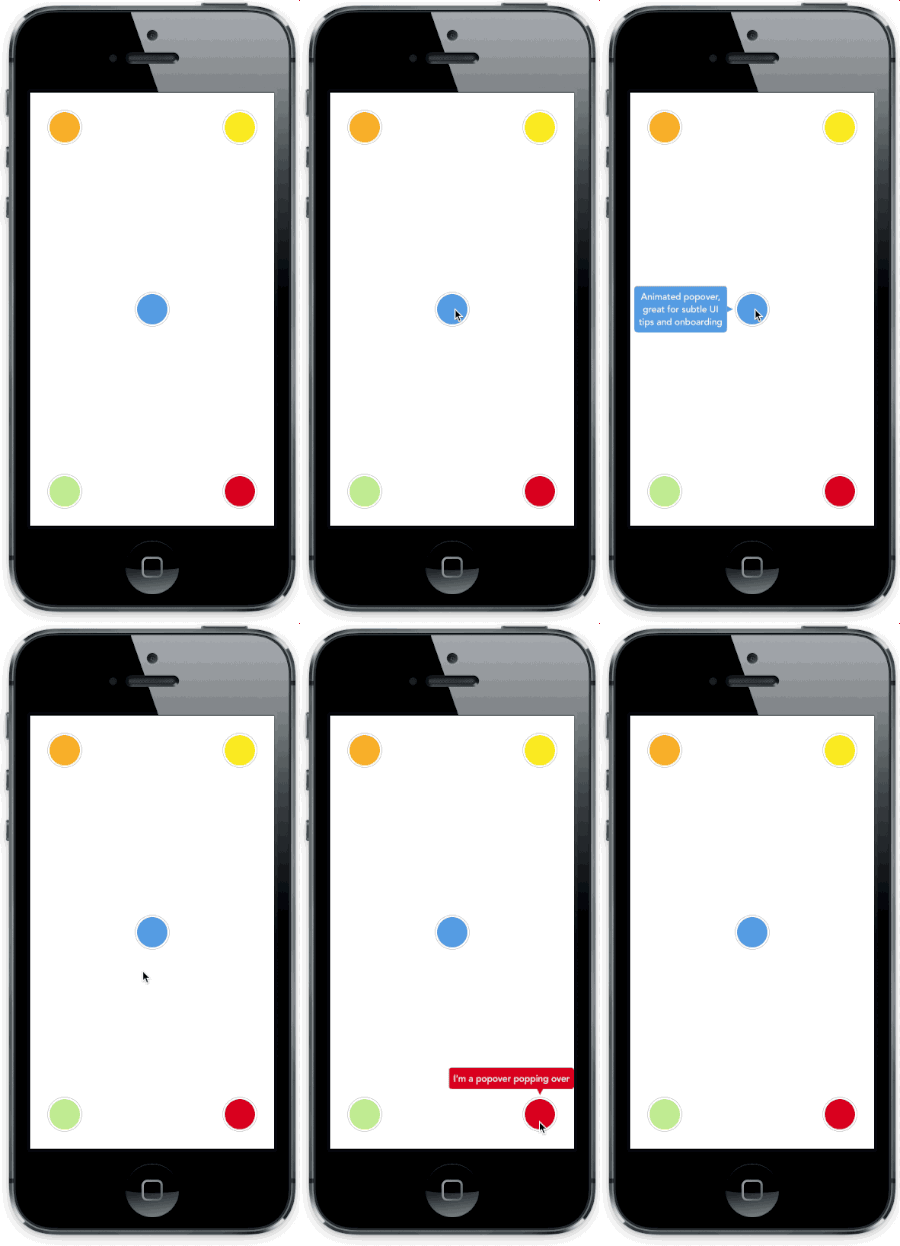
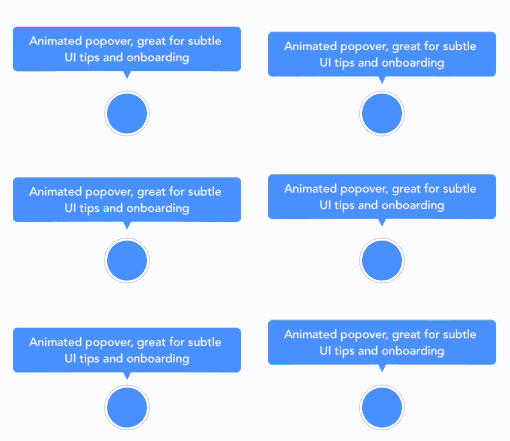
Animated popover that pops out of a frame. You can specify the direction of the popover and the arrow that points to its origin. Color, border radius and font can be easily customized. This popover can be used to leave subtle hints about your UI and provide fun looking onboarding popups.
Screenshot
Versioning notes
With version 2.0.0 the library was re-written in Swift, and the API was slightly updated. Checkout version 1.5.x for the previous Objective-C implementation.
Version 3.0.0 introduces Swift 4 support.
Setup with CocoaPods
- Add
pod 'AMPopTip'to yourPodfile - Run
pod install - Run
open App.xcworkspace
Setup with Carthage
- Add
github "andreamazz/AMPopTip" - Run
carthage update - Add
AMPopTip.frameworkin your project
Usage
The API is fairly straight forward, you can show and hide the popover at any time.
Showing the popover
You must specify the text that you want to display alongside the popover direction, its max width, the view that will contain it and the frame of the view that the popover's arrow will point to.
let popTip = PopTip()
popTip.show(text: "Hey! Listen!", direction: .up, maxWidth: 200, in: view, from: someView.frame)
You can also display the popover in the center, with no arrow, in this case the from can be the whole view:
popTip.show(text: "Hey! Listen!", direction: .none, maxWidth: 200, in: view, from: view.frame)Coordinate system
Please note that the frame you are intended to provide needs to refer to the absolute coordinate system of the view you are presenting the popover in. This means that if you are presenting the popover in a view, pointing to a nested subview, you'll need to convert its frame using UIKit's convertRect(_:toView:). Read the reference here.
Showing a custom view
You can provide a custom view that will be wrapped in the PopTip and presented.
let customView = UIView(frame: CGRect(x: 0, y: 0, width: 100, height: 100))
// Configure your view
popTip.show(customView: customView, direction: .down, in: view, from: someView.frame)
Dismissing the popover
You can hide the popover by calling:
popTip.hide()Or you can specify the duration of the popover:
popTip.show(text: "Hey! Listen!", direction: .up, maxWidth: 200, in: view, from: someView.frame, duration: 3)You can also let the user dismiss the popover by tapping on it:
popTip.shouldDismissOnTap = trueYou can add a block that will be fired when the user taps the PopTip...
popTip.tapHandler = { popTip in
  print("\(popTip) tapped")
}
... when the popover is shown...
popTip.appearHandler = { popTip in
  print("\(popTip) appeared")
};
... or when the popover is dismissed:
popTip.dismissHandler = { popTip in
  print("\(popTip) dismissed")
}

popTip.tapOutsideHandler = { _ in
  print("tap outside")
}

popTip.swipeOutsideHandler = { _ in
  print("swipe outside")
}
Updating the PopTip
You can update the text, attributed text, or custom view to a PopTip already visible:
popTip.update(text: "New string")
popTip.update(attributedText: someAttributedString)
popTip.update(customView: someView)
The position can also be changed by updating the from property:
let here = CGRect(x: 100, 100, 10, 10)
let there = CGRect(x: 400, 400, 10, 10)

popTip.show(text: "Hey! Listen!", direction: .up, maxWidth: 200, in: view, from: here)
DispatchQueue.main.asyncAfter(deadline: .now() + 2) {
  popTip.from = there
}
Custom entrance animation
You can choose which animation should be performed when the popTip is displayed:
popTip.entranceAnimation = .scale;Available animations:
PopTipEntranceAnimation.scale,
PopTipEntranceAnimation.transition,
PopTipEntranceAnimation.none,
PopTipEntranceAnimation.custom
PopTipEntranceAnimation.custom
You can provide your own animation block when using PopTipEntranceAnimation.custom:
popTip.entranceAnimationHandler = { [weak self] completion in
  guard let `self` = self else { return }
  self.popTip.transform = CGAffineTransform(rotationAngle: 0.3)
  UIView.animate(withDuration: 0.5, animations: {
    self.popTip.transform = .identity
  }, completion: { (_) in
    completion()
  })
}
This sample makes the PopTip rotate on entrance. Make sure to call the completion block when the animation is done. Also note that the animation is fired as soon as the PopTip is added as subview.
Action animations
Action animations are subtle animations that can be performed to get the user's attention. Set your preferred animation:
popTip.actionAnimation = .bounce()Available animations:
PopTipActionAnimation.bounce,
PopTipActionAnimation.float,
PopTipActionAnimation.pulse,
PopTipActionAnimation.none
The animation is fired as soon as the popover enters the scene and completes its entrance animation, if startActionAnimationOnShow is set to true.
Customize the animations
You can pass a custom value as an associated value to customize the action animation:
popTip.actionAnimation = .bounce(16) // This will bounce for 16px instead of the default valueCustomizing the arrow position
The arrow is centered by default, and moves to avoid the edge of the screen. You can manually change the offset from the center using the bubbleOffset property.
Customization
Use the appearance proxy to customize the popover before creating the instance, or just use its public properties:
textColor = <#UIColor#>;
textAlignment = <#NSTextAlignment#>
bubbleColor = <#UIColor#>
borderColor = <#UIColor#>
borderWidth = <#CGFloat#>
cornerRadius = <#CGFloat#> // Popover's border radius
rounded = <#Bool#> // If set to YES the radius will equal frame.height / 2
offset = <#CGFloat#> // Offset between the popover and the origin
font = <#UIFont#>
padding = <#CGFloat#>
edgeInsets = <#UIEdgeInsets#>
arrowSize = <#CGSize#>
animationIn = <#TimeInterval#>
animationOut = <#TimeInterval#>
delayIn = <#TimeInterval#>
delayOut = <#TimeInterval#>
entranceAnimation = <#PopTipEntranceAnimation#>
actionAnimation = <#PopTipActionAnimation#>
actionAnimationIn = <#TimeInterval#>
actionAnimationOut = <#TimeInterval#>
actionDelayIn = <#TimeInterval#>
actionDelayOut = <#TimeInterval#>
edgeMargin = <#CGFloat#>
bubbleOffset = <#CGFloat#> // Offset between the bubble and the arrow
Author
Andrea Mazzini. I'm available for freelance work, feel free to contact me.
Want to support the development of these free libraries? Buy me a coffee ☕️ via Paypal.
Contributors
Thanks to everyone kind enough to submit a pull request.
MIT License
Copyright (c) 2017 Andrea Mazzini. All rights reserved.

Permission is hereby granted, free of charge, to any person obtaining a
copy of this software and associated documentation files (the "Software"),
to deal in the Software without restriction, including
without limitation the rights to use, copy, modify, merge, publish,
distribute, sublicense, and/or sell copies of the Software, and to
permit persons to whom the Software is furnished to do so, subject to
the following conditions:

The above copyright notice and this permission notice shall be included
in all copies or substantial portions of the Software.

THE SOFTWARE IS PROVIDED "AS IS", WITHOUT WARRANTY OF ANY KIND, EXPRESS
OR IMPLIED, INCLUDING BUT NOT LIMITED TO THE WARRANTIES OF
MERCHANTABILITY, FITNESS FOR A PARTICULAR PURPOSE AND NONINFRINGEMENT.
IN NO EVENT SHALL THE AUTHORS OR COPYRIGHT HOLDERS BE LIABLE FOR ANY
CLAIM, DAMAGES OR OTHER LIABILITY, WHETHER IN AN ACTION OF CONTRACT,
TORT OR OTHERWISE, ARISING FROM, OUT OF OR IN CONNECTION WITH THE
SOFTWARE OR THE USE OR OTHER DEALINGS IN THE SOFTWARE.


